The 17 WEIRDEST club badges in world football
Think Bournemouth's crest is a bit odd? You ain't seen nothing yet. Huw Davies has compiled a comprehensive rundown of Planet Football's most bizarre logos so you don't have to

17. TOT SC (Thailand)
This Thai club’s crest is nothing if not professional. They’ve paid someone to make that. However, slick design can’t conceal the team’s struggles – TOT were relegated last season with less than half the points total of the side above them – nor the fact that it’s an honest-to-God telephone.
All right, so TOT originally stood for Telephone Organisation of Thailand and they’re based in the telecommunications district of Bangkok (apparently there is one). Still, adopting the motto ‘Hello’ is taking things too far.

16. Canon Yaounde (Cameroon)
You don’t win three African Champions League titles without some serious firepower, although this is surely cheating. The Cameroonian club have a cannon so powerful it can even fire footballs bigger than its muzzle. And if you don’t like the badge’s design, you can click on the settings tab on the left to change it.

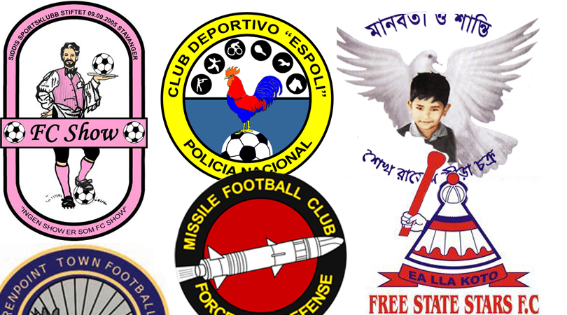
15. Missile FC (Gabon)
“Hmm, that lot have a cannon. What’s bigger than a cannon…?”
Get FourFourTwo Newsletter
The best features, fun and footballing quizzes, straight to your inbox every week.

14. Independiente Caravel (Aruba)
Continuing the theme of violence, we have Aruba’s finest, Independiente Caravel. It’s possible these pirates of the Caribbean had Johnny Depp in mind during the design process. The result is more Gilbert & Sullivan.
There appears to be a redesign in the offing, although we’re not convinced it’s any better.

13. Sheikh Russel (Bangladesh)
This lot have won the Bangladeshi Premier League before and are now in the AFC Cup, where they invite opponents’ mercy with a logo that presents a peaceful dove and a cherubic child. Wait, did we say ‘cherubic’? We meant ‘highly sinister’.

12. Santos (South Africa)
All right then, lads, what are we looking at here? A bleeding smiley face with too many eyes? A tribute to acclaimed graphic novel Watchmen? An acid trip gone horribly wrong? Please tell us what you had in mind.
And fear not, Pele fans: this isn’t O Rei’s mob. The Santos in question play in South Africa, and prior to this, their logo featured the not-very-South-African Statue of Liberty. So this is an improvement… we think.

11. ASA Targu Mures (Romania)
Targa Mures are inexplicably in the top flight, rubbing shoulders with Romania’s best and brightest. This season they’re among three clubs deducted six points for failing to comply with Romanian licensing laws. Unrelatedly, this is their club crest.
At first FFT thought this was a badly-drawn bear wearing a suit of armour, and from a distance, we still do. Closer inspection reveals an off-camera knight wielding a kebab skewer that’s been clogged up with bear head. Disembodied arm, disembodied head – whichever it is, the animal doesn’t look too happy with this state of affairs.

10. Wikki Tourists (Nigeria)
Proving that no team name is so ridiculous their badge can’t top it, Wikki Tourists are currently making a strong bid to grace the African Champions League with the worst logo in its history.
They actually led the Nigerian first division for a good portion of this season, only for results to drop off once their free-scoring elephant had been taken out with a tranquiliser dart, crushing the entire continent.

9. SexyPöxyt (Finland)
FFT doesn’t believe in giving excess publicity to teams who clearly want it, so we’re just going to leave SexyPants’ logo here and move on.

8. Club Deportivo ESPOLI (Ecuador)
There’s an awful lot going on here. Whoever created the Ecuadorian capital club’s badge clearly didn’t know when to Quito (we’re so sorry).
It’s easily broken down, however. ESPOLI denotes Escuela Superior de Policia, the police academy behind the team. The chicken refers to the club’s nickname, El Gallito, though with a rifle pointed at its head, ‘The Little Rooster’ isn’t long for the world.
And finally, the roundels represent the club’s other sporting interests, from tennis and cycling to equestrianism, something that’s presumably meant to resemble swimming and… um… what actually is that above Lee Harvey Oswald? Interpretive dance?

7. SC Faetano (San Marino)
Presenting: Nottingham Forest’s new crest.
Sadly not. The Tricky Trees (does anybody actually call them this?) have yet to visit San Marino for inspiration, but when they do, they’ll surely file a glowing scouting report.
Strengths: solid trunk; eyes on the ball; right arm/branch apparently offers WiFi.
Weaknesses: crap first touch; limited mobility; inadvertently gives team-mates distracting flashbacks to Lord of the Rings or, worse, Evil Dead.
Never mind then.

6. Feni SC (Bangladesh)
See, what you’ve done here, guys, is you’ve given away your tactics. Opponents must rub their hands with glee when they see a team declare, just in its logo, the intention to go all-out attack.
Still, there’s little alternative when the other team has all three of its players defending. Feni’s right-sided centre-back is so shocked by their Pulis-ish set-up that his forward runs come with exclamation marks. But then why wouldn’t he surge into attack? A shield-shaped football pitch gives a huge advantage to the team defending its narrow end, especially when there’s a gigantic ‘E’ blocking the goalmouth.

5. Free State Stars (South Africa)
...
*squints*
...
Nope, no idea.

4. FC Show (Norway)
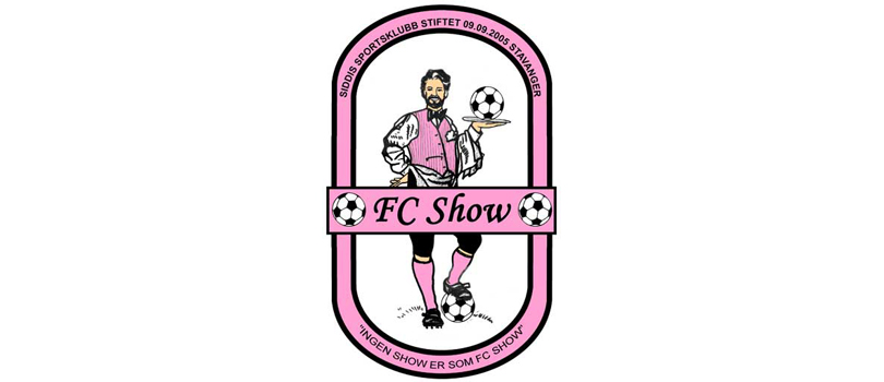
There’s no arguing that this isn’t a magnificent club crest – and yes, FC Show are a real team, dandily lighting up the murky depths of the Norwegian seventh tier. It’s quite extraordinarily camp, and also features at least three more footballs than is necessary.
Sadly, FC Show (real name: Siddis Sportssklubb) lose points with FFT simply for trying too hard. Also, we think that just looking at that seedy waiter has given us the clap.

3. Changchun Yatai (China)
What even is that thing? If FFT had to guess, we’d take a stab – perhaps even literally – at an ungodly crossbreed of pig, stag and either Huey, Dewey or Louie. Throw in the poor sod’s ginger hair and human-ish hands, and it’s a surprise the club motto isn’t “KIIIIIILLLL MEEEEE”.
Changchun Yatai are actually a top-flight outfit, so they’re no clowns, even if their mascot is. Admittedly, though, they're currently propping up the Chinese Super League, despite the efforts of London-born Hong Kong international Jack Sealy and former Wigan flop Marcelo Moreno. Stick that abomination up front, we say.

2. Kugsak-45 (Greenland)
Yes, it’s a pair of fisherman fighting over a bored seal. Well? What of it?
-45 is my favorite soccer team in Greenland. Go seal-huggers go! January 20, 2014
1. Warrenpoint Town (Northern Ireland)
The Northern Irish club’s logo might not seem much at first, but look at those rabbits. Look at the drawing of those rabbits. Look at this beautiful work of art.
It’s a fascinating scene. We see a baby bunny gamboling across an extremely small field, watched from the bushes by a creepy presence holding a dead Christmas tree. In the background, a monochrome dawn breaks. This is a sad tableau. A sadleau.
But if you thought Warrenpoint’s minimalist take on Watership Down was sad, there’s more. The Point were relegated from the Irish Premiership earlier this year with the final kick of the season: a stoppage-time equaliser conceded after an extremely contentious penalty decision. Manager Barry Gray said afterwards, “There are absolutely no consequences for [the officials] whatsoever. They take their overpaid package, they go home and they worry about nothing.”
Then he went outside and shot a baby rabbit.

See also...
More good lists • New features you'd like every day on FourFourTwo.com
Huw was on the FourFourTwo staff from 2009 to 2015, ultimately as the magazine's Managing Editor, before becoming a freelancer and moving to Wales. As a writer, editor and tragic statto, he still contributes regularly to FFT in print and online, though as a match-going #WalesAway fan, he left a small chunk of his brain on one of many bus journeys across France in 2016.
