Are these the 17 worst kits of the 2016/17 season?
From Porto to Leicester, Roma to Crystal Palace, Huw Davies has picked out some of the worst kits of the new campaign
17. Celtic, third
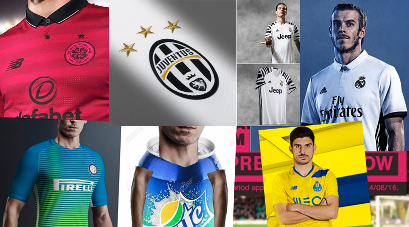
That’s a brave choice of colour, lads. It’s even ballsier, though, to claim the kit is inspired by the Lisbon Lions, as if everybody in 1960s Glasgow wore neon pink. But the match tickets were that colour, you see. Because that’s what everyone remembers about the ’67 European Cup Final.
Introducing our New Pink Kit, pre-order today at Celtic Stores or https://t.co/egkPQ2xAAQ#IfYouKnowYourHistorypic.twitter.com/GD5TchuLmd
— Celtic Football Club (@celticfc) July 25, 2016
16. Real Madrid, home
Real Madrid’s 2016/17 home kit isn’t awful – not compared to that monstrosity above – but it isn’t quite right, either. Other shirts suit Adidas’ repositioning of their stripes; here, however, the sleeves feel empty without them. The collar sits oddly, too.
Luce la nueva equipación gracias a #RMRunner ¡Vota Ya! El ganador el día 1 de Agosto en https://t.co/PTkc2GUOF9pic.twitter.com/DH5IVKLG6M
Get FourFourTwo Newsletter
The best features, fun and footballing quizzes, straight to your inbox every week.
— Real Madrid C. F. (@realmadrid) July 23, 2016
15. Hertha Berlin, home
While we like the differently-coloured shoulders on most new Nike shirts (England, say), it doesn’t work as well with stripes.
Ab sofort könnt ihr das neue Hertha-Trikot vorbestellen: https://t.co/kZUMcZIz16#hahohepic.twitter.com/1L3yzh1zut
— Hertha BSC (@HerthaBSC) June 29, 2016
14. Southampton, home
For some reason, Southampton hate their regular kit. At least, that’s how it seems from their constant experiments with it. 2010/11: Too much white. 2012-14: Too much red. 2014/15: Can we have diagonals as well? 2016/17: Actually, what we’re really missing is a training bra.
#SaintsFC's new @UnderArmourUK kits are now officially on sale! #BarRaisedpic.twitter.com/jxT00zVBjA
— Southampton FC (@SouthamptonFC) July 18, 2016
13. Borussia Monchengladbach, home and away
Presenting, m’lud, exhibits A and B in the Attempted Murder case of Sponsors vs Kits.
We're ready for the new @Bundesliga_EN season. Are you? Grab the new kits here: https://t.co/bdm1siGIqjpic.twitter.com/OYfxL2nRgO
— Gladbach (@borussia_en) July 3, 2016
12. Inter, third
Anyone picking up Inter's new sprite...uhmm...we mean third kit? pic.twitter.com/imP3sHrpuE
— Onefootball (@Onefootball) July 18, 2016
The Nerazzurri’s first strip is gorgeous. The second’s nice, too. The third just ain’t right. Neither shade’s unappealing, but blend them together and the result is an art student’s paint palette on a particularly hot day.
11. Roma, third
See above. Anyone for a Fruit Salad?
Roma's third kit #ASRomapic.twitter.com/L8ZlU4dz0M
— Tony Roma (@LaRomanBomber) July 27, 2016
10. Porto, third
Nope. We applaud Porto’s attempt to mix things up – and again, their home kit is lovely – but it’s all gone a bit horribly wrong here. The zigzagging inversion of colours is off-putting and the blue panels so small and scarce, they look as if they’ve been put there by accident.
Equipamento alternativo/alternative kit/equipaje alternativo
Já disponível/now available/ya disponible@NBFootballpic.twitter.com/CO3bzgU1tW
— FC Porto (@FCPorto) June 25, 2016
9. Leicester, away
“Carl! Get over here. I know I told you to make their away kit anything other than blue, but blue teams shouldn’t wear red, got it? End of discussion. Even Claudio knows it, look. Now go away and start again.”
REPORT: Our verdict on a thrilling shootout win for #lcfc away at Celtic - https://t.co/E4Ha2GdUfS#ICC2016pic.twitter.com/DwybEbWo8i
— Leicester City (@LCFC) July 23, 2016
8. Juventus, third
Like so many teams on this list, Juventus have decided that their home kit is so nice, it’s only fair they even things out by designing a horrific third strip (one that won’t even solve most kit clashes). When has zebra print ever been a good idea, Juve? You’re better than this.
"@Marcocalcio22: Juventus Third Jersey. More leaked images [via @La_Bianconera] pic.twitter.com/GYXSgd40zh"
— JUVENTUS News Flash (@juvenewsflash) July 25, 2016
7. Bordeaux, home
Bordeaux 16/17 Puma Home Kit
Pics: https://t.co/a39jA6mFnz#LesGirondins#footballshirt#footballpic.twitter.com/rIZ1aWBAMx
— FootballShirtCulture (@footballshirt) June 20, 2016
There’s just one problem here, and it’s taking up 90 per cent of the shirt. That V is huge – extravagantly, eye-catchingly, needlessly huge. You can’t escape the feeling there should be a gold chain hanging from it. We like Bordeaux’s alternate effort, though. What?
Bordeaux's 3rd kit for the 2016/2017 season is an interesting choice. #Bordeaux#Girondins#FCBordeauxpic.twitter.com/m7brvfjcnT
— Classic Footy Shirts (@Football_Kits1) May 23, 2016
6. Chelsea, all of the kits
Chelsea’s white third kit is inoffensive enough, but we’re torn over which over their other three is worst. Is it the goalkeepers’ uniform, luminously shouting, “Here’s the goal, strikers!” while Yokohama tyre treads on its shoulders point towards a hit-and-run? Is it the charcoal change strip, which looks as if they bought some faded Wales Euro 2016 tops second-hand? Or is it the tribute to Russia’s Euro 2016 shirt, its imprinted logo giving an air of brothel wallpaper? Questions, questions.

5. Cruz Azul, home
Boing!
Jerseys @UnderArmourMx de @Cruz_Azul_FC 2016/17: https://t.co/BO5VFhejHapic.twitter.com/f5tzoxyhKn
— Todo Sobre Camisetas (@EleteTSC) July 14, 2016
4. Montpellier, away
It’s not Nike’s fault that Montpellier have a sponsor overload – nor is it Montpellier’s, really, because you take what you can get – but it does create an incredibly busy shirt.
[Mercato] Quentin #Cornette quitte le #MHSC pour @AmiensSC. https://t.co/g2cbRoI1Vlpic.twitter.com/PUpCfcyDmH
— MHSC (@MontpellierHSC) June 24, 2016
3. Crystal Palace, home
“You can only do so much with stripes,” protested Palace chairman Steve Parish, spectacularly missing the point. The Eagles got away with wearing halves in 2013/14, but this atrocity is neither halves nor stripes. Instead, it just looks blue, with red afterthought – and that’s not Crystal Palace. Wrong, wrong, wrong, wrong, wrong.
PRE-ORDER: Guarantee delivery of the new home & away kits before they go on sale in store. https://t.co/zBu7bfUMxTpic.twitter.com/c9SiqfVPAg
— Crystal Palace F.C. (@CPFC) June 2, 2016
2. Freiburg, home
What is going on here? Why are Freiburg wearing this? When did they embrace pink? Who are Schwarzwaldmilch? Is this their fault? How do we stop them?
The new @sc_freiburg kits are now available online! #teamhummelhttps://t.co/ZLCARQNOTFpic.twitter.com/XozFCtWfUL
— hummel USA (@hummelUSA) July 12, 2016
1. Norwich, third
Sometimes all you can do is ask: why?
It takes effort to make a white kit painful to see, but the Canaries are well aware of what the eyesore they’ve unleashed upon an unsuspecting world that had only just got over the original attempt, some 20-odd years ago. And just in case this doesn’t hurt your eyes sufficiently, the crest is in 3D.
If the worst thing you can do in design is make something that’s forgettable, then congratulations, Norwich. You’ve created the Sharknado of football kits.
First game for this too pic.twitter.com/8lWCrtSlMj
— Norwich City FC (@NorwichCityFC) July 23, 2016
Huw was on the FourFourTwo staff from 2009 to 2015, ultimately as the magazine's Managing Editor, before becoming a freelancer and moving to Wales. As a writer, editor and tragic statto, he still contributes regularly to FFT in print and online, though as a match-going #WalesAway fan, he left a small chunk of his brain on one of many bus journeys across France in 2016.
