Ranked! The 14 best football kits of the 2019/20 season
Clubs from around the globe are stuck with their shirts for 2019/20 – but luckily for these clubs, they're absolutely glad of that

Hark at these beauties: the finest threads of 2019/20, if we don't say so ourselves.
It's a game of opinions, Clive, but if you don't agree with our No.1 shirt then please seek optical assistance. As for the rest... well, see for yourselves why don't you?
SEE ALSONew Premier League kits 2019/20: EVERY released home and away shirt
THE GREATS FourFourTwo's 50 best football shirts... EVER
GEAR 11 great retro football shirts you need in your life this summer
Please note: Prices correct at the time of writing.
14. Derby home
Get FourFourTwo Newsletter
The best features, fun and footballing quizzes, straight to your inbox every week.
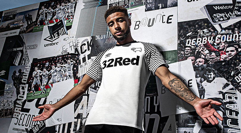
Critics may argue that this is more like a training top than a home kit, but it’s stylish nonetheless. The sponsor logo blends in well with the rest of the design, which is minimalist without being boring. We’re big fans of the striped sleeves, too.
13. Middlesbrough away
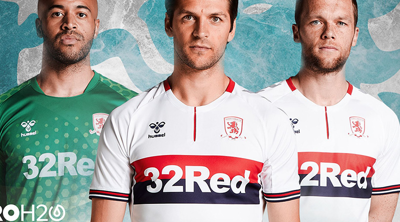
A very tidy offering from Boro, who have made excellent use of a white template. The navy and red horizontal band is an upgrade on the navy-only version of two seasons ago, while the dash of red on the neck plus red and navy cuffs are subtle but slick features.
12. Crystal Palace away

Palace are no strangers to a lovely away kit, having produced some sensational, sash-tastic numbers in recent seasons. The 2019/20 iteration features a central red and blue stripe rather than a diagonal one, with a bold black pattern and different colours on the shoulders adding further style and uniqueness.
Anything that makes Mamadou Sakho this happy is fine by us.
#PalaceAwaypic.twitter.com/FHokBl6zBy— Crystal Palace F.C. (@CPFC) July 12, 2019
11. Coventry home

It will take more than an attractive strip to appease Coventry’s beleaguered supporters, but this 1980s throwback is delightful. The gradient design is a lot less bland than plain sky blue, and it also accentuates the old-school club crest.
10. Lille home

On paper this shouldn’t work, but by our reckoning New Balance and Lille have pulled this bold design off. Modelled on the “raw and creative energy visible across Lille’s street art”, this is a vibrant, eye-catching uniform which sensibly limits the graphic design to only the top half of the shirt.
9. Atalanta home
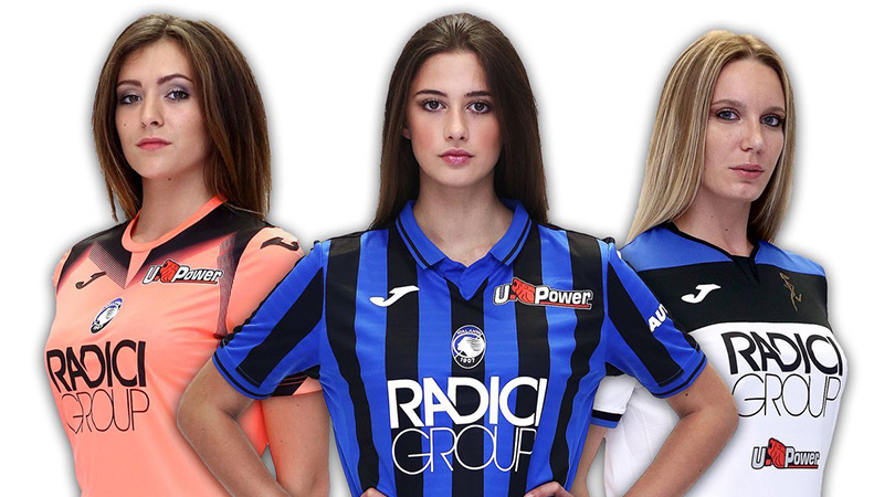
Atalanta’s Champions League qualification made them one of the stories of 2018/19, and Joma have ensured they’ll look the part when they take to the field in Europe’s premier competition for the first time. There’s just the right number of stripes on the body and sleeves, while the collar is smart without being too try-hard.
Shame about promo material that looks like it’s from about 2003, mind.
8. Roma home
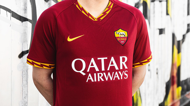
Although Roma’s classic colours make it difficult to produce a dud kit, Nike deserve credit for recognising that less is more: the lightning bolt sleeves and collar are distinctive, but this is otherwise a pleasingly simplistic, sharp design.
7. Real Madrid home

Has a man ever looked like he wants to be somewhere less than Gareth Bale does in this photoshoot? Still, at least the Welshman looks dashing in Real Madrid’s glorious 2019/20 home kit, which strikes the perfect balance between white and gold. It’s just a shame this is the only time Bale will get to wear it.
6. Go Ahead Eagles away
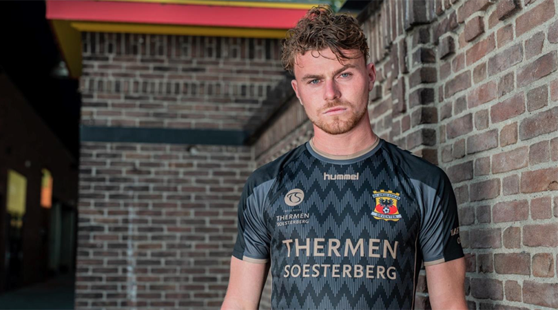
More like Go Ahead And Take My Money, right?
Guys?
5. Leicester away

Things went horribly wrong when Everton introduced a pink away kit in 2010/11, and the colour has rarely been seen in the Premier League since then. Leicester could be about to change all that, though, for this change shirt is less garish and more gorgeous. The choice of black for the various insignia was a smart one, and the shoulder stripes are another fine addition.
4. Arsenal home

No major new signings, a limited transfer budget and club captain who’s so desperate to leave that he refuses an all-expenses-paid trip to the US? Arsenal have shown this summer that the banter era is far from over, but they’ve at least done something right with this marvellous new home kit. We can’t wait to see Shkodran Mustafi using it to cover his face after giving away a penalty on the opening weekend.
3. West Ham away
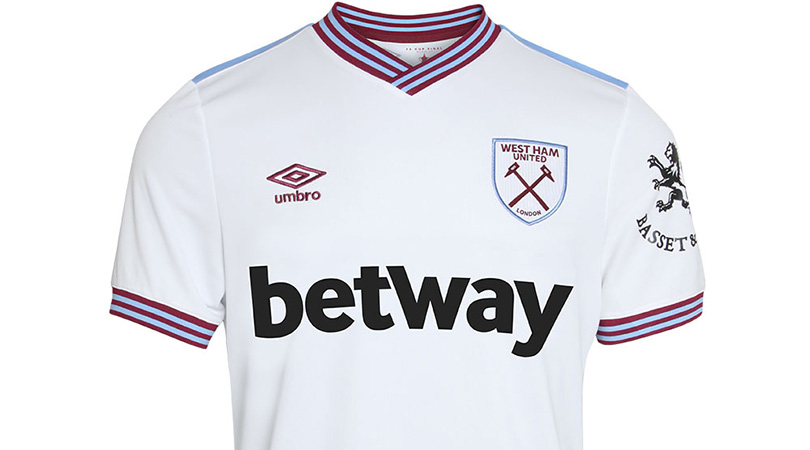
Claret and blue are classic English football colours, and West Ham have made the most of them with this beautiful away strip. The striped collar and cuffs are delightful, and the club crest blends in well with the rest of this shirt.
2. Ajax home
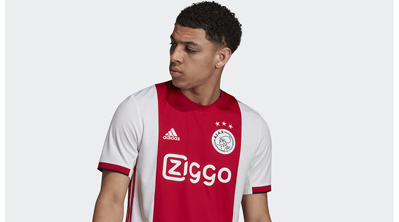
We didn’t believe in love at first sight until we clapped eyes on this jersey. Adidas and Ajax have combined to produce a masterpiece for the 2019/20 campaign: it’s smart, clean and thoroughly modern without having excessively tampered with tradition. We’ll take the lot.
1. Inter Milan away
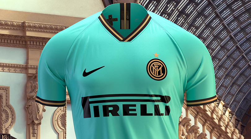
Excuse us reader, is that your jaw on the floor down there? It’s the only plausible reaction to this stunning piece of art. A mint-coloured body complemented by black and gold flourishes: Inter’s away kit is the best Europe has to offer in 2019/20.
While you're here, why not take advantage of our brilliant subscribers' offer? Get 5 issues of the world's greatest football magazine for £5 – the game's greatest stories and finest journalism direct to your door for less than a pint in London. Cheers!
NOW READ...
FIFA 20 Advice, tips and guides from the experts
LIST 10 big, disastrous signings who cost managers their jobs
QUIZ! Can you name Arsenal's last 50 players in the Premier League?
Greg Lea is a freelance football journalist who's filled in wherever FourFourTwo needs him since 2014. He became a Crystal Palace fan after watching a 1-0 loss to Port Vale in 1998, and once got on the scoresheet in a primary school game against Wilfried Zaha's Whitehorse Manor (an own goal in an 8-0 defeat).

