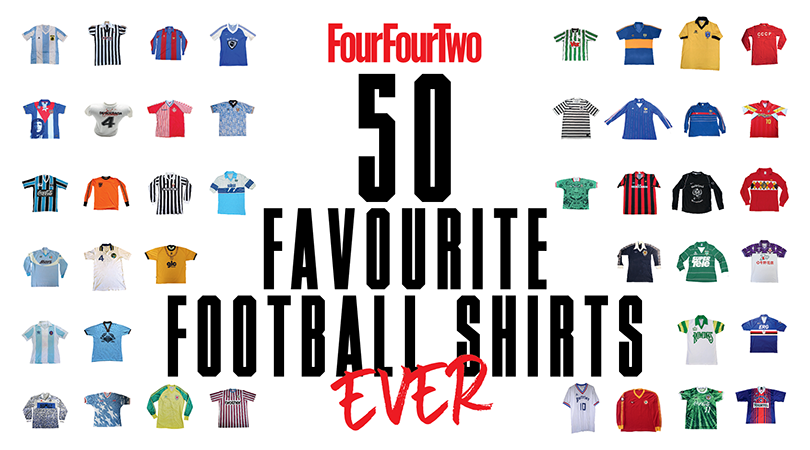
FourFourTwo's 50 best football shirts... EVER
The (footballing) pornography you can actually get away with looking at, lovingly curated by football shirt connoisseur Neal Heard. These best football shirts are just about safe for work...
What makes a great football shirt? (Unfortunately the answer isn't just 'anything that's not Norwich 1992-94'.)
Is it what it looks like? Who wore it? Whether a team won stuff in it? Whether it makes you smile? Misty-eyed? Well, it's all of those things and yet maybe even none of them; for football shirts are a completely subjective entity, and difficult to evaluate. And yet, we can still all agree on many of the beauties out there.
In The Football Shirts Book, Neal Heard (find him on Instagram here, Twitter here) sets out to rejoice about more than mere design. "I find it's more about sharing memories with people," he says. "I like the fact that around the globe you can wear a shirt and someone will stop you to ask the immortal question: 'Where'd you get that?'"
Well, quite. Good luck getting your grubby hands on the sought-after selections below – picked by Neal, ranked by FFT – but just go ahead and admire them anyway. Talk to us (@FourFourTwo) about them at #FFTGreatShirts and we'll get some conversation going on Twitter.
SEE ALSO The best classic football shirts that you need in your life
RANKED The 20 best Premier League shirts EVER
RATED! The 15 best England football shirts of all-time
Get FourFourTwo Newsletter
The best features, fun and footballing quizzes, straight to your inbox every week.
50. Gamba Osaka, home (1996-97)
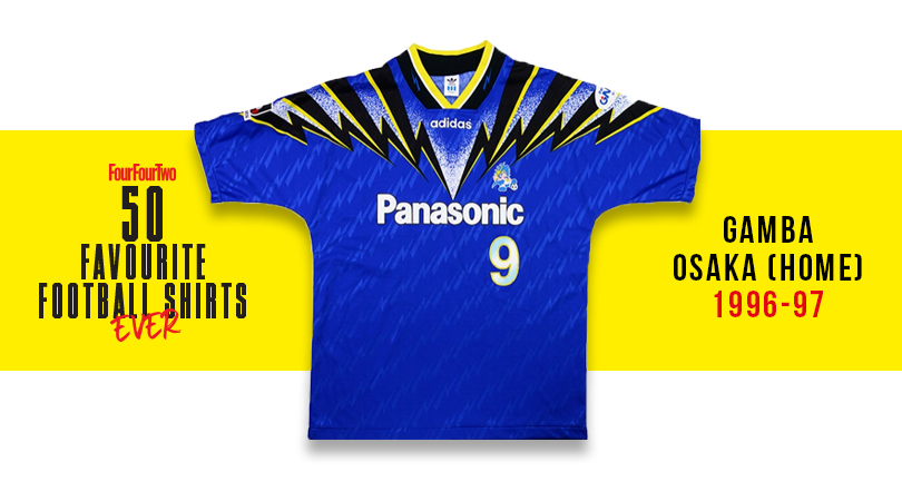
J League exuberance: the crescendo of lightning bolts – aptly enough descending into Panasonic’s logo over the chest – is simply electrifying.
49. USA, away (1994)
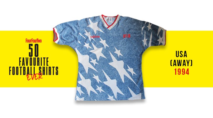
Best modelled by Alexi Lalas – a flame-haired, wizard-bearded giant for whom a cameo as part of the Night’s Watch is surely still on the cards. This none-more-American kit featured faux denim and massive stars, and was like nothing that had ever been seen before.
48. Greenbank U10s (2006)
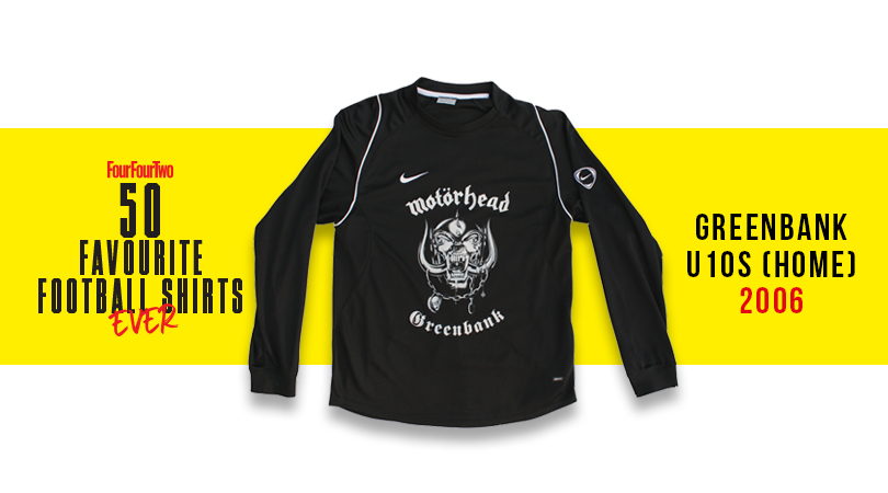
Back in 2006, a group of under-10 cherubs from Lincoln petitioned Lemmy to let them wear the rocker’s famous Motorhead logo on their shirt – and the warty metal maestro agreed, adding: “Kick everything really hard.” Eventually he met the team, while the tots gave the ‘sign of the horns’. Winner.
47. Scotland, home (1978)
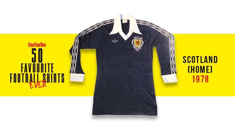
Archie Gemmill chipped the Dutch keeper at World Cup ‘78 to score one of the tournament’s most beautiful goals ever – and he looked the part in a great Umbro design, with the logo dotted all along the sleeves.
46. Blyth Spartans, home (1993-94)
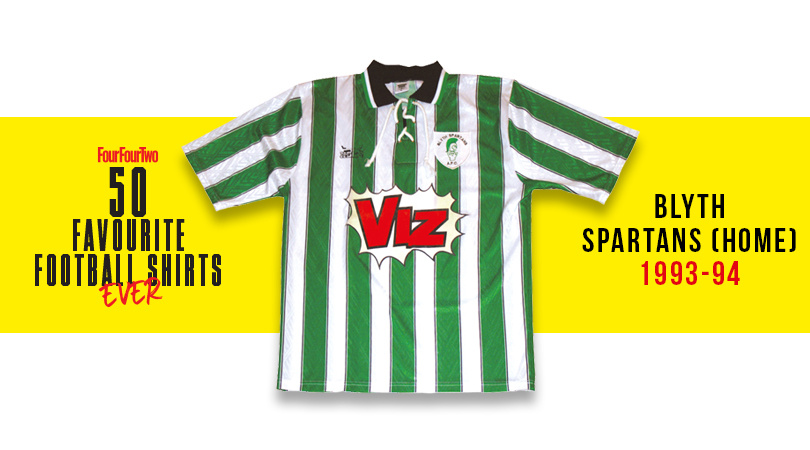
The Geordie genius of Viz is arguably the North East’s greatest contribution to British culture – and its sponsorship of Northumberland upstarts Blyth was entirely fitting, as well as looking great.
45. Milan, home (1989-90)
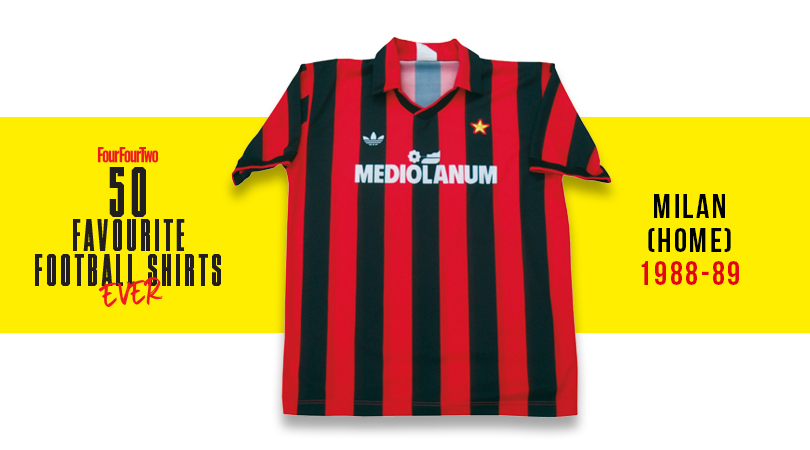
Few better teams, few better shirts: say ‘Milan’ to a fan of a certain age and they can’t help but picture Ruud Gullit, Frank Rijkaard and Marco van Basten posing in this adidas cracker, high on their own brilliance.
44. PSG, home (1993-94)
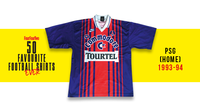
Sometimes more is more: a wild collision of thickening-then-thinning stripes, bold colours and in-yer-mush sponsors logos, this Parisian party somehow works.
43. Newport County, home (2004-05)
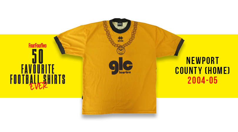
Ah, the golden years of Welsh comedy rap. Enriched by their international hits Guns Don’t Kill People, Rappers Do and the searing social commentary of Your Mother’s Got a Penis, Newport-based hip hop collective Goldie Lookin Chain became kit sponsors for the side’s FAW Premier Cup run, and slapped a massive GLC on the actual shirt.
42. Barcelona, home (1982-89)
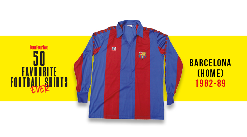
Another club with very few bad shirts in its back catalogue thanks to an irresistible colour combo and simple execution, their high point was perhaps the decade in which local Barça brand Meyba – better known for swimwear – made the jersey.
41. Colorado Caribou, home (1978)
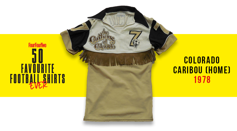
The NASL always toyed with the boundaries of acceptability – it’s the American way – and none more than this Caribou top. It featured a tassled ‘rodeo fringe’ around the midriff, making former Wrexham midfielder Brian Tinnion and the rest of the Denver side – founded and disbanded in the same year – look like demented line dancers. Coyote ugly but somehow marvellous.
40. Fiorentina, home (1992-93)
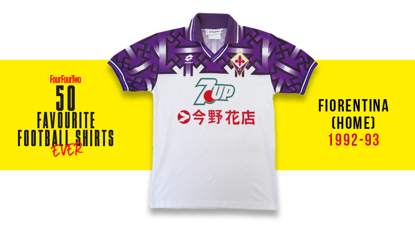
It was a tough year on the pitch – La Viola were relegated from Serie A – and also for Lotto’s design department, when it was pointed out that their shirt was covered in bloody swastikas. They pleaded it was an accident, but it was withdrawn, quick-sharp, just in case.
39. Madureira Sporting Club (2013)
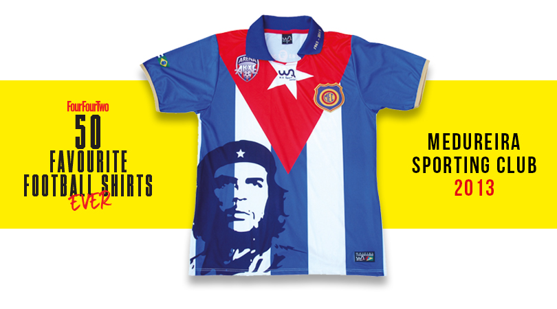
Brazilian minnows Madureira slapped '60s Argentine troublemaker Che Guevara on their shirt not just in the hope of selling it to students: it marked 50 years since the club visited Che’s old stamping ground of Cuba and met the beret-wearing Marxist insurgent after one of their games.
38. Tampico Madero (1980-82)
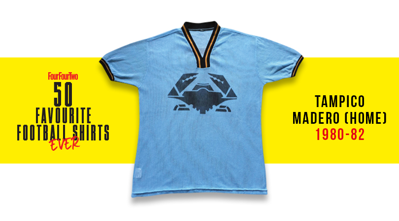
Behold our new crustacean overlords! The Mexican Tamaulipas region is well known for its jaibas seafood, with nippy claw logos plastered all over the place, from buses to benches. So it was only natural that the team – nicknamed the Brave Crabs – would take matters to the next level.
37. Belgium (1984)
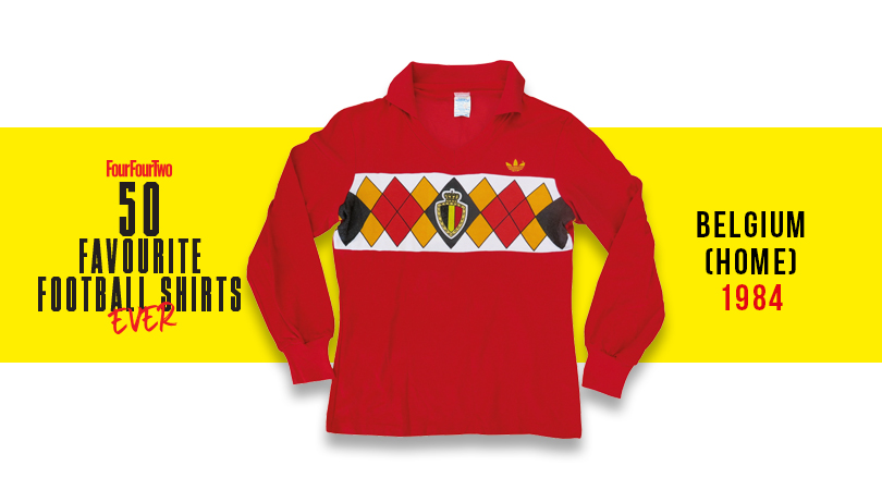
Part shirt, part pack of a playing card, this Argyle reference is a 1980s football casual dresser’s wet dream, and one of the most original international jerseys ever. Adidas at its creative best.
36. Tampa Bay Rowdies (1978-81)
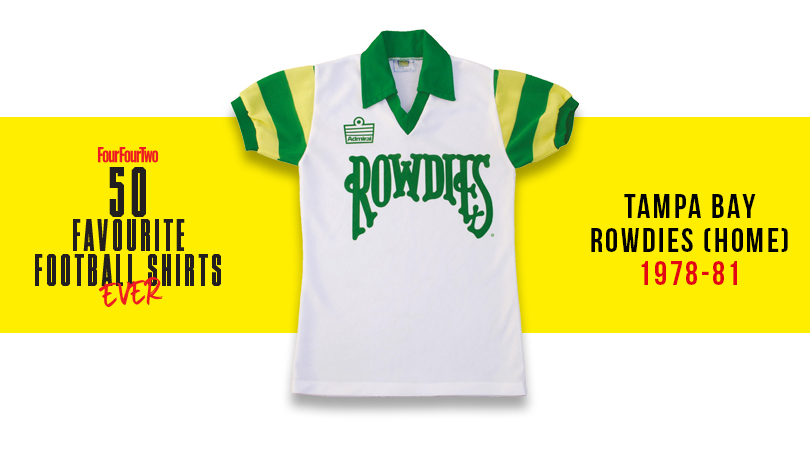
One of the short-lived NASL’s finest efforts: a great green and white colour scheme, and a font you’d associate more with a rock ’n’ roll poster.
35. Atalanta, away (1991-93)
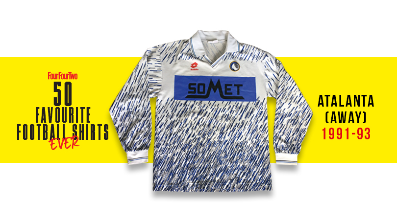
A love-it-or-hate-it affair, but we’re in the former camp. Some art school football shirts look dreadful, but this pen-flecked attempt – classic early '90s stuff – was pretty swish.
34. France (1982)
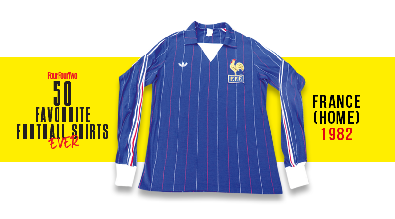
Alright France, we give in: your shirts are simply le bomb. The deep blue, central stripes and proud cockerel make this one something to crow about – especially as a great Bleus side wore it as they thrilled in the '82 World Cup.
33. CCCP (1970)
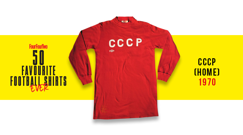
The Soviet Union's big red machine trampled its way to the quarter-finals of Mexico '70, where they were eventually immobilised by Uruguay. But they did it looking menacingly sharp in this simplistic number, complemented by the all-black goalkeeper kit of Anzor Kavazashvili. Terrifying.
32. New York Cosmos (1979)
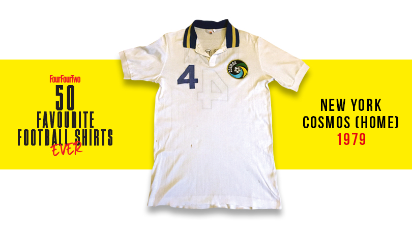
Designed by Ralph Lauren, and further proof that the Cosmos were barely about football at all; more peacocking around Studio 54 with Warhol and Bowie. Still, the logo was outstanding, and with Carlos Alberto, Franz Beckenbauer and Johan Neeskens all in the side, they could play a bit too.
31. Brazil (1986)
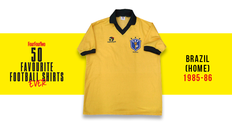
There’s never been a ropey Brazil shirt, but this one, donned by Socrates, Zico, Josimar, Falcao and chums, is – for us – the definitive Seleção selection.
30. Gremio, home (1989-90)
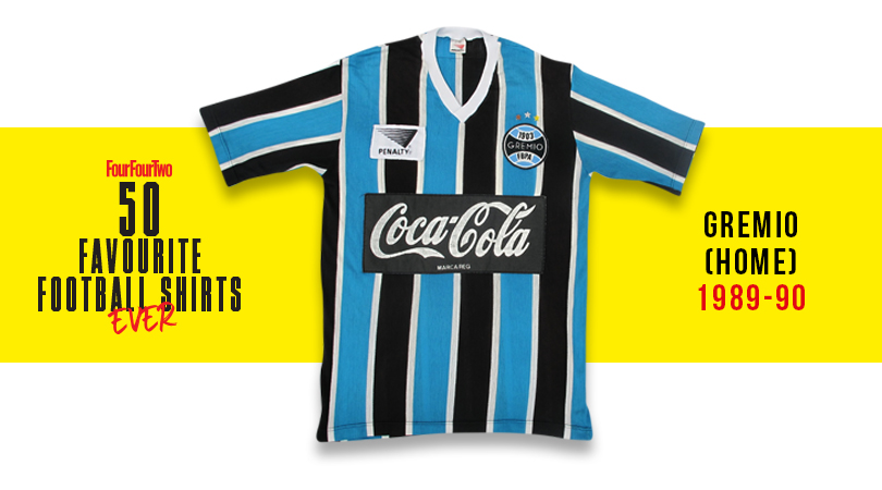
A Brazilian classic colour combo, enhanced further by the sewn-on manufacturers logo and curly fizzy pop logo sponsorship.
29. Roma, home (1981-82)
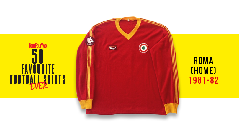
Another side that rarely put out poor kits – that colour combo and wolf imagery can’t fail – Roma’s apex came this year with its most stylish exponent, Falcao (despite his curly Phil Neal mullet), apparently having a hand in the design.
28. Nigeria, home (1994)
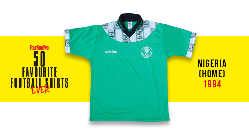
The Super Eagles topped their group at USA '94 with this African print-patterned adidas number, only to deny the world a fifth game in it by losing to eventual finalists Italy in the last 16. If only more teams would incorporate local influences into their shirts like this.
27. Nagoya Grampus Eight, home (1994-95)
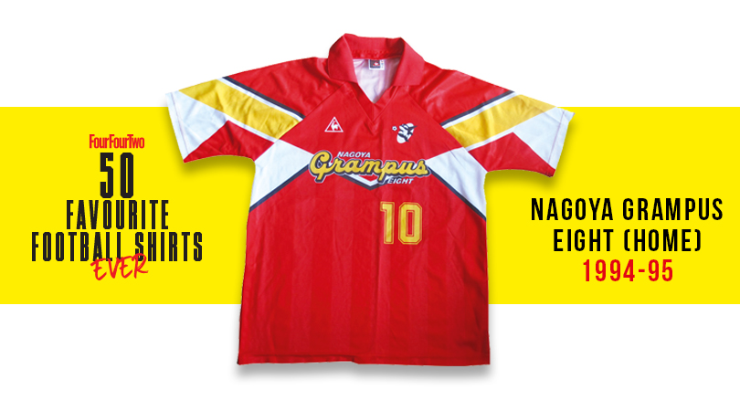
J League shirts have always been heavily influenced by Japan’s unique artistic and design tradition, and this one – famously modelled by Gary Lineker for a couple of terms at the end of his career – was a smasher.
26. Marseille, home (1971/72)
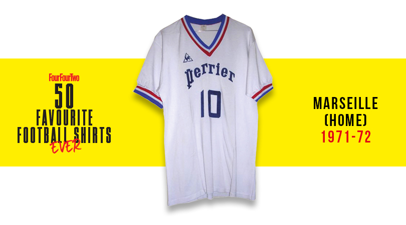
A groundbreaker. This was the first shirt to have something we now take for granted: a brand logo and a sponsor. It looked darned dapper, too.
25. Argentina, home (1986)
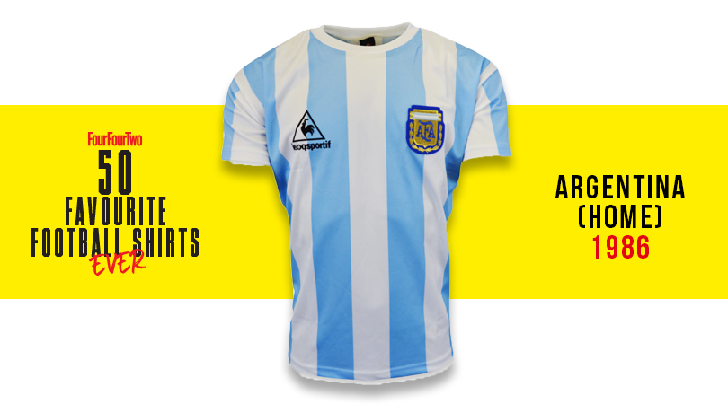
England players saw far too much of this shirt's rear while watching Diego Maradona scurry out of reach for 90 minutes at Mexico '86 – the tournament at which Argentina's diminutive genius left all in his wake before lifting the Jules Rimet. Iconic.
24. Corinthians, home (1982-83)
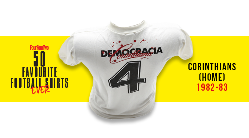
Charged with political significance: in ’82 the players of the crisis-torn Sao Paulo outfit – including ciggy-mad Seleção God Socrates – took over the running of day-to-day operations, with employees, players and managers all getting an equal vote. It looks unbelievably good, too.
23. Fiorentina, away (1996-97)
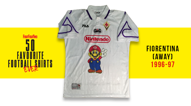
Purple is a tricky colour to pull off and often the preserve of the Mad Cat Lady (even when it's merely just for trim in this white number), but in Italy’s most beautiful city they’ll tell you it’s violet and point you at a picture of Gabriel Batistuta looking unbelievable. Bonus points for Super Mario getting involved.
22. France, away (2011-12)
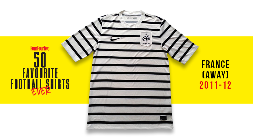
The Breton stripe was used by the French navy from 1858, popularised by Coco Chanel in 1917, and is still a staple of casual womenswear and high fashion Jean Paul Gaultier sailor outfits. Full marks to the France side for embracing the tradition for this shipshape away effort.
21. Juventus, home (1983-84)
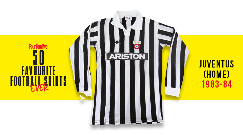
A shirt fit for Serie A and European Cup Winners' Cup champions. This delightful creation from Kappa is the all-time classic Juventus shirt, known for its stylish giant collar, smart V-neck... and Michel Platini. It's all about Platini.
20. Stockport County, home (1981/82)
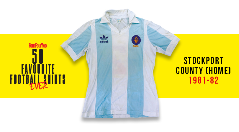
Even the most agitated Falkland Islander would be hard pushed to deny that the Argentina international shirt is a peach, but Stockport’s lovely homage to it was unfortunately withdrawn after the war over Las Malvinas broke out early that season.
19. Man City, away (1988-90)
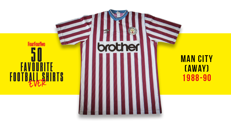
One of the few football tops that could be acceptably worn in the church of Mancunian acid house cool, the Hacienda. Mind my pint, Bez!
18. Wales, away (1980-83)
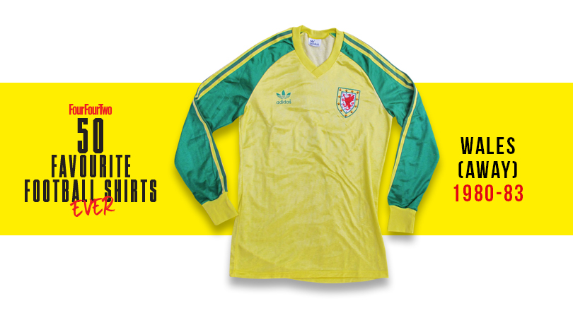
The Principality have had some great kits over the years, and for our money the finest is this obscure yellow and green change number from 1980-83. Think Ian Rush, Kevin Ratcliffe and Joey Jones in full adidas glory.
17. Verdy Kawasaki, home (1993-94)
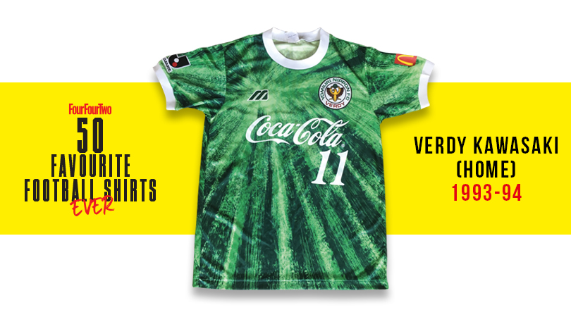
Presumably after passing the bong around Mizuno HQ and wigging out to Anthem of the Sun by the Grateful Dead, the design team got straight on with knocking up this splendidly psychedelic effort for the Tokyo-based yo-yo club. Far out, おとこ (that’s Japanese for man).
16. Colombia, away (1990)
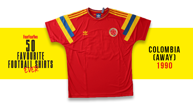
Higuita! Valderrama! Escobar! Rincon! Iconic team they may have been, but Colombia were actually a bit rubbish at Italia '90, scraping out of the group stage in third place then exiting to Cameroon. Still, at least they looked good while getting their arses handed to them by Roger Milla & Co. in this deep red number, complete with jazzy symmetrical shoulder bars.
15. Atalanta, away (1990-91)
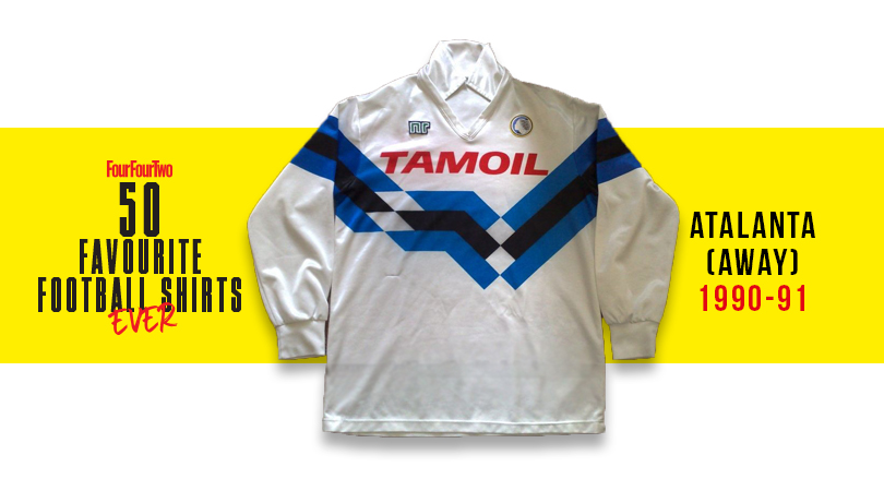
Despite being a cut and paste of the classic Germany shirt from the same era, this is a masterpiece of design, and the colour scheme just gives it the edge over Die Mannschaft’s top threads.
14. Club America, home (1994-96)
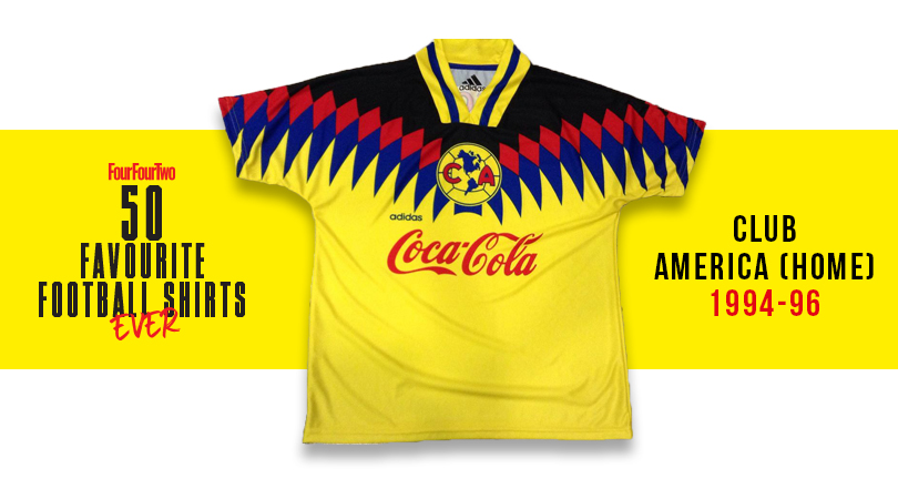
A shirt that invokes both Colombia’s ‘birdman’ super-fan and the Rio carnival, this was a jersey that could have gone badly awry. But for us, the primary colours ambition on display makes it more brilliant than bonkers. The Mexico City outfit’s continental badge finishes it off perfectly.
13. Sampdoria, home (1991/92)
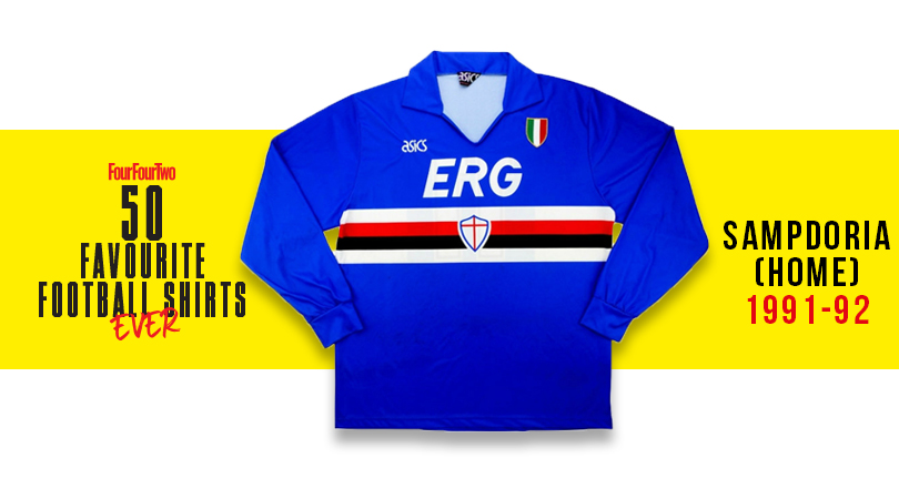
Sampdoria shirts are always outstanding, but this one – from the year that the Genoese marvels pipped the two Milan clubs to the title – is slick Italian style at its very zenith. Best worn by the slick ‘terrible twins’ up front – Gianluca Vialli and Roberto Mancini.
12. Tottenham, home (1985-87)
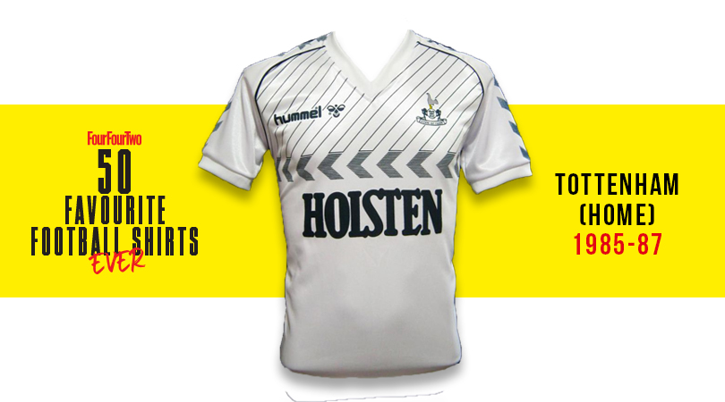
Good on hummel, who thought slanted pinstripes above chevrons would work. And by Jove, they do: this super-stylish Spurs effort from the mid-to-late '80s was fine design, featuring yet more chevrons on the sleeves and neatly fitting all of its components into one compact area. Ossie Ardiles never looked so good.
11. Mexico, home (1998)
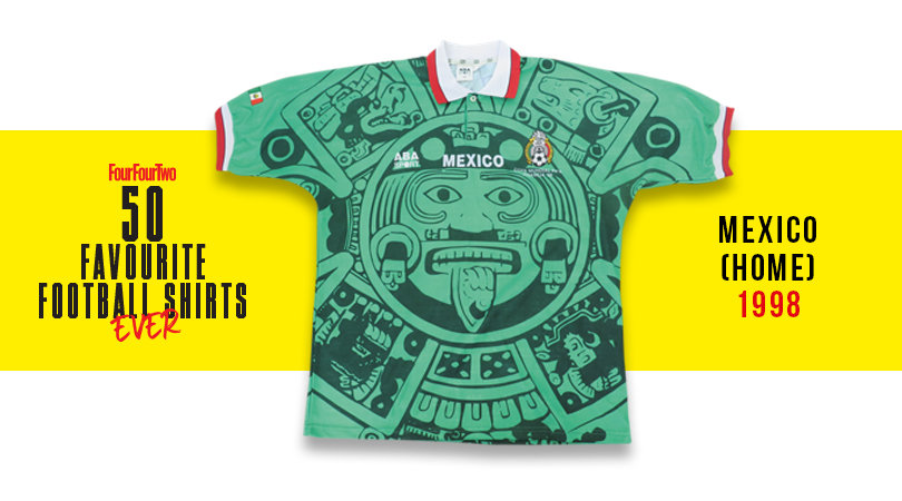
A bit of local artistic influence always enhances a kit, and manufacturers Aba Sports channel a bit of imagery here in a manner that the Aztec god Quetzalcoatl would surely have approved of – becoming drunk on fermented agave juice and cavorting with his sister in celebration, as was apparently his wont.
10. Ascoli, home (1981-82)
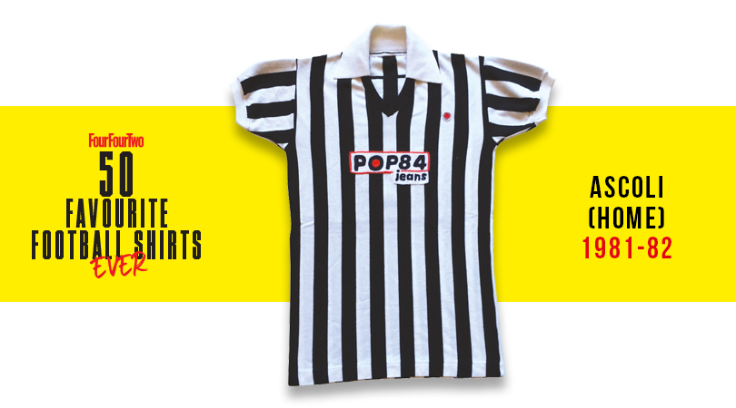
Just beautiful. From the Gridiron field judge stripes to the neat ‘Pop 84 Jeans’ sponsor and discreet badge, the Woodpeckers out-Juve Juventus with this effort.
9. Bastia, home (1978-79)
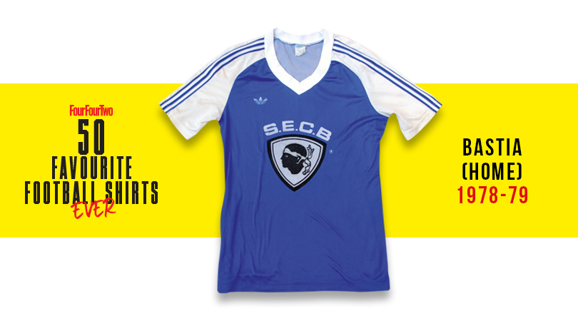
No sponsor, just a giant version of the club's Corsican crest and acronym dominating this adidas delight.
8. Napoli, home (1990-91)
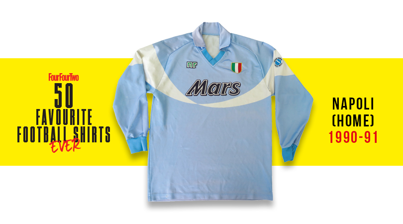
The kit that followed the Partonopei’s finest hour: their second (and last) league title, Diego in his barmy pomp, and an NR shirt with a Mars logo that’ll make Serie A romantics go misty-eyed.
7. Saint-Etienne, home (1980-81)
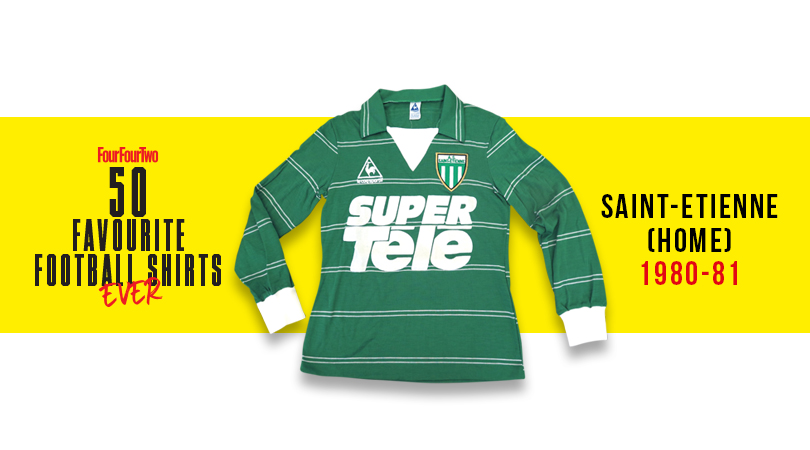
No side have ever had such a sexy je ne sais quoi as Saint-Etienne, and this is a shirt so Gallic it should be having an affair with your next-door neighbour. The green number - replete with massive SUPER TELE sponsors – looked magnifique on the back of the French kings, a side including Jacques Santini and Michel Platini. Allez les Verts!
6. France, home (1984)
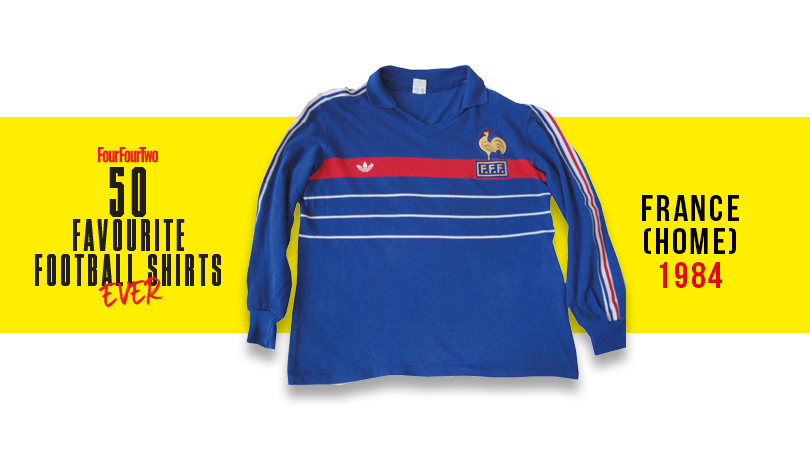
Wasn't Platini a very lucky boy? Before he was a puffed-up ball of UEFA administrative self-importance, the Frenchman was one of the most aesthetically delightful humans to ever grace a yard of grass, and this shirt was his equal: a never-bettered Bleus masterpiece.
5. England, third (1990)
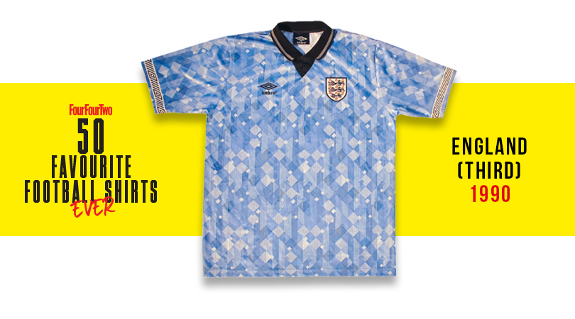
A kit that shouldn’t really be admirable: the overlaid diamonds that Umbro went bananas for around this time could often be nausea-inducing, but this one somehow worked. Worn with effortless chic by Barney Sumner in the World In Motion video, it encapsulates the good vibes of that summer neatly.
4. Lazio, home (1982-83)
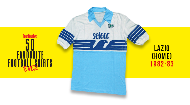
Further excellence from the NR brand, whose simple baby blue effort with beautiful trim was saved from looking like a toddler’s top by its ingenious, striking – if slightly fascistic – expansion of the Lazio eagle badge.
3. Holland, home (1976)
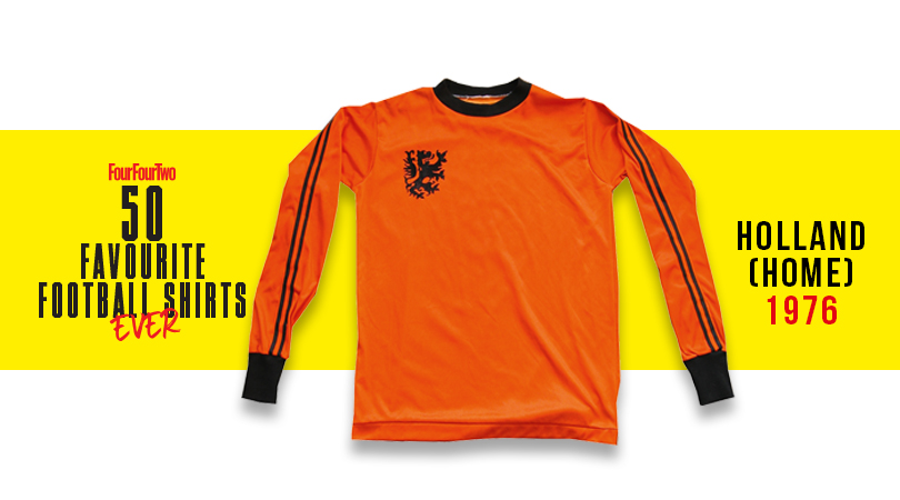
Johan Cruyff was sponsored by Puma, and thus tore one of the three stripes of the company’s mortal enemy from his Netherlands shirt – somehow making it look even cooler. Maybe the best ever Oranje shirt, on the planet’s most stylish-ever operative.
2. Boca Juniors, home (1981)
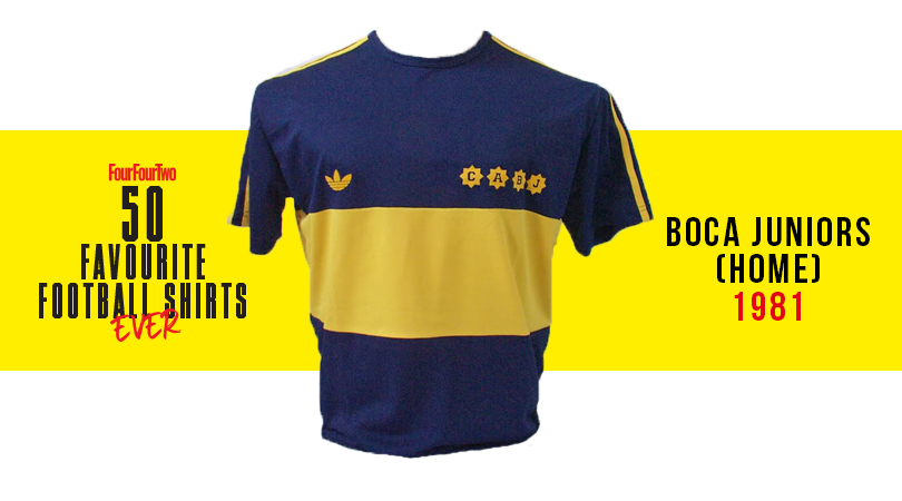
It’s hard to think of a more perfect collision of iconic team, player and kit: the bouffant-bonced Maradona still had his baby cheeks when he pulled on Argentina’s most striking shirt for one glorious season before switching to Barça.
1. Denmark, home (1986)
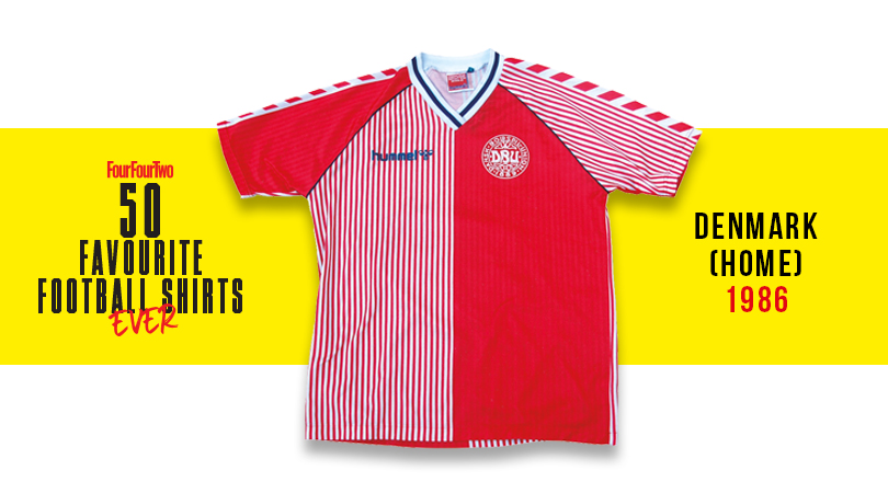
Many of the Norse marauders who would go on to win Euro ’92 were at the Mexico World Cup, where they modelled the tournament’s most pulchritudinous top. Made by Aarhus-based firm hummel, its striking chevrons and gentlemanly pinstripes worked wonderfully.
Go get The Football Shirts Book by Neal Heard now!
While you're here, why not take advantage of our brilliant subscribers' offer? Get 5 issues of the world's greatest football magazine for £5 – the game's greatest stories and finest journalism direct to your door for less than a pint in London. Cheers!
NOW READ...
LIST FourFourTwo's 100 best footballers of all time
EYE CANDY Ranked! The 14 best football kits of the 2019/20 season
WATCH Premier League live stream 2019/20: how to watch every game from anywhere in the world
