The best Premier League kits ever
What are the best Premier League kits ever? From Cantona’s turned-up collar to two numbers which graced the torso of Ginola, we rate the finest threads
The greatest Premier League kits ever aren't just the ones worn by champions – though that often helps.
Sometimes a shirt just stands out in the best Premier League tops released that year… sometimes the best that year full stop. Sometimes, a classic design comes along that sticks in the memory for its garishness, its timelessness or just because it was one that every kid had in the playground when you were at school.
So what's our favourite shirt ever? Here's a selection…
Leeds United, away, 2000/01
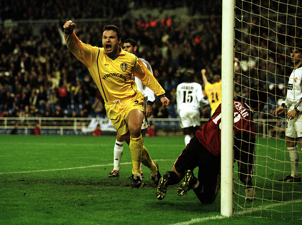
The Whites were busy living the dream as they reached the semi-finals of the Champions League under David O’Leary. A youthful side, featuring star players like Rio Ferdinand, Lee Bowyer and Mark Viduka also finished fourth in the Premier League, just missing out on a return to Europe’s top club competition. They did so wearing a plain white home shirt, which was paired with a bright yellow away offering. The blue trim and distinctive Strongbow sponsor helped Leeds to stand out on their travels to Stadio Olimpico, the Bernabeu and the Mestalla.
Brighton and Hove Albion, home, 2020/21
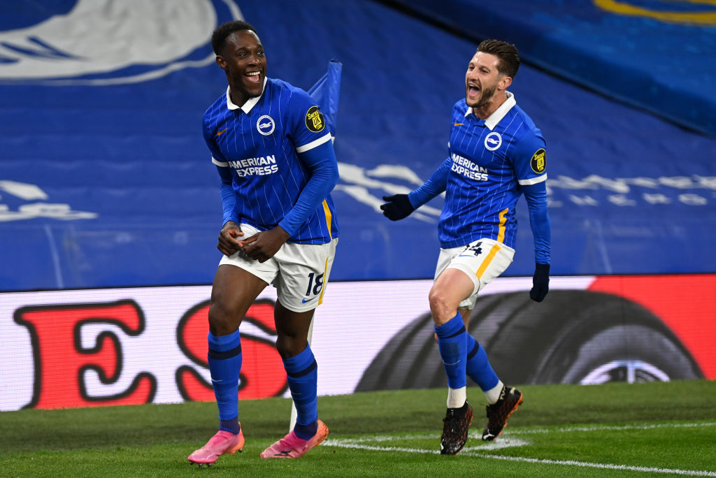
The Seagulls strayed from tradition to great effect with their home kit three years ago. Ben White, Alexis Mac Allister and new signing Adam Lallana were some of the players to wear a fetching blue shirt with white pinstripes and collar.
It wasn’t the best season for Brighton on the pitch as they finished 16th, still 13 points clear of relegation, but at least they looked smart while securing their Premier League status. A 3-2 win over Manchester City was an undoubted highlight for Graham Potter’s side.
Arsenal, third, 2021/22
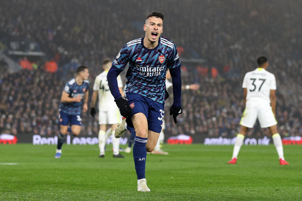
When Nike snatched the keys from Adidas to Arsenal in the 90s, they moved away from yellow away tops to begin with, giving the north Londoners more contemporary navy/cyan lightning bolts. It was only right for Adi to take that back. Arsenal’s third shirts from 2021/22 feel both classic and unmistakably modern with a loud colour palette working in perfect harmony across the shirt.
Buy the Arsenal third shirt – £65
Get FourFourTwo Newsletter
The best features, fun and footballing quizzes, straight to your inbox every week.
Liverpool, away, 1996/97
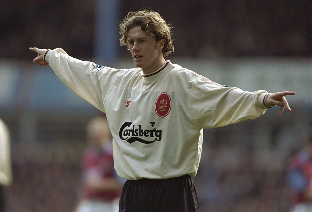
A cream colour so synonymous with Liverpool FC that the Reds brought this back as their change strip this season in celebration of the original – and we've seen virtually nothing like it in between. It's hard to top the inspiration, though: we've got so many memories of Michael Owen and Robbie Fowler running riot in this.
That oval badge, too. Sublime.
West Brom, home, 2016
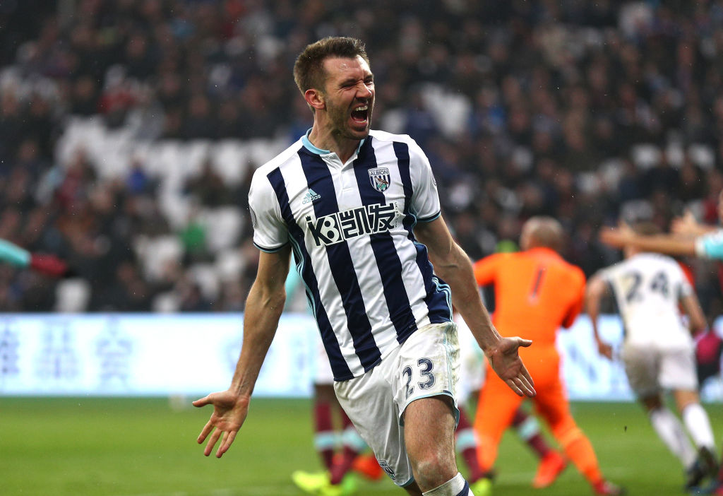
Baggies kits looked amazing in the 1960s and '70s, before running a gamut of awfulness through much of the next three decades. But this effort was genuinely stunning: with UK-K8.com’s Chinese lettering (凯发娱乐) combining perfectly with the traditional old stripes, it looked like it was beamed down from space (in a good way).
Crystal Palace, home, 1997-98
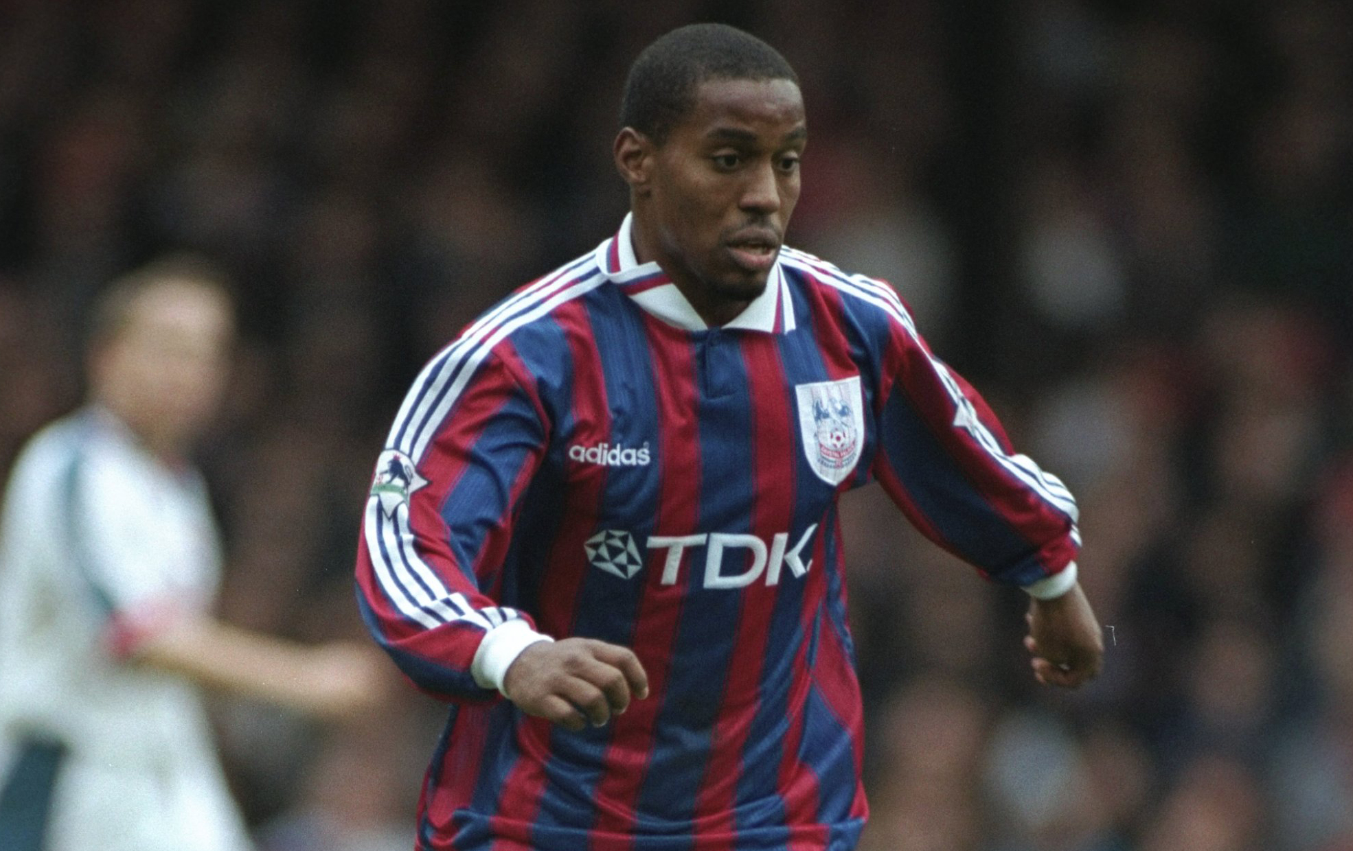
Adidas have contributed some beauties over the years but one often forgotten partnership came in the late 90s when Crystal Palace hooked up with the German manufacturer.
Red and blue is always a winner – look at Barcelona – but the use of white Adi stripes and the text-only logo made this one an absolute classic from back in the day.
Manchester United, third, 2023/24
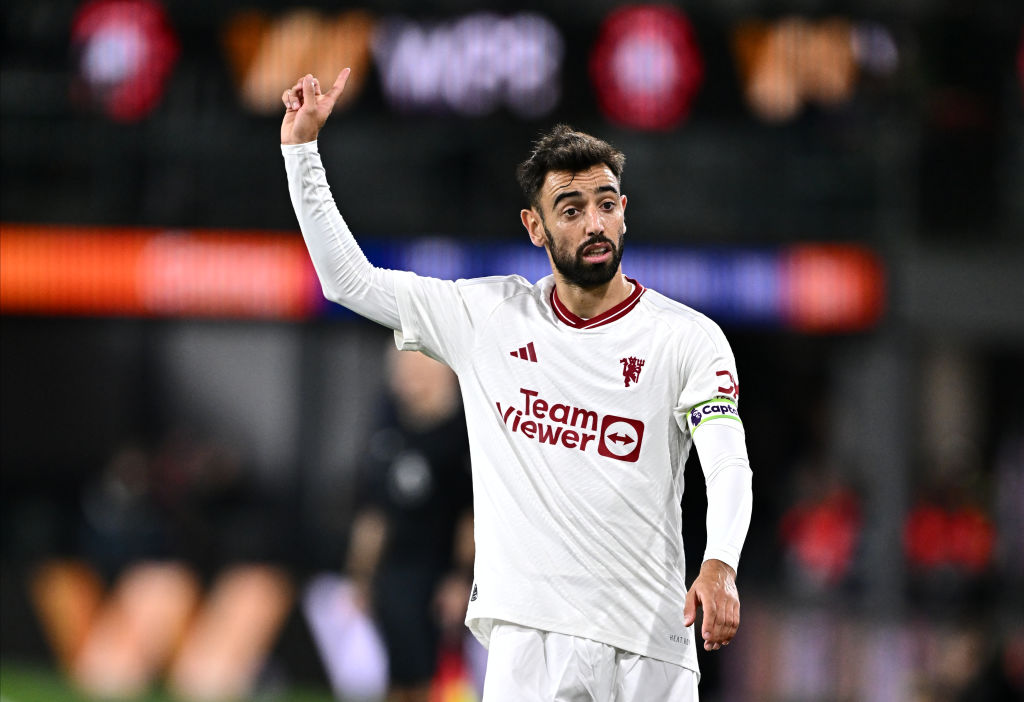
There's minimal and then there's this: a white/crimson work of art in which Manchester United's admittedly dated crest was given a sleek new rework. Nothing added, no embellishments, this might be Adidas's finest example of knowing when to stay simple.
Portsmouth, home, 2003-05
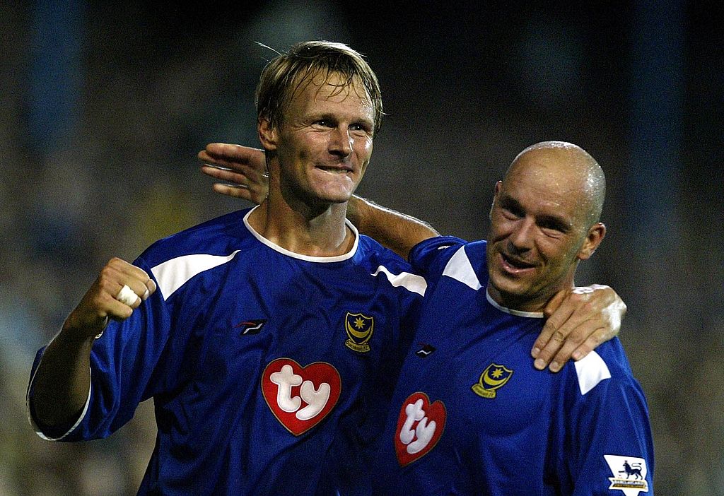
Sponsors make a huge difference to a football shirt and this one proves it. Ty made Beanie Babies, which swept the nation around the turn of the Millenium, and then decided to spend all that hard earned cash sponsoring Pompey for some reason. It's a handsome blue and white combo to boot. Just lovely from start to finish.
Southampton, home, 2001-03
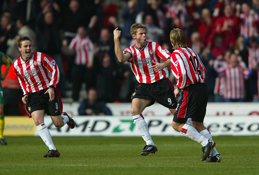
Like Newcastle, it’s hard to design a bad Saints shirt – and we’re devotees of the five medium-sized red stripe model that was adhered to between 1896 and the mid 1970s. The millennium-straddling model was near-perfect – fit for Le Tiss to blast some of the Premier League’s best ever goals in.
Sheffield Wednesday, home, 1992/93
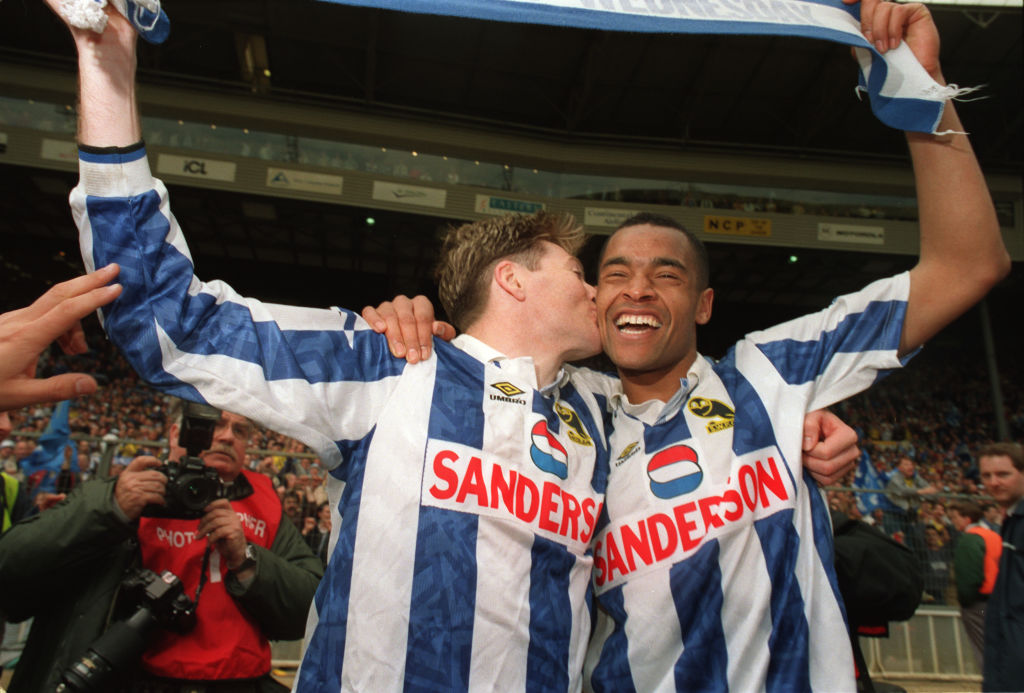
This was Wednesday’s first shirt with Sanderson, who FFT just had to Google (a successful fantasy author who published his first book in 2005, apparently). We actually think the sponsor looks marginally better with the white block behind it – something lost from later shirts.
But really it’s the minimal, black owl badge that steals the show. Bring it back, please.
Leeds United, home, 1995-96
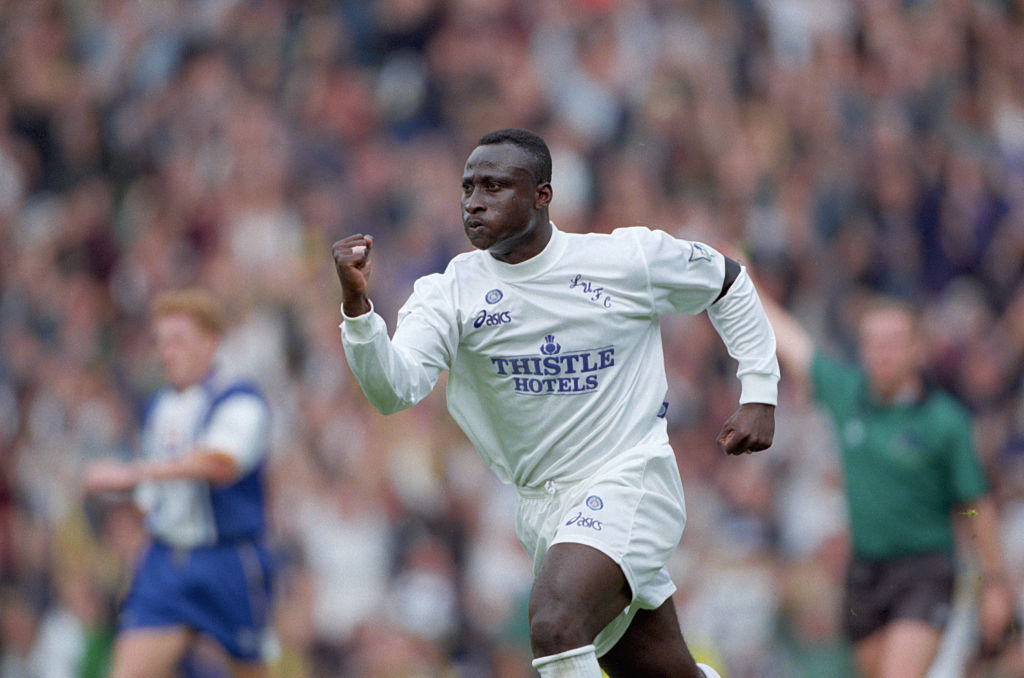
“Yeboaaaaaaaaahhhhhhh!”
In 1995, Asics looked at the Leeds kit and asked: “What if we took everything off?” Even the badge somehow ended up in the bin.
This was the result, making Gary McAllister look like he’d dropped straight out of Don Revie’s starting XI. Just imagine the Daz it required to keep them cleean.
Nottingham Forest, home, 1996/97
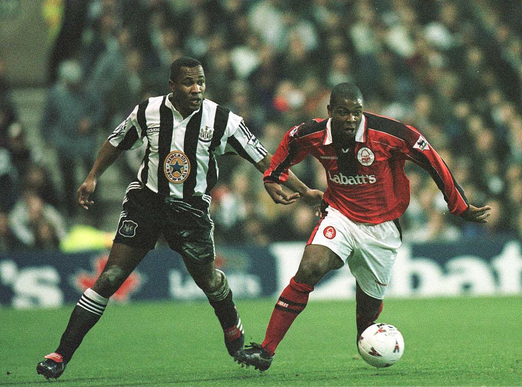
Faded stripes are something that don't crop up in football shirts often – but we still remember Forest's fondly. The Tricky Trees donned a black/red top in the 90s that had two separate sponsors: while Pinnacle was nice, however, we preferred Labatt's.
Leicester City, home, 1998-2000
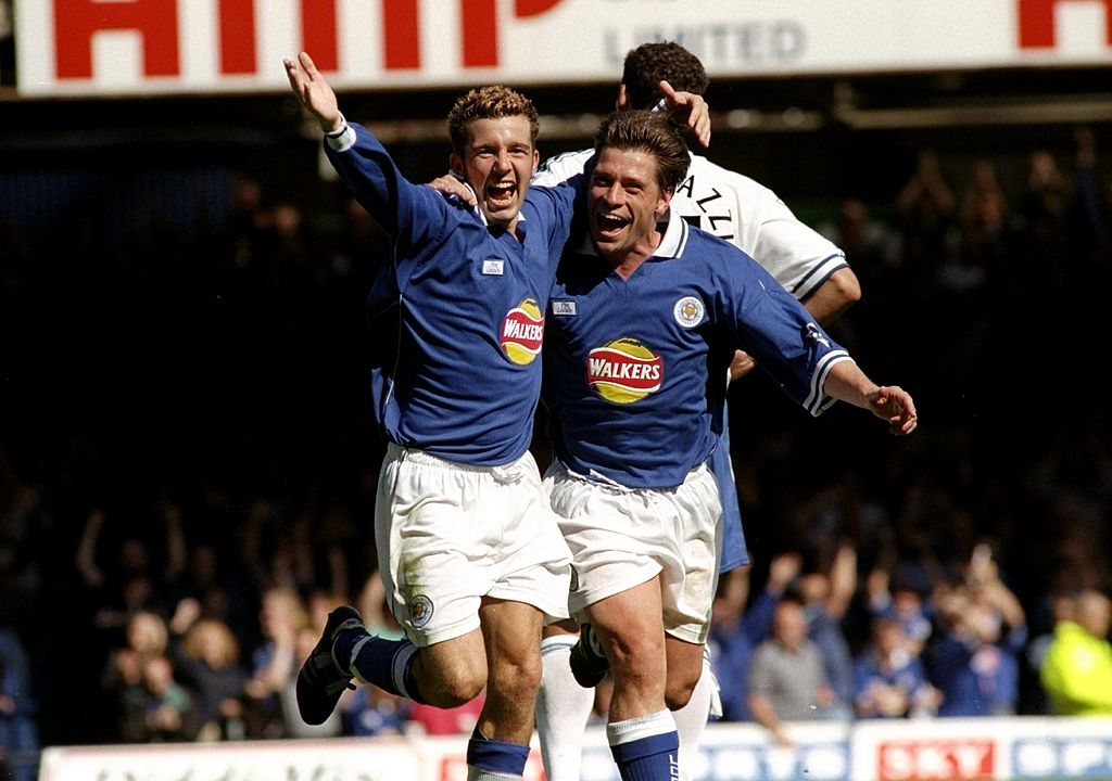
Regardless of what the good people of Thailand have done for the Foxes, it should be a law that Leicester have to play with Walkers on the front of their kit. They had many variations of the sponsor, but this version – with a giant crisp hovering in the background like a benevolent moon – is FFT’s favourite.
Coventry City, home, 1996/97
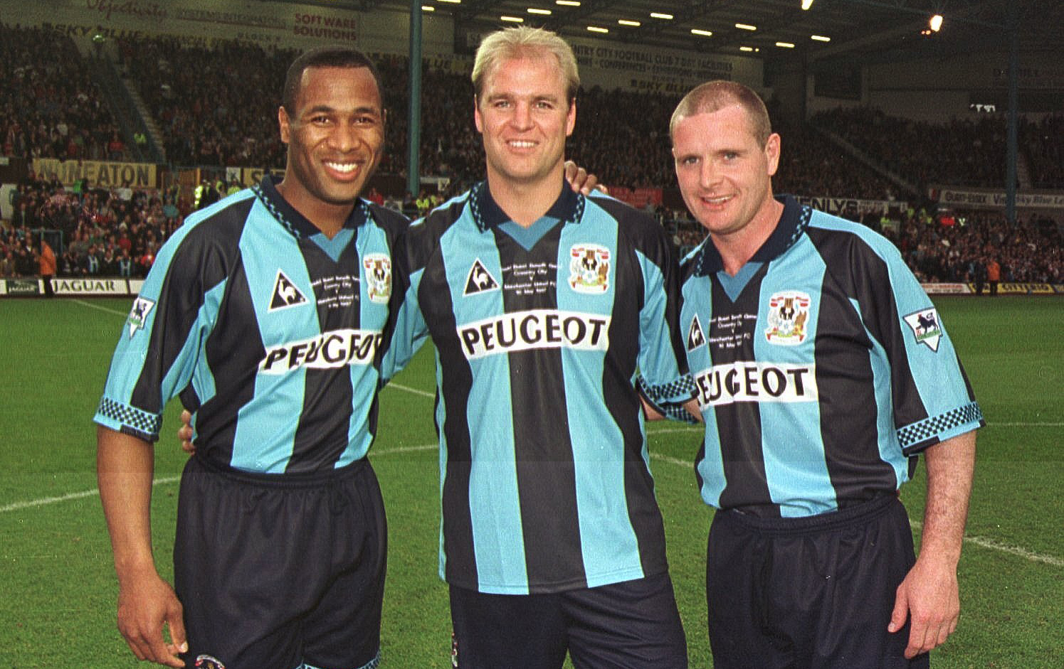
Coventry’s pantheon of kits over the years have arguably been the most vile of any club anywhere on earth, but this Le Coq Sportif dazzler was the exception to the rule – a Sky Blue-Dark Blue combo worn beautifully by the likes of Peter Ndlovu and... er, Gazza?
Manchester City, home, 1993
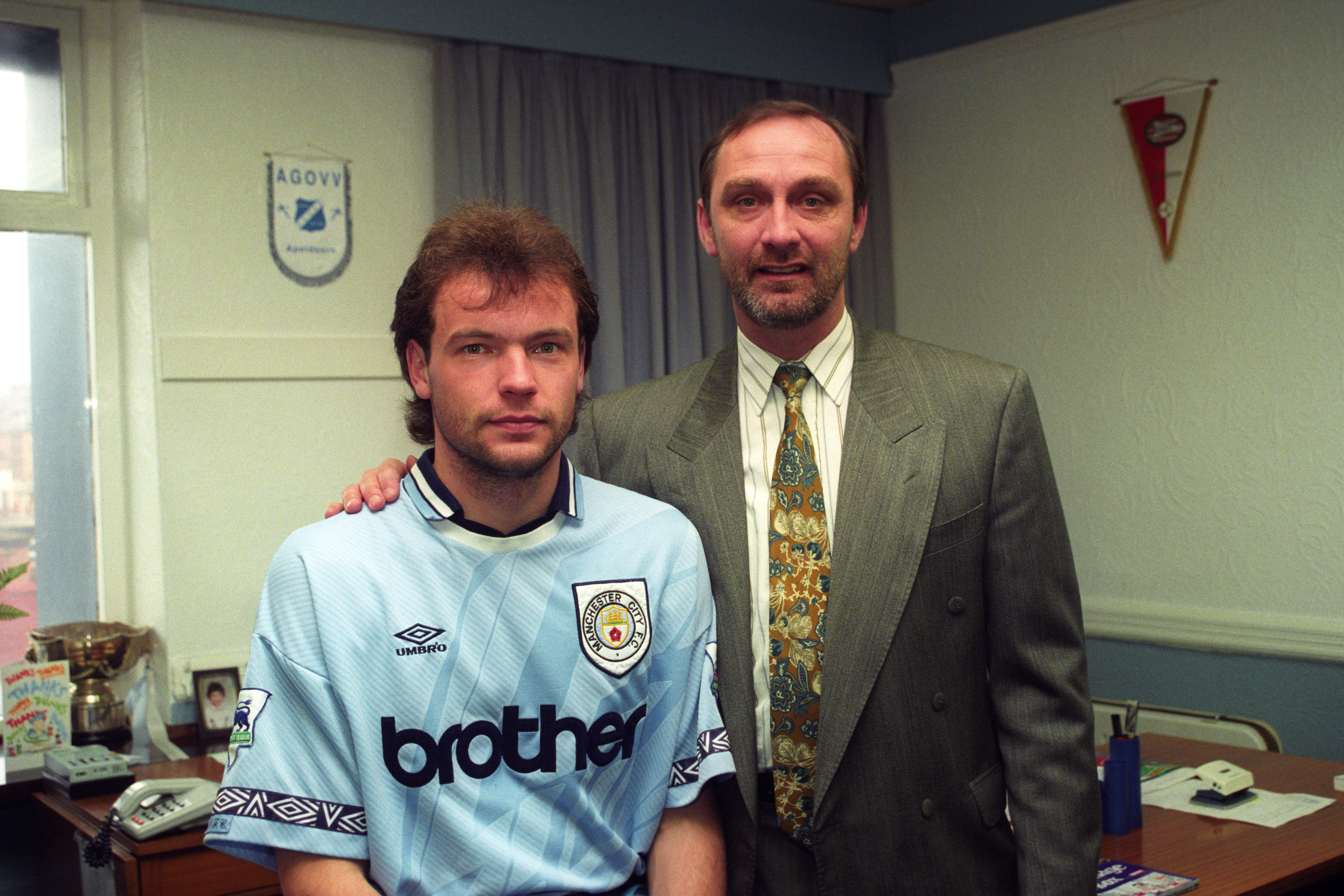
Maybe it’s because of Oasis but Brother is the Manchester City sponsor, however much they win with Etihad. With its thick colour, splashes of blue and iconic Umbro logos lining the sleeves, this is the best kit that City have ever had in the Premier League, hands down – and no amount of paisley, Day-Glo or the club’s name across the chest in thick letters will change that.
Blackburn Rovers, away, 1994-96
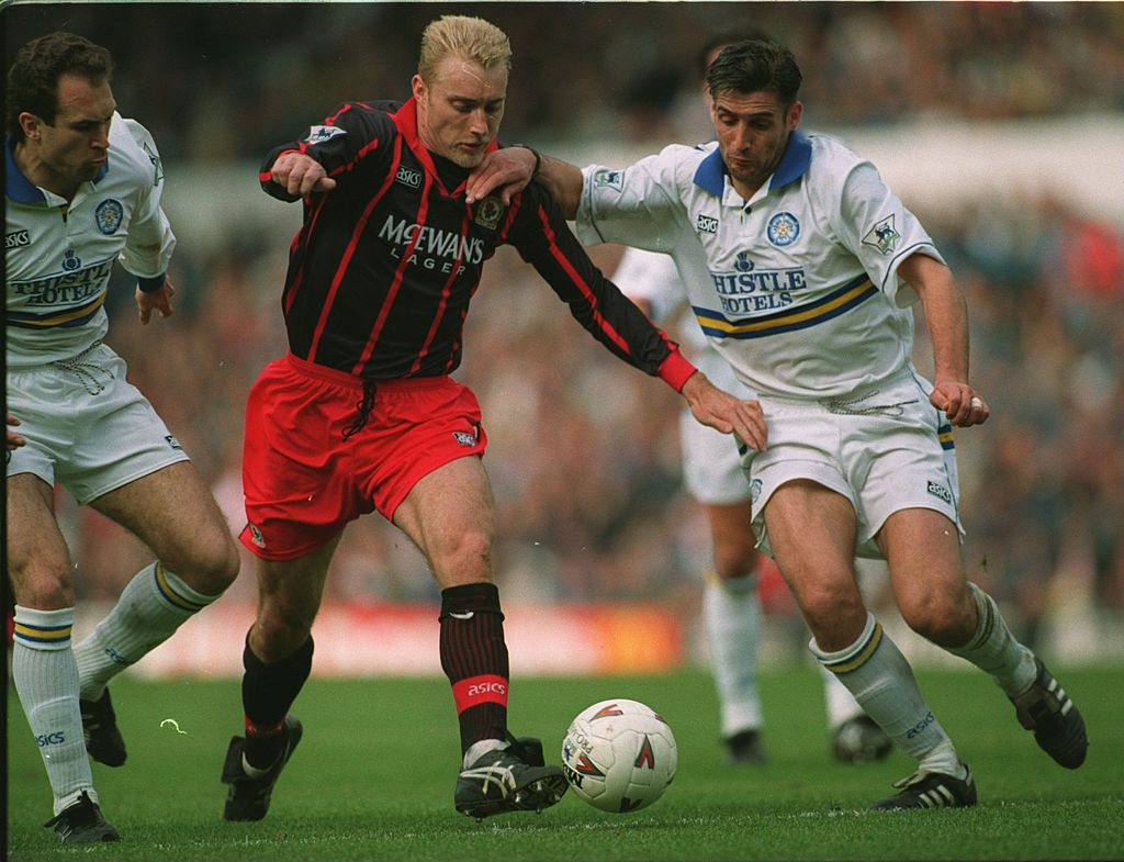
Black-and-red stripes are an all-time classic kit combo – we’re looking at you, AC Milan – and so taking liberties with it should not be encouraged.
But Blackburn’s title-winning away kit opted for red pinstripes and red shorts, and we can’t complain.
Arsenal, home, 2005/06
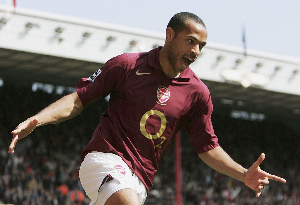
Arsenal’s controversial one-season switch to a redcurrant jersey – to coincide with Highbury’s final season – is possibly the greatest celebratory shirt of all time. The deep colour and gold lettering, paired with white shorts, has naturally become synonymous with Thierry Henry’s freewheeling heroics in the Champions League and this season became the inspo behind a new prematch Adidas shirt.
Newcastle United, away, 1995-97
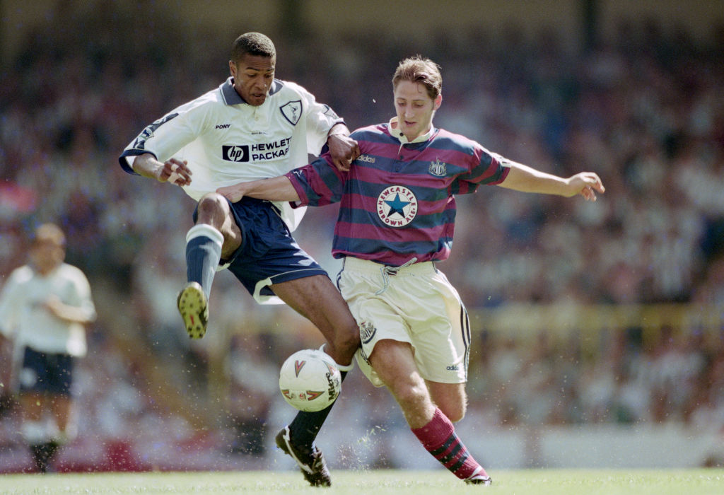
Arguably the most recognisable away kit in Premier League history. The maroon and navy horizontal stripes steal the show, of course, but the buttoned up collar and Newcastle Brown Ale sponsor are each shirt porn in their own right.
Picture '90s football, and an image of an insanely handsome Les Ferdinand smashing a Mitre Delta sporting this top flood the memory like a soapy dark liquor brewed on the banks of the Tyne.
Buy the Newcastle 1996 retro shirt – £30
Manchester United, away, 1993-95
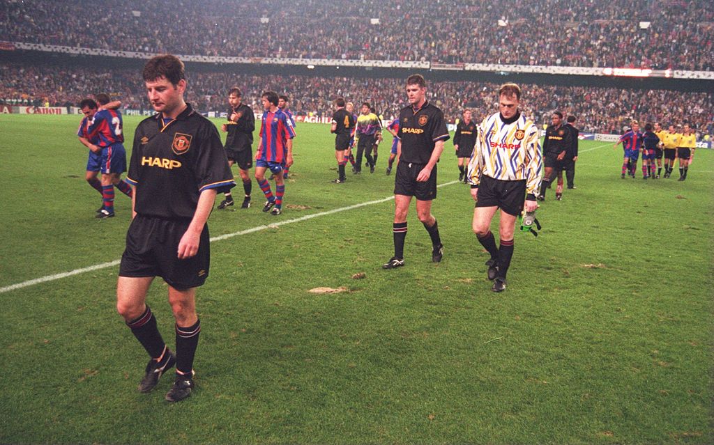
Everyone expects all-black kits to be cool, which means they actually have to work harder to actually be cool.
This shirt definitely achieves that. The gold trim is sublime, the subtle stripes incorporate the Umbro logo, and if you look closely, you’ll spot a bit of blue around the edge of the sleeves.
Wimbledon, home, 1994
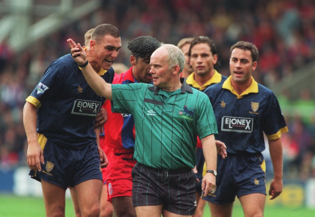
The Dons being dismantled and moved to Milton Keynes was terrible for a number of reasons, including robbing Premier League fans of one of the snappiest dressing teams around. Navy and yellow simply was Wimbeldon back in the day. This was their best kit of the 90s, with a bizarrely 90s sponsor. Elonex, anyone? Nope, us neither.
West Ham United, home, 1999
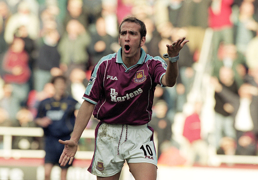
The best claret ’n’ blue shirt ever made: a rare Fila venture into the field of making UK kits, this none-more-London combo of classic colours and Dr Martens sponsor logo looked a treat on the back of genius/madman Paolo Di Canio.
So nice, in fact, they brought it back in 2021/22 for Declan Rice and the lads to stomp all over Europe in. Magnificent.
Liverpool, away, 1995-97
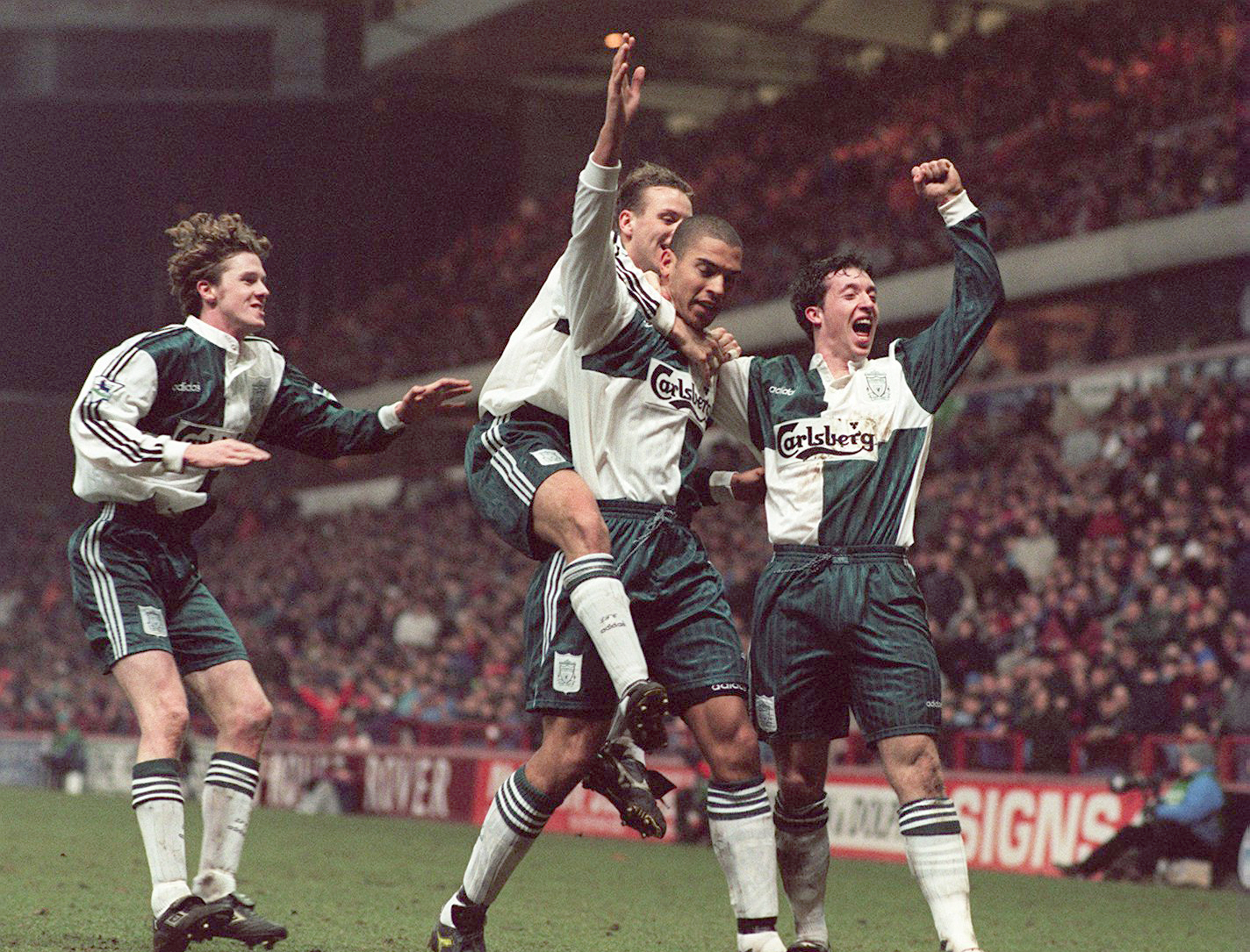
You can just picture a windswept Steve McManaman bewitching defenders in an oversized version of this puppy. Moss green and white are a lovely colour combo, and the Carlsberg sponsor is nostalgic, cool and gorgeous all at once - a little like the Scouse winger himself back in the day.
Chelsea, away, 1996-98
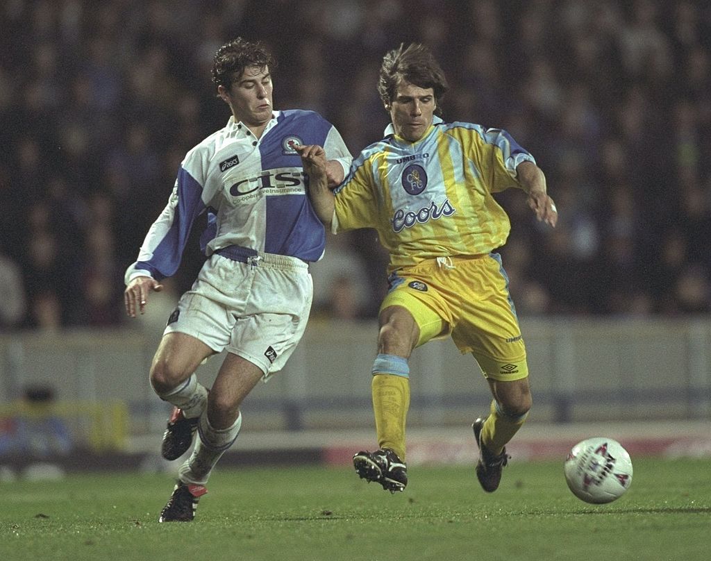
It's difficult to get creative with Chelsea kits – though Nike have tried desperately with that all-blue get-up in recent seasons. Given that the away colours are usually yellow or white, you run the risk of doing something either immensely boring or yuck.
So Chelsea's yellow/blue masterpiece of the late 90s is a unicorn; a change strip for the Bridge boys that managed to look fresh, funky and timeless to boot. Autoglass took over sponsorship in '97 – but we prefer the '96/97 Coors logo, ourselves.
Buy the Chelsea 1997 retro shirt – £30
Fulham, home, 2001-03
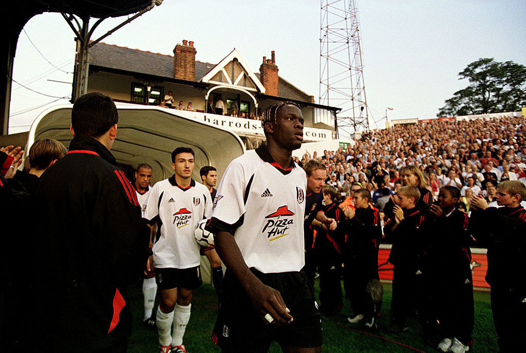
Despite featuring on the famous white shirt for just one season following the Cottagers’ 2000/01 promotion to the top flight, Pizza Hut’s logo holds a place in Premier League folklore. It’s an instantly recognisable offering from the usually unassuming west Londonders, who impressed in their debut season in the big leagues thanks to some stellar performances from the likes of Louis Saha and Edwin van der Sar.
Tottenham Hotspur, home, 1997-99
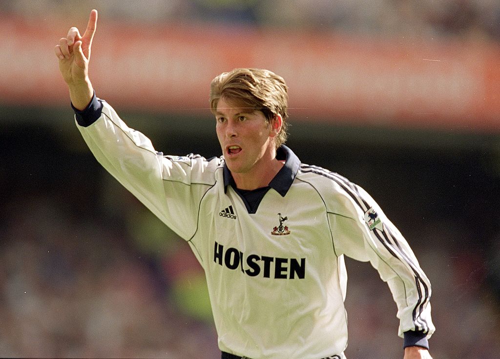
David Ginola can’t be seen in any old tat – and the French matinee idol looked impeccable in this glorious Tottenham top with its minimalist design and retro collar. The German duo of adidas and Holsten was also apt for the era of Jurgen Klinsmann. Euro chic.
Liverpool, home, 1993-95
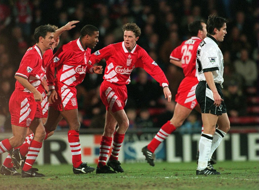
Those encroaching Adidas stripes on the sides made Razor Ruddock look like he was being lifted to heaven by enormous hands belonging to a hidden ghoul.
And if that’s not a reason to love this shirt, what is?
Manchester United, home, 1994-96
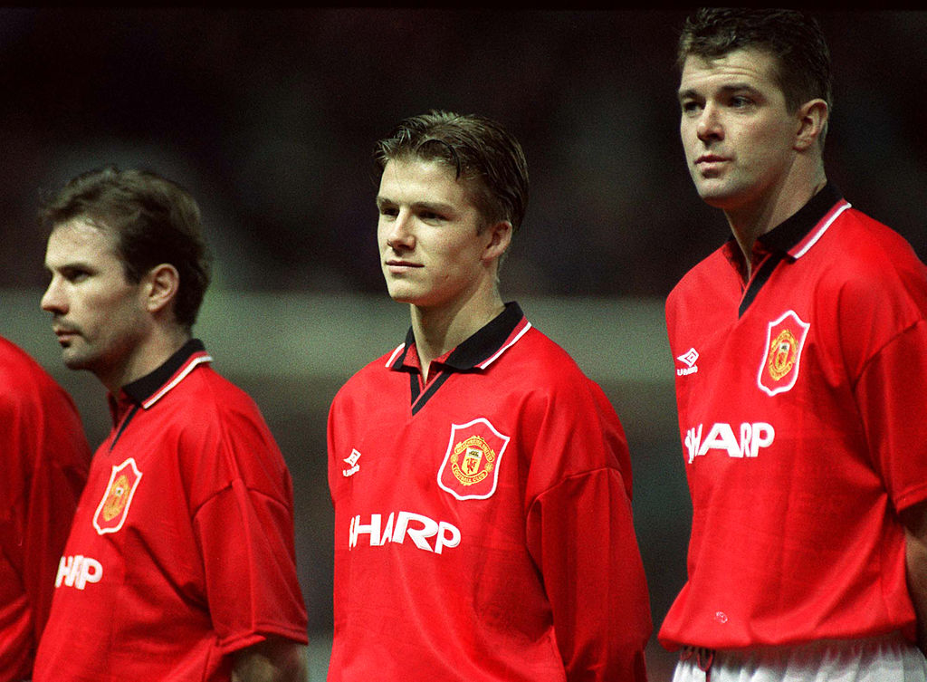
The successor to United’s odd lace-up white-collar effort – a shirt they won their first two Premier Leagues in, but could make Steve Bruce look like he was prancing round in a medieval ruff.
The black V-neck was much cooler: it was the definitive garment for Cantona’s iconic collar-popping – and Umbro’s designers also somehow embedded a picture of Old Trafford into the shirt, too. Cosmic.
Arsenal, away, 1992-93
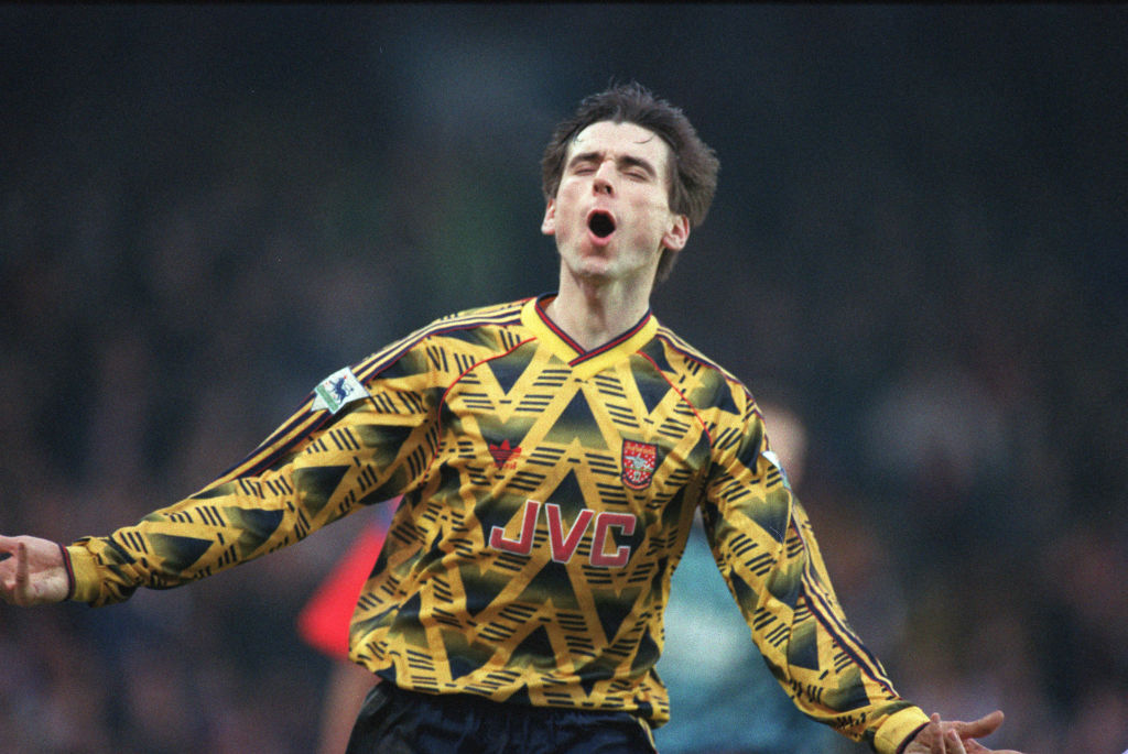
Arsenal’s bruised banana has gone down in history for all the right and wrong reasons; a design so jarring that it couldn’t possibly look good… yet somehow… does.
This was an Adidas template of the early 90s that the three stripes floated around eastern European and German clubs in normal colours, before handing the Gunners a clashing zig-zag top with flashes of red. It looked great at the time – and when the club rereleased retro remakes of the shirt in 2019, they all sold out.
Blackburn Rovers, home, 1994-96
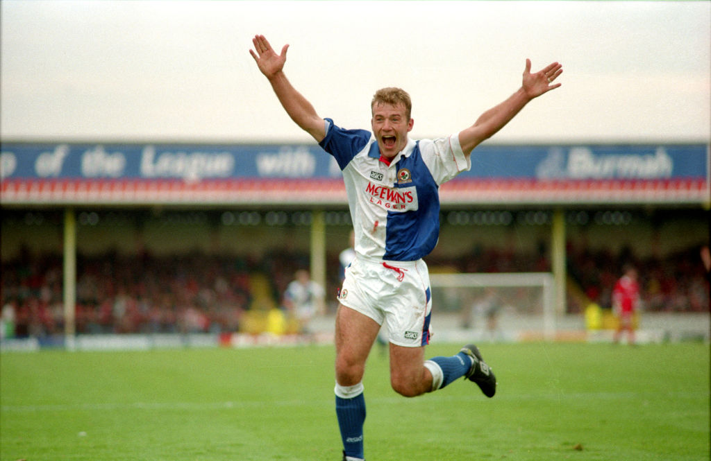
Blackburn’s halved shirts are immediately recognisable in English football, and the year they won the Premier League also coincides with their best shirt. Even an enormous McEwan’s Lager logo compliments the design well.
Latin on the sleeve, big collars and buttons – buttons! What’s not to love?
Newcastle, home, 1995-97
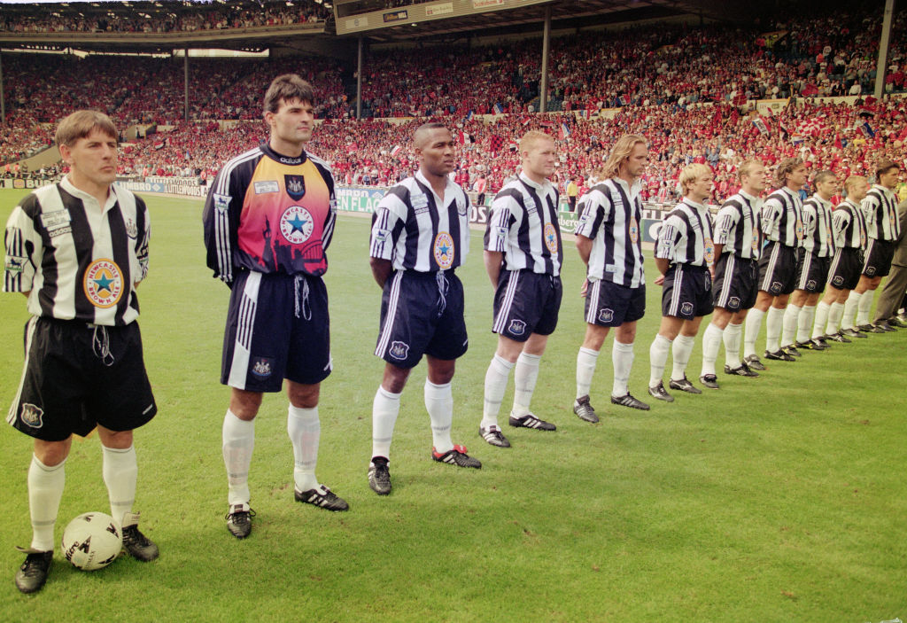
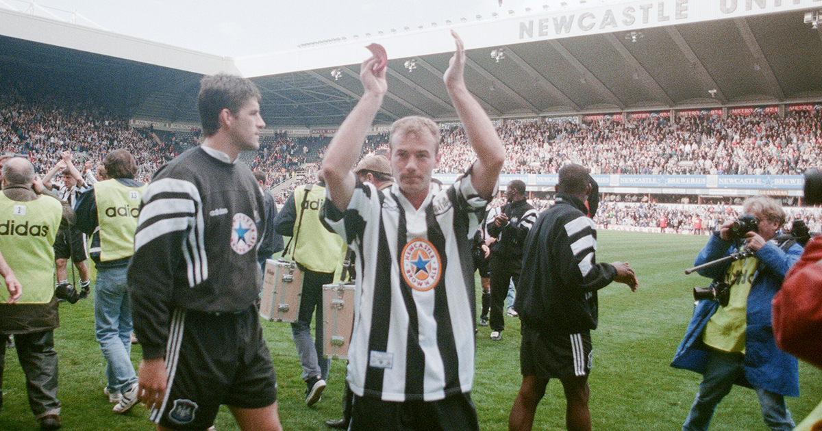
Come on. Probably the greatest shirt of the Premier League era, and certainly the most Geordie item of clothing ever: with a Newkie Brown label plastered over the top of the magpie stripes, it’s an Adidas masterpiece that can perhaps provide a little solace for fans who still rue the fact they didn’t win the league while wearing it.
Perhaps with the Toon Army now under new ownership, we'll finally see them win the league. But if we're honest – sorry Newcastle fans – we'd much rather that the Saudis invest some money into getting a shirt as nice as this. Howay.
Buy the Newcastle 1996 retro shirt – £30
More football shirt stories
This is FFT's pick of the best football shirts around right now.
We've also got a roundup of the best retro shirts ever.
Mark White has been at on FourFourTwo since joining in January 2020, first as a staff writer before becoming content editor in 2023. An encyclopedia of football shirts and boots knowledge – both past and present – Mark has also represented FFT at both FA Cup and League Cup finals (though didn't receive a winners' medal on either occasion) and has written pieces for the mag ranging on subjects from Bobby Robson's season at Barcelona to Robinho's career. He has written cover features for the mag on Mikel Arteta and Martin Odegaard, and is assisted by his cat, Rosie, who has interned for the brand since lockdown.
- Ed McCambridgeStaff Writer
- Conor PopeOnline Editor
