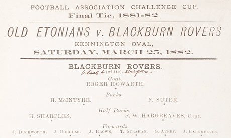
The good, the bad and the ugly of FA Cup Final programmes
Nick Moore takes a misty-eyed journey through the evolution of that essential collector’s item, the cup final programme...
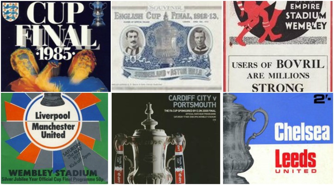
1882: Old Etonians vs Blackburn Rovers
The oldest surviving FA Cup final programme is simply a single sheet of faded paper printed onto in black ink. A copy was sold at Sotheby’s in 2013 for £35,250, and contained some scribbled pencil notes on it about who had played well. Design-wise, the only way was up.
Eton, meanwhile, won 1-0. Call us cruel, but we’d love to see some current Old Etonians – David Cameron, Boris Johnson, Douglas Hurd, Hugh Laurie, Bear Grylls, Prince William and Ranulph Fiennes, perhaps – turn out against the modern-day Blackburn at Ewood Park on a chilly Wednesday night, and witness the likes of Grant Hanley boot their daft boater hats into next week.
1912: Barnsley vs West Bromwich Albion
Jump forward two decades and the FA Cup final proggy looks a little more sophisticated. It’s a centre-folded 25cm x 32cm effort with prominent adverts for beer and cider – not much will change on that front – as well as a big boxout extolling the multifarious wonders of OXO.
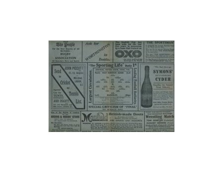
There’s a nicely centred team sheet, and a promotion for a future wrestling match, too. Find one of these in the attic and you’re looking at a £9,000 bonanza. The match ended 0-0; Barnsley scraped through in a replay at Bramall Lane.
1913: Aston Villa vs Sunderland
Get FourFourTwo Newsletter
The best features, fun and footballing quizzes, straight to your inbox every week.
The first Cup Final programme to be in the A4 format – a design which would become a terrace staple for the next 90 years.
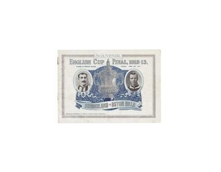
With simple, no-nonsense typography, reference to the ‘Football Association Challenge Cup’, and ‘proper’ teams like Villa and Sunderland, this is where the modern template begins. Villa won 1-0, after an unprecedented 17 minutes of stoppage time.
1924: Aston Villa vs Newcastle United
Another Villa final, another landmark: after a decade of fancy illustrated fluffery depicting the fair and beautiful nymph Britannia sitting by the trophy, we finally get a classic comic book illustration of two sturdy lads leaping to contest a header in front of a huge bank of supporters.
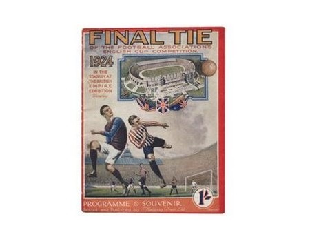
There’s also a lovely depiction of Wembley, and the words ‘FINAL TIE’ emblazoned across the masthead, which is something that would run, on and off, until 1965.
1925: Cardiff City vs Sheffield United
A team from outside England were taking part in the final for the first time since Glasgow’s Queens Park lost one in 1885, and in another shocker, photography would be used for the first time on the cover of the programme – yours for 6d.
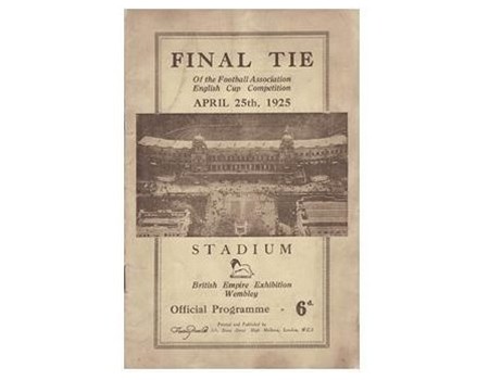
The grand aerial shot of the Twin Towers, taken from a blimp, would have dazzled the 91,763 present.
NEXT: Photography, colour and fussy art directors
1928: Blackburn Rovers vs Huddersfield Town
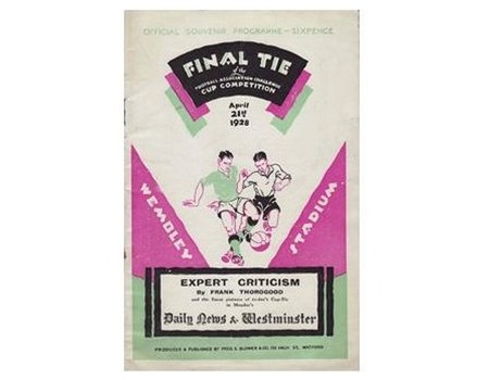
Ahead of its time in a way that it might not have wanted to be – there’s something unpleasantly 1980s about the vile use of pink and lime green hues, and the jagged print-setting on this cover. It resembles the opening credits to a long-lost entertainment show now being carefully scrutinised by Operation Yewtree.
Hugely inappropriate for gritty powerhouses Blackburn Rovers and Huddersfield Town, it also offers a first foray into punditry, with the cover promising “expert criticism” within from Frank Thorogood – who can’t have been that thorough or good, because he lost the gig to Charles Buchan the next year. Not for us, Clive.
1934: Manchester City vs Portsmouth
Here come the Art Directors! The first truly stylised FA Cup final programme is this attractive effort, in which exotic silhouettes and curved headlines hint at an age of art deco and design experimentation.
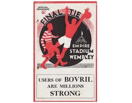
They don’t even deem the names of the two sides necessary to the posterised front page, and the powerful feel of the cover is finished off by the advert proclaiming USERS OF BOVRIL ARE MILLIONS STRONG. Don’t mess with a “user” of thick, salty meat extract, kids.
1954: Preston North End vs West Bromwich Albion
After a decade of broadly similar covers – standard images of airborne footballers transposed over an illustration of Wembley – came the iconic cover shot of the uncovered Empire Stadium from above, which ran every year until 1962.
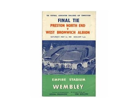
Oddly, as soon as the stadium roof was completed in 1963, a smaller illustration of the new-look ground was chosen, and a year further after that, Wembley was replaced on the front by the trophy itself for an eight-year stint.
1970: Chelsea vs Leeds
Published by Manchester United instead of the FA thanks to the replay being held at Old Trafford, this cover is the first truly contemporary-looking effort to go into print, shaking off the fusty feel of establishment suits.
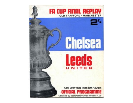
In fact, with its bold half-and-half colouring and chunky fonts, it couldn’t be any more Mod if it tried: when you open it you half expect a foul-mouthed Phil Daniels to mooch out in a fur-lined parka and spark up a ciggie.
1977: Liverpool vs Manchester United
A pearl amid swine: after a run of boxy-looking, hastily slapped-together final programmes, this beautifully simple rosette design jumps out a mile.
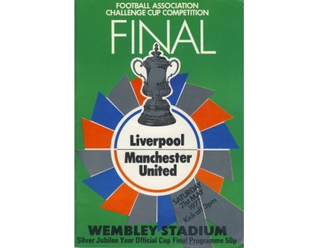
Alas, a year later it was replaced by a gaudy photo of the trophy, and there wouldn’t be another tasteful cover for two decades.
1985: Everton vs Manchester United
A couple of years into the birth of desktop publishing programmes, and designers everywhere have completely lost their marbles, perhaps beset by some kind of God complex after discovering what computers can do.
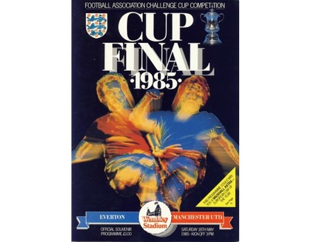
This effort is the nadir: a horrid excretion of colour from an ‘artist’ presumably loaded to the gills with hallucinogenic drugs, a kaleidoscope and a set of those blobby Rorschach Test cards used by head doctors to work out if you’re a psychopath.
Take a look at this Norman Whiteside-shaped blob and tell me about your mother…
NEXT: Danger Mouse, discotheques and the Basingstoke Canal
1987: Tottenham Hotspur vs Coventry City
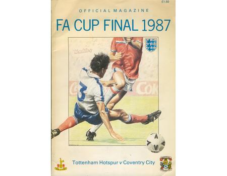
A great cup final – underdog victor, ding-dong goal action and Gary Mabbutt’s knee – marred only by the worst programme cover of all time.
A truly nasty piece of street sketch art that looks like it should be getting hastily knocked out for two quid alongside depictions of Bananarama and Danger Mouse and a caricature of Phil Collins in mid-eighties Leicester Square. Uck.
And that's definitely a foul: possibly a card, too. Which is fitting, as this cover also resembles the cards you get every birthday from a distant aunt. Even when you're 35.
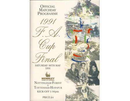
1991: Nottingham Forest vs Tottenham Hotspur
Happier memories for Spurs fans – but another godawful cover, with its off-cream colour, gold calligraphy and panel of pictures making it resemble a tedious out-of-print history of the Basingstoke Canal or commemorative booklet for something to do with Prince Edward.
1993: Arsenal vs Sheffield Wednesday
Aargh! My precious eyes! Ian Wright’s epilepsy-inducing shirt, the thunderous Waddler, the squashy discotheque poster font and the casually shouty yellow FA CUP|93 up the side – everything about this is upsetting and wrong.
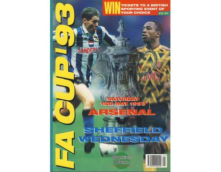
Perhaps hoping not to cause any more optical distress, the programme for the replay was almost funereal.
2000: Aston Villa vs Chelsea
It doesn’t quite work, but brownie points for trying something different here, as the designers made the front cover resemble a yellowing, olde-worlde newspaper Sunday pictorial special.
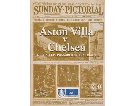
Slightly marred by the whacking great team names in the middle and the AXA logo at the bottom, it’s still a nice-looking souvenir, albeit one costing a tenner.
2008: Cardiff City vs Portsmouth
Full disclosure: Haymarket, who also produce FourFourTwo, took over the publication of the Cup Final programme in 2006.
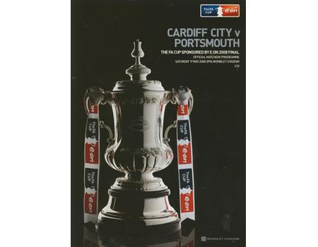
Nevertheless, from an entirely unbiased standpoint, this is a stunning piece of visual art, clearly produced by a talented, handsome and sexually dynamic team of geniuses. See you in the pub later.
Nick Moore is a freelance journalist based on the Isle of Skye, Scotland. He wrote his first FourFourTwo feature in 2001 about Gerard Houllier's cup-treble-winning Liverpool side, and has continued to ink his witty words for the mag ever since. Nick has produced FFT's 'Ask A Silly Question' interview for 16 years, once getting Peter Crouch to confess that he dreams about being a dwarf.
