Ranked! The 14 worst kits of the 2019/20 season
Rotten horrors – get them out of our sight immediately

Please note: This is the opinion of one writer. If you think he’s wrong about some of them – because of course he is – let’s play nice, shall we…
SEE ALSOThe 14 best football kits of the 2019/20 season
14. Luton away kits
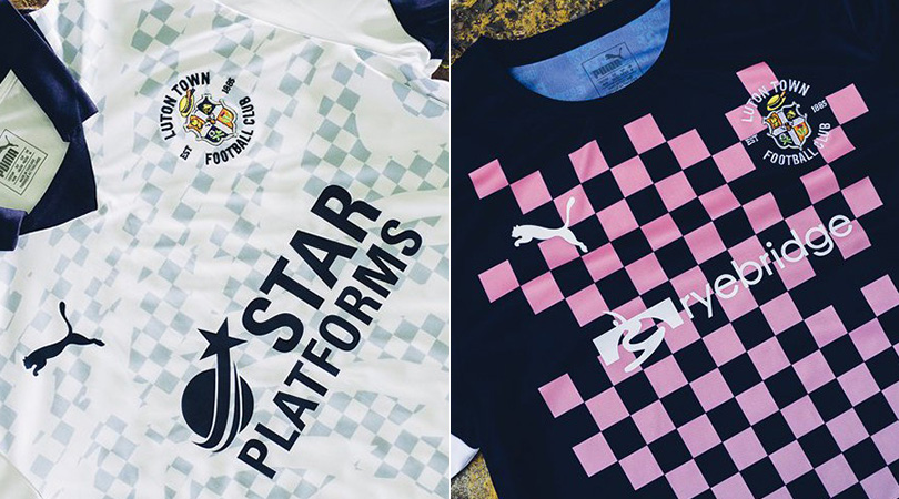
It’s always nice when clubs give a nod to tradition with their kit designs, but we’re afraid Luton’s pleas aren’t enough for their two away uniforms to avoid inclusion on this list.
A block design, using the navy and pink colours that featured on the club’s first ever home strip, is confusing. The alternative version – inspired by the Hatters’ iconic chequered flag, obviously – is far too messy for our liking.
13. Wolfsburg home
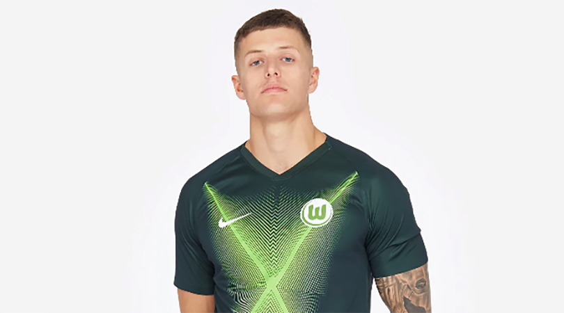
If you suffer from epilepsy, look away now. Maybe it’s too late.
Get FourFourTwo Newsletter
The best features, fun and footballing quizzes, straight to your inbox every week.
12. Liverpool away
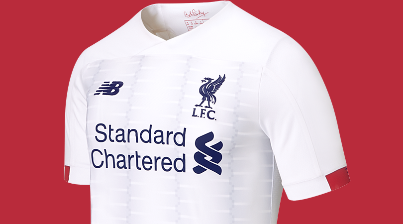
Bad kits usually fit into one of two categories: eyesore or naff. This belongs to the latter group, largely because of a curious grey pattern on the front that we can’t make sense of. It’d be fine – nice, even – without, no?
11. Amiens home and away
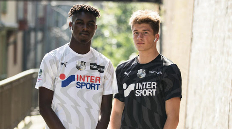
Not content with sending supporters to sleep with their on-field performances (only one surviving Ligue 1 team scored fewer goals last season), Amiens have decided to knock their remaining fans out with a pair of kits that could feasibly be used as tools for hypnosis. Perhaps they’re hoping to send opposition players into a trance and make it easier to hold on for a 0-0 draw.
10. Manchester United away
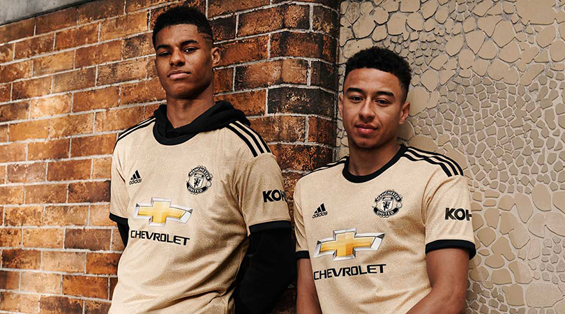
It’s been another eventful summer at Manchester United, who have been scouring the globe for potential new additions to their official commercial partners. And some players, probably.
They clearly took their eye off the ball when it came to designing an away kit, coming up with a bizarre-looking “savannah-toned” jersey whose mosaics are apparently inspired by those found in Manchester’s Northern Quarter. Imagine what it’ll do to Phil Jones’s face.
9. Valencia away
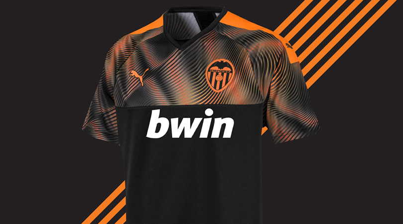
Black and orange often make for a lovely colour combination on away kits, but we’re struggling to get on board with this.
The fiery graphic at the top of the shirt cuts off so abruptly that it feels as if PUMA ran out of orange colouring a third of the way through. Either that or the designers suddenly noticed it was 5pm on a Friday and were keen to make the most of happy hour at the local.
8. Southampton home and away

When the Saints go marching in, we’ll be heading out.
NEXT: Cheating, and also terrible. Sigh...
7. Fiorentina aways

We’ve said it before and we’ll say it again: producing four different away kits is cheating. We’re happy to continue including you in this yearly list until you get the message, Fiorentina. They’re not even good.
SEE ALSO West Ham’s banter era of strikers: a horrible history of filthy, filthy dross
6. Juventus home
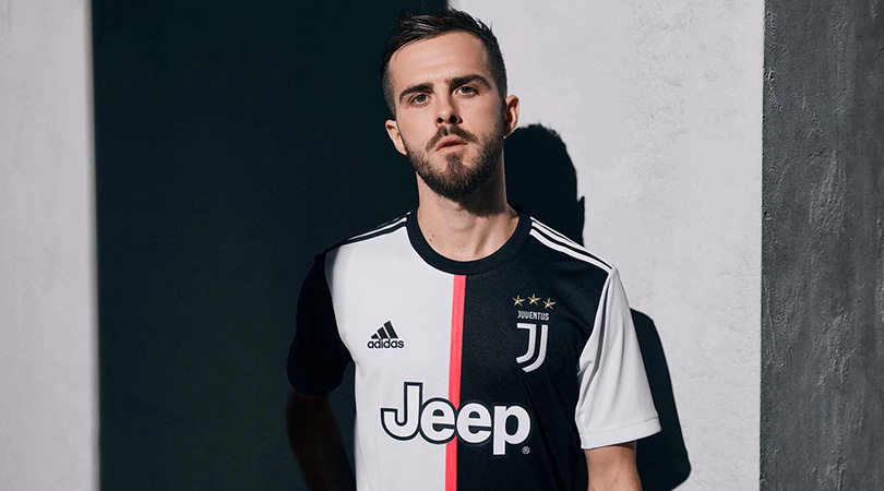
No, no, no, no, no.
Juventus. Should. Wear. Black. And. White. Stripes. We don’t care that you’ve won 139 consecutive Serie A titles – there are some things you can’t tamper with.
No.
5. Chelsea home
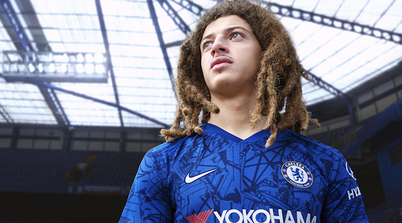
Which Nike employee let their four-year-old loose with a crayon? That’s the only explanation we can muster for this monstrosity, which was mostly modelled by Eden Hazard in the marketing material. No wonder he wanted out.
4. Eibar home

Given that all stripes are created equal, we can’t help but feel sorry for Eibar’s blue horizontal bands which are pitifully squeezed into narrow areas by their larger red brothers. Also, what on god’s green earth is that collar?
3. Manchester City third
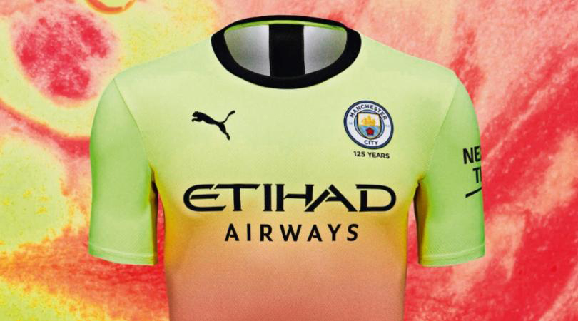
Two words: Slush Puppie. And as everyone knows, football and syrupy flavoured ice beverages just don’t go together.
2. Barcelona home
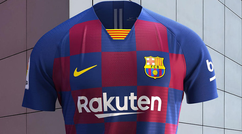
Now, we can understand the logic behind Barcelona consulting Lionel Messi on big transfer decisions, but letting Ivan Rakitic design the kit is a step too far. Article 24, paragraph 5b of the football kit rulebook clearly states that a chequered design should not be present on any jersey that doesn’t belong to Croatia.
1. Stevenage home and away
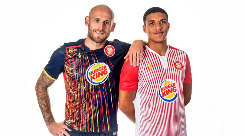
Fun fact: it’s impossible for a human being to focus on other parts of these kits for more than three seconds before the brain and eyes are drawn back to the sponsor’s logo.
The home shirt actually looks more like a Burger King employee’s uniform than a football jersey, while the garish graphic on the away offering is literally painful to look at. What a pair of whoppers.
While you're here, why not take advantage of our brilliant subscribers' offer? Get 5 issues of the world's greatest football magazine for £5 – the game's greatest stories and finest journalism direct to your door for less than a pint in London. Cheers!
NOW READ
GALLERY New Premier League kits 2019/20: EVERY released home and away shirt
QUIZ! Can you name the 50 most expensive centre-back transfers of all time?
Greg Lea is a freelance football journalist who's filled in wherever FourFourTwo needs him since 2014. He became a Crystal Palace fan after watching a 1-0 loss to Port Vale in 1998, and once got on the scoresheet in a primary school game against Wilfried Zaha's Whitehorse Manor (an own goal in an 8-0 defeat).

