Ranked! The 17 worst kits of the 2018/19 season
Eurgh – these horrors aren’t getting past FFT’s style council this summer. Greg Lea gets his Gok Wan on...
17. Wolves, away
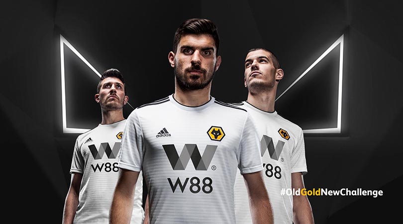
In our humble opinion, Wolves should always have a black away kit, preferably with splashes of gold dotted around the design. This white number is bland and dull, exacerbated by the jarring shades of grey used in the sponsor’s logo.
16. Brighton, away
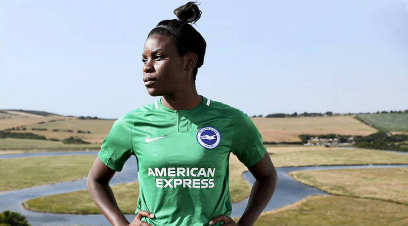
There’s a reason green is an underrepresented colour in football kits. Brighton have disappointingly chosen to ditch last season’s yellow uniform in favour of this pitch-friendly camouflage top, which should at least allow Lewis Dunk to hide more easily when he’s conceded another own goal. (Sorry, Lewis).
15. PSG, home

We get what PSG were trying to do here, but it doesn’t really cut the (French) mustard – particularly when you observe it up close. The central red zig-zag may or may not be a print of the sound wave produced by one Neymar squeal after a slight tap on the ankle.
14. Roma, away
Get FourFourTwo Newsletter
The best features, fun and footballing quizzes, straight to your inbox every week.
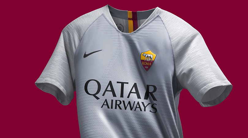
When will clubs learn? Grey isn’t a good colour for an away kit. Roma should have got Alex Ferguson on the blower.
13. Arsenal, home
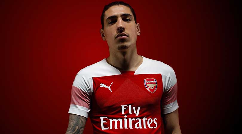
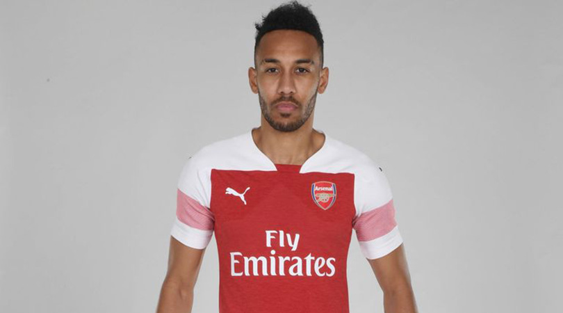
The Marmite of 2018/19 kits. Arsenal’s home offering has fiercely divided opinion both among and outside the club’s fan base – it’s essentially the new Wenger In/Wenger Out. For our money, the faded red sleeves look naff and the subtle shade change around the chest is superfluous, blud.
12. Manchester City, third
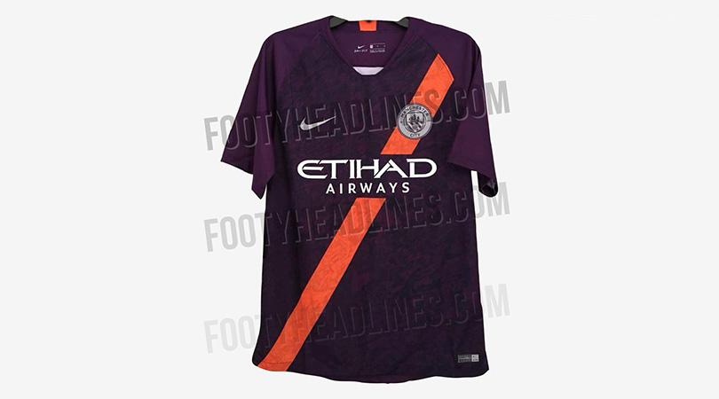
Disclaimer: this is just a leaked version for now. But there’s bold and then there’s reckless, and this combination of purple and orange is far too much to stomach. The graphic print only adds to the messiness, which is a shame given that City produced a beautifully clean claret away kit last time out.
11. Bournemouth, third
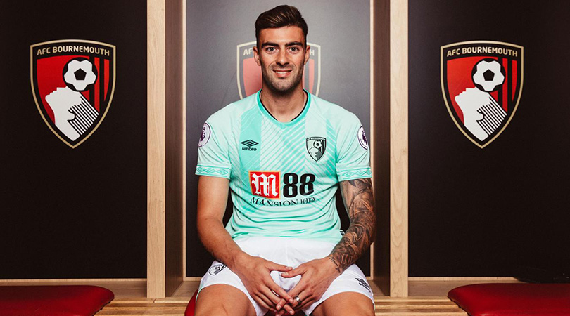
‘Mint green’, says the brochure. ‘Bad kit’, says us.
10. Lille, home
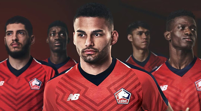
Lille’s home strip for 2018/19 is a fine example of a manufacturer adding a completely unnecessary flourish in an attempt to make the kit stand out. The blend of red and navy here actually looks pretty neat, but it’s completely undermined by the peculiar pattern plastered all over the front of the shirt.
9. Napoli, home
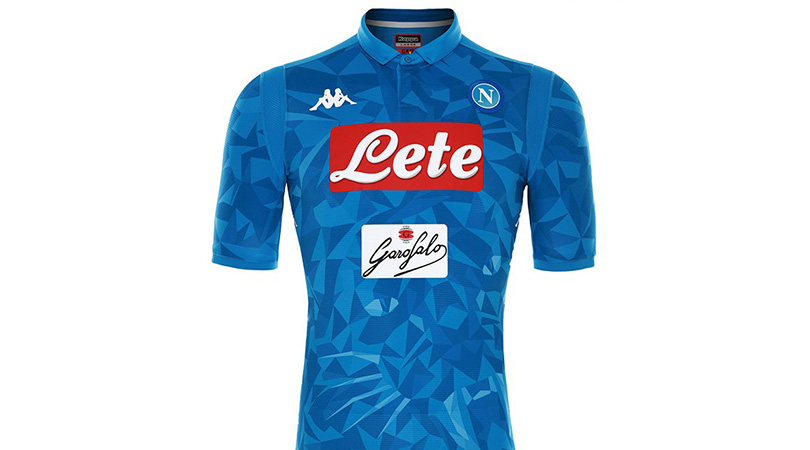
Oh, Napoli. Previously in possession of one of Serie A’s most pleasingly minimalist shirts, the Partenopei have been guilty of overkill this time around. There’s simply far too much going on here: two sponsors, multiple Kappa logos and a graphic print of a tiger’s head. One question: why?
8. Getafe, home, away and third
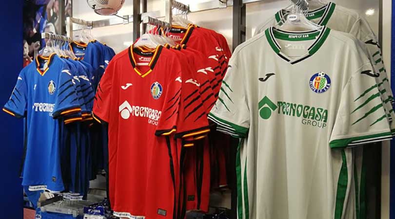
Now this is just lazy. Instead of drawing up distinct designs for each of their kits, Getafe have decided to use the same template for all three and simply swap around the colours, hoping no one will notice. They’re not fooling us.
7. Manchester United, home
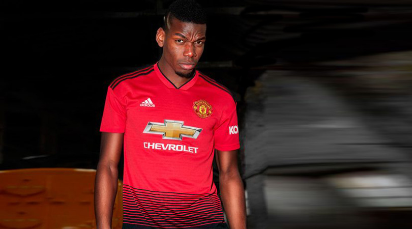
Who said modern-day superclubs are too willing to disregard their local roots? United’s home kit for the upcoming campaign features a train track graphic on the front, a nod to their original Newton Heath Railway Cricket FC name. A #classytouch, we expect you’ll agree. The only problem is that it looks terrible.
6. Milan, away
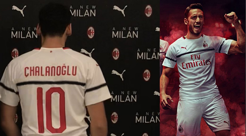
We understand that much of Milan’s summer has been focused on overturning a ban from European competition, but they surely could have produced a better away kit than this. The single black horizontal stripe is bizarre, and misspelling Hakan Calhanoglu’s name at the official launch wasn’t the best move either.
5. Watford, home
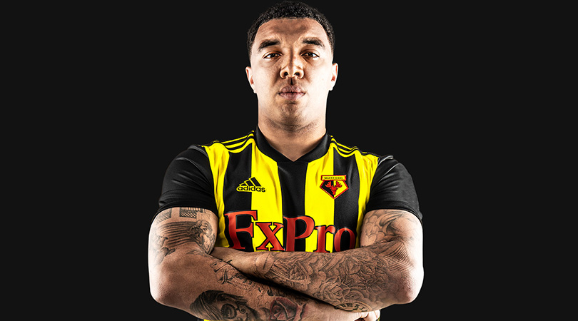
This isn’t a bad kit per se, it’s just not very Watford; if anything, it looks more like a West Brom away shirt. It’s going to take a while for us to get our heads wrapped around this one.
4. Fiorentina, aways
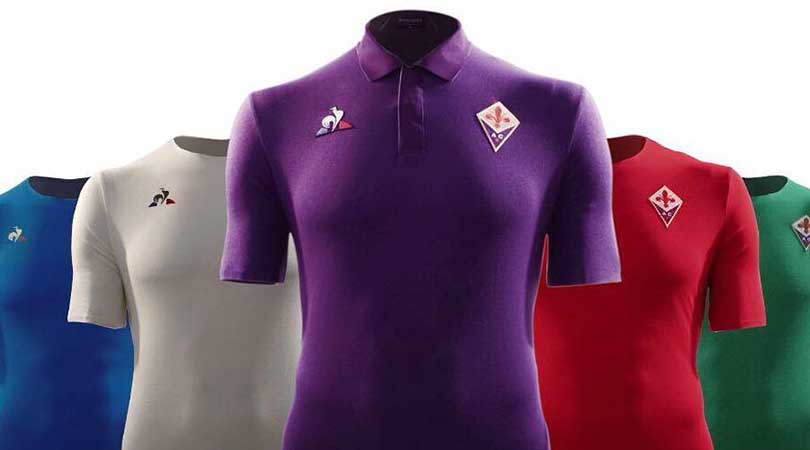
The formula is pretty simple: release a home kit featuring your traditional colours, choose a suitably different change strip, and perhaps pick a third option for those rare occasions where the other two won’t suffice. Yet cocky Fiorentina have ripped up the rulebook for a second year running, unveiling no fewer than four (!) away kits – one white, one red, one green, one blue – to represent Florence’s four historic districts. At least the purple home shirt remains sacred.
3. Villarreal, third
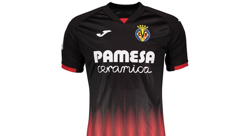
The top half of this kit is rather slick, with the red dashes on the sleeves and white of the sponsor and manufacturers’ logos complementing the black base.
It falls to pieces at the bottom, though, as a perfectly decent jersey slowly descends into a complete mess of red dots and lines. Stare into the centre of the diamonds for long enough and there’s a good chance you’ll be hypnotised.
2. Bordeaux, away

Most kits fall down because of shoddy design, but others fail to impress simply due to the colours chosen. Unfortunately for Bordeaux, they’ve managed to fail both tests with their alternative strip for 2018/19.
The thin, wobbly-looking vertical lines look like they’ve been drawn on by a toddler with a felt tip pen, and the downward-pointing arrow and sponsor’s scrawl don’t do the shirt any favours either. It’s somehow made even worse by the choice of an extremely pale purple hue on a white background; a combination which we don’t expect to catch on.
1. Tottenham, home and third
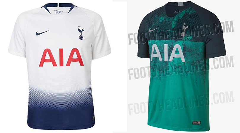
If you think the worst thing about Spurs’ summer is the lack of signings, you clearly haven’t seen their new kits. The gradient, fade design at the bottom of the home jersey is all well and good until you see the shirt without the shorts.
The (leaked, unconfirmed) third strip is a mystifying muddle of dark green and turquoise. The away shirt isn’t the best but looks like Peru ’78 in comparison to its stablemates.
Now read...
LIST 10 major Premier League signings who were sold for a substantial loss within a year
OPINION Why Jose Mourinho has finally picked a battle that he can’t win
ANALYSIS Why English football could learn to finally love Chelsea under Maurizio Sarri
Greg Lea is a freelance football journalist who's filled in wherever FourFourTwo needs him since 2014. He became a Crystal Palace fan after watching a 1-0 loss to Port Vale in 1998, and once got on the scoresheet in a primary school game against Wilfried Zaha's Whitehorse Manor (an own goal in an 8-0 defeat).

