Ranked! The 20 worst World Cup kits EVER
Freddy Krueger, Roy Keane and - even scarier - Jorge Campos star in Nick Moore's countdown of the ugliest football strips ever seen at the World Cup
20. Ivory Coast (2006)
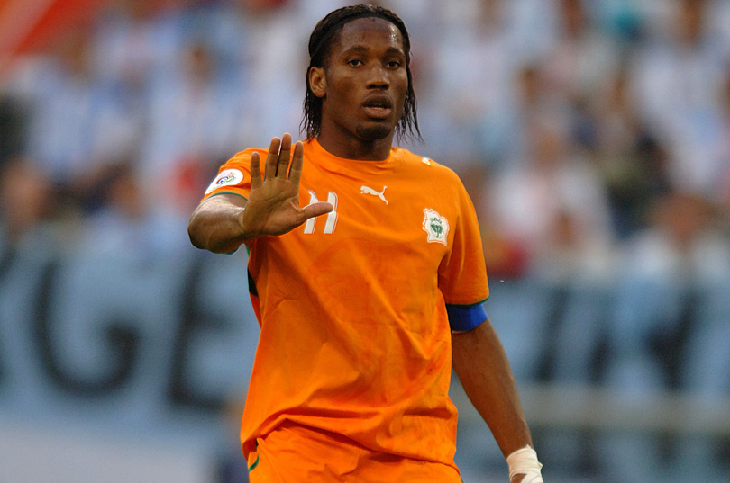
Let’s face it, orange isn’t the new black: it’s a difficult colour to pull off, being the general sartorial preserve of American convicts, lollipop ladies, air traffic controllers and members of mad 70s sex cults that might start stabbing each other at any minute. The only football team that have done it with any real verve is Holland, who go all guns blazing with a deep, in-yer-face tangerine.
Blackpool, alas, veer into hi-vis tabard territory, but the Ivory Coast’s tops are more of a mouldy clementine rather than a proud easy peeler. Difficult to rectify, style-wise – but at least they can see each other.
19. England (2006)
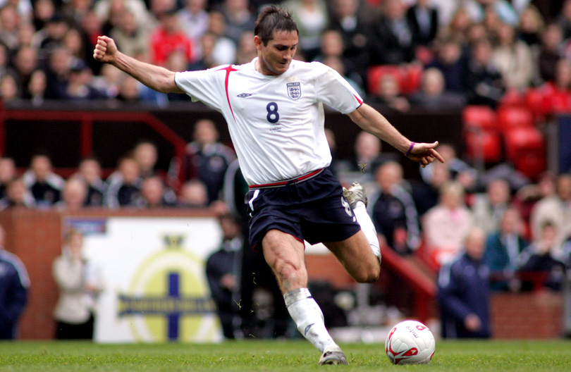
Essentially just a white Tee with the whisper of a St George’s cross draped across the shoulder. Almost as dull as the first 90 minutes of the England vs Portugal game.
18. Tunisia (2018)
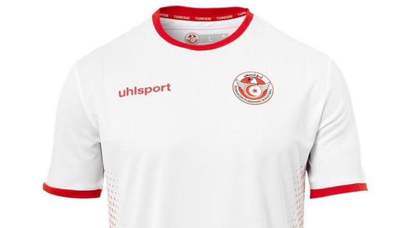
A top design so lazy that we can’t be bothered writing more than one sentence about it.
Get FourFourTwo Newsletter
The best features, fun and footballing quizzes, straight to your inbox every week.
17. Tunisia away (1998)
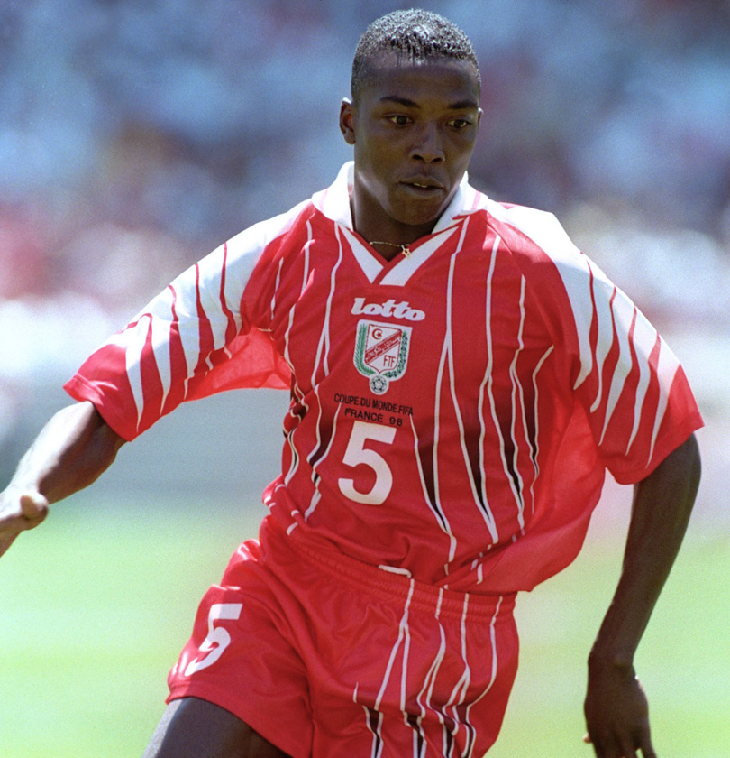
If their entry for this year was quarter-arsed, Tunisia’s ’98 away design was wild and hellish: The Eagles of Carthage looked like they’d been attacked by actual angry eagles – or perhaps Freddy Krueger, with life-ending artery slashes sustained to the shoulders and groin.
16. Slovenia (2010)
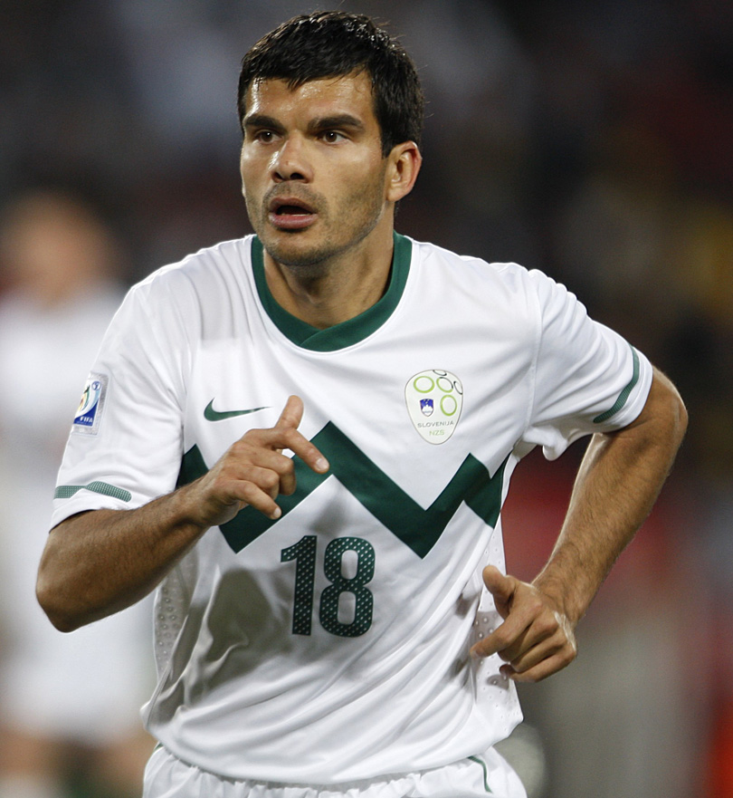
It’s hard to quite put your finger on what’s wrong with this, but the odd line graph feels too low, the shades too neutral, and the overall effect somehow a bit too Twenty20 cricket-y. We can see an Australian off-spinner secretly scuffing up a ball in it, and then weeping on television – but it just didn’t suit Aleksandar Radosavljevic.
15. Scotland (1990)
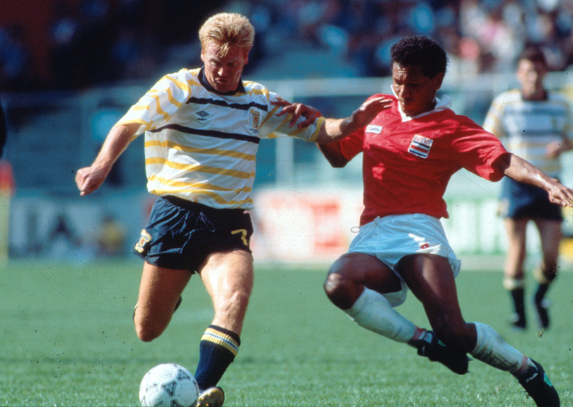
Say what you like about Scotland’s international footballing woes, but they usually look pretty menacing on the pitch in their noble blue. Their away choices have been odder, however – and the Tartan Army’s torrid time at Italia ’90 were worsened by this bizarre purple and yellow horizontal striped fashion calamity, in which they lost to Costa Rica.
=14. Russia away (1994)
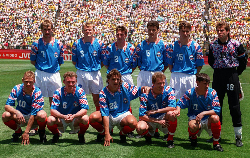
After Playing as the USSR at World Cup 1990 and CIS at Euro ’92, it’s no wonder that Russia didn’t know if they were coming or going at USA ’94. Their baffling Reebok away kit - blue with odd flashes of the Ghost of Croatia future defiling the shoulders – was just as confusing.
=14. Russia (2014)

It’s 2018 and having a go at the Russians is suddenly as fashionable as it was back in 1968, so we might as well give their old football tops a kicking as well as accusing them of being responsible for ruining Facebook and electing Trump and poisoning people outside supermarkets.
Anyway, four years ago in Brazil, while everyone was supping the juice out of coconuts, jigging a samba and generally having a technicolour carnival, the Russians were trudging round miserably in this incredibly austere and serious garment. Just looking at it makes you tired.
12. Republic of Ireland away (1994)
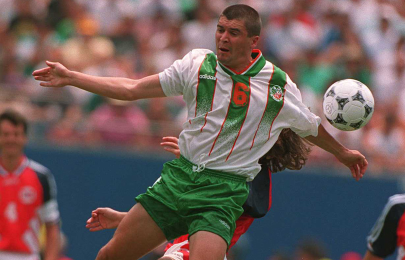
Much of the pasty Irish side were sunburned and irritable in the scorching heat of USA ’94, and their white change kit, with three feeble, fading green stripes down the middle, didn’t do Aldo, Keano and Steve Staunton any favours, appearance-wise.
11. Iran (1998)
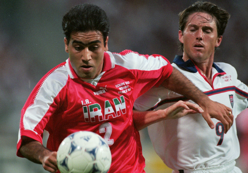
Font failures: the Puma logo, shirt number, ‘I.R.’ letters and ‘COUPE DE MONDE FRANCE 98’ bit all orbit a weird, uncalled-for central tricolour IRAN motif, making Mehdi Mahdavikia resemble a Wolverhampton speedway ace with too many sponsors.
10. Brazil (1994)
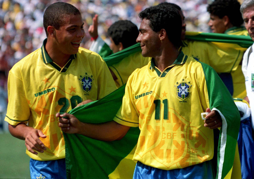
There was a strange phase in the mid-90s where designers – newly armed with computer technology that could do all sorts of crazy layered nonsense – went into collective overkill. Think about the mad Man United top that had Old Trafford subtly pasted into the background, or the Mexico jersey with an Aztec god peeping out through the player’s stomachs.
It didn’t last long – everyone soon afterwards realised that less is actually more after all – but not before Umbro ruined the almost unruinable Brazil shirt with some massive, unnecessary overlapping crests. Yuck.
9. Africa Unity (2010)
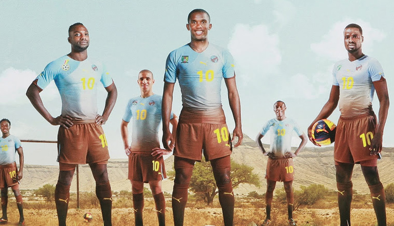
Puma did some interesting kits for the first World Cup to be held on African soil, and some of ‘em were crackers. But alas the Africa Unity kit, which was worn by numerous nations during qualifying and had the noble aim of funding biodiversity, was a bit of a wrong ‘un.
It was meant to represent the continent’s mighty earth and sky, but ended up looking like Man City emerging from a 1970s mudbath, or as if something had gone terribly wrong after Kwadwo Asamoah put the Black Stars’ washing machine on the wrong setting.
8. Mexico goalkeeper (1994)
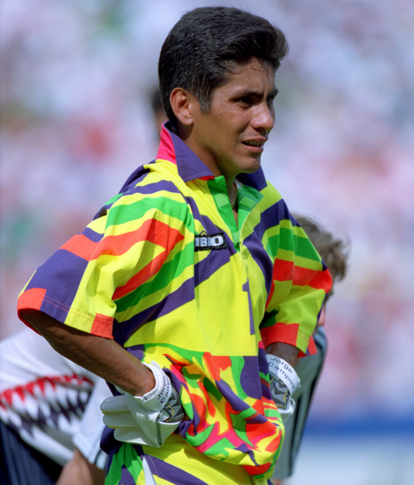
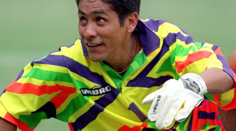
Aargh! My corneas! They’re melting! Mexico’s 1994 outfield home kit was semi-acceptable, but goalkeeper Jorge Campos strode onstage in a flouro zigzag vomit hodgepodge that Lady Gaga would deem a bit OTT.
Being the coolest hombre at the World Cup (5ft 6in tall, wild acrobatics, crazy saves), Campos somehow pulled it off anyway – and was also actively involved in the design, presumably after necking a couple of goblets of peyote.
7. Mexico away (1994)
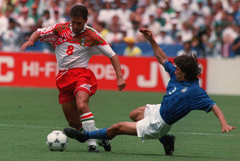
Yes, we’re still here with Mexico, yes it’s still the 1990s, but Christ, what was going on? This white change strip featured a slapdash multi-panelled collage across the shoulders and chest, which made El Tri look like their skin had been ripped off their right upper arms by the bird of prey that had settled on the left. Disturbing and peculiar.
6. Jamaica (1998)
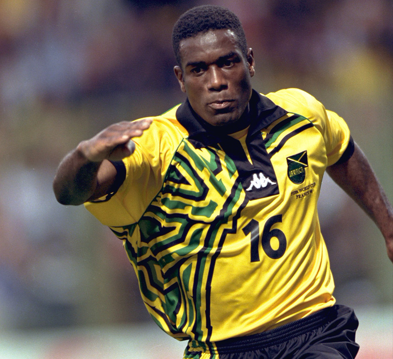
The Reggae Boyz, on paper, should have a nice shirt: their yellow is every bit as noble as Brazil’s, and the green and black of the flag are classic and complementary trims – but they keep making a pig’s ear of it. The current design looks like the mid-90s Norwich side after a vigorous afternoon of paintballing, but the ’98 eyesore by Kappa was even worse. Even Usain Bolt would look like a wally in this disastrous garment.
5. Spain (1994)
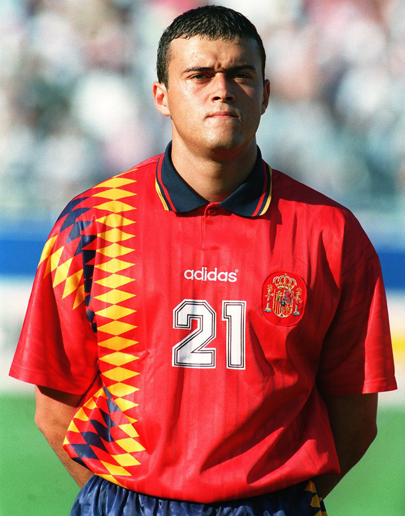
Remember when Spain weren’t very good? We reckon there was a direct correlation between the awful tops they had in the 90s and their inability to break through in a major tournament. This one was the nadir for Nadal and pals: a harlequin horrorshow.
4. Germany (1994)
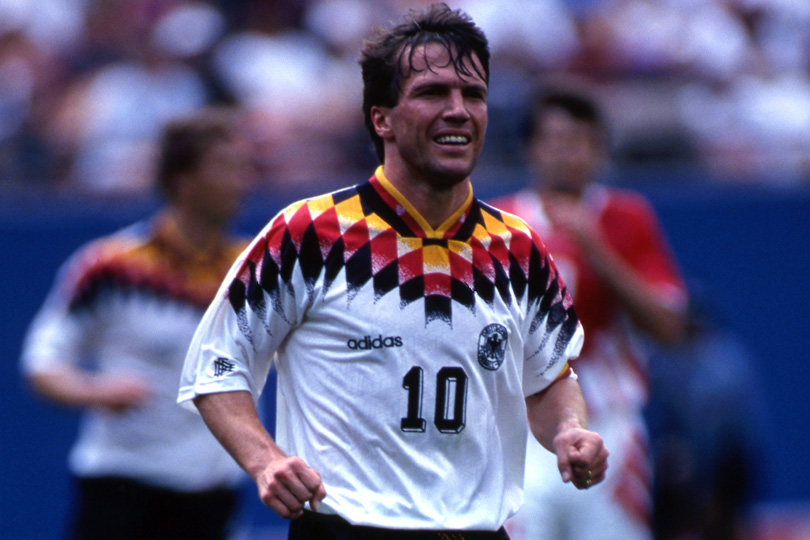
Adidas are normally reliable shirt operatives, but 1994 was clearly a strange time (almost half our our entries are from the design hell of 1994) and the same rhombus-crazed bozo who presumably went mad with the Spain kit was also allowed to deface the normally intimidating looking Mannschaft top with equilateral quadrilaterals, making very serious people like Lothar Matthaus look like prancing jesters.
3. Nigeria (1994)
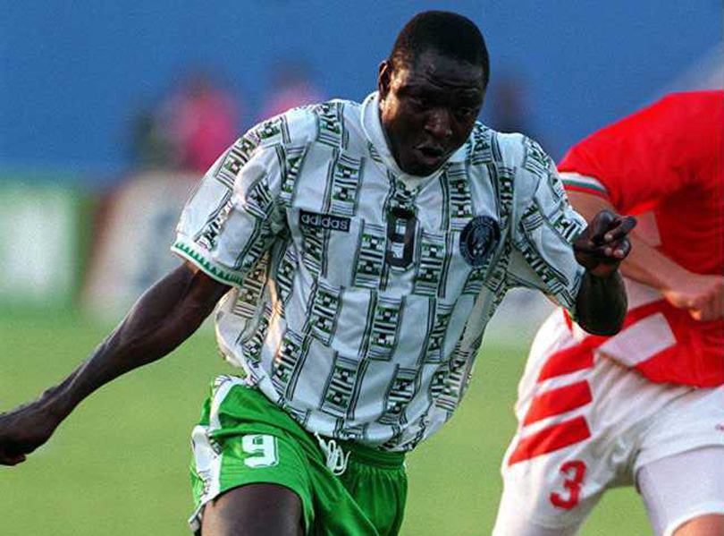
More 1994 Adidas woe, alas – although this berserkness, which looks like the Super Eagles plastered a load of dollar bills to their shirts, veers dangerously close, but not quite, into so-bad-it’s-good territory.
2. South Africa (1998)
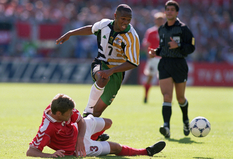
Just insane: the kind of bizarre garment that renegade golfer John Daly might design for his LoudMouth Apparel range after spending 48 hours in Hooters.
1. Bolivia (1930)
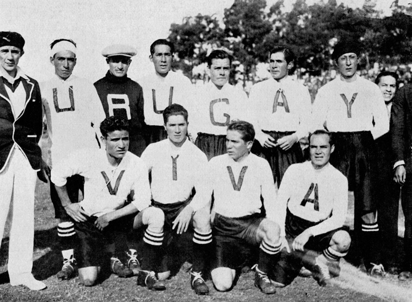
Resembling the sort of risible little Englanders that go to Centre Court in T-shirts that carefully spell “GO ANDY!” in a bid to get a chortling comment from John Inverdale, Bolivia decided to pay tribute to the hosts of the first ever World Cup by pulling on shirts that read “VIVA URUGUAY”.
How this worked on the pitch, we’re not sure. Why is the goalkeeper wearing the R, for starters? Anyway, alas, one of the team photos saw a letter U go missing, meaning the side spelt ‘URUGAY’, so the tribute came off as a vague insinuation. All in all, poorly thought through – and a clear winner.
Now read...
RANKED! The 20 greatest World Cup kits EVER
World Cup Wonderland: stories, interviews and more
New features you'd love on FourFourTwo.com
Nick Moore is a freelance journalist based on the Isle of Skye, Scotland. He wrote his first FourFourTwo feature in 2001 about Gerard Houllier's cup-treble-winning Liverpool side, and has continued to ink his witty words for the mag ever since. Nick has produced FFT's 'Ask A Silly Question' interview for 16 years, once getting Peter Crouch to confess that he dreams about being a dwarf.

