Ranked! All 92 Premier League and Football League club badges
Separating the crap crests from the lovely logos – where does your club sit in our list?
70. Bromley
A shield placed within a roundel isn't the best option clubs can opt for, but Bromley have made it work better with the gold outer circle providing a good contrast to the black and red centre shield. There, you'll find three ravens in the centre.
69. Stockport County
Like fellow League Two Greater Manchester outfit Rochdale, Stockport made the decision to roundel-ify their traditional coat of arms badge. And can anyone honestly say it looks better like that?
68. Reading
Once home to famed biscuit-makers Huntley & Palmers, Reading was affectionately known as ‘Biscuit Town’ – and, while it looks more decorative, we reckon this badge could be repurposed to serve the tea-accompanying treats.
67. Chesterfield
Without the colourful church spire cutting through this crest, then Chesterfield would be looking at a lot lower on this list. Thankfully it's there, and is a nice hint towards the club's Spireites nickname.
66. Middlesbrough
When Middlesbrough switched things up in 2007 and replaced their circular badge with a shield, it had the (presumably) unintended effect of turning it into a pub sign. (Is the lion on fire, by the way?)
65. Salford City
Following their takeover of the club in 2014, the Class of ‘92 set about rebranding Salford – and part of that seems to have involved replacing their old badge with a lion inspired by the Emperor from Star Wars.
64. Burnley
"Hi Burnley, it's your badge designers. So we've got a few ideas: what about a shield? A lion? Some kind of bird? Or maybe some bees… a hand? Otherwise, you can have some kind of weird bird thing. Or you can have some stairs on there… or a ribbon. What do you think?"
Get FourFourTwo Newsletter
The best features, fun and footballing quizzes, straight to your inbox every week.
"Yep, all of that sounds great, ta."
63. Rotherham United
Have you ever seen a windmill give birth to a traditional leather football? No? Well, you’ve obviously never studied the badge of Rotherham (the Millers) closely enough. It’s a miracle!
62. Wigan Athletic
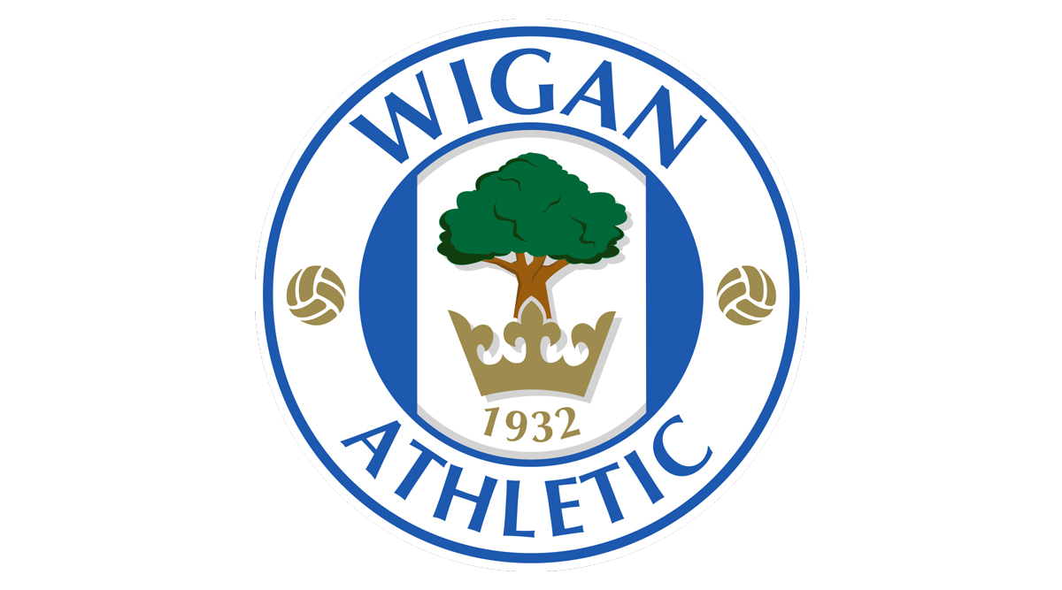
A popular design among Latics fans, Wigan’s ‘Tree and Crown’ crest was brought back in 2008. What kind of tree is that? A mountain ash – known locally as… a ‘Wiggin Tree’. You can’t beat a good badge backstory.
61. QPR
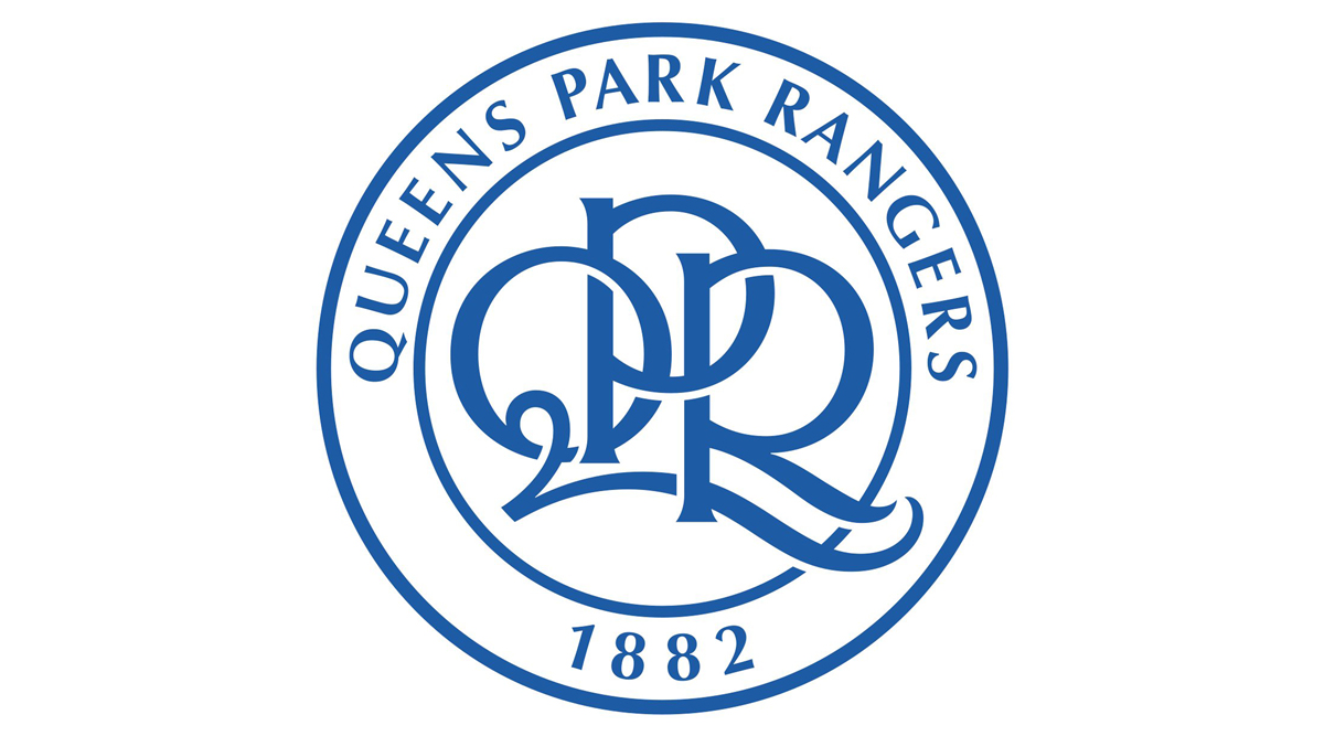
QPR’s foundation year is clearly displayed at the bottom of their badge, but – and we can’t tell whether this is by design or not – it actually appears again, within the club initials. Pretty cool, huh?
60. Leicester City
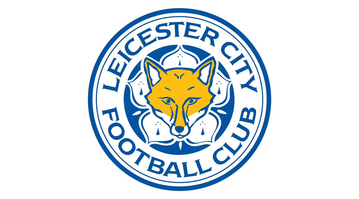
Look, it’s not our place to tell the club who wrote football’s greatest-ever underdog story how to do anything, but can we just politely point out one thing…? Foxes are not yellow!
59. Peterborough United
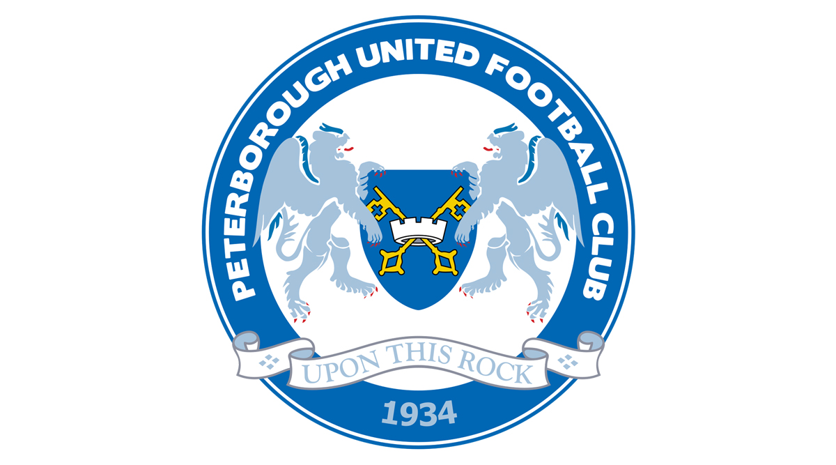
There two Biblical references on Peterborough’s badge, adapted from the Cambridgeshire town’s coat of arms: the keys to heaven and the ‘Upon this rock’ motto (Saint Peter was the metaphorical ‘rock’ upon which Jesus built his church).
58. Shrewsbury Town
It’s too bad Shrewsbury no longer play on the banks of the River Severn: those lions look parched. Still, at least they haven’t come home to find they’ve been burgled like the poor sod on the Shropshire club’s previous crest.
57. Crewe Alexandra
Sure, the outline shape could be a bit less ‘Microsoft Word speech bubble’, but Crewe’s crest strikes a decent balance between modern and traditional. All in all, a solid effort.
56. Brighton & Hove Albion
Is it possible to oversimplify a badge? Brighton’s crest would suggest that the answer to that is very much ‘Yes’. Even the seagull looks bored; could they not at least have added one of the city’s three piers?
55. Harrogate Town
There’s a certain hypnotising quality to Harrogate’s badge, at the centre of which stands… a double door to another dimension? In any case, it’s distinctive enough to avoid being forgotten as just another roundel.
54. Accrington Stanley
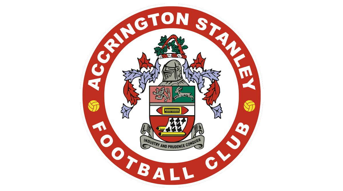
No, that’s not a harmonica in the middle; it’s a cotton shuttle. And no, that’s also not the eight of clubs underneath; those black shapes are acorns, recalling the town’s original name of Akerenton. Very nice.
53. Exeter City
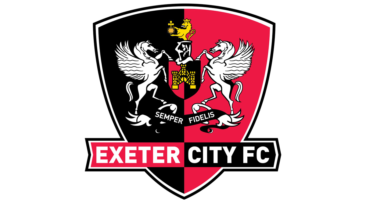
Exeter appear to have cloned ancient Greek equine icon Pegasus to give a degree of symmetry to their crest – which also features *checks notes* a lion rising from a knight's helmet, presenting an ornate jar of honey?
52. Fleetwood Town
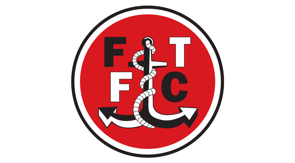
Fleetwood’s fishing industry was largely destroyed by the 1960s Cod Wars, but the Lancashire town’s football club aren’t going to forget its proud history: that’s one heck of an anchor.
51. Oxford United
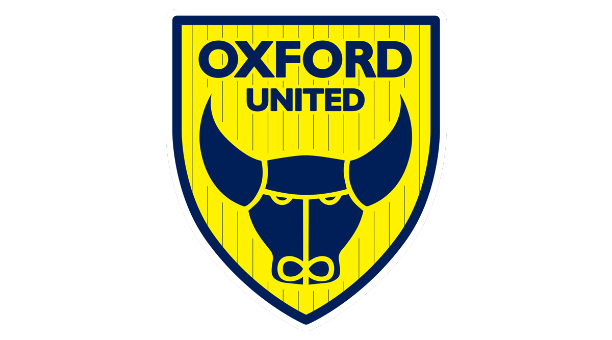
Quite clearly, that’s an ox – but something magical happens when you flip Oxford’s badge upside down: it’s an angry crab… Or an owl perched on a massive croissant… Let your imagination run wild!
Current page: English football badges ranked: 70-51
Prev Page English football badges ranked: 92-71 Next Page English football badges ranked: 50-31Tom Hancock started freelancing for FourFourTwo in April 2019 and has also written for the Premier League and Opta Analyst, among others. He supports Wycombe Wanderers and has a soft spot for Wealdstone. A self-confessed statto, he has been known to watch football with a spreadsheet (or several) open...
- Ryan DabbsStaff writer

