Ranked! EVERY 2018 World Cup kit on show in Russia this summer
Huw Davies turns FFT fashion critic to rate and slate the threads coming to a screen near you soon. And oh, isn't he wrong...
Kits! Wonderful World Cup kits. Well, some of them are. We’ve gone through all 64 home and away strips that’ll be worn at Russia 2018 and ranked them according to the Dulux colour chart. No, wait – that was the rejected suggestion. In fact, we’ve ranked them according to how good they look, worst first.
FFT feels duty-bound to warn you: this year’s collection features some fairly uninspiring efforts (fun fact: 40% of the kits are plain white). So, save your lust for the drop-dead gorgeous exceptions, because we have a Sports Direct van-load of £5 gym tops to tick off before we get there.
There’s a decidedly old-school theme to some of the World Cup 2018 kits, which puts several of them high up our rankings. Not all of them, however...
Where possible, we've even made it easy for you to buy them. Just click on the team name or picture...
64. Belgium, home
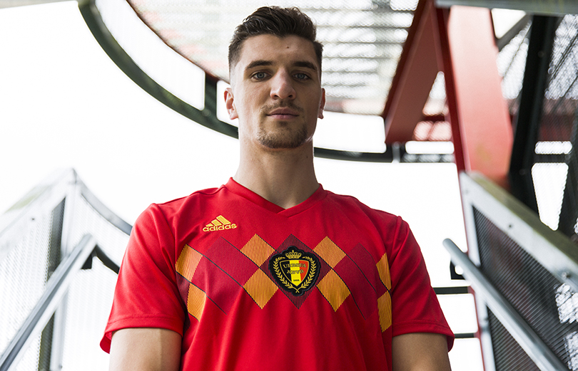
Not then, not now, not ever. Retro can be brilliant – but not when the original kit was crap. The Red Devils will at least be more red, following their overly black number at Euro 2016; however, they’ll still be wearing a design that looks as if it was knitted by Thibaut Courtois’ nan.
63. Japan, away
Get FourFourTwo Newsletter
The best features, fun and footballing quizzes, straight to your inbox every week.
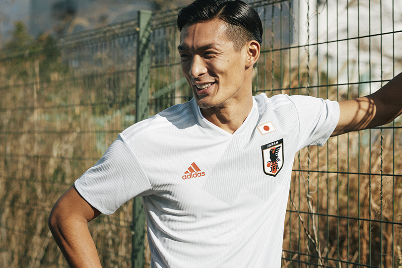
Grey shirt + white shorts + white socks = apparent laundry disaster. “Aw, mum!”
62. Serbia, home
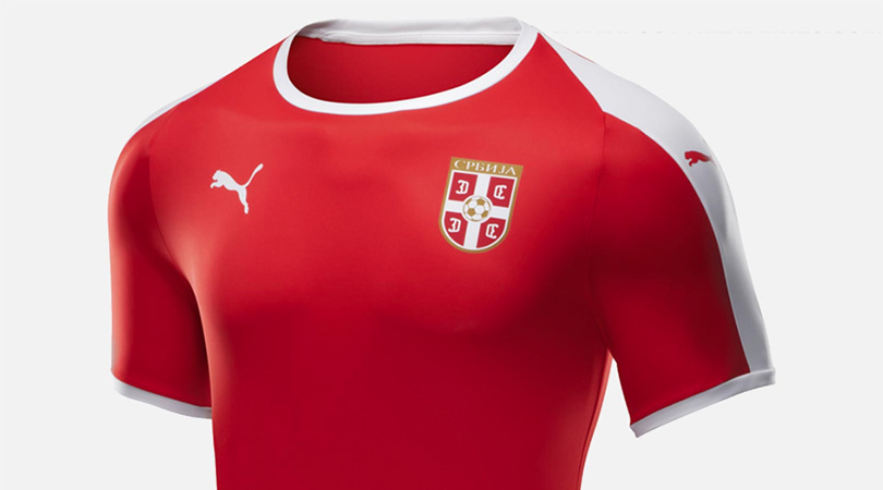
This exceedingly dull Powerleague-ish top leads us to an associated Puma controversy...
61 & 60. Switzerland, away & Uruguay, away
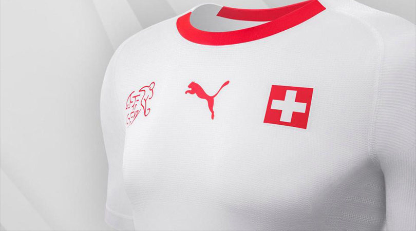
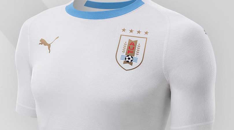
So, this World Cup will have a lot of white kits. And while Adidas, Nike, Umbro, New Balance, Hummel and Uhlsport are all guilty to different extents of putting out an uninspiring plain white T, the worst culprits are the otherwise-sound types at Puma. Not only did they release extremely similar white shirts for 10 different nations, they announced all 10 together, as if trying to emphasise the homogeneity.
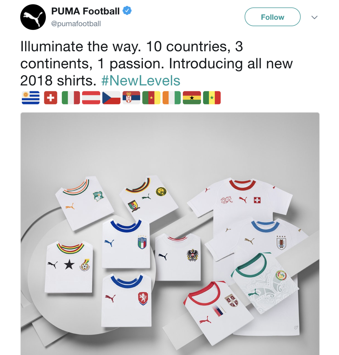
Only four of these 10 will be at Russia 2018, and two feature a design that makes things a bit more interesting. Switzerland and Uruguay weren’t so lucky.
59. Japan, home
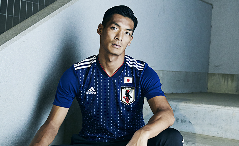
Adidas, why do you hate Japan so? This is meant to look like samurai armour. It doesn’t.
58. Spain, away
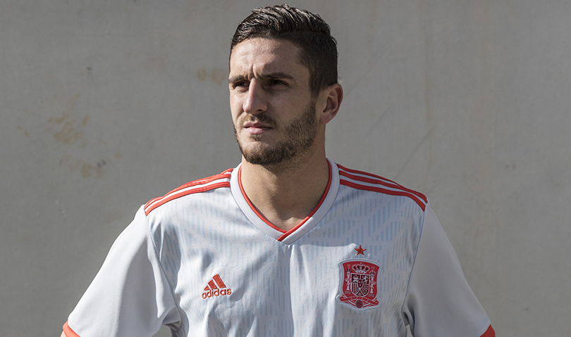
This is, apparently, ‘halo blue’ (i.e. off-white) and red (i.e. orange). Colour us unconvinced.
57. Morocco, away
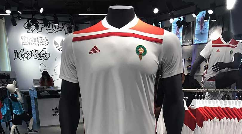
The Moroccan FA delayed their kits’ reveal in order to stymie touts with their replicas, so it’s unfortunate that the official versions wound up resembling replicas anyway.
56. Costa Rica, away
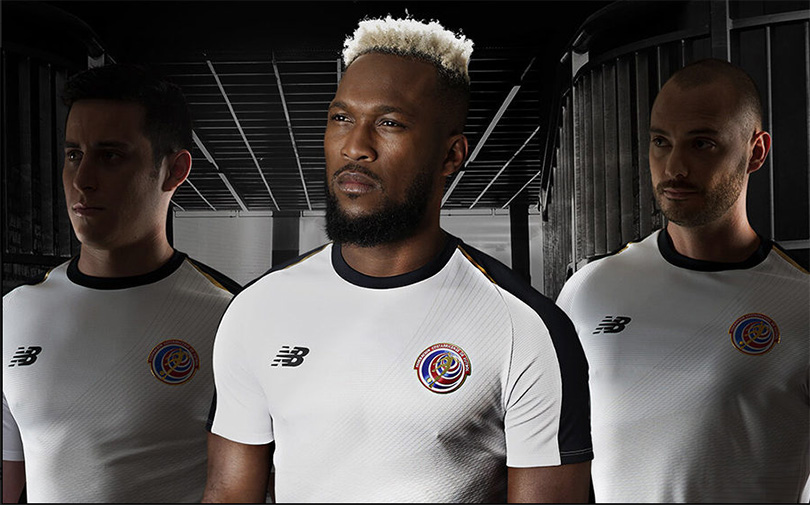
STOP. MAKING. WHITE. AWAY KITS.
55. Saudi Arabia, away
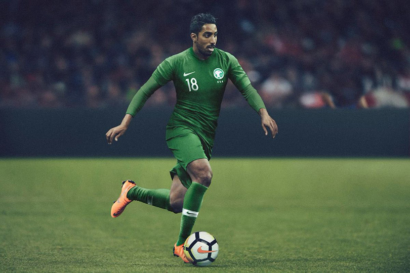
Well, it’s not white, although that’s only because Saudi Arabia’s home kit is white. No, this is just green. Too green. With matching shirts, shorts and socks, and nothing to offset the principal colour, the Saudi players could blend into the pitch – or have Marvel’s next CGI epic filmed on their torsos.
54. Australia, home
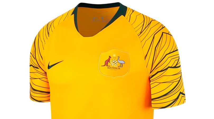
Though it’s good to see the Socceroos dropping their green shorts (as it were) and wearing all gold instead, their fans will be thankful that Russia’s cooler climate means they can wear jackets to cover the shirt sleeves. In a classic case of something sounding better in a pitch meeting than it ends up looking, the wave motif was inspired by Australia’s triumphant 2006 team “requesting the support of every fan to create a sea of gold”. You tried, Nike, that’s the important thing.
53. Iran, away
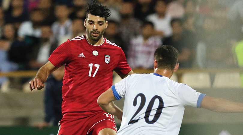
“Carl? Carl! People are saying our Iran away kit is boring. Is there anything we can add to jazz it up a bit? What’s that you’re wearing?”
“This? Oh, my nephew gave it to me. He went to the zoo yesterday and got this sticker of a jaguar for putting a quid in the fundraising box.”
“Perfect!”
52. Egypt, away
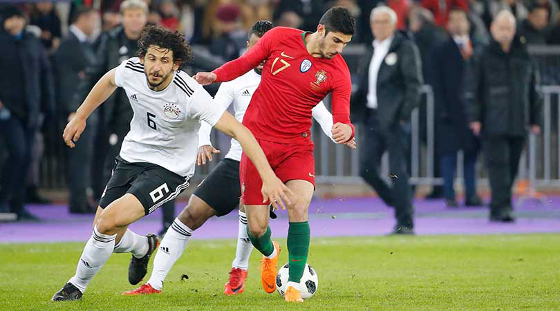
If you can’t play like Germany, dress like Germany.
51. Morocco, home
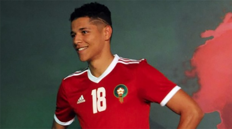
This was one of the final two kits to be revealed. The design doesn’t assuage any doubts that Adidas just forgot they had to make one.
50. Iran, home
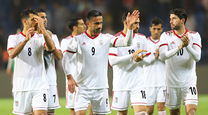
And this was the other straggler. It's white.
49. France, away
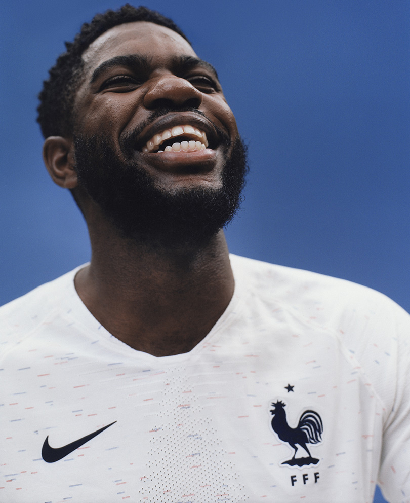
In a doomed attempt to better the unbetterable, which was France’s gorgeous flag-across-the-shoulders away kit for their hosting of Euro 2016, Nike tried something different this time. Specifically, they took a plain white T-shirt and used it to calibrate an old inkjet printer. No? Oh, ask your dad.
48. Tunisia, away
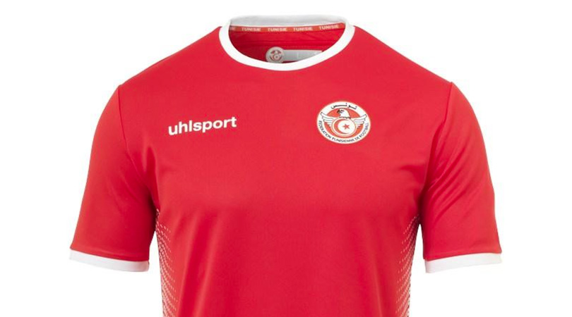
Thanks to revolutionary new technology from German manufacturers Uhlsport, it’s possible to forget this kit even as you’re looking at it.
47. Tunisia, home
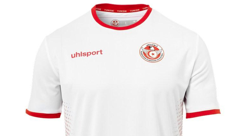
FFT is told this is similar to Tunisia’s away strip, but we don’t know as we haven’t seen it.
46. Panama, home
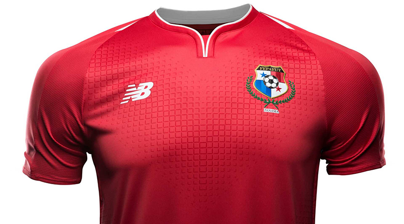
The away kit is nicer.
45. Australia, away
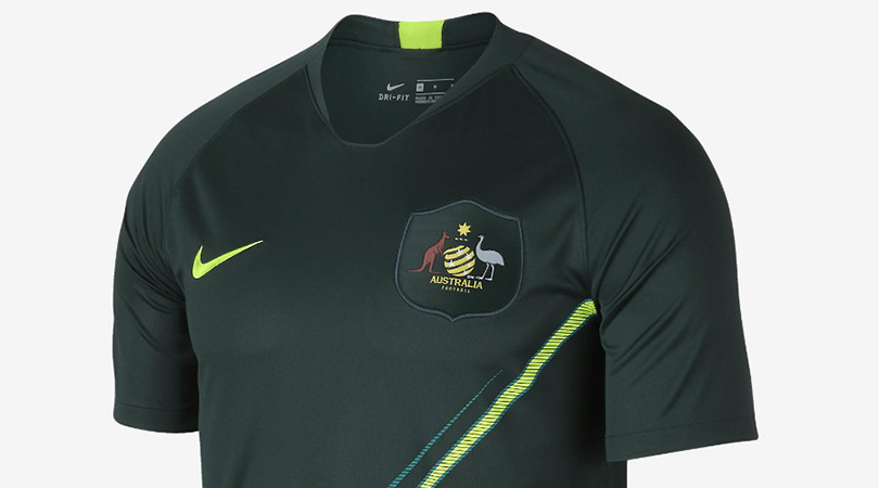
This is a cricket top, isn’t it? Do cricket tops usually have badges the size of continents?
44. Egypt, home
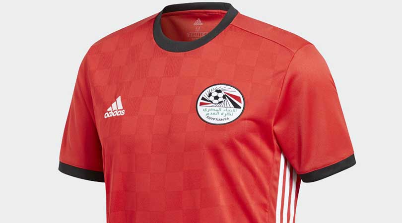
We alternate between finding this decent and finding it dull. The colour tones are dead right, at least, and you’d be surprised how easy it is to cock that up.
43. France, home
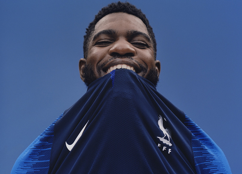
Oh, hello. France’s shirts seem to have been getting darker with each tournament, to the point that, as the contrast on each sleeve shows, this one may as well be black. It doesn’t do LesBleus justice, and the collar’s strange single button isn’t helping matters. Yeah, just bite it off, mate.
42. Costa Rica, home
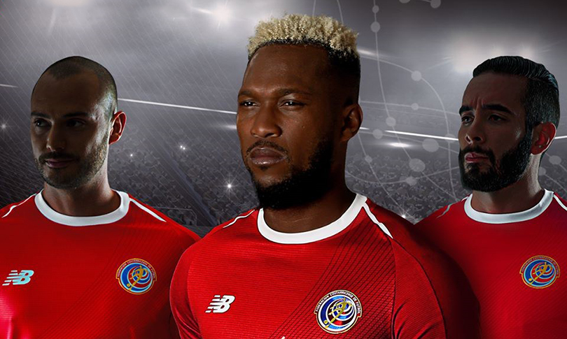
Amid Costa Rica’s rich colours, New Balance’s ‘Declare your DNA’ slogan doesn’t really come across in the swirls (representing DNA strands), although they look pretty enough.
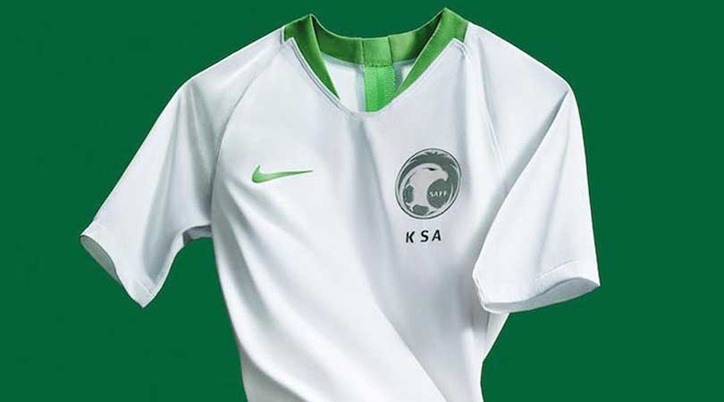
This is a solid effort, but it does carry the air of a gym top. Sadly that’s quite appropriate, as Saudi Arabia, along with South Korea and Australia, have been given Nike’s old Dri-Fit fabric – generally used for replica shirts – instead of their fancy new Fast Fit Vaporknit technology, worn by the likes of France, Portugal and the Dutch, who didn’t even qualify for this World Cup. At least the Saudis’ new crest is lovely.
40. Russia, home
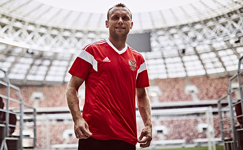
Hmm. The hosts’ get-up isn’t bad, reviving an old kit as so many teams are this year, especially those kitted out by Adidas. However, the shirt’s inspiration – USSR in 1988 – lacks… well, inspiration, and the final product isn’t a patch on the snazzy retro ensemble that Russia wore for last year’s Confederations Cup. Nice socks, though.
39. Poland, away
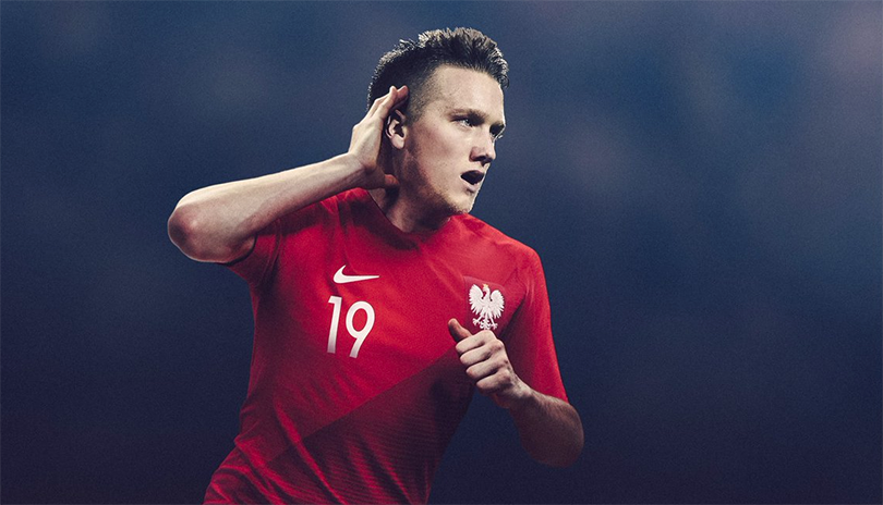
S’alright. Next.
38. Sweden, home
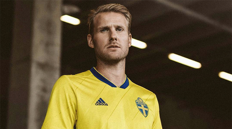
This is… fine. Come on, we’ve a lot to get through.
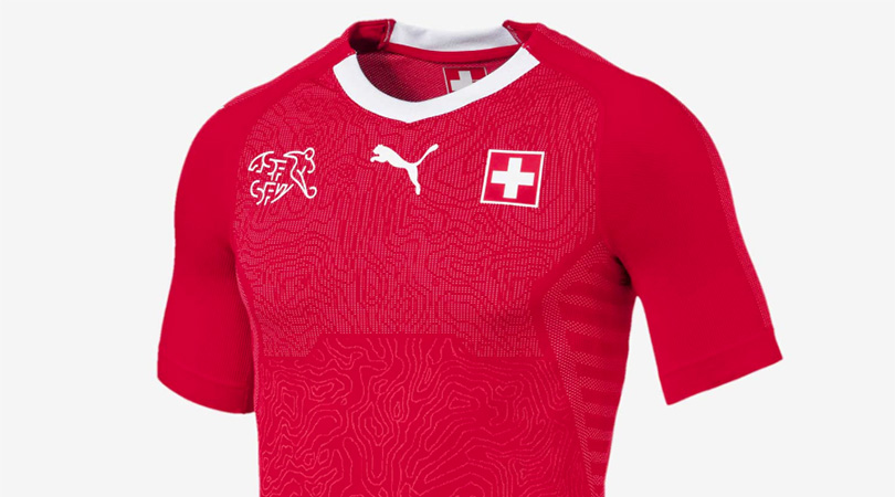
Introduced last autumn in time for their World Cup play-off with Northern Ireland, the Swiss home shirt has an intricate pattern that represents the country’s topography. Whether it’s strictly accurate, we don’t know, so please don’t use it to navigate climbing the Alps.
36. Nigeria, away
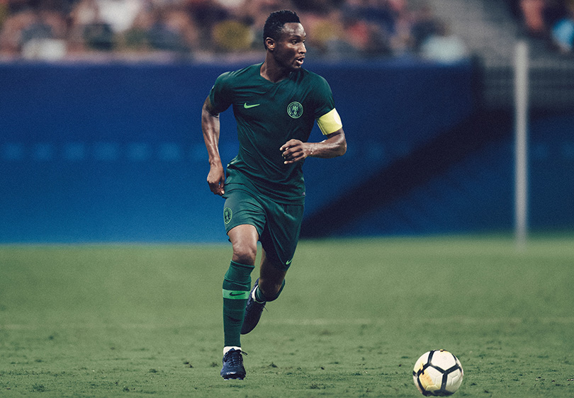
Classical without being classic, this Nike package is at least better than the similar one being worn by Saudi Arabia.
35. Mexico, away
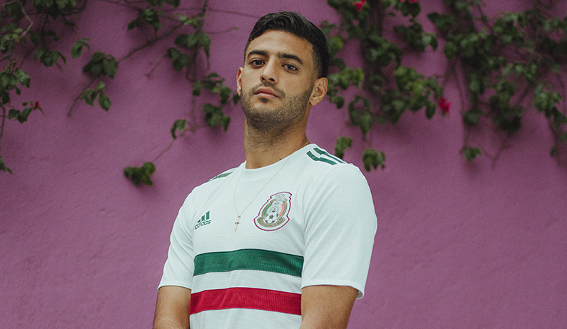
El Tri’s understated change strip is in all the right shades – it’s just a shame that the hoops make it look like an upside-down Hungary kit.
34. Poland, home
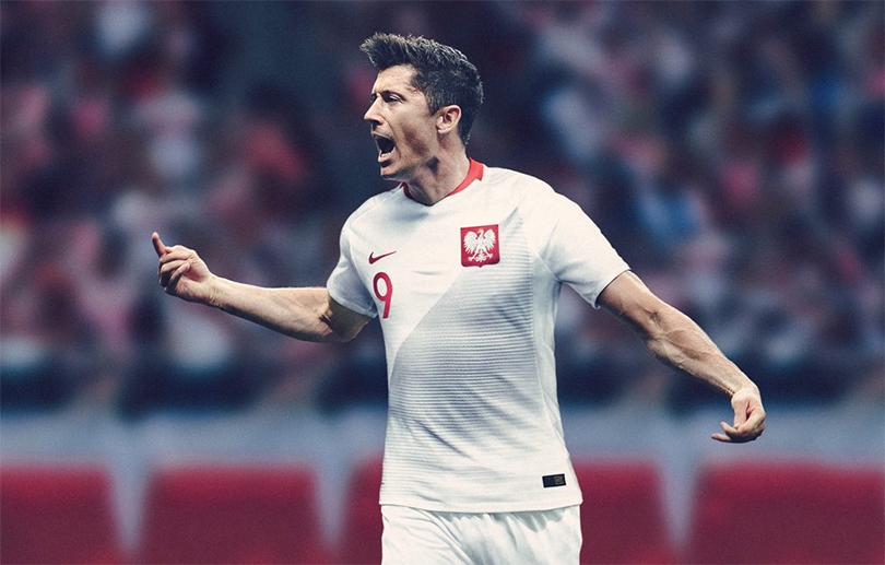
“What if we offset the main shirt colour with another shade, to really bring out the whiteness?”
“Hmm, that sounds a bit bold. What colour did you have in mind?”
“... grey?”
33. Sweden, away
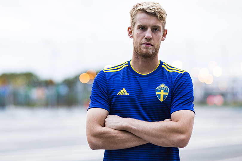
Even if the alternating of thin and thick lines has been done to death this year, the resulting squared pattern here adds some texture to an otherwise-average strip.
32. Panama, away
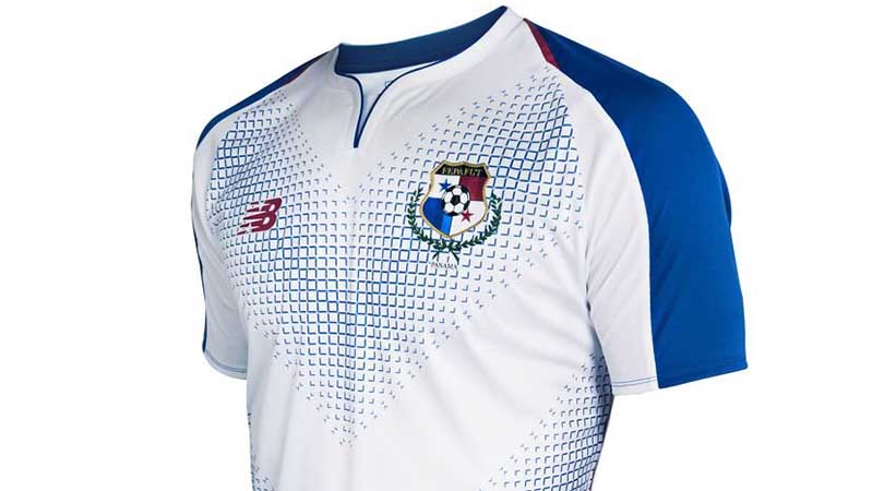
We’re into the top half with… a thoroughly OK kit. To be fair, closer inspection reveals that Panama’s blue chevrons are formed by a neat pattern of morphing 3D squares (so, cubes?) – it’s just disheartening to see something that’s merely OK being officially above average for this year’s World Cup collection, according to our highly scientific ranking.
31. Portugal, away
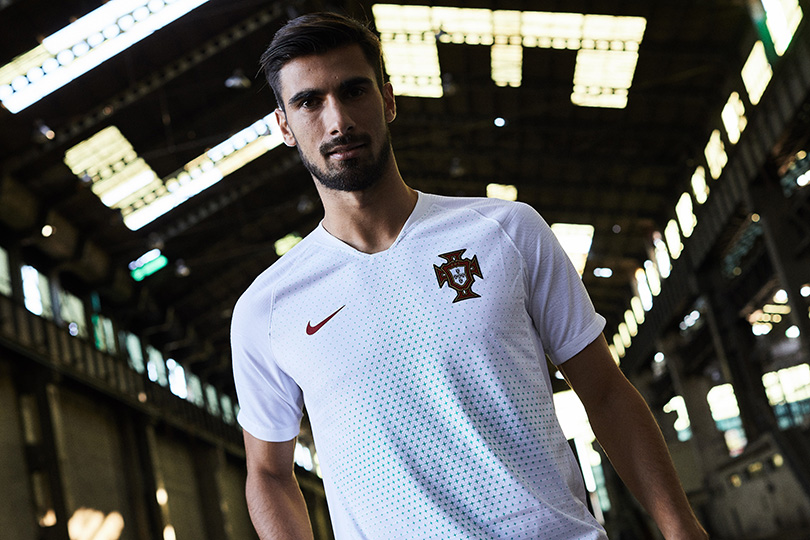
On that note, we’ll share that this Nike number started poorly in our estimations but, like Portugal themselves at Euro 2016, crept up by virtue of its rivals being fairly insipid. It is, at least, much better than the toothpaste kit they wore then.
30. South Korea, home
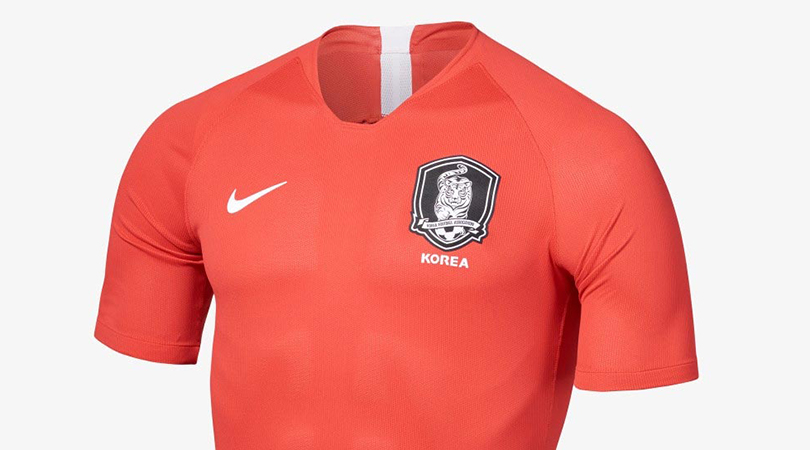
Uncluttered. Understated. Unremarkable.
29 & 28. Peru, home & Peru, away
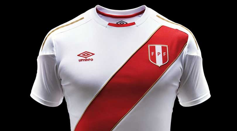
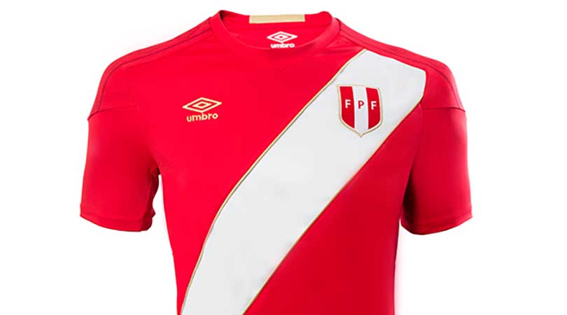
We had such high hopes for Peru. Not only is this their first World Cup since Spain '82; they’ll also be wearing Umbro’s last hurrah before Marathon take over – and Umbro don’t get much representation on football’s biggest stage these days. What an opportunity. With those three reasons added to the nostalgia factor and iconic look created by Peru’s unique sash, we were expecting something… more.
This is fine. It’s definitely a Peru football kit. But while Umbro did the right thing in resisting bells and whistles, the shirt is more basic than classic. The collar is tight, the gold trim doesn’t really stand out and overall it’s a bit lacklustre, which is disappointing.
27. Croatia, away
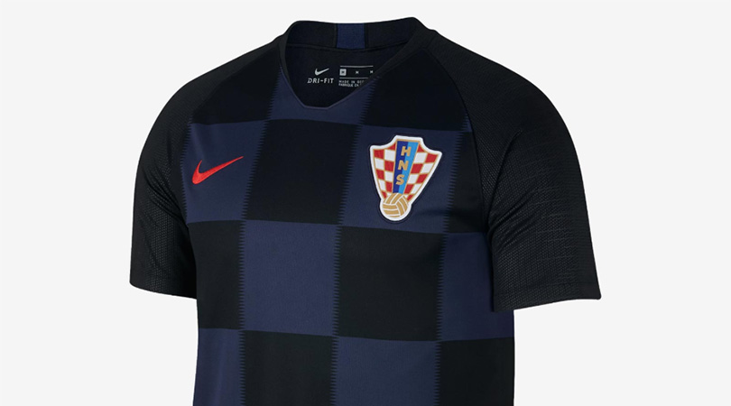
Croatia’s aesthetic always works well in black and blue; the shading is just a little too dark this time around. Yep, we’re a tough crowd.
26. Russia, away
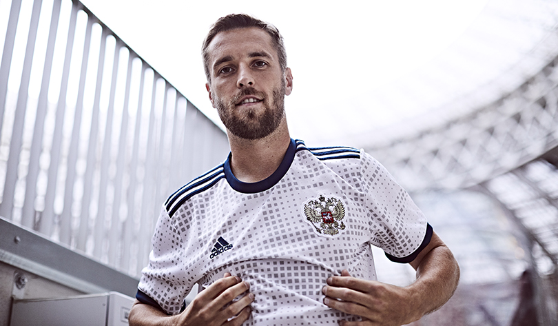
Although it’s not spectacular, and Pacman’s wandered off, this is a half-decent change strip elevated by the smart way in which shirts, shorts and socks display Russia’s flag.
25. Argentina, home
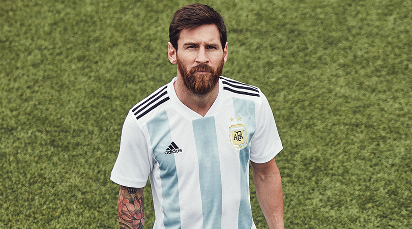
We tried to like this, and the Adidas stripes do stand out now they’ve moved back from the flanks to the shoulders where they belong, but the shade of blue is too pale even for Argentina, and the white arrows have the appearance of clouds on an ancient PC game.
24. England, home
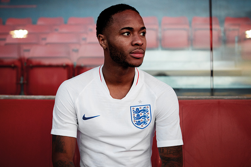
The Three Lions are rightly back in white-blue-white, accentuated this time by red numbering. Sure, it’s a little dull, but you can overcomplicate an England shirt.
23. Belgium, away
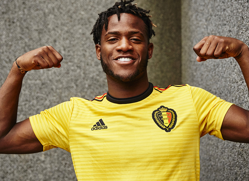
Belgium’s away kit at Euro 2016 was stunning, so Adidas were never going to live up to that. This is a decent attempt, even if it is exactly the same as Sweden’s second strip, only with yellow and not blue being the primary hue. Having two-tone shoulder stripes is a welcome innovation.
22 & 21. Denmark, home & Denmark, away
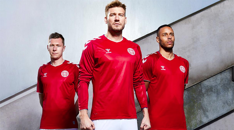
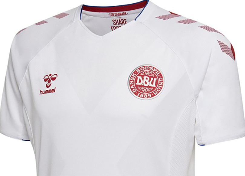
Hummel, knowing the neutrals’ love of a retro Denmark shirt, spent ages teasing their World Cup 2018 release with GIFs and little details, which resulted in fans mocking up some lovely designs of their own.
Perhaps that’s why we were a tad underwhelmed when the official home and away kits finally came to light. Hummel’s stylish chevrons are present, naturally, while a subtle cross and silver badge outline act as nods to the uniforms worn by Denmark’s Royal Lifeguards. It doesn’t hold a candle to those hipster classics, though.
20. Senegal, away
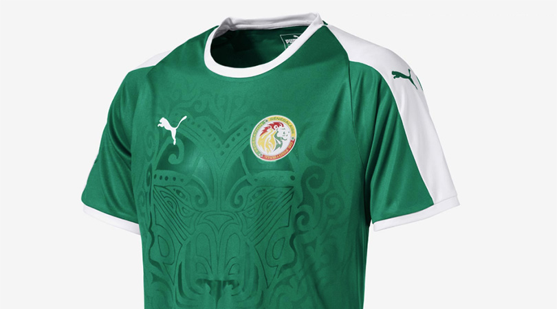
Despite this lush shade of green, Senegal’s home kit – yes, one of Puma’s white ones – does the central design better.
19. Argentina, away
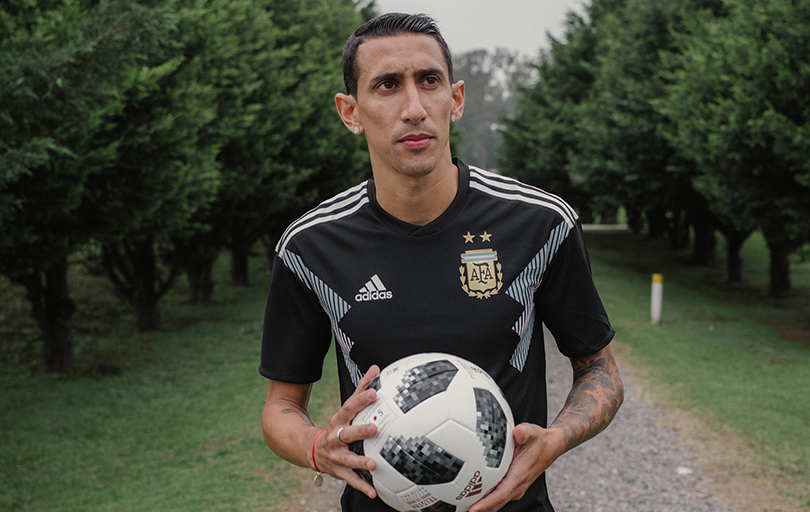
It took long enough, but we’re starting to get into some properly good football kits. This is an attractive design, based on Argentina’s 1993 change strip, and it’d be higher in this list if the blue wasn’t too pale (as on the home shirt) for a kit that’s 99% black from head to toe. It’s not on a par with the identical effort Nike made for Colombia’s home kit, anyway, even if we’d happily wear it.
18. Mexico, home
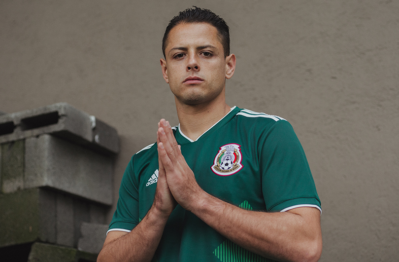
Adi’s three diagonals are inverted to good effect, thought the best part of this ensemble is the colour matching. Top CMYK work, people.
17. Senegal, home
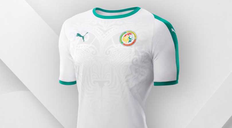
It’s not as good as the Lions of Teranga’s previous shirt, which featured a big cat’s gaping maw preparing to swallow Sadio Mané’s squad number, but the stylised lion sits nicely here.
16. Croatia, home
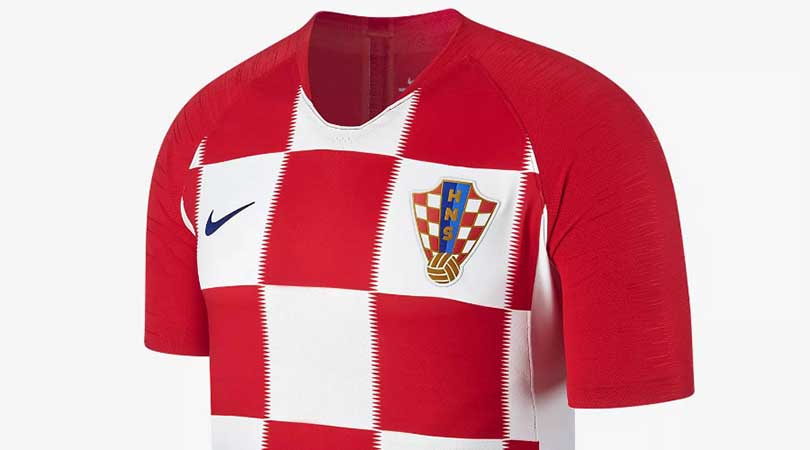
Vatreni topped our Euro 2016 rankings with a billowing, swirly thing that made us ask, “Trouble is: how can Nike top it?” Well, they can’t. This effort falls down in comparison as the squad number sits far too low, hidden up Luka Modric’s armpit as a result of gigantic squares limiting space for Nike’s swoosh. Plus, the fuzzy lines make our head hurt. It’s impossible to make an ugly Croatia kit, mind, and overall this is still a good ’un.
15. Serbia, away
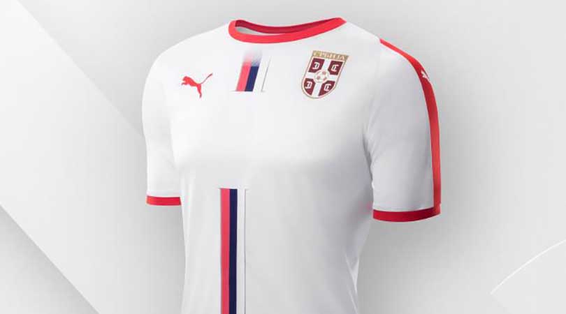
Simple yet stylish, using only Serbia’s flag as inspiration, it proves Puma could have made each of those white away kits unique even when there isn’t a massive lion to stick on it.
14. England, away
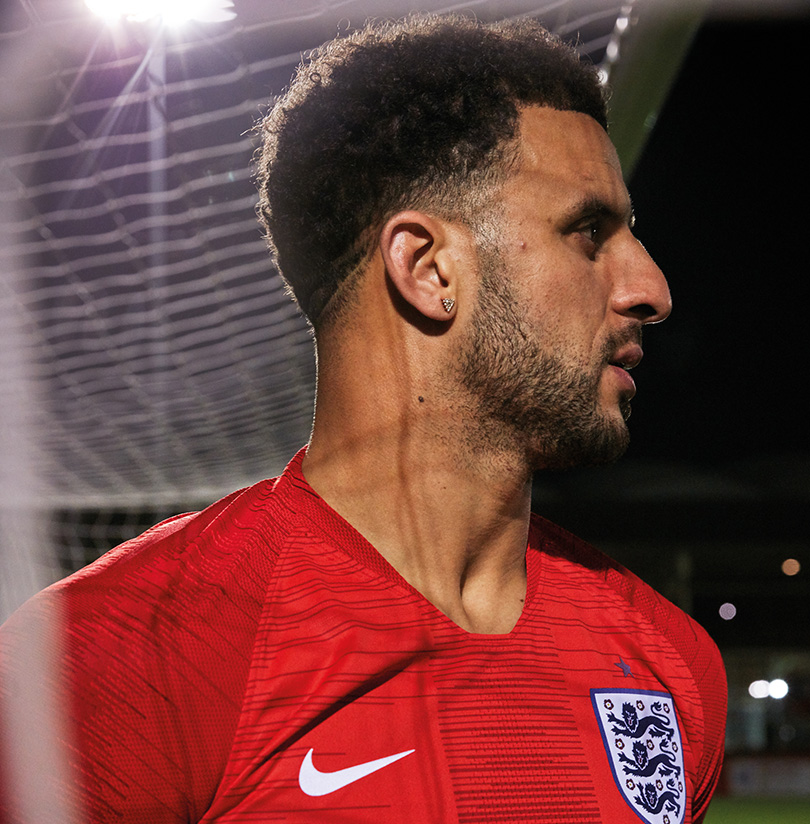
This isn’t overwhelmingly popular (not that any England kit ever is these days) but it’s a strong number. Red suits England better than blue and, most impressively, Nike approached St George’s Cross with the right amount of subtlety – it’s easy to imagine this kit having gone full Hard Brexit.
13. Germany, away
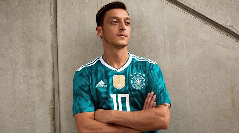
Now this is retro. We applaud the intent, and to an extent the execution as well, but here’s a question: was this ever a good kit to begin with? And don’t get us started on the font Adidas are inflicting on several of their teams. Still, you can see why this kit is a hit.
12. Uruguay, home
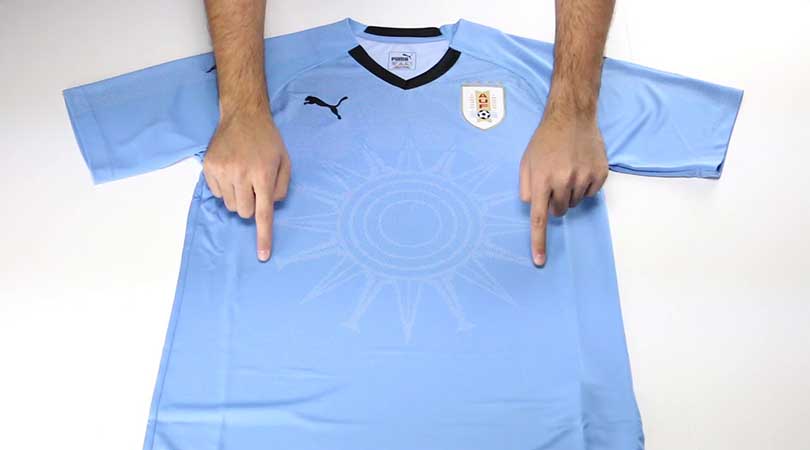
This is good from Puma: simple, eye-catching and featuring a sun graphic inspired by Uruguay’s Sol de Atlantida monument… or possibly just, y’know, the sun.
11. Brazil, away
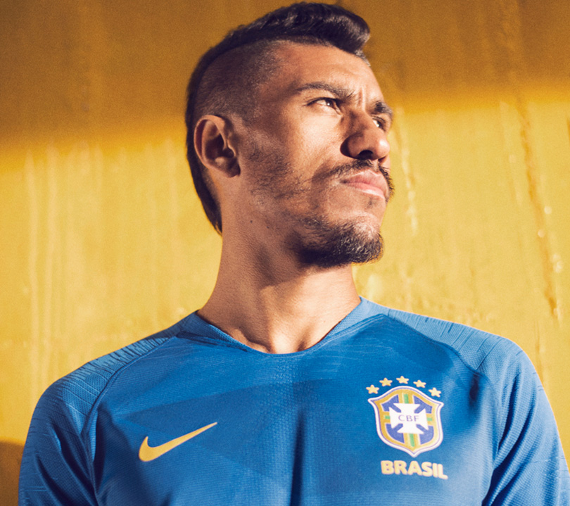
Yep, this is how a Brazil away kit should look.
10. Spain, home
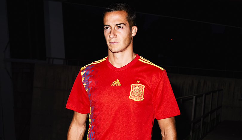
Hoo boy, the ’90s really are back, aren’t they? Spain’s home shirt is modelled on the one they wore at USA '94, and although it’s unnoticeable from one side, the look front-on is swish. The Adidas logo moving centrally to accommodate this design feature gives an asymmetrical feel as it sits close to Spain’s very large crest, but we’re quibbling, really.
9. South Korea, away
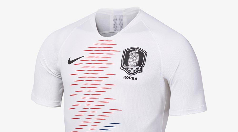
Most kits near the top of our rankings have made a bit of noise on social media; this, however, has made about as much impact as a referee telling Sergio Ramos to behave. That’s a shame, because South Korea’s second kit is subtly sublime. Nike have borrowed the national flag’s Taegeuk iconography and turned it into a beautiful wave pattern.
8. Brazil, home
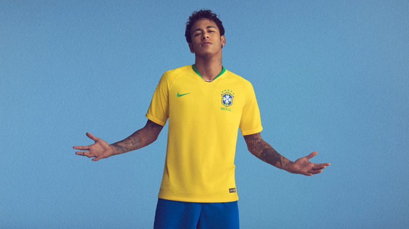
Proving once again that simplicity is often the best approach, Nike have done little with Brazil’s legendary uniform except to brighten its yellow shade a touch, making it stand out even more. You can imagine this being worn on five-a-side pitches in years to come.
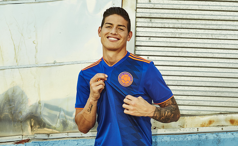
Inspired by their orange kits of the ’70s and ’80s, only with the contrast turned up to 11, Colombia’s away kit takes their regular blue back-up and goes supernova with it. The colour matching is perfect, and we especially like the vertical print that is apparently (come on, we can’t know everything) a nod to the mulera – a scarf worn over the shoulder by Colombia’s coffee growers; Los Cafeteros being the Colombian national team’s nickname. All in all, it’s a strong look.
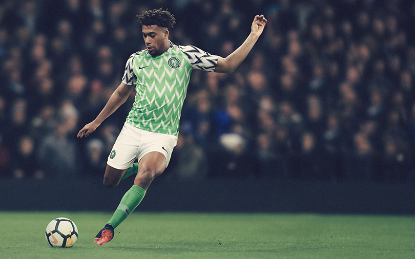
Wow. This is quite something. Nike say this design “pays subtle homage to Nigeria’s ’94 shirt, worn by Nigeria’s first team to qualify”; we say that’s a generous interpretation of the word ‘subtle’.
There’s a hint of false memory about this, though, because the model in question was worn later in 1994, after the World Cup, including in a match against England that saw Neil Ruddock win his only cap (not for Nigeria, obviously). The Super Eagles’ USA '94 kit was plain green with a weird white cowl thing. So we have to ask: if this new effort is only loosely inspired by days gone by, did they have to combine the lush pale green of the torso with the “eagle wing-inspired black-and-white sleeves”, making the shirt look like a cut-and-shut of two cars with equally bonkers owners?
It is bloody good, though. No wonder it’s broken pre-order records.
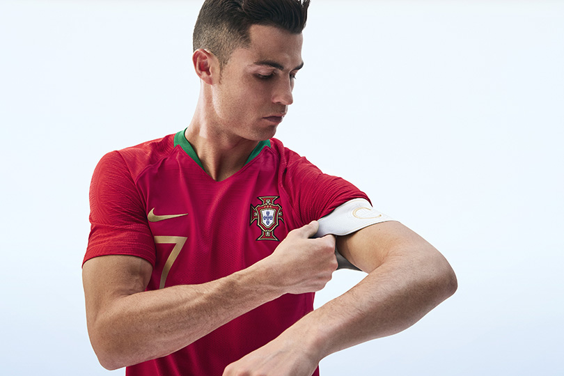
We like this a lot. The colours are rich, with Nike’s Vapor sleeve template design working particularly well in these hues, and the silly breastplate worn at Euro 2016 is gone. The gold metallic trim looks fantastic, too, even if the designers say it’s there to symbolise royalty because “Ronaldo is a Portuguese hero and we wanted to tell the story of the modern king of football leading this new team”. Yuck.
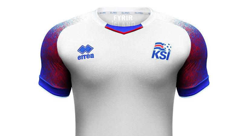
With great sadness, we had to put Iceland second-last in our Euro 2016 countdown. This time, however, Errea have really come up trumps. The sleeve design here is sex on legs – well, arms – with the merging colours representing fire and ice, one melting the other.
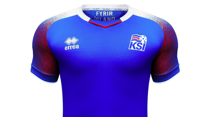
It’s the same, yet somehow even better.
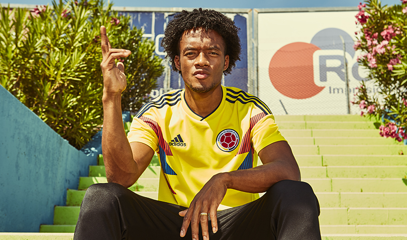
Yes please. Other Adidas countries have borrowed heavily from this design (*cough* Argentina *cough*) but truly it belongs to Colombia, as a virtually identical remake of their Italia '90 shirt worn most famously by one Carlos Valderrama. And the only significant change – besides the shoulder stripes being navy blue instead of red – is an improvement, as the yellow socks of old become red in order to perfectly represent the Colombian flag: from top to bottom, yellow, blue and red. Exquisite.
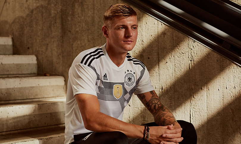
Logically, this doesn’t work. The lettering for players’ names is horrific, as we discussed earlier, and horizontal stripes force the squad number down to an unhelpfully low position. Won’t somebody think of the commentators?
On the other hand... just look at it. Gaze upon this wondrousness, then shield your eyes from its celestial beauty. It’s retro yet modern, busy yet clean, and based on a previous classic (Germany’s 1990 shirt, which featured the flag’s colours of black, red and yellow rather than this monochrome interpretation) yet instantly iconic in its own right.
It is a kit made for the world champions.
World Cup Wonderland: stories, interviews and more
Huw was on the FourFourTwo staff from 2009 to 2015, ultimately as the magazine's Managing Editor, before becoming a freelancer and moving to Wales. As a writer, editor and tragic statto, he still contributes regularly to FFT in print and online, though as a match-going #WalesAway fan, he left a small chunk of his brain on one of many bus journeys across France in 2016.
