Ranked! Every Euro 2024 kit, from worst to best
We rank every Euro 2024 kit set to be worn in Germany this summer - from the repulsive and rancid to the pieces of literal art...
36. Poland Home

For some, this shirt is a beauty; for others, it just doesn't cut it whatsoever. The white and red combination is sharp, while the centralised Nike logo and Poland crest keeps things working seamlessly together.
However, there's a lack of innovation, looking, well, exactly as you'd expect from a Poland home kit. Shame.
35. Slovenia Away
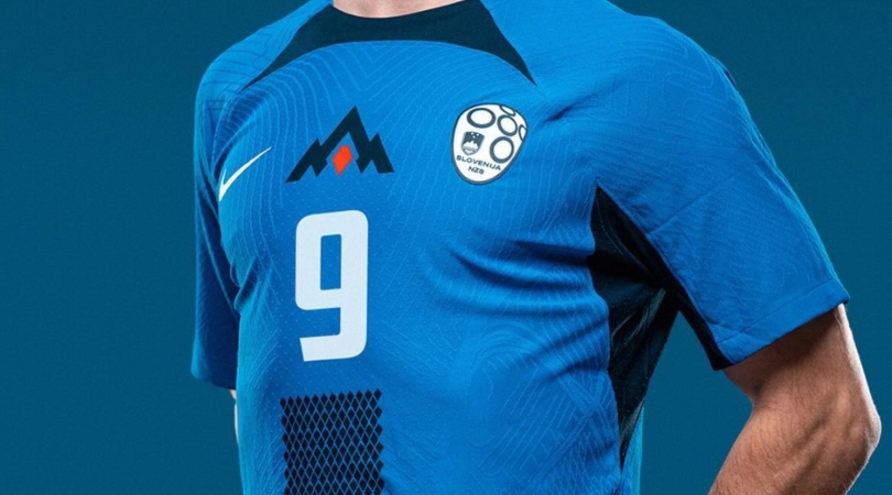
We're really not sure the combination of blue and navy works here, especially when placed onto a Nike template that incorporates a rather garish collar. The pattern of tiny diamonds moving vertically down from the chest to the base of the shirt adds something different at least, but the colourway is what lost the majority of the points from our judges.
34. Switzerland Away
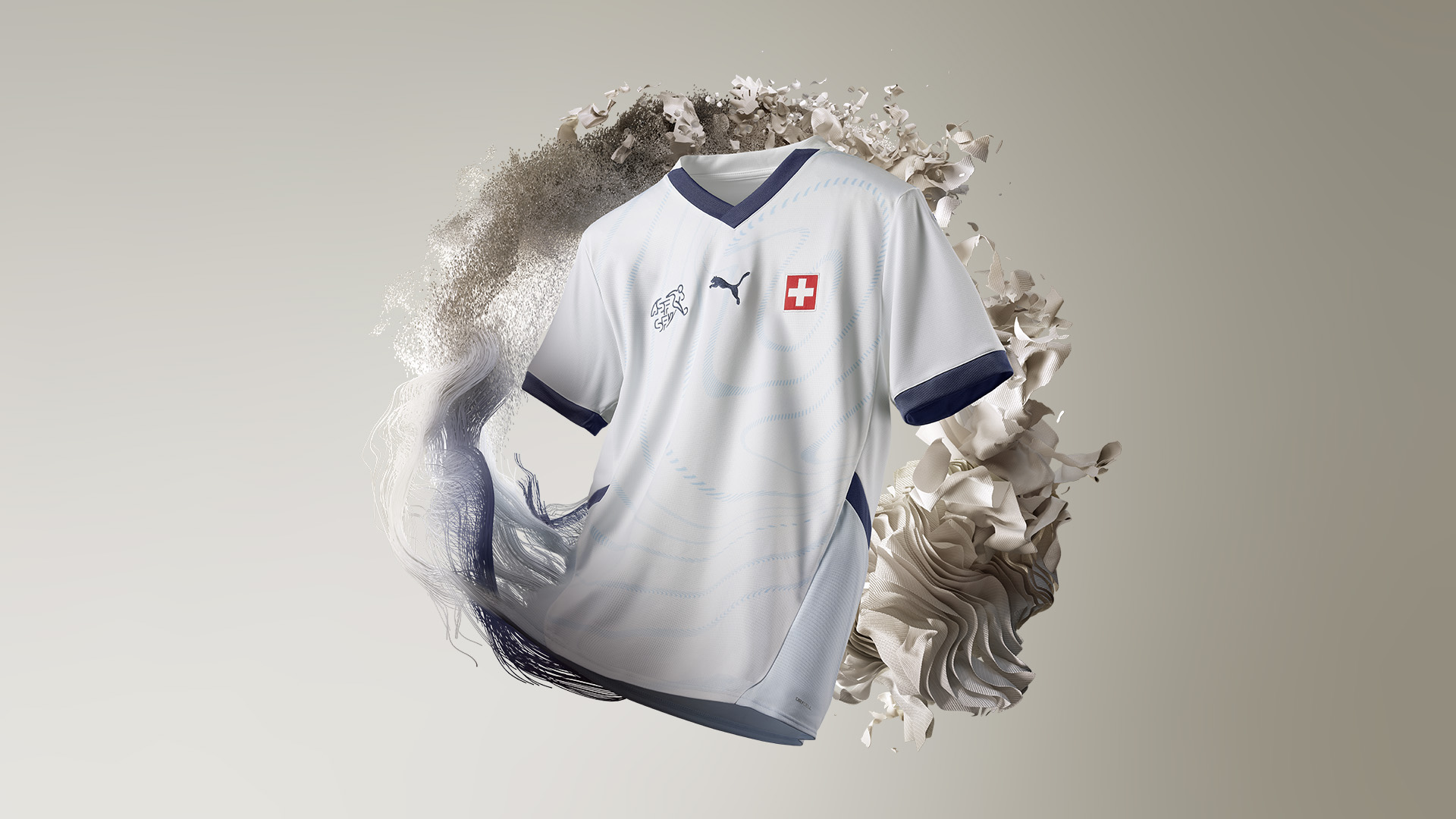
Arguably a little too subtle for its own good, the Switzerland away kit has some good qualities - the navy, white and light blue coupled with the minute detailing - but it failed to capture the attention of our judges on the whole.
Mostly fours and fives were awarded, though it did receive an optimistic seven to prove it's not all bad.
33. Czech Republic Away
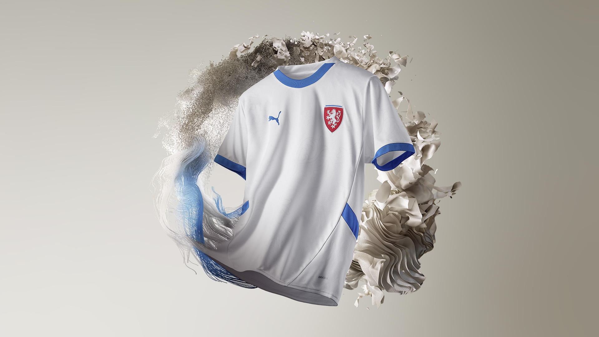
Looking two decades out of date, the new Czech Republic away kit looks a bit too nice and friendly for a nation that utilises a sharp red for their home kit. The white is fine, but the light blue accents don't seem to quite work, seeing a range of scores five and below.
32. Albania Away

Without the red emanating from the Albania crest, there's no question this kit would've scored a lot lower. It's fine, but the white and black template is a little uninspiring, especially when considering it takes the exact same design as the home shirt.
Get FourFourTwo Newsletter
The best features, fun and footballing quizzes, straight to your inbox every week.
More of that later, though...
31. Scotland Away

Hmm, "almost blue" and purple is a brave choice for the Tartan Army, and we're unconvinced it works all that well. The side panel pattern works tremendously, but the colour choice is certainly an intriguing one - especially when Adidas claims it's inspired by a previous Scotland kit. Which one, though, we're not sure.
Mostly fours and fives as scores here.
30. Georgia Home
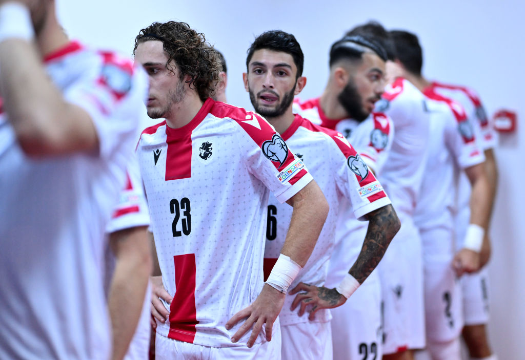
Competing in their first-ever international tournament, Georgia will have the eye-catching red cross adorning their shirt, inspired by the nation's flag and replete with sublte bolnur-katskhuri crosses throughout.
The kit's overall score was negatively impacted by the 1/10 it received by one judge. The Caucasas nation will hope to sore their eyes some more by reaching the knockout stages against all odds.
29. Serbia Home
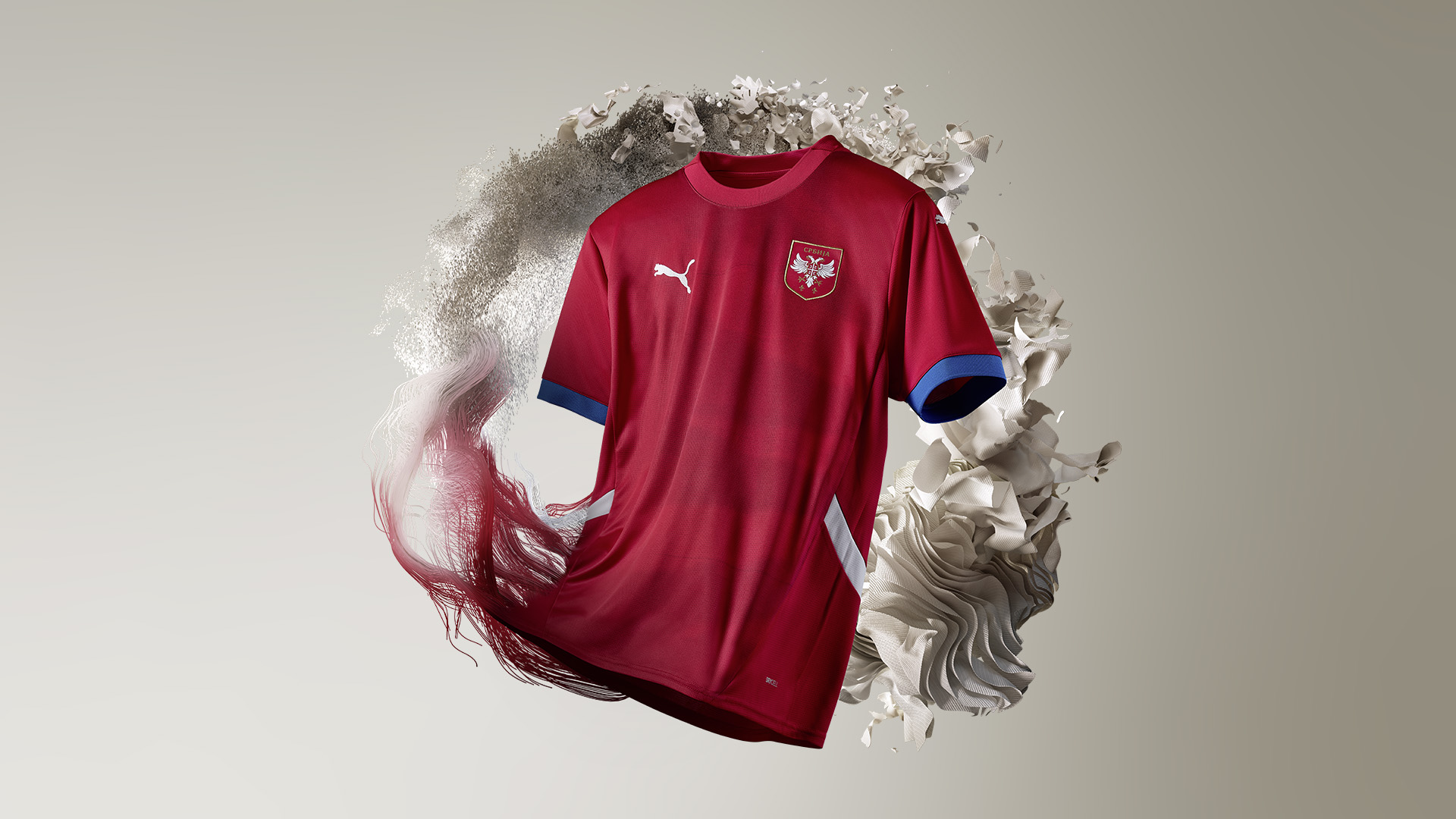
While most sides who wear red play in a vibrant, popping colour, Serbia opt for a deeper red to intimidate opponents, while the shirt features eagle wings spreading across it, too.
Despite these features, all judges though the kit was decent, nothing more, nothing less.
28. Hungary Away

There's no question: this ranking seems harsh. Sure, Adidas are using the same template a lot of other nations have been handed for this tournament, but the colours on this occasion work together in great harmony. The majority of judges weren't fans of the green and red accents, however, which sit atop the white base to mimic the colours of the Hungarian flag.
27. Albania Home

The dark red base is certainly intimidating, while the black collar ensures the Albania home kit is a smart option for players and fans alike to wear. One gripe we had with the kit, though, was the Macron logo coming in white, detracting from the overall aesthetic of what would otherwise be a sound design.
26. Slovenia Home
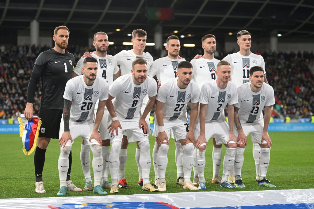
In the exact same template design as the away shirt, it's perhaps a surprise to see the Slovakia home kit reach so high on this list. The white and black works a lot better than the blue and black on the away, though, and the pattern utilised is actually quite interesting.
It'd be interesting to see how this would've been scored if the away kit didn't follow the same template.
25. Croatia Away

In previous years, the Croatia away kit has been where Nike experiment with a slightly whackier version of the nation's home kit, an alternative that plays on the checkerboard flag in a blue variation.
This time around, though, there's not as much innovation. The checkboard remains, though with two different tones of blue that barely stand out against one another - let alone when placed under the floodlights at a stadium. Modric deserves better, according to our judges.
Current page: Ranked! Every Euro 2024 kit: 36-25
Prev Page Ranked! Every Euro 2024 kit: 48-37 Next Page Ranked! Every Euro 2024 kit: 24-13
Ryan is a staff writer for FourFourTwo, joining the team full-time in October 2022. He first joined Future in December 2020, working across FourFourTwo, Golf Monthly, Rugby World and Advnture's websites, before eventually earning himself a position with FourFourTwo permanently. After graduating from Cardiff University with a degree in Journalism and Communications, Ryan earned a NCTJ qualification to further develop as a writer while a Trainee News Writer at Future.
- Mark WhiteContent Editor
- Adam Clery
- James AndrewEditor
- Ed McCambridgeStaff Writer
