Ranked! Every kit at Euro 2016: which gets your vote?
Huw Davies gets square-eyed in the name of football fashion…
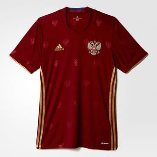
48. Russia, home
Adidas have made some cracking kits for Euro 2016, and we’ll be waxing lyrical about them later, but Russia’s home top isn’t a patch on their swish away number. The crest imprint belongs on the wallpaper of a film noir brothel.
47 & 46. Iceland, home and away
Nobody is more excited than FFT to watch Iceland take on nations 20 times their size, but we wish they wouldn’t do it wearing shirts with weird collars made worse by Comic Sans-like lettering on the inside.
: reveal new kits for . Read more: March 2, 2016
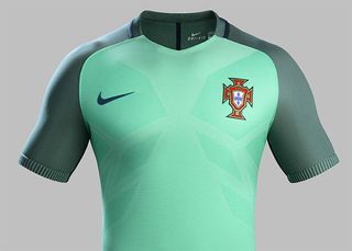
45. Portugal, away
We’d love to know what Cristiano Ronaldo thinks of this hue. It somewhat undermines the breastplate’s intended intimidating effect.
44. Romania, home
Get FourFourTwo Newsletter
The best features, fun and footballing quizzes, straight to your inbox every week.
“Carl! Romania called – they need a new strip in time for tomorrow’s launch. I’ve just about got the collar sorted, although it’s a bit tight; do we have any material left for the rest of it? What do you mean, ‘just yellow’? How much yellow?”
Home & Away Kits March 23, 2016
43. Romania, away
“Oh, now you find another colour. All right, this’ll have to do. Let’s just hope they don’t face Ukraine or Sweden. No, Carl, for the last time: Brazil won’t be at the European Championship...”
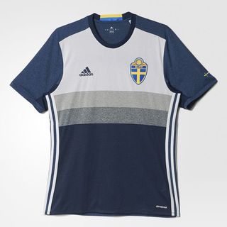
42. Sweden, away
We applaud the intent to do something different, but this looks like a training top – albeit a durable one. You’d take it to the gym, anyway.
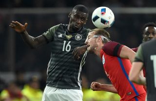
41. Germany, away
Speaking of training tops, this literally is one. Germany’s reversible away shirt, worn against England, doubles as a practice bib. Full marks for innovation; fewer marks for colouration.
40. Italy, home
A classical style suits the Azzurri, but there’s something not quite right about the pinstripes, restricting collar and wavy midriff pattern. Wait until you see the away kit, though – it’s bellissimo.

39 & 38. Albania, home and away
It isn’t easy to design a minimalist two-headed eagle to be fair, but these panels looks less like Albania’s emblem and more like the Millennium Bug. The home (red), away (white) and third (black) strips are near-identical in design, down to the unusual “Korean collar”.
Football Federation of New Official Kits January 31, 2016
37. France, home
We’re big fans of Nike’s cross-brand matching of shirt and short colours (e.g. England), but France belong in a top-to-bottom Tricolor, dammit. Still, it’s a nice shade of blue, paler than previous jerseys.
The new France Euro 2016 Home Kit introduces a modern design for the hosts of the Euro 2016, released on March 17. March 20, 2016
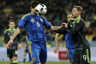
36. Ukraine, away
Tartan was born beside the Black Sea – who knew?
35. Czech Republic, home
We’re torn on this kit (probably because it’s so tight). The shading is nice, as is the central positioning of the crest, but the overall feel is that of a base layer rather than a football shirt. And why are those chevrons pointing so suggestively south?
Czech Republic EURO 2016 PUMA Home Kit - November 10, 2015
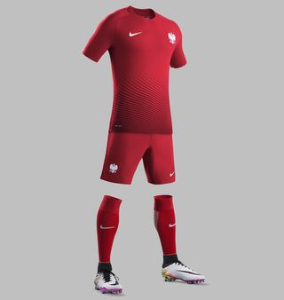
34. Poland, away
This change strip is slick and tidy, not unlike the team. However, it’s perhaps in need of white shorts to offset the strong colour and assert Poland’s identity.
33. Ukraine, home
Eye-catching cross-hatching suits Ukraine’s regular uniform better than their blue away top, though we’re not sold on buttons adorning a football kit. And if you disagree, Crimea river. Eh? Eh? Oh, never mind.

32. Republic of Ireland, away
The FAI and Umbro released a new change strip at the behest of supporters, and they seem happier with this refined if routine effort than the "charcoal, white and green gecko" hues of the previous away shirt.
The new Ireland away strip. April 29, 2016
31. Slovakia, home
Sharing the midriff wave and thick hoops of Puma stablemates Italy and Switzerland respectively, with a swooping collar to boot, this feels a little unfocused.
Slovakia EURO 2016 PUMA Home Kit - November 12, 2015
30. Czech Republic, away
We challenge you to be excited by this kit.

29. Germany, home
Ditto. Die Mannschaft must have a sober home kit, of course, but without striped sleeves (Adidas have moved them to the flanks on several of their designs) it’s oddly drab – or classic, depending on your tastes.

28. Wales, away
And here’s why many supporters favour a classic look. Wales fans are divided over this effort. We quite like it, but must deduct points for lacking traditional Welsh colours and – as with the home kit and both of Northern Ireland’s – including a collar that’s simultaneously a V-neck and, when folded back, a crew neck. Odd.

27. Switzerland, home
The three logos battling for space on one stripe is a little undignified (not an issue for the Swiss away kit, higher in this list), although there’s some nice sleeve work on display.
Switzerland Euro 2016 Puma Home Kit Revealed November 9, 2015
26. Slovakia, away
Slovakia suffer the same agonising dilemma: a triple logo melée. On the other hand, the colour balance and barcode effect work nicely.
Slovakia EURO 2016 Away Kit - February 10, 2016
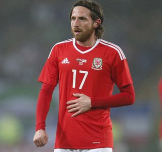
25. Wales, home
Welshmen were much happier with this classic design. Timeless, certainly, but it doesn’t set our pulses racing – plus the reversion to white shorts is a shame.
24. Republic of Ireland, home
Umbro have gone all out, with orange trim and a Gaelic-style font. Shame about the collar, which looks out of place.

23. Portugal, home
Unfussy if unspectacular, Portugal’s home strip features a smooth green stripe continuing from shirt to shorts. As with their change strip, however, the breastplate motif is a bit invasive.

22. England, away
England’s second kit is similar to Portugal’s first, but with a more pleasing – if not particularly English – colour combination.

21. Sweden, home
It’s nice enough, but misses Adidas’s traditional shoulder stripes.
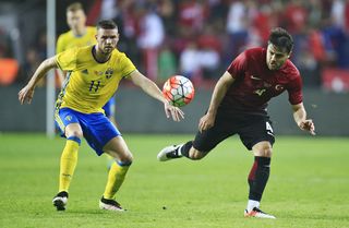
20. Hungary, away
That’s more like it.
ハンガリー代表 ユーロ2016 ユニフォームUEFA EURO 2016で着用する新ユニフォーム March 21, 2016
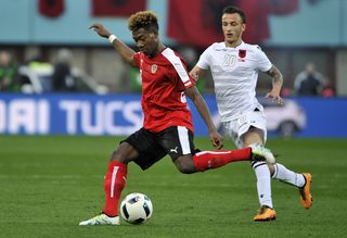
19. Austria, home
Different without being distracting, this is a solid effort. We especially like the Austrian flag adorning the sleeve ends.
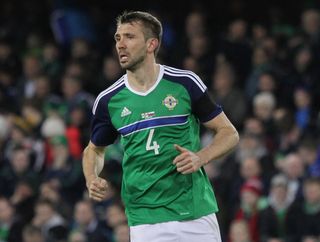
18. Northern Ireland, home
A.K.A. The kit that split a nation. Several thousand Northern Ireland fans signed a petition to change what’s seen as an overly blue affair. Predictably, FFT disagrees. In short: we like it. Sorry, chaps.
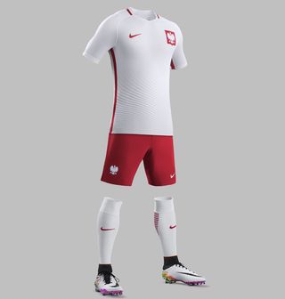
17. Poland, home
The thought of Polish football evokes memories of Grzegorz Lato and Zbigniew Boniek, and they’d be proud to wear this number. It’s classical yet… what’s a posh word for ‘swirly’?
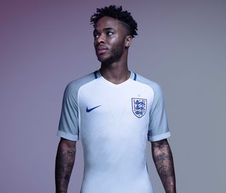
16. England, home
Nike’s decision to tear up the rulebook and design matching shirts and shorts with different socks pays off here. Bar one-off games, England haven’t played in white-white-red before. Better late than never.
15. Hungary, home
Attractive collar + attractive colour contrast = attractive kit.
ハンガリー代表 ユーロ2016 ユニフォームUEFA EURO 2016で着用する新ユニフォーム March 21, 2016
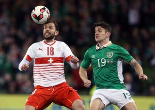
14. Switzerland, away
The hooped socks are an acquired taste, but the top is delectable. The Swiss flag’s imprint on that central bar works perfectly.
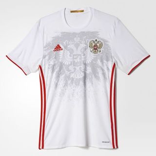
13. Russia, away
This huge improvement on Russia’s home kit shows how you should imprint a crest on a football jersey. Very nice, if a little t-shirty.
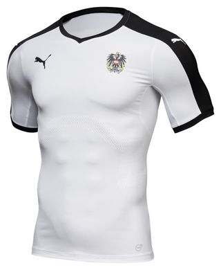
12. Austria, away
Classical, refined, unassuming – it’ll fit Marko Arnautovic perfectly.
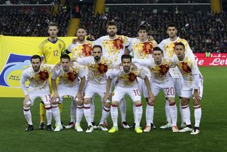
11. Spain, away
Call us crazy, but this is great: daring, vibrant, reminiscent of USA 94 and memorable – definitely memorable. The only problem is that, like the Russian away shirt, the pattern seems more suited to a t-shirt.
10 & 9. Turkey, home and away
Oh wow. Now, it’s possible that after so many designs FFT is imagining seeing-eye puzzles, but if these are real then hats off. These are fine, fine football kits; the home one even works as a Spider-Man costume.


8. Northern Ireland, away
If the home kit splits opinion, this is a surefire winner. With two-tone green shading and simplicity of design, it’s an understated gem, right at home in Norn Iron’s historical kit canon. It’s just that double collar…

7. Spain, home
Spain’s home jersey incorporates the away shirt’s triangles (a tribute to their passing game, perhaps) with just a touch more subtlety. And, despite featuring four colours, the whole ensemble isn’t too busy. Yes, we used the word ‘ensemble’ – what of it?

6. Croatia, away
What is it about the blue tones of Croatia’s away kits that makes them look so good? This is a beauty, even by their own high standards.

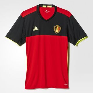
5. Belgium, home
This typically strong Belgian effort gets every shade perfect, and demonstrates well why Adidas changed the positioning of their stripes. There’s a lot going on – the back looks very different from the front – but it’s one of the best home kits at Euro 2016. Even Marouane Fellaini looks good in it… ish.
4. France, away
Oh, j’aime ça. The Tricolor is back – or more specifically, on the shoulders. Beautiful. In fact, looking at this kit actually makes us a bit emotional. Moving on…

3. Italy, away
Italy’s home kit may not be ‘quite right’ but their change strip more than makes up for it. The central crest, the use of the Italian flag, the subtle sleeves – mwah. It even makes V-necks look good.
Italy Euro 2016 Puma Away KitPics: September 9, 2015
2. Belgium, away
Great football kits are rarely inspired by cycling jerseys. Do correct us if we’re wrong. Adidas, however, cocked a snook to us doubters with a sublime away kit for Belgium’s Euro 2016 campaign, in a nod to the country’s proud history of being quite good on two wheels. It’s superb.

1. Croatia, home
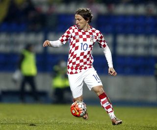
It shouldn’t work. It just shouldn’t work. The wavy pattern, the blue stripe, the chequered socks (oh, the chequered socks)… yet it does. Croatia’s home kits always look gorgeous, but the billowing flag effect somehow improves upon perfection. Trouble is: how can Nike top it?
Huw was on the FourFourTwo staff from 2009 to 2015, ultimately as the magazine's Managing Editor, before becoming a freelancer and moving to Wales. As a writer, editor and tragic statto, he still contributes regularly to FFT in print and online, though as a match-going #WalesAway fan, he left a small chunk of his brain on one of many bus journeys across France in 2016.

‘The fact he’s on a short deal doesn’t sit well. Gareth laid the foundations for players coming through. All Tuchel’s got to worry about is the here and now’: England hero lays out his issues with Thomas Tuchel appointment

‘England supporters are craving some success. If Tuchel can come in and finish the brilliant job Gareth Southgate started, nobody will care if he leaves’: Ex-Three Lions international gives his take on Thomas Tuchel's short-term deal

