Ranked! Every kit in the Premier League this season from worst to best
How well dressed is your club? Let's sort the honking from the stonking and decide who has the best kit
There are some football fans who believe it doesn't matter what you wear so long as you win. Here at FFT, we don't believe that's true.
A football shirt is so much more than just a piece of clothing to distinguish you from the opposition. Woven into the fabric of a football kit is your club's identity, a cultural DNA; these shirts become synonymous with the icons of the game and so it's important to create postcard images that will stand the test of time.
Yet not all football shirts were created equally. Some this season have been marvellous – others, minging. So we asked our team to rank all 60 tops out of 10, averaging a score for each one. Here's how we ranked each one…
Every kit in the Premier League this season, ranked from worst to best:
60. Wolverhampton Wanderers third
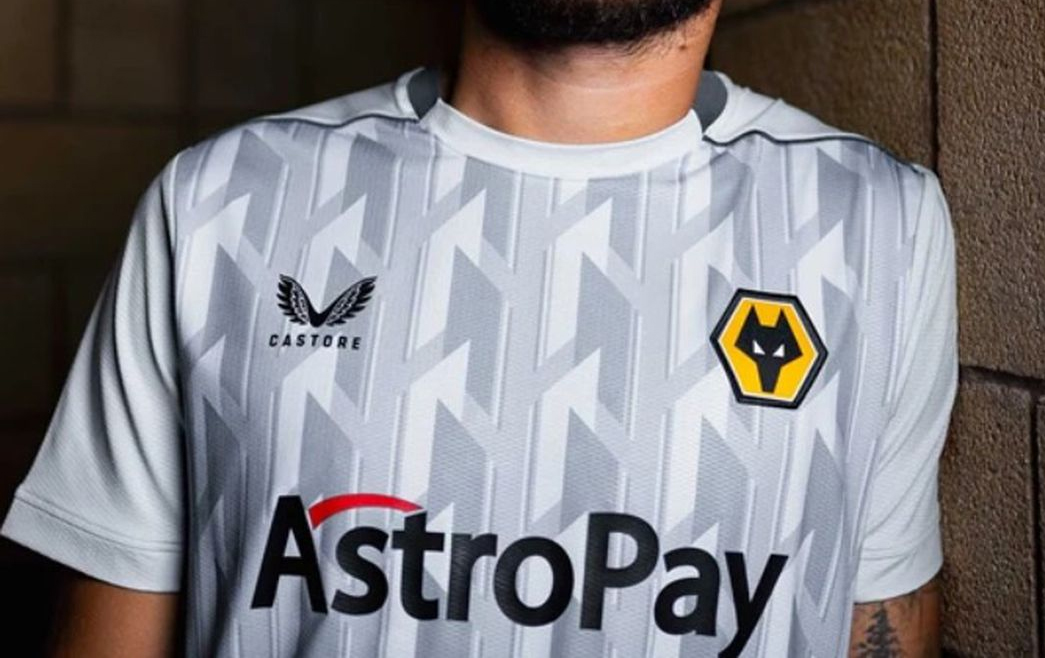
Taking bottom place of 60th out of 60 – we didn't count Newcastle United's special "fourth" shirt – are Wolves, with their gopping grey mess that feels both too loud and extremely dull at once. Recognise that design? It looks like an office carpet.
59. Tottenham Hotspur away

"If you have to ask whether it looks like a wetsuit, it probably looks too much like a wetsuit," came one response on FFT's Twitter account when we asked whether there was a deep-sea diving likeness with the Spurs away shirt. It's not grown on us, either.
58. Manchester United third
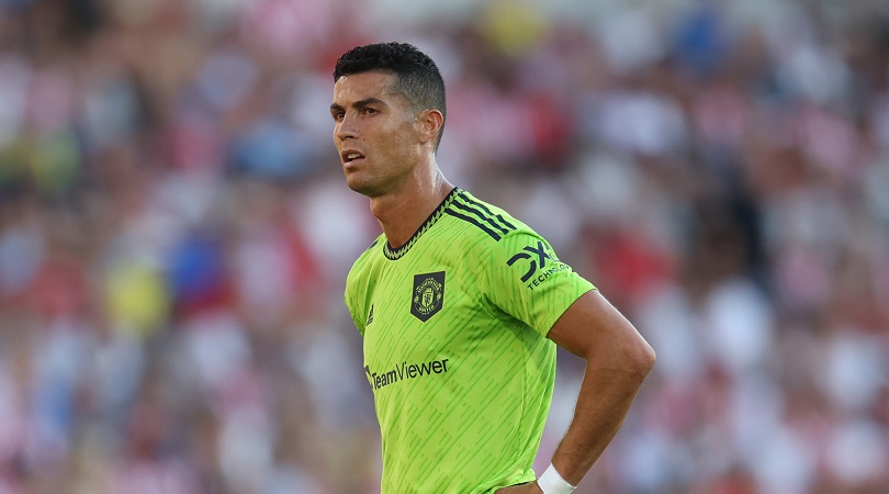
It may forever be associated with that defeat against Brentford. Piccalilli isn't the most flattering shade for a shirt.
57. Leeds United away

Tie-dye isn't cool, lads. This one feels particularly messy, especially in comparison to Leeds' cleaner home and third shirts.
Get FourFourTwo Newsletter
The best features, fun and footballing quizzes, straight to your inbox every week.
56. Chelsea third
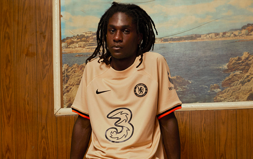
Mysteriously held back until mid-October from a release… and we can sort of see why. Nike labels this one "sesame" in colour and it feels a little cheap. Should be shinier, not this off-gold tint.
55. Everton away
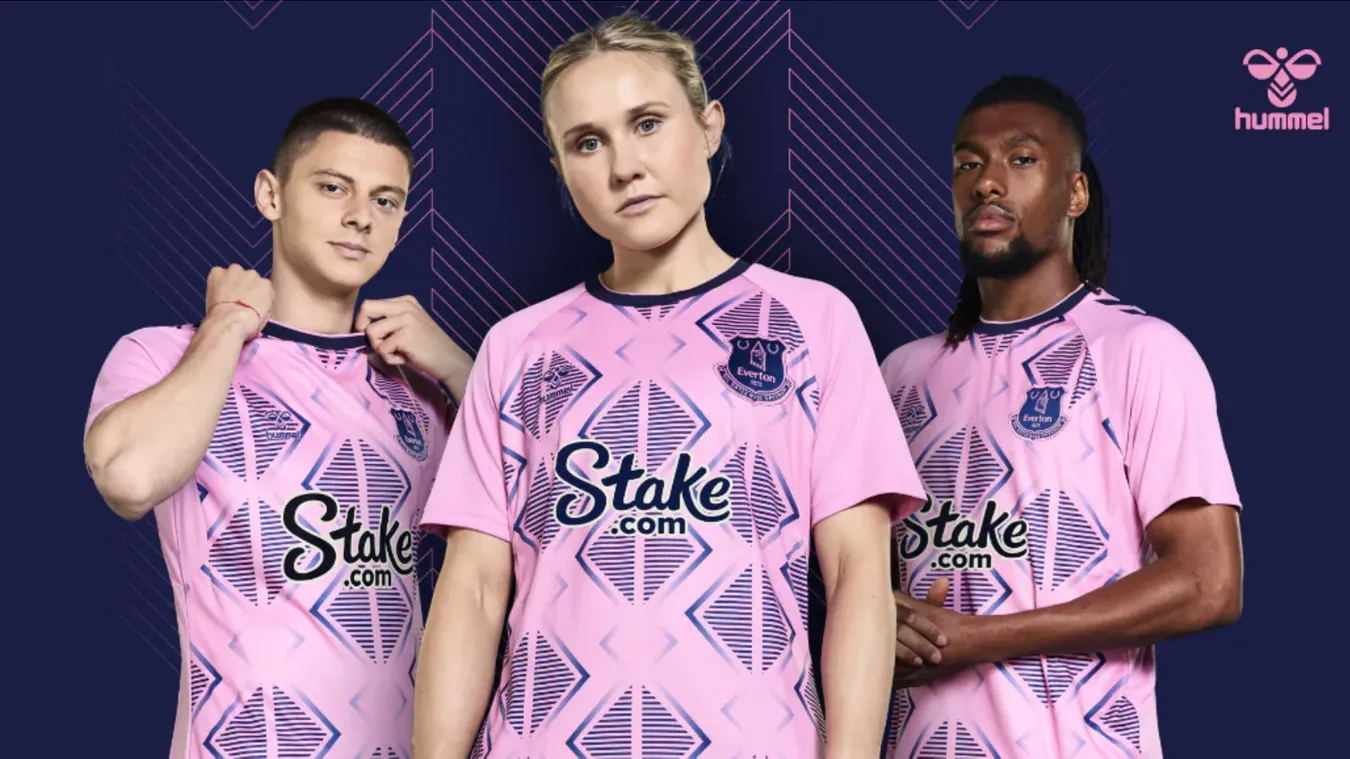
Hummel are usually bang on the money but this one is a little divisive. Light pink with big, navy patterning feels a bit of a strange choice.
54. Manchester City third

Ah, the fluorescent bumblebee look. We're not surprised we've never seen it before and we'll be shocked if Puma ever release a kit in future that harks back to this effort.
53. Leicester City third
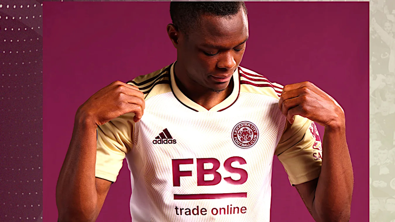
Yellow and white are hard to mix together. Add in some maroon and you've got something particularly difficult to love.
52. Chelsea away
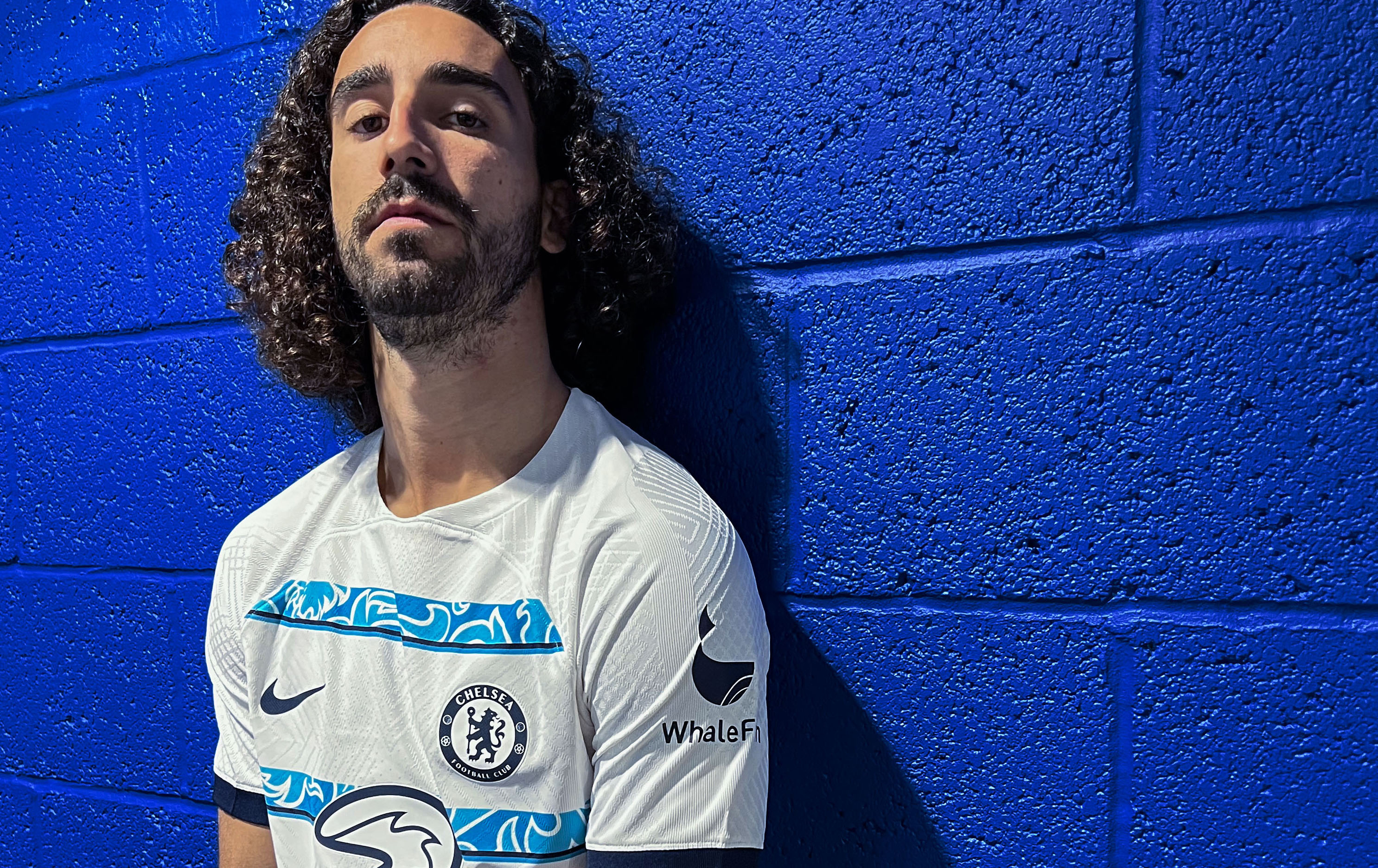
The patterning from Chelsea's home collar appears in horizontal bands on the away shirt this season. The one problem? We don't particularly like that pattern in either instance.
51. Everton third
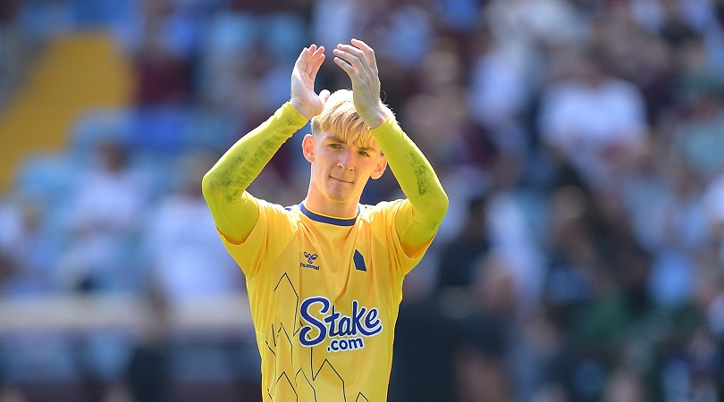
A simplified badge, a relatively minimalist pattern and a nice tint of bright yellow. Everton's third shirt this season is smart, if unbelievably safe. It's not awful – just a little dull.
50. Newcastle United third
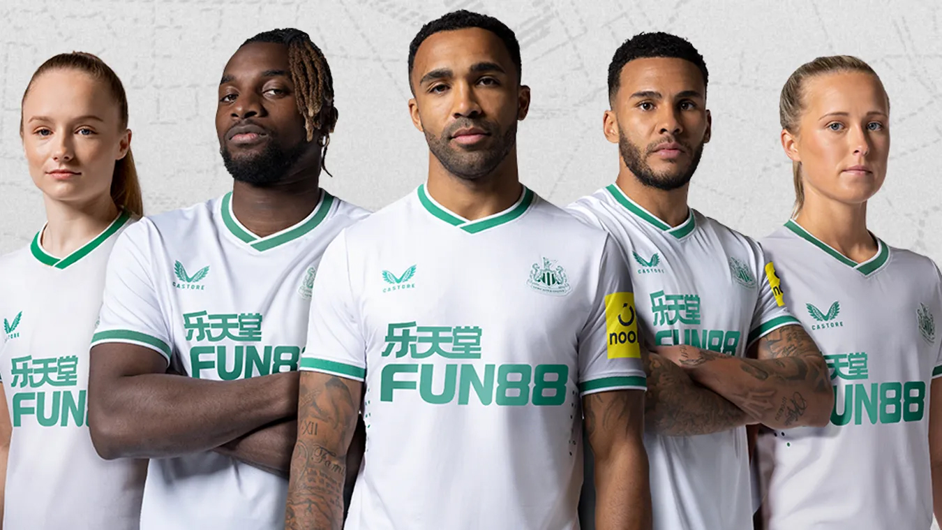
The kit that caused all the commotion in the summer – yep, it's Saudi-coloured – Newcastle's third shirt is a nice enough top if a little boring. And as already discovered against Brighton, it doesn't provide enough contrast to the home. Oops.
49. Leicester City away
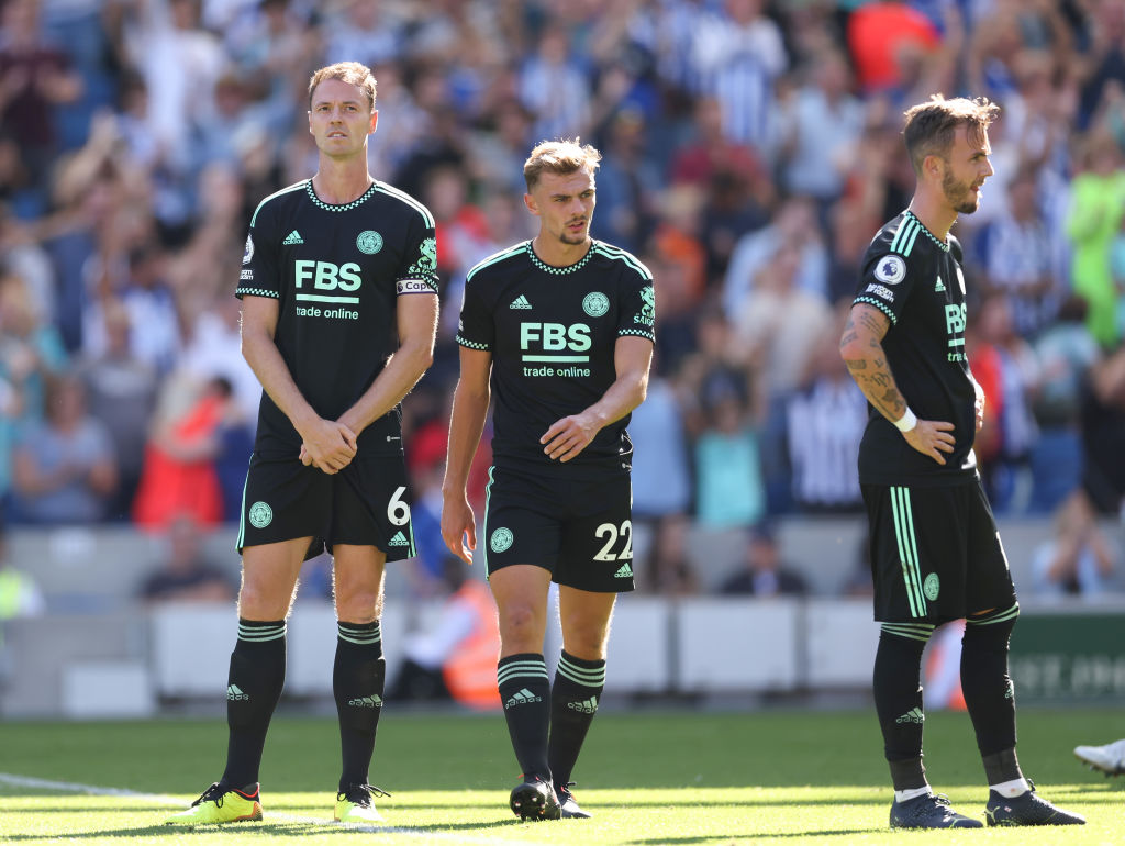
Adidas's Leicester shirts have been disappointing and this is another effort that we struggled to get excited about. Black and pale green isn't the wildest of colour schemes, is it?
48. Wolverhampton Wanderers home
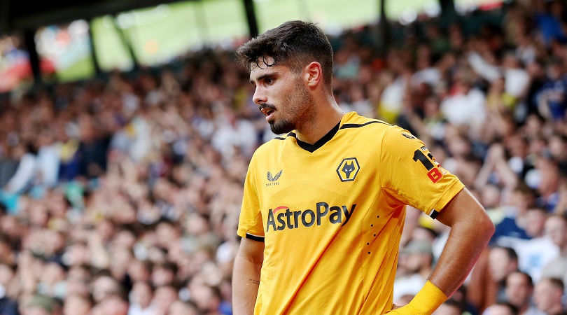
Do not adjust your eyes: the Wolves home shirt has changed from last season. And the one before. You know what you're getting from the Midlands outfit, that's for sure.
47. Leeds United third
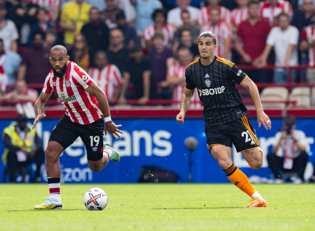
Centred logos, dark grey, a subtly striped pattern and bright orange. It's inoffensive and preferable to the tie-dye but not one we'll remember in seasons to come.
46. Bournemouth third
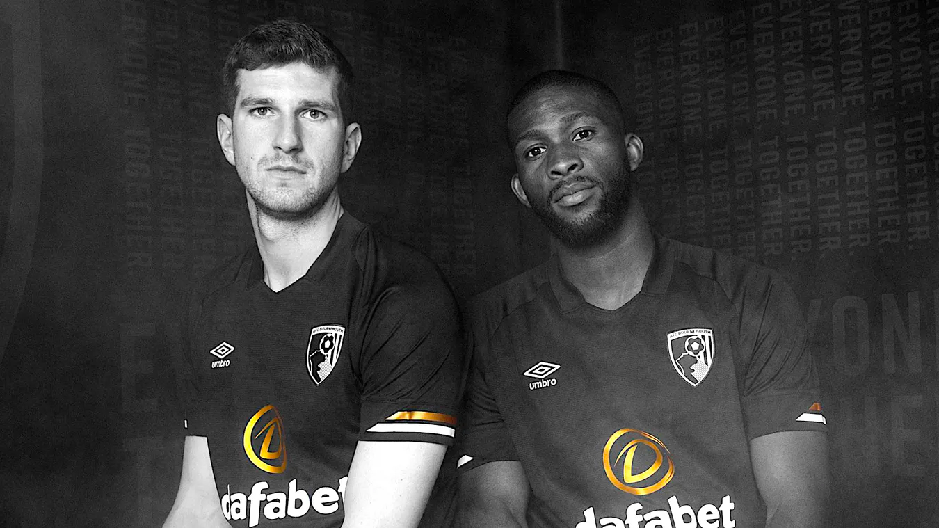
Bournemouth's third shirt is all black with virtually no detailing whatsoever. It's a little generic but good-looking.
45. Liverpool third
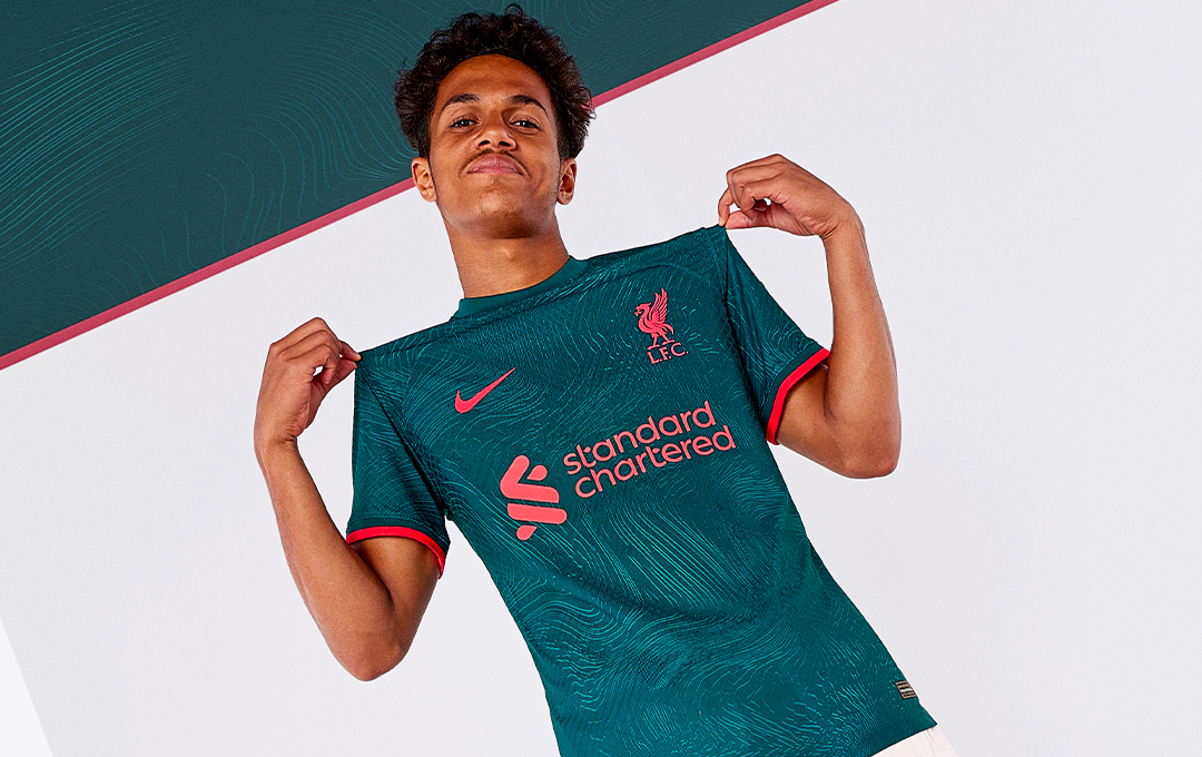
A little marmite. Some will love the teal green and bright reddish-pink, others will despise this colour combo and long for the yellow back from last season.
44. Aston Villa third
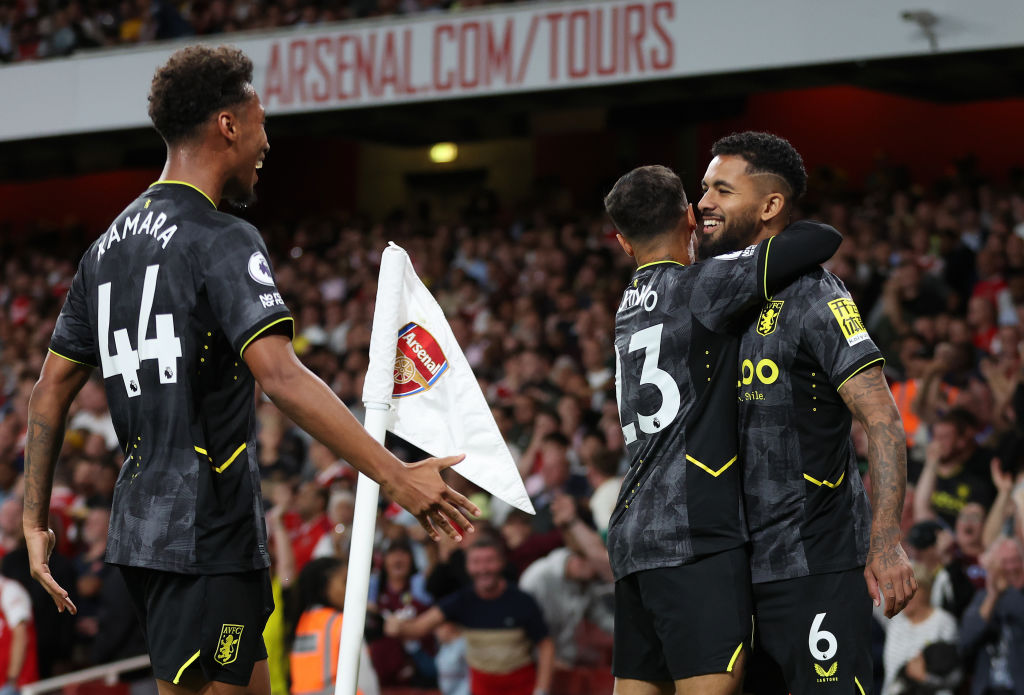
This one is modern and intricate with a deep grey pattern and yellow flourishes. Not the worst shirt out there but nowhere near Villa's nicest this season.
43. Liverpool away
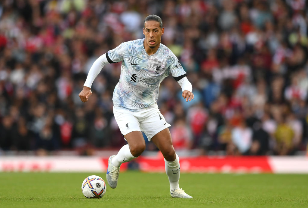
Another that may divide fans, the jazzy, 90s-influenced away shirt is already associated with a couple of painful away defeats. Reds will be hoping some nicer memories are made in this one.
42. Aston Villa home
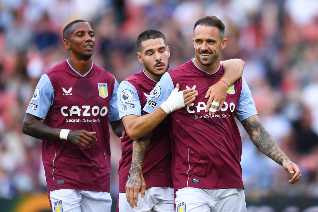
It's classy, it's cool and it's… last year's? Impossible not to like but very unlikely to be anyone's favourite.
41. Aston Villa away

One of our team ranked this as a straight 10/10 for its gorgeous subtle stripes and claret flourishes. Unfortunately, its score was brought down by no one else seeing the hype. At least one of us has your back, Villa fans (and he's a Plymouth fan, so no bias, there).
Current page: Every kit in the Premier League this season: 60-41
Next Page Every kit in the Premier League this season: 40-21
Mark White has been at on FourFourTwo since joining in January 2020, first as a staff writer before becoming content editor in 2023. An encyclopedia of football shirts and boots knowledge – both past and present – Mark has also represented FFT at both FA Cup and League Cup finals (though didn't receive a winners' medal on either occasion) and has written pieces for the mag ranging on subjects from Bobby Robson's season at Barcelona to Robinho's career. He has written cover features for the mag on Mikel Arteta and Martin Odegaard, and is assisted by his cat, Rosie, who has interned for the brand since lockdown.
