Ranked! Every Premier League 2024/25 kit, from worst to best
We rank every Premier League kit this season, from the eye sores to the wonders - and everything in between

Every Premier League kit for the 2024/25 season has been released, so that means just one thing: ranking all 60 of them to discover which are our favourites. Of course, you'll probably have yours - but so do we.
There are some absolute beauties that left the FourFourTwo office sharply disagreeing over, some stinkers that would work better as your nan's curtains, and a good amount looking identical on the same base templates, save for a few colour changes.
Our esteemed team have rated each shirt out of 10, helping yield an average score. What we've been left with is the definitive list of every home, away and third shirt for this campaign…
Ranked! Every Premier League kit this season
60. Chelsea home

There’s a part of us that think Todd Boehly has purposefully ordered the design this season’s worst Premier League kit to take attention away from their transfer market shenanigans, but that would perhaps be giving him too much credit.
While the result looks like a lava lamp has vomited over a perfectly functional blue kit, the marketing men assure us that ‘the melting pot pattern, resembling liquid gold and silver, is a fusion of our rich legacy with the ever-hot youth culture within our city.’
Sigh. And don’t get me started about the fact that you can’t see the badge unless it’s cloudy…
59. Wolves third

FourFourTwo's team genuinely recoiled when this appeared on our phone screen during a late-night doom scroll the other evening.
Get FourFourTwo Newsletter
The best features, fun and footballing quizzes, straight to your inbox every week.
The club may say that this bright purple effort is ‘bold, rebellious and fearless’, but none of our raters can get the 1980s McDonalds character Grimace out of our heads. It’s the stuff of nightmares.
58. Southampton third

Comparing Southampton’s neon pink and yellow kit to Mr Blobby isn’t big or clever, but that never usually stops us.
Saints have gone for the jugular with this effort, and while plenty of teams have been able to make a pink kit look cool, this is not one of those occasions.
57. Leicester City home

One of the first questions any kit designer asks themselves is whether they want to maintain tradition or go for something more outlandish.
Whoever drew up Leicester City’s home kit this season went for the former option, as there is nothing noteworthy about this kit. It’s blue, as it should be, it’s uncontroversial and it’s completely forgettable.
56. Chelsea away

A marked improvement on their home kit, even if this is just a version of the current England shirt that you’ve accidentally put in a high-temperature wash with a pair of black socks. That said, calling this shade of grubby white ‘guava ice’ is a win for the marketing team.
The badge has again been tampered with, but again, not to the egregious nature as on the home kit.
55. Newcastle third

Newcastle have played the retro card here, taking a 1970s club badge and a colour scheme from their 1999/00 away kit to produce something that has a distinctly ‘80s vibe.
A bit too much going on? Perhaps, but we’ll see how it looks on the pitch.
54. Leicester City third

Like the home kit, it’s a simple and clean design, but this one is a lot more distinctive. The tonal retro badge works well and was inspired by the team’s ‘Ice Kings’ side of the 1962/63 campaign that saw the Foxes go on an 18-game unbeaten run during the coldest winter on record.
53. Brighton third

If you think this kit looks familiar, then you’re right, as this is the same strip that Brighton used as their away kit last year.
A commendable move from the Seagulls in an age of spiralling cost of living and over-consumption, although we can’t really put it much higher in our rankings.
52. Manchester United away

Doesn’t scream ‘football kit’, does it? You could imagine Jos Buttler coming out to keep wicket at Old Trafford Cricket Ground for an ODI in this shirt.
Other than that, it’s a fairly inoffensive effort that is likely to sell well.
51. Chelsea third
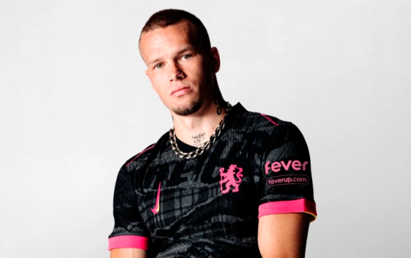
The fact that Chelsea have looked to the 1970s west London punk scene as inspiration for their third kit is mildly hilarious, as the world of American hedge funds and private equality couldn’t really be further away than the movement pioneered by the likes of Malcolm McLaren and Vivienne Westwood fifty years ago.
But then again, isn’t punk all about subverting expectations and deviating from the norm - which is exactly how Chelsea approach the transfer market? Now we’re really confused…
Current page: Ranked! Every Premier League kit this season: 60-51
Next Page Ranked! Every Premier League kit this season: 50-41
Ryan is a staff writer for FourFourTwo, joining the team full-time in October 2022. He first joined Future in December 2020, working across FourFourTwo, Golf Monthly, Rugby World and Advnture's websites, before eventually earning himself a position with FourFourTwo permanently. After graduating from Cardiff University with a degree in Journalism and Communications, Ryan earned a NCTJ qualification to further develop as a writer while a Trainee News Writer at Future.
- Jack Lacey-HattonFreelance writer
- Joe Mewis
