RANKED! Every Premier League kit this season from worst to best
From the honking to the stonking, the trousers to the wowsers, here's a rundown of how we rate every shirt in the Prem this term
The best features, fun and footballing quizzes, straight to your inbox every week.
You are now subscribed
Your newsletter sign-up was successful
Want to add more newsletters?
Join the club
Get full access to premium articles, exclusive features and a growing list of member rewards.
There are some people who say that it doesn't matter what your team wears, so long as they win.
Boo to that, we say. Of course it matters. A football shirt has so much culture and identity in it; it can tell a story, inspire or just make you feel better about your team. It might be the reason you support them in the first place.
Some of these shirts will go on to become classics in the genre. We may look back in years to come at some of these tops as being the peak of that club's style.
Article continues belowWell we sat our writers down to rate each one out of 10, before working out a mean and mode to sift through all 60 of the Premier League shirts for this season. Here's our least favourite through to our most.
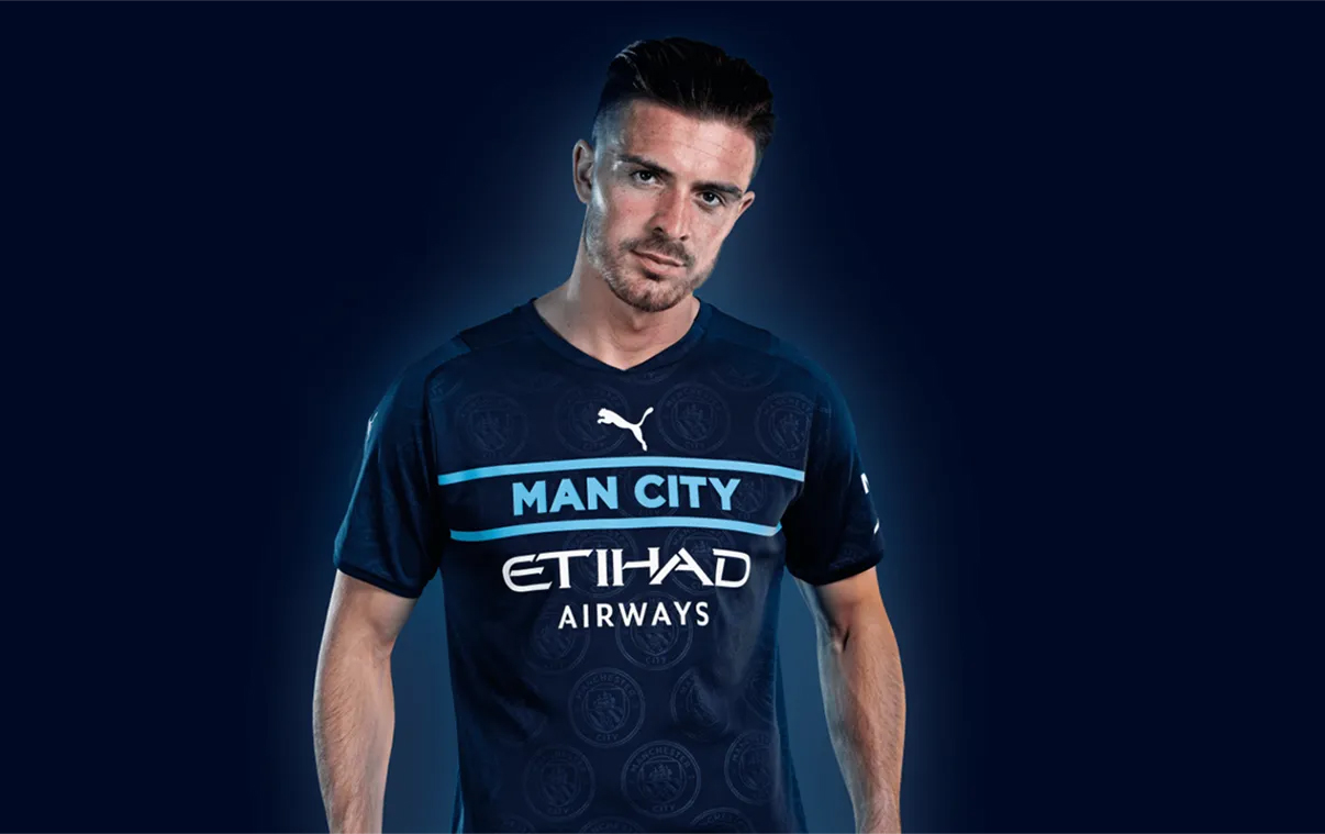
60. Manchester City - third
"It's barely a football shirt," one of the FFT remarked. Puma's new template hasn't so much divided fans as hacked them off, with this City shirt looking like a fake you might see in a high street chain.
Sorry lads. If the formula ain't broke and all that...
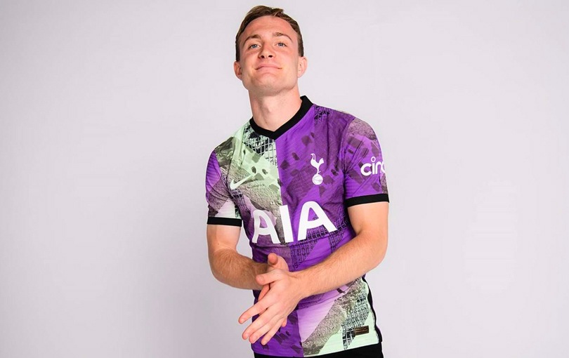
59. Tottenham Hotspur - third
The last shirt in the Premier League to be officially released, perhaps Nike were holding it back deliberately. It was always going to be a polarising design.
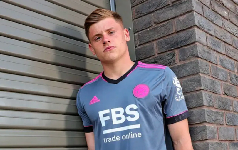
58. Leicester City - third
Leicester City have had plenty of naff shirts since Adidas took over and this is another unfortunately, in our opinion. The grey and pink don't really go together - how come Arsenal get so many nice designs from the manufacturer, yet a club who beat them into Europe get palmed off with this?
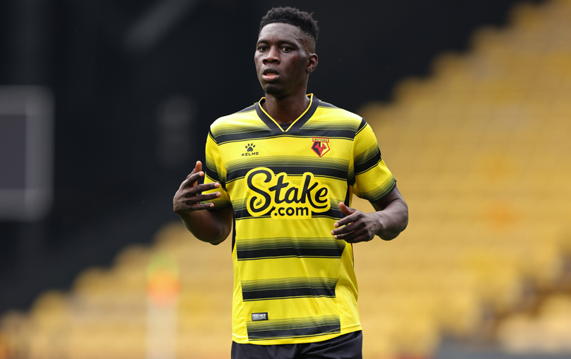
57. Watford - home
The worst home shirt in the Premier League, according to us. Still... not as bad as last year's.
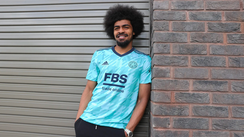
56. Leicester City - away
We're not sure why Leicester have been given a tartan away shirt but it's not one of our favourites this season.
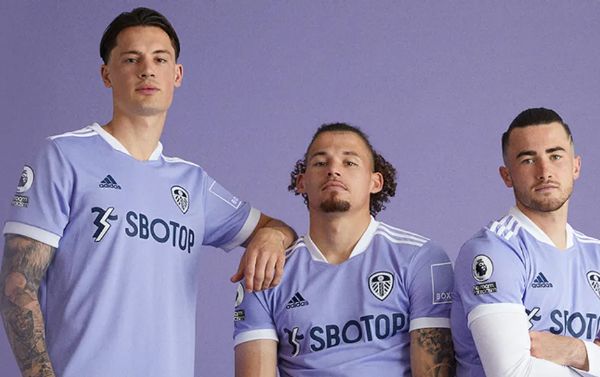
55. Leeds United - third
Leeds United channel their inner Barcelona with this one - just without the iridescent badge and with a worse sponsor. It's not offensively bad but they've had better.
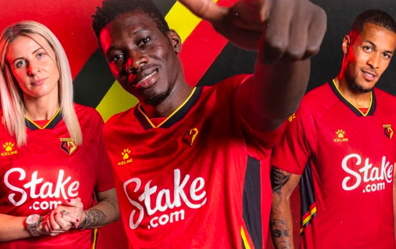
54. Watford - away
It's difficult to get red, black and yellow all to gel nicely in the same design. This effort from Watford isn't the worst attempt we've seen but it doesn't quite hit the spot.
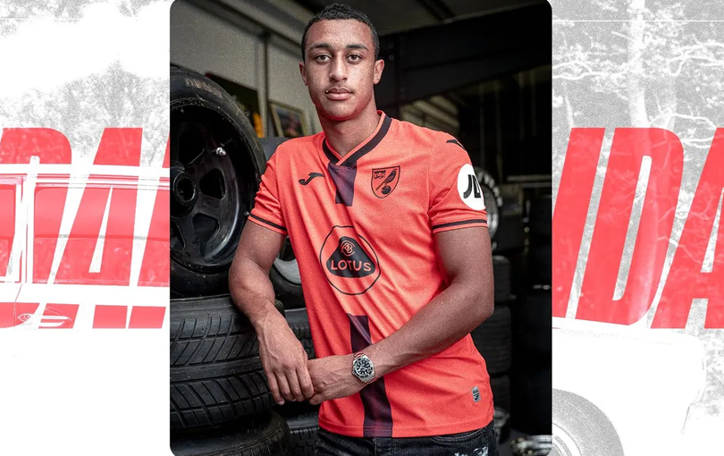
53. Norwich City - third
Norwich's third kit this season goes halfway between a bright Netherlands orange and a pastel shade - and it suffers for it. Monochrome badges are always naff, too.
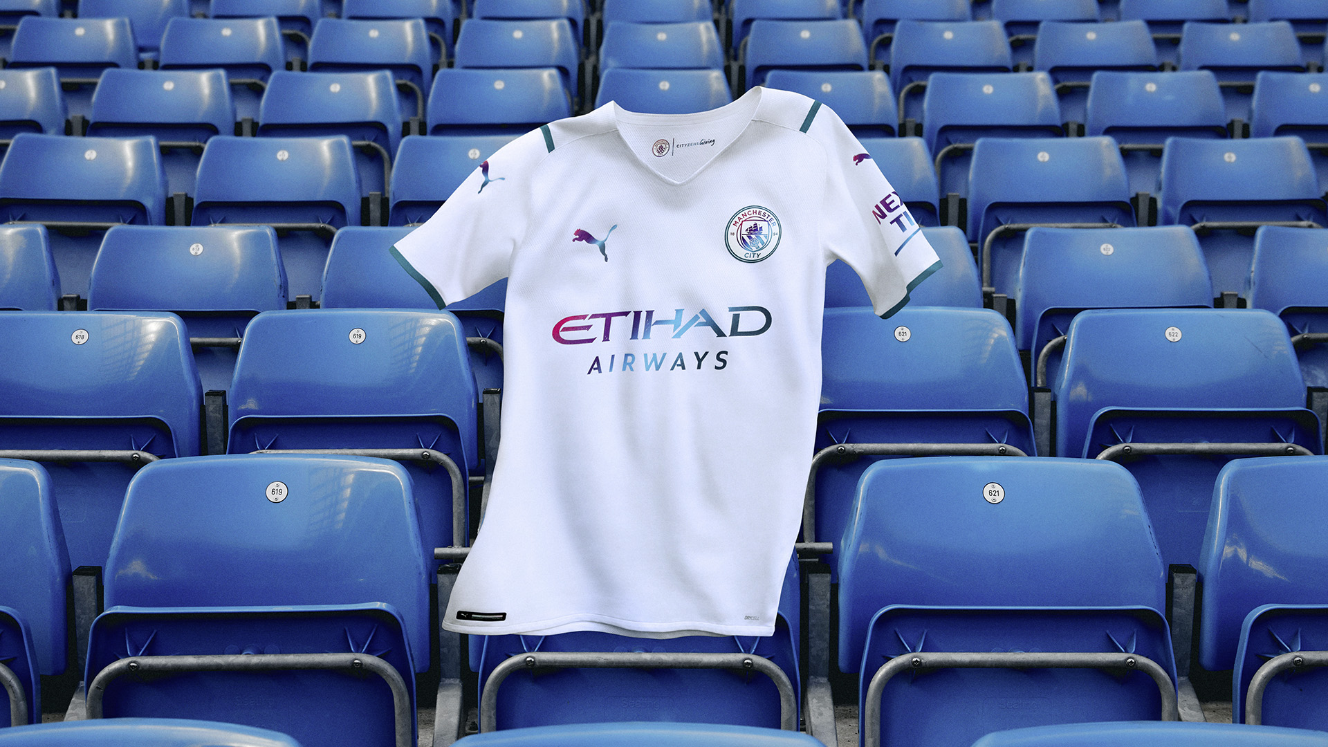
52. Manchester City - away
A dull effort that doesn't compare any of last season's shirts - despite those "water-inspired" pinks and blues.
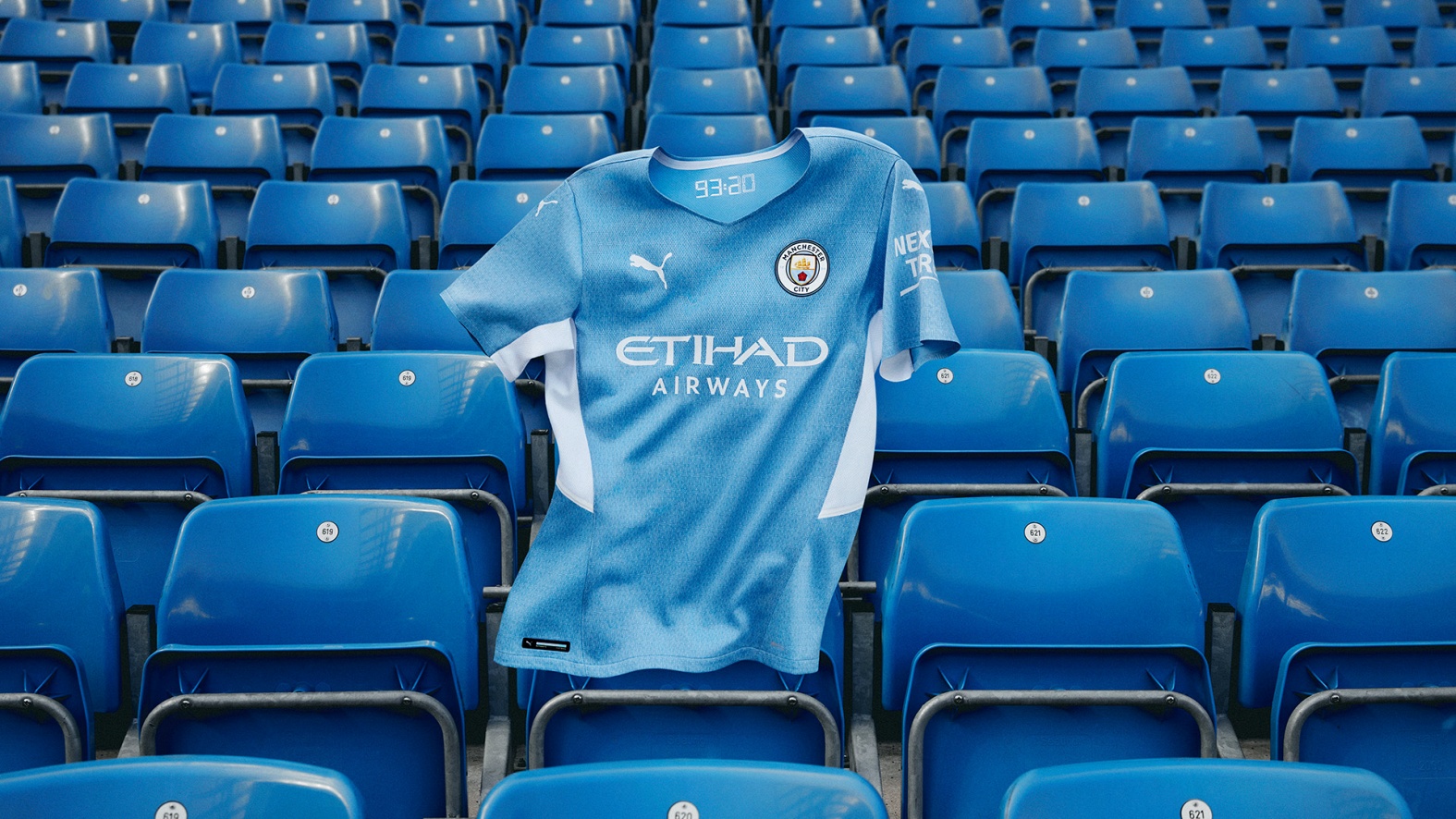
51. Manchester City - home
Why do Puma's kits have such big necklines this season? This is the best of City's bunch this season but not one of our favourites.

50. Leicester City - home
A stock pattern and chunky sponsor drag this one down for the Foxes. Still, we prefer it to the other two.
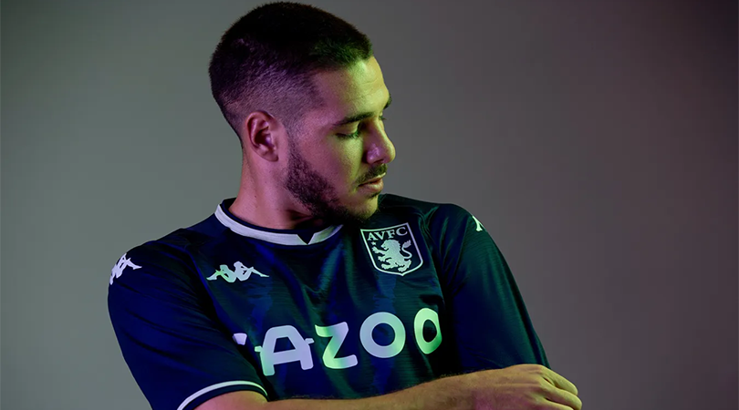
49. Aston Villa - third
Villa's third choice is a navy, purply shirt that's subtle enough to fly under the radar and won't divide too many fans - unlike some of the others they've had in recent seasons.

48. Everton - third
There were those in our team who liked the colour and design of Everton's third shirt, while others said that central column looked like tyre tracks. You can't please them all.
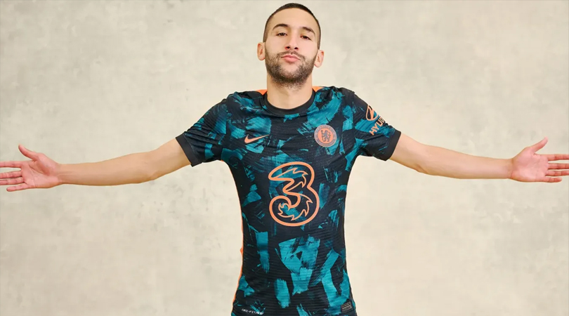
47. Chelsea - third
Another shirt that polarised the FFT office - but then that's what happens when teal and orange are used on the same shirt.

46. Chelsea - home
Surprisingly popular despite initial reactions - no, we're talking about the shirt, not Tammy Abraham. This 60s-inspired get-up might not be a favourite with Blues supporters but we don't mind it.

45. Wolves - home
It's nothing to write home but equally, it could be a whole lot worse.

44. Norwich City - home
This one got straight shrugs from the FFT team who couldn't find a reason to either love it or loathe it. An achievement of kinds.
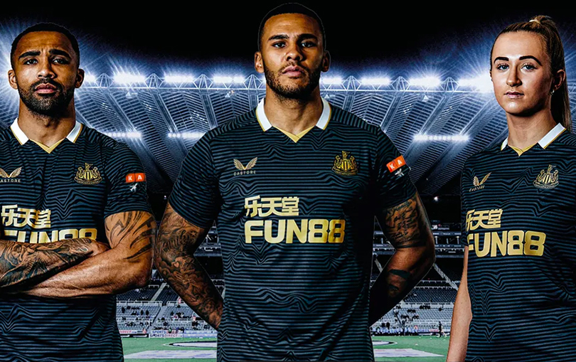
43. Newcastle United - away
We didn't mind the distorted stripes - but we much prefer Newcastle's other two shirts over this navy and gold effort.
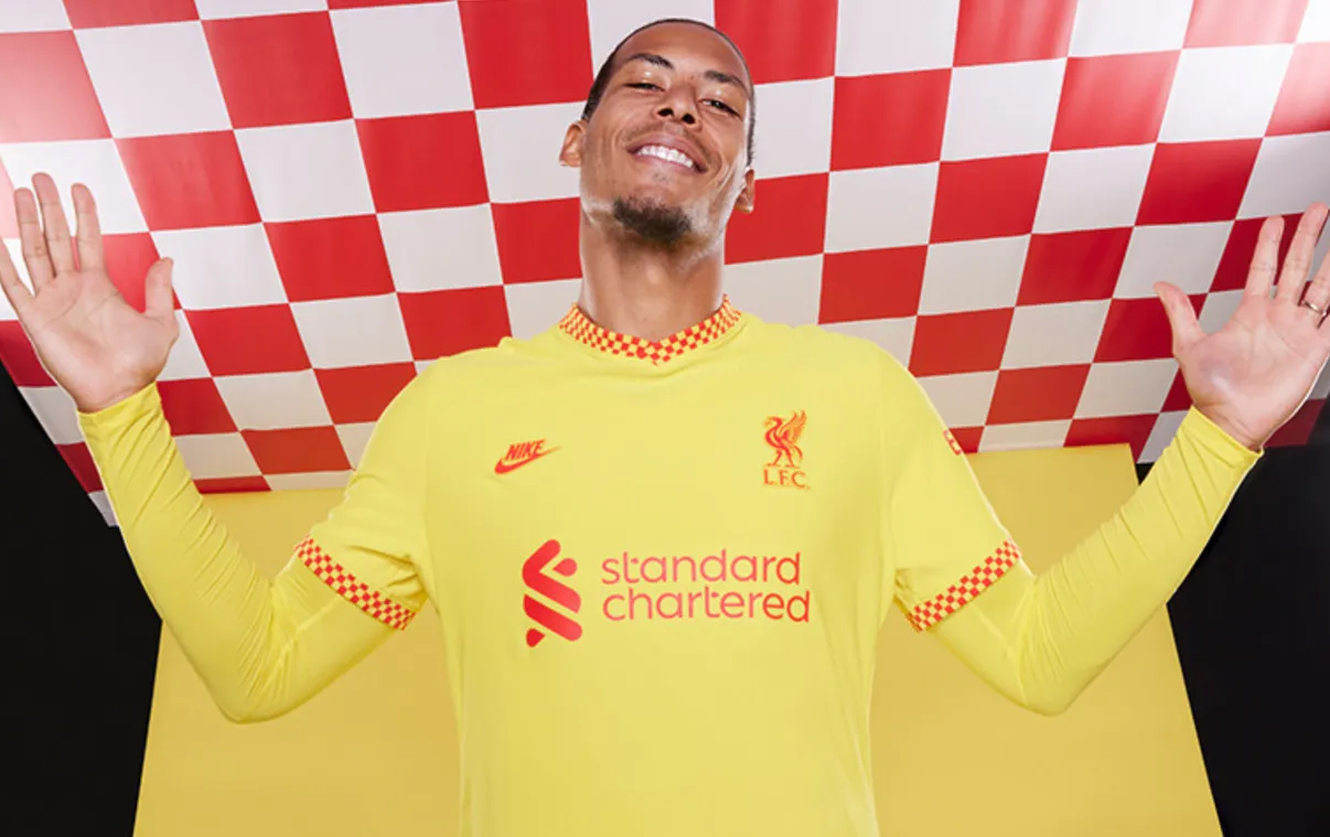
42. Liverpool - third
One that we couldn't agree on. Some of the team loved the simplicity and chequered trim on this one, while others thought it was a little lazy. It's the lowest-ranking of the Reds' tops this season for us.
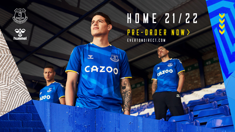
41. Everton - home
The yellow trim is nice and the pattern brings a bit of brightness. No one can hate this, right?
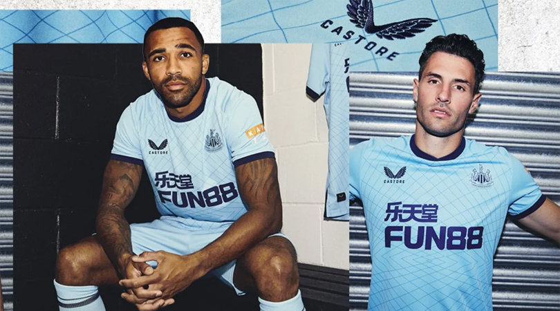
40. Newcastle United - third
Newcastle don't do many sky blue jerseys but this is one has an elegant pattern across it and the navy piping goes nicely.
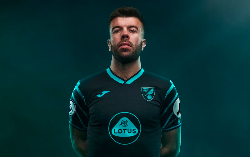
39. Norwich City - third
Just about scraping into the top 40, this icy Norwich shirt looks mean and moody - the best of the bunch from the Canaries.
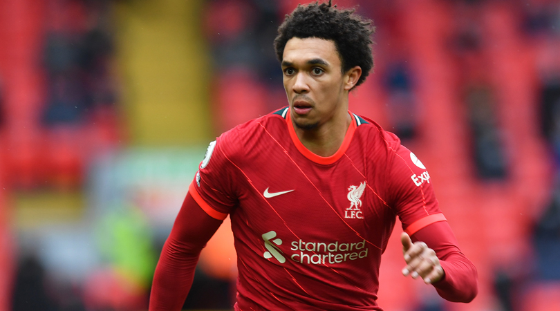
38. Liverpool - home
The FFT team are torn over that secondary colour of orange. Some of us love it, some of us... don't. Better than the Warrior days, mind.
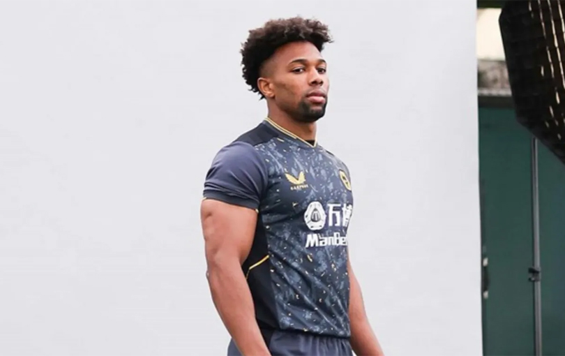
37. Wolves - away
The one thing we can all agree on? It's better than that cloud-inspired shirt from last season.
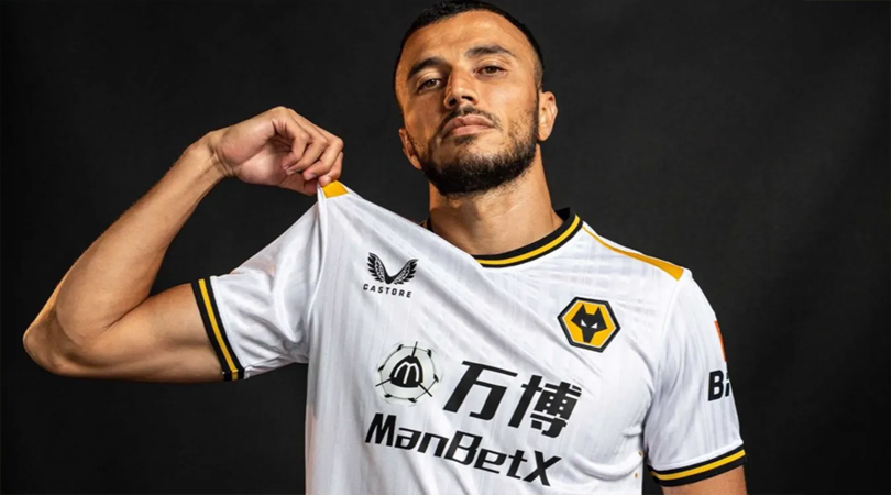
36. Wolves - third
A fairly inoffensive white top for Wolves, we quite like the golden flourishes... just not the sponsor.
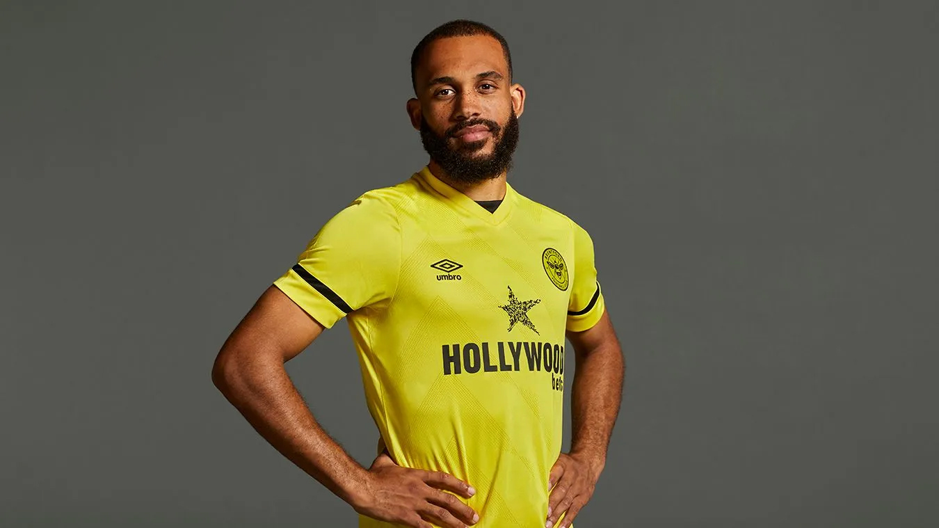
35. Brentford - away
A smart shirt for the Premier League, Brentford's away is a nice shade of yellow, despite the lack of any eye-catching features.

34. Aston Villa - home
The thin collar is nice, the pinstripes are smart. It's hard to reinvent the wheel with Villa shirts but we like this one.

33. Crystal Palace - home
Sideways stripes tend to be avoided. We don't know why though - this looks great.
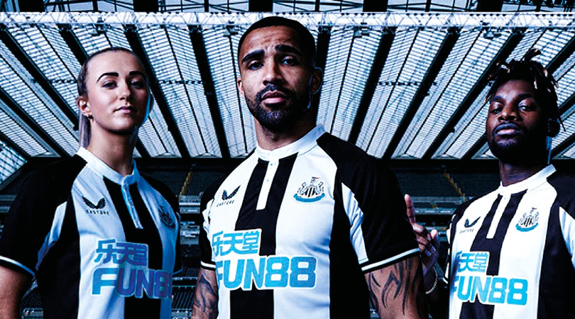
32. Newcastle United - home
Newcastle's first Castore home shirt is a triumph. The thick stripes look great - as does that button-down round collar.
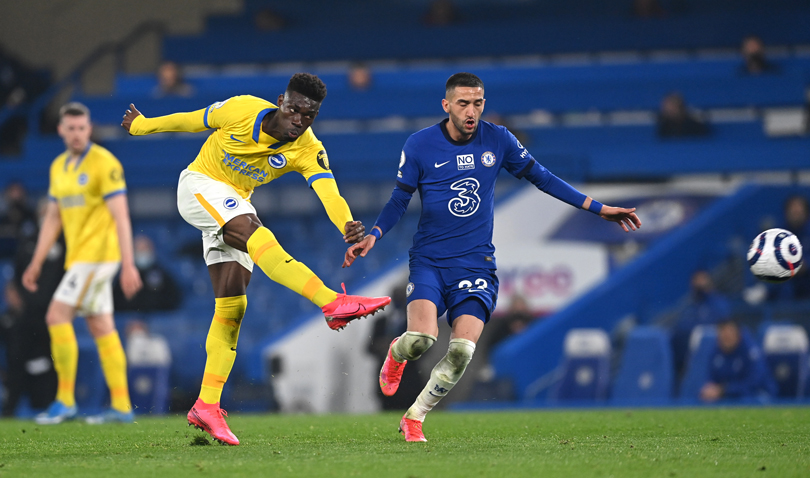
31. Brighton - third
Brighton's third shirt is the away shirt from last season - but we haven't marked them down for Nike's laziness. The collar is snazzy and the pattern is nice and subtle. We're fans.
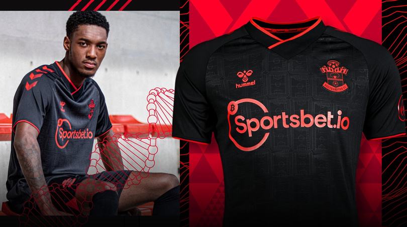
30. Southampton - third
One of the FFT team had this one in their top three shirts this season - ultimately though, it's only made it as far as 30th.
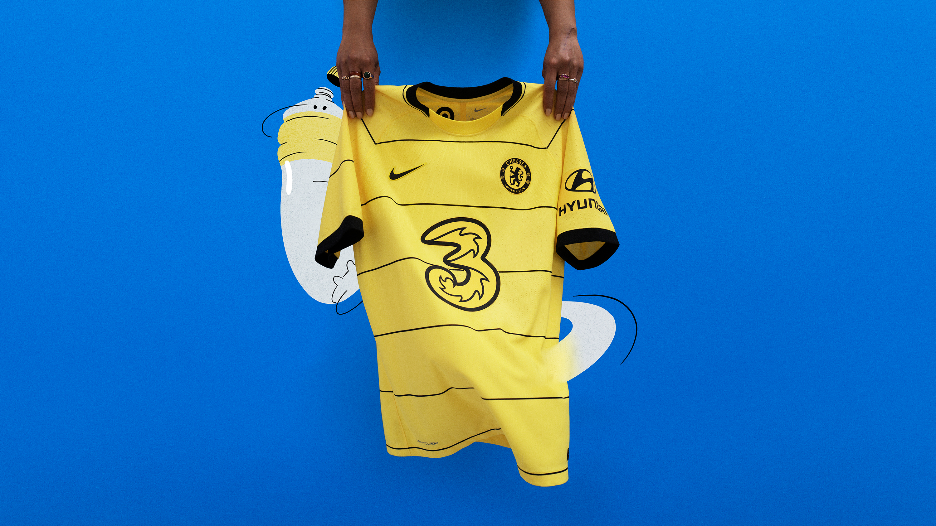
29. Chelsea - away
The home and away Chelsea shirts are pretty loud but one thing we can agree is that the away shirt is a classy touch, indeed.
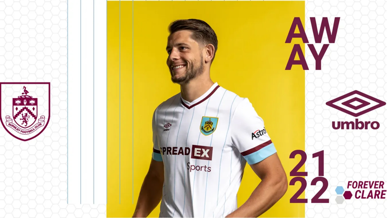
28. Burnley - away
Another pinstripe masterpiece, this time from Burnley. It's hard to go wrong with these colours, right?
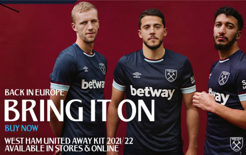
27. West Ham United - third
A smart top from Umbro for West Ham's third-choice this year - though it's been marked down for being extremely similar to another navy shirt released a couple of years back.
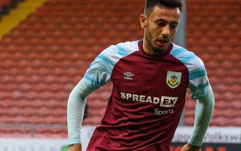
26. Burnley - home
The sleeves should look extremely jarring but actually, this is a bright and fun take on a Burnley shirt that we weren't expecting this season. Bravo.
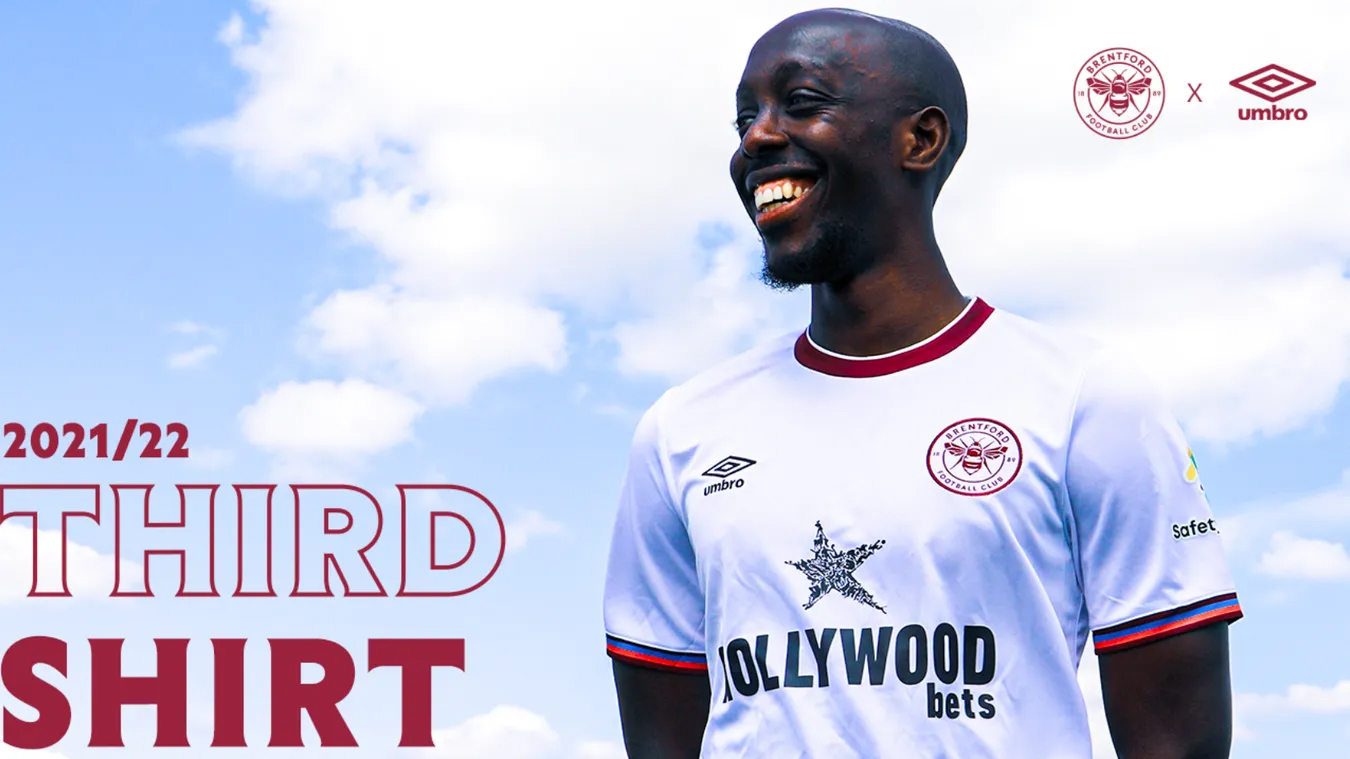
25. Brentford - third
White, dark red and black all brought together in a simple but effective design. We all liked it.
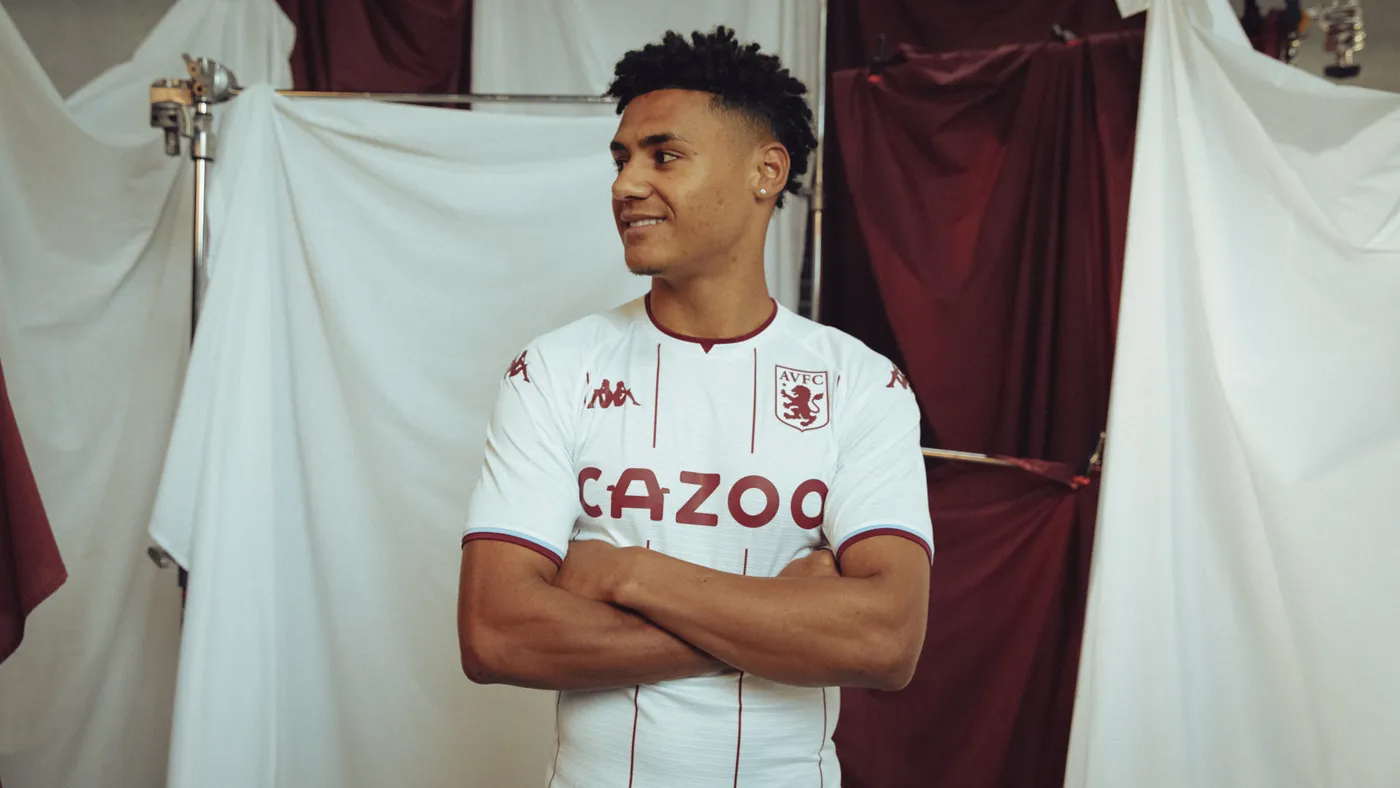
24. Aston Villa - away
More pinstripe and this time it's Villa. A pristine white top with nice claret piping that it's almost impossible to have anything against.
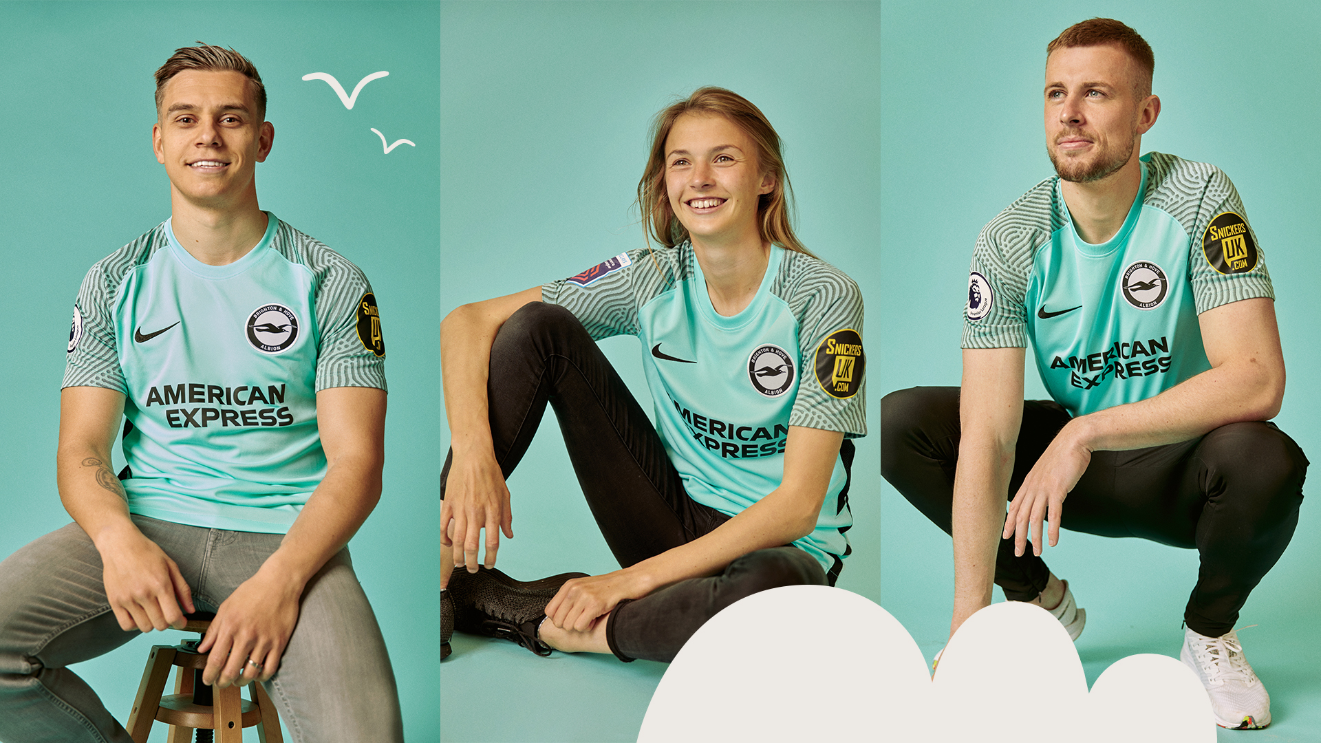
23. Brighton - away
Brighton's away shirt this season is suitably seasidey and went down fairly well at FFT Towers. Opinions ranged from "Meh" to "Ooh": make of that what you will.

22. West Ham United - away
Perhaps a surprise to see a sky blue and white striped offering up this high but it was a surprise hit with us. That claret collar just finishes the whole thing off nicely.
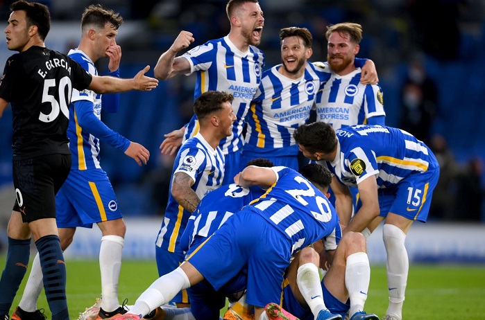
21. Brighton - home
Stripes are back for Brighton with a touch of gold, too. Good to see that this top has white numbers rather than red, too.
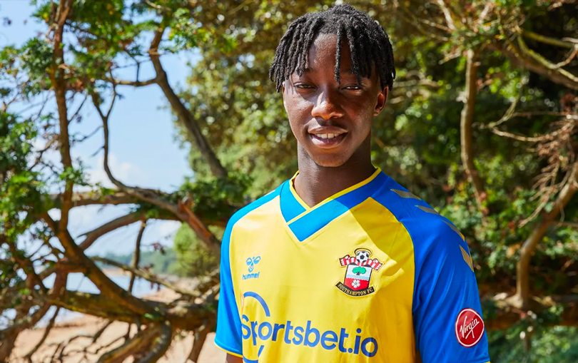
20. Southampton - away
A classic colour combination from the Saints - which may have influenced our votes. It's a nostalgic one, this. And that thick collar is just lovely.
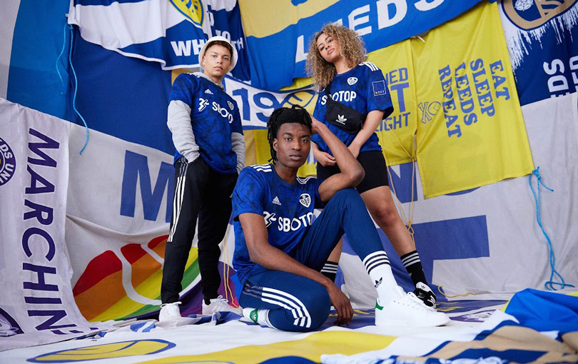
19. Leeds United - away
A strong colour on this one that we all approved of, Leeds' away was universally liked by all. Still not mad about the sponsor but it cracks the top 20 for everything else.
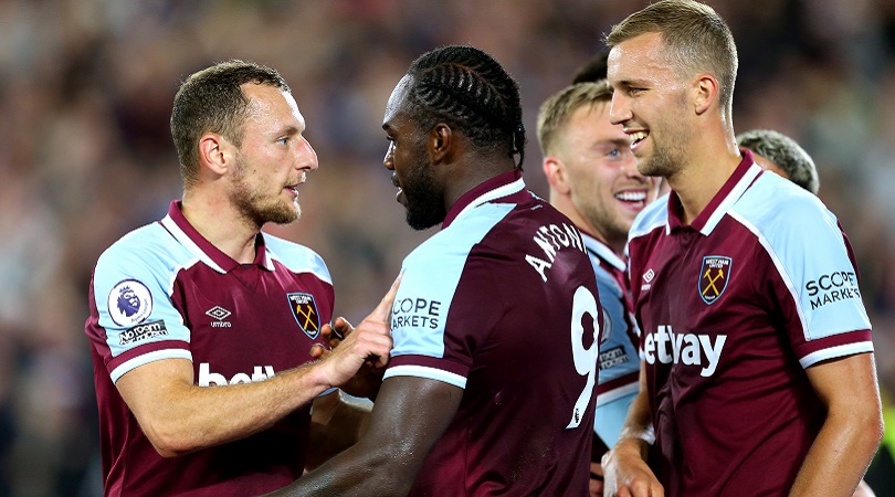
18. West Ham United - home
Maybe it's the Paulo Di Canio memories talking but this one is a shirt for the ages. The vintage collar tops it off.
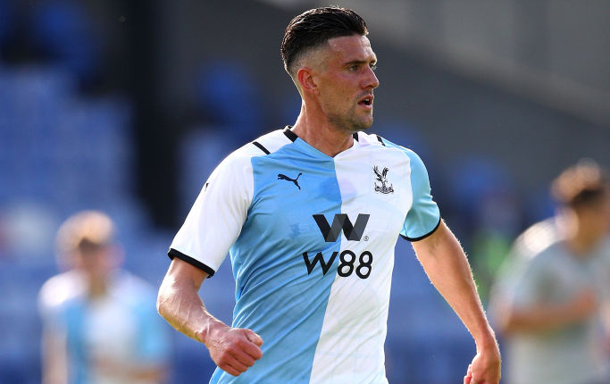
17. Crystal Palace - third
This one might not go down well with Palace fans (due to its similarity in colour to Brighton) but we all voted the Eagles' home kit favourably. Its high score is thanks to a unanimous seal of approval - not one Blackburn fan rigging the vote.
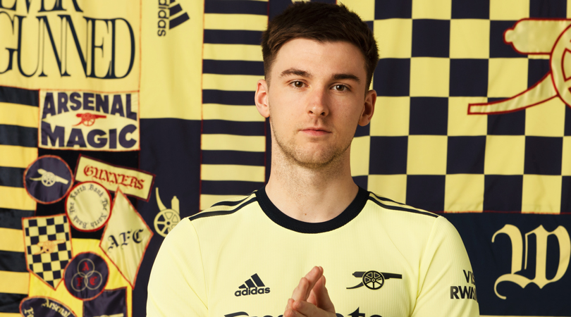
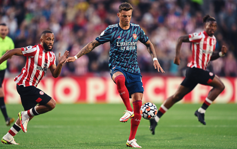
16. Arsenal - away
Arsenal's away top is simple, sophisticated and even includes a beautiful canon insignia rather than the badge. What's not to love?
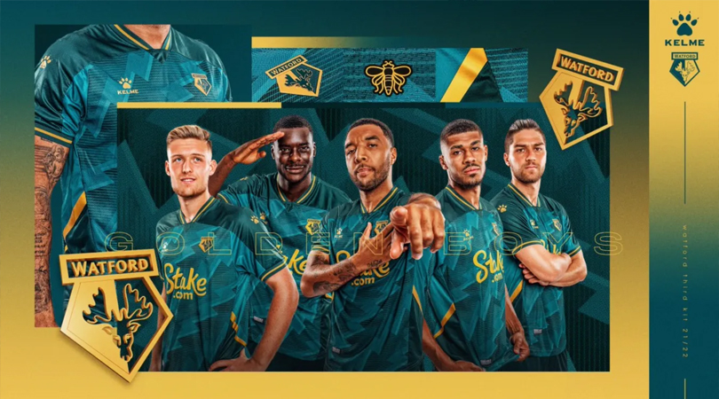
15. Watford - third
Expectation was low for Watford's third shirt after we saw the first two but Kelme have smashed this. Great colour, fun pattern and the gold is sublime.
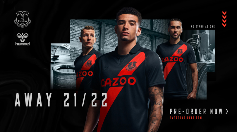
14. Everton - away
You can't often beat a sash and this Everton top proves it. The colour combination is magnificent, too.
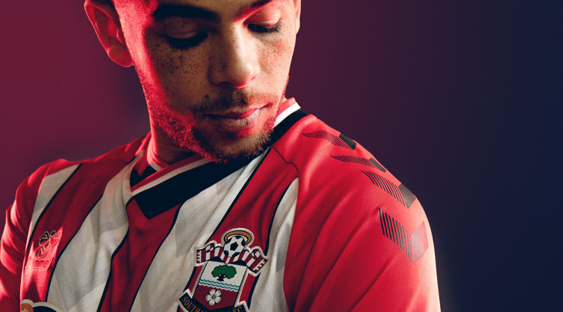
13. Southampton - home
Another excellent offering from Hummel, which scored highly from all of us. In fact, we're big fans of all of their shirts this season.
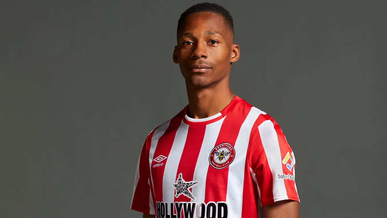
12. Brentford - home
Brentford's first-ever home shirt in the Premier League is a minimal but effective jersey that we've got plenty of time for. It manages to look extremely modern and classic all at once.
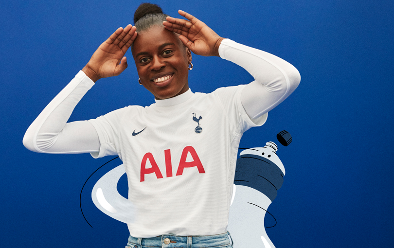
11. Tottenham Hotspur - home
Sometimes, the best thing you can do is... nothing at all. A plain white shirt from Nike with no trim, no collar, no nothing got high praise from the FFT team. The US manufacturer have gone for extremes with loud and minimal for Spurs shirts this season.
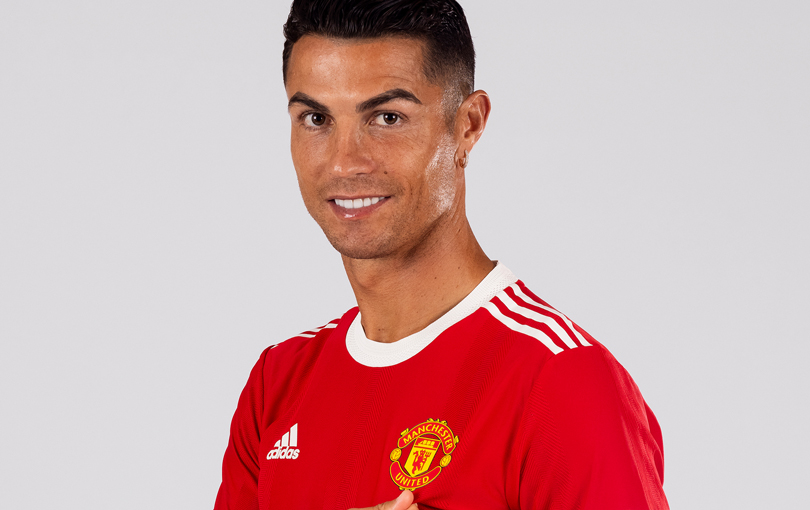
10. Manchester United - home
Perhaps the biggest-selling Manchester United shirt for a while, Adidas have gone with something that wouldn't have looked too out of place in the 60s and we love it. Some call it boring: we call it classic.

9. Leeds United - home
The yellow stripes look superb, we've got to say. This one was a hit with everyone at FFT.
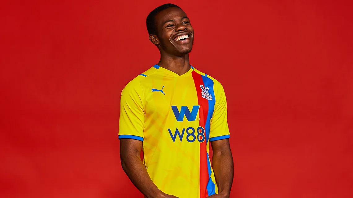
8. Crystal Palace - away
How could Puma get it so right for Palace and so wrong for City? It'll be a tough season for Patrick Vieira's side but we all agree here that they'll look fabulous on the field.
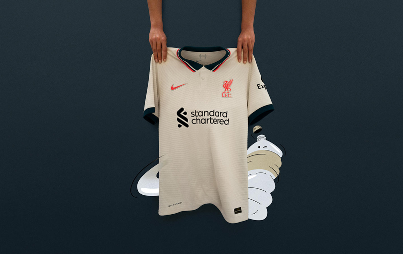
7. Liverpool - away
Maybe it's the memories of Fowler and McManaman tainting our perception of this one but this might be the best away shirt Liverpool have had since the 90s. We all scored this one as one of our favourites.
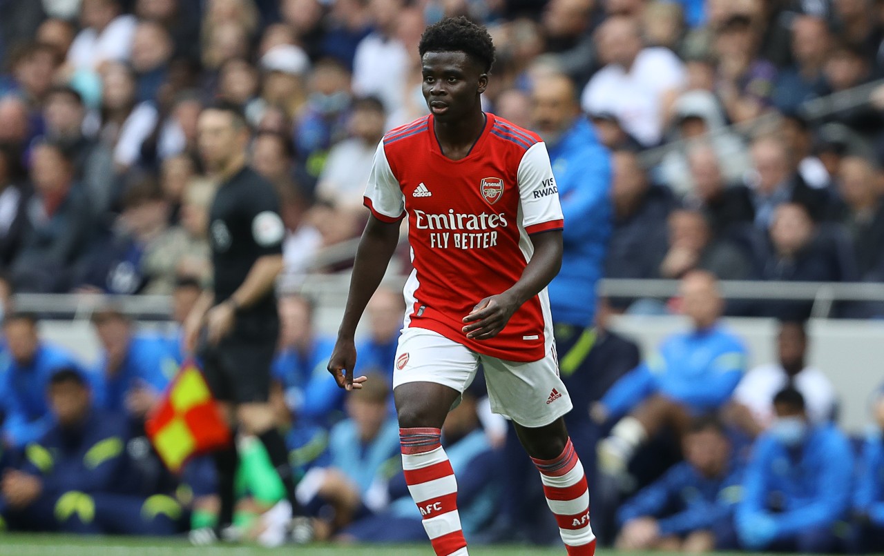
6. Arsenal - home
This is the perfect example of how to do something different with the same design - and not go over-the-top. Arsenal's home shirt last season was a little jazzy: this one has charmed us.
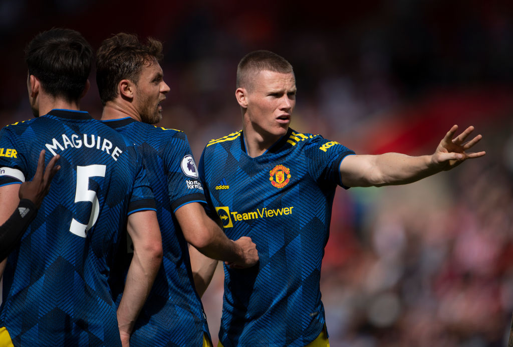
5. Manchester United - third
Adidas have excelled for United this season. The third top was another one that we all loved - despite original concerns that United had two blue away shirts.
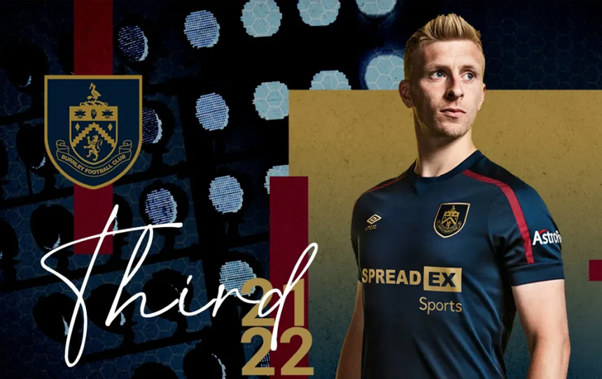
4. Burnley - third
Considering we can't really remember last year's Burnley third shirt, it was a real surprise to us that this one impressed quite so much. Lovely colours and a simple design, Umbro have done a great job.
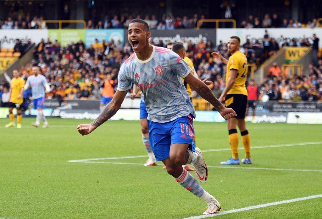
3. Manchester United - third
What a top. Drawing from 90s classics is Adidas's forte these days and Man United's up-to-date nod to their early 90s away shirt has become a modern classic. Take a bow.
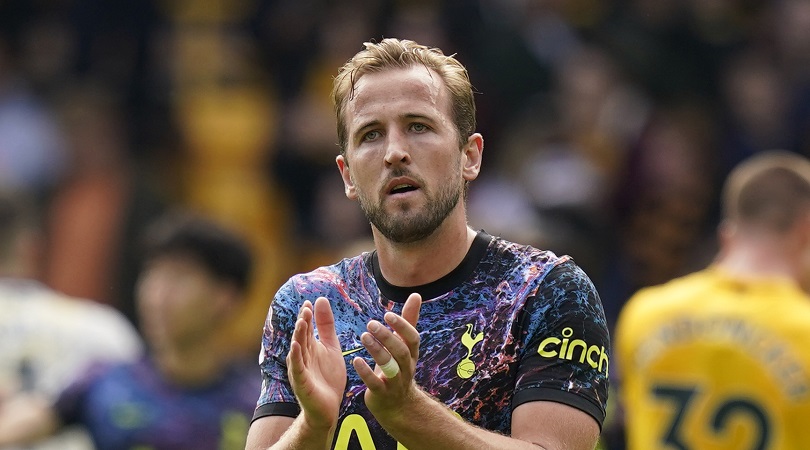
2. Tottenham Hotspur - away
Whether it's paint, oil, or a nebula pattern, all of us at FFT are in awe of Tottenham's away shirt this season. The yellow flourishes just tie the whole thing together: perhaps this is the reason Harry Kane stayed...
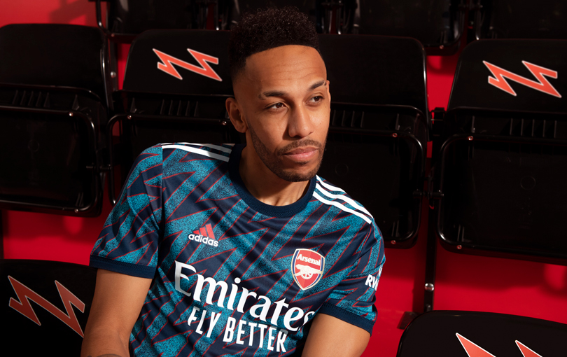
1. Arsenal - third
It's a one-two for North London. While Arsenal might have been a spent force on the pitch this last couple of years, the apparel that Adidas have been churning out for them seems to be getting better and better.
This shirt might even top the bruised banana update of a few years back: everyone at FFT ranked it as our no.1 of the season. Congrats Gunners.
The best features, fun and footballing quizzes, straight to your inbox every week.
FourFourTwo was launched in 1994 on the back of a World Cup that England hadn’t even qualified for. It was an act of madness… but it somehow worked out. Our mission is to offer our intelligent, international audience access to the game’s biggest names, insightful analysis... and a bit of a giggle. We unashamedly love this game and we hope that our coverage reflects that.
 Join The Club


