Ranked! The 10 WORST football shirts of the season
The worst football shirts of the summer, with this lot deserving of a spot in the hall of shame

The worst football shirts of the season are often more memorable than the good ones, let's face it.
Who can forget Manchester United's zebra-striped effort just a couple of seasons ago? The Aston Villa kit in which "DWS" looked rather more like "COWS"? The Fiorentina shirt that was banned because the geometric pattern contained swastikas? Or any Liverpool shirt made Warrior?
You've seen the best shirts of 2022 – now it's time for the worst. These 10 belong in a hall of shame…
Ranked! The 10 WORST football shirts of the season
MORE FOOTBALL SHIRT GUIDES
- Best football kits right now
- Best retro kits
- Best Premier League kits
- Best European football shirts
- Women's Euro 2022 kits
- World Cup 2022 kits
- Best Nike football kits 2022
- Best Adidas football kits 2022
- Best Puma football kits 2022
- Best Premier League retro shirts
- Best England retro shirts
10. Inter Milan away
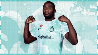
Oh, how the mighty fall. Not Romelu Lukaku – but Inter Milan, who believe it or not, used to be pinnacles of style.
They had the coolest badge in Italy and the coolest sponsor in Pirelli. Now they have neither – and Nike have this year supplied them with a white and cyan away top that displays a world map. Where's Italy? Obviously, the awful new "IM" insignia covers it entirely. Of course.
It's very weak. A nice idea executed poorly, unfortunately.
Get FourFourTwo Newsletter
The best features, fun and footballing quizzes, straight to your inbox every week.
Nike Inter Milan away shirt 2022/23
9. Hartlepool away shirt
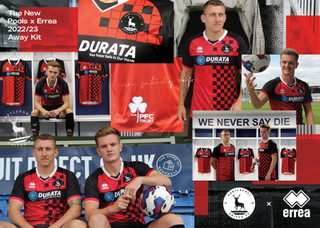
It's not great, is it? In trying to do a black and red chequered jersey, Errea have gone with two different styles and mashed them both together. Both only on the left half of the shirt, for some reason…?
Not even Jeff Stelling himself would be able to convince us this is anything other than a monstrosity.
Errea Hartlepool away shirt 2022/23
8. RB Leipzig home shirt
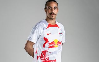
While some criticise the Red Bull networks of football clubs, we are not here to judge how an energy drink can flagrantly flout sacred Bundesliga ownership rules. We will, however, judge them for this.
The red blobs on this shirt look accidental at best, as Nike have combined white and silver before deciding it needed something more and just chucking the accent colour over the base of the shirt. It's a good job that this club isn't particularly popular anyway.
Nike RB Leipzig home shirt 2022/23
7. Juventus home shirt

Once upon a time, football shirts were released every two years – sometimes more. Kit manufacturers didn't have to frantically panic every season about how to reinvent something as simple as stripes just to have come up with something new.
Those days are long gone in Turin. Over the past few years we've seen a half-and-half shirt, painted stripes, thick stripes, thin stripes and now, stripes made from tiny squares. It just looks silly. And the Jeep logo with lightning bolts in it isn't helping matters.
Adidas Juventus home shirt 2022/23
6. Tottenham away shirt

Last season, Tottenham had one of the worst shirts in all of Europe, a purple nightmare that incorporated bright shades as accents. This season, Nike have rectified that by releasing a purple shirt that incorporates bright shades as accents.
This is perhaps one of Nike's worst templates ever, with the the accented block on the front below the collar just looking completely out of place. Giving Spurs this template and filling it with purple, black and volt yellow feels very lazy… and yes, it looks like a wetsuit.
Nike Tottenham Hotspur 2022/23 away shirt
5. Levante third kit
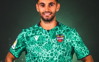
All-over shirt patterns are back in fashion after an era of super simplicity. But Levante, unfortunately, have taken that way too far.
The Valencians' third shirt is modelled to look like frog skin. Yeah, really. Above anything else, the Levante badge just looks totally out of place on this one: one of a few examples of when a monochrome badge would look much better.
Macron Levante third shirt 2022/23
4. Leeds United away kit

Leeds have had some great yellow away kits. Leeds have had some great blue away kits. This is neither.
Adidas have combined the two colours that the Yorkshire giants most often wear on the road and splashed them into one tie-dyed mess. The badge, sponsor and Adidas logo all blend into the shirt itself and the pattern looks messy. Bring back the lilac, all is forgiven.
Adidas Leeds United away shirt 2022/23
3. Atletico Madrid home kit

Apparently, Nike are struggling to sell the new Atletico Madrid home shirt – which incorporates stripes in the shape of the nearby Manzanares river. Sorry lads… but we can't say we're surprised.
It's just too odd: it doesn't feel right. The new WhaleFin sponsor doesn't look particularly cool either. Can everyone just go back to doing normal stripes for a while, please? We're not sure how much more of this we can take.
Nike Atletico Madrid 2022/23 home shirt
2. Everton away kit
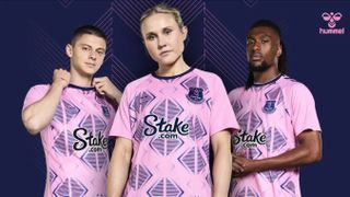
Here at FFT, we're huge fans of Hummel's output this summer. Everton's own home shirt is a magnificent jersey that eschews silly, outlandish patterns for something simple and classy. But given that Everton already have the worst pink shirt in Premier League history, looking to beat it is… ambitious.
The strange pattern ruins the shirt – and that pale pink doesn't work with that much deep blue. The sponsor is particularly poor, while the badge almost disappears into the rest of the mess. Still, Alex Iwobi comes closest to pulling it off. Man's got style.
Hummel Everton away shirt 2022/23
1. Reading home kit

It had to be, didn't it? Look at those sleeves. But wait – the rings around the sleeves actually mean something…
"Each stripe represents the average temperature for a single year, relative to the average temperature over the period as a whole; shades of blue indicate cooler-than-average years, while red shows years that were hotter than average," the Royals helpfully explain. "And the stripes on the home shirt specifically track climate change in Reading across the full 151-year existence of Reading Football Club."
So it's a kit designed to highlight climate change – even though it ironically features a car leasing sponsor. And given that getting a new football shirt every season isn't kind to the environment either, there are some mixed messages on this one. It's a nice idea but not our cup of tea, guys.
Macron Reading 2022/23 home shirt

Mark White has been at on FourFourTwo since joining in January 2020, first as a staff writer before becoming content editor in 2023. An encyclopedia of football shirts and boots knowledge – both past and present – Mark has also represented FFT at both FA Cup and League Cup finals (though didn't receive a winners' medal on either occasion) and has written pieces for the mag ranging on subjects from Bobby Robson's season at Barcelona to Robinho's career. He has written cover features for the mag on Mikel Arteta and Martin Odegaard, and is assisted by his cat, Rosie, who has interned for the brand since lockdown.
