Ranked! The 20 greatest football kits that were only worn once
Newcastle United are set to take to the field in a special kit this weekend, following in a long line of wicked one-hit wonders
Newcastle are set to wear a fourth kit against Brighton this weekend, given that all three of their shirts clash with the Seagulls'. It's a one-off, of course – but many of the greatest shirts of all time have only ever been donned on one occasion.
England only ever wore their blue diamond third shirt once, for example. It's since become a cultural icon but that beautiful top from the World In Motion video only ever got worn during a game against Turkey in 1993. The price of football shirts is rising every year so it makes sense to rinse these shirts over the course of the season – and not just bring them out for special occasions like Graham Taylor's lads did back then.
But we're not going to count it in our list today – that would be too obvious. Nope, we're looking for tops that became famous because they only got one outing. These were only worn once on purpose, not by pure chance…
20. Werder Bremen: 120th anniversary shirt (2019)
PREMIER LEAGUE KITS 2022/23 Every home, away and third shirt of every club
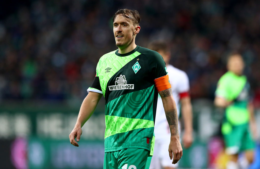
For their 120th anniversary, Werder Bremen went loud for a one-off game against Augsburg, which they won 4-0. The Umbro top for the occasion was a mash-up shirt that faintly had the year, "1899" – the club's foundation date – hidden within all those shades of green.
Not for everyone, admittedly… but it was only around for 90 minutes, making it Bremen's most successful shirt ever. It's one of a kind in a different way, too: not many kits celebrating a club's anniversary go for the mash-up theme, instead choosing to dial things back with something more subtle and evocative of the past. We're glad that Umbro chose this route, though.
19: Manchester City: 125-year anniversary shirt (2019)
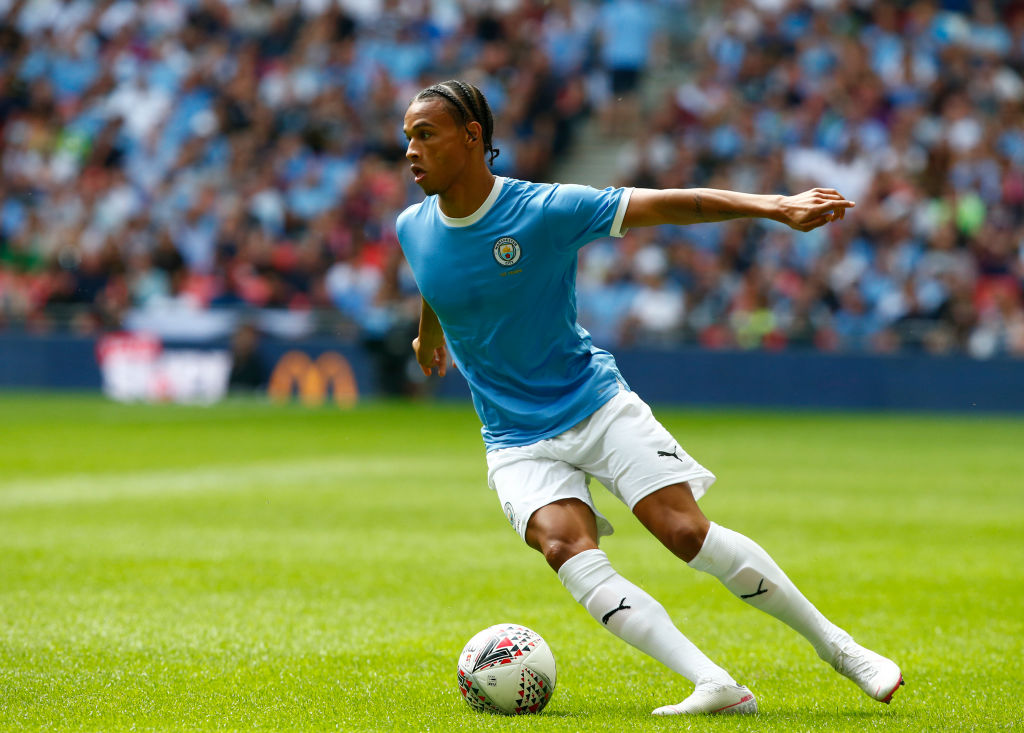
Manchester City have had some questionable kits under Puma. There was the cocktail-coloured orange and yellow fade, which was apparently supposed to change colour in the rain and the navy blue get-up that had "MAN CITY" emblazoned across it.
In fact the German manufacturer's finest work for the Citizens probably came in a Community Shield against Liverpool in 2019. Simple, sophisticated and they've never quite got that sky blue so right.
Get FourFourTwo Newsletter
The best features, fun and footballing quizzes, straight to your inbox every week.
18. Inter Milan: Nike 20-year anniversary shirt (2019)
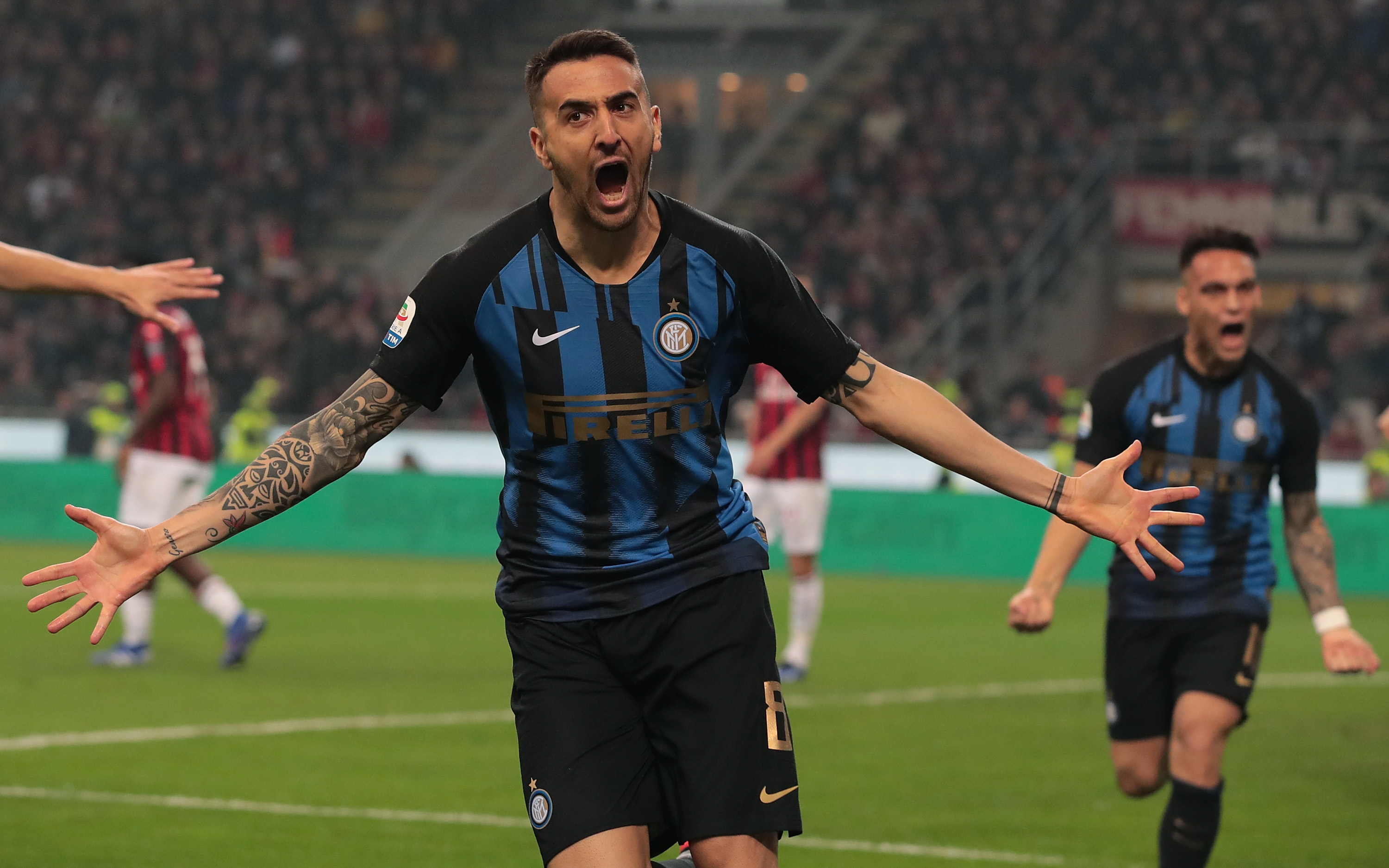
Mash-up shirts can be hit or miss – but if all the tops you're mixing follow the same theme, it shouldn't be too loud.
That was why the Inter Milan Nike mash-up shirt worked so well. Manchester City never wore theirs for a match; neither did Arsenal. Frankly, neither compared to the Inter version, which feels a lot classier than both.
17. France: Centenary shirt (2019)
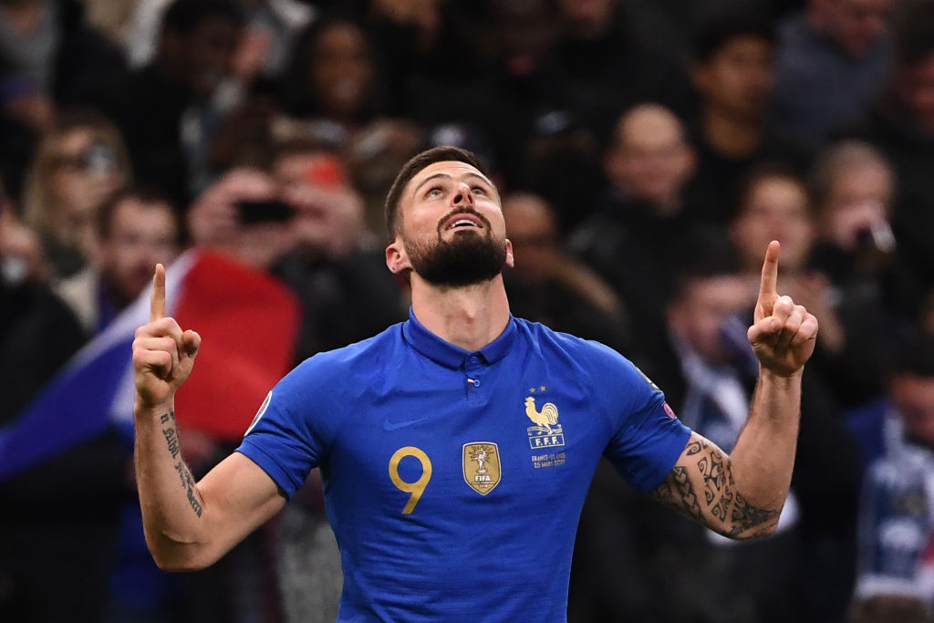
France, as a country, changed their flag back in 2020. The nation reverted to the original version of the tricolore, darkening the blue – and so the football team might well have more navy shirts than bright blue in the future.
Les Bleus wore a night-sky colour for their second World Cup triumph but just a year later, they donned a similar kit – only lighter. The collar, the blue Nike Swoosh and the gold detailing were all stunning… some may say better than the shirt they actually lifted the Coupe de Monde wearing.
16. Blackburn Rovers: the Coors shirt (1992)
One-OffsBlackburn Rovers 🤝 Coors🍻 pic.twitter.com/bC1faHcS6RSeptember 3, 2021
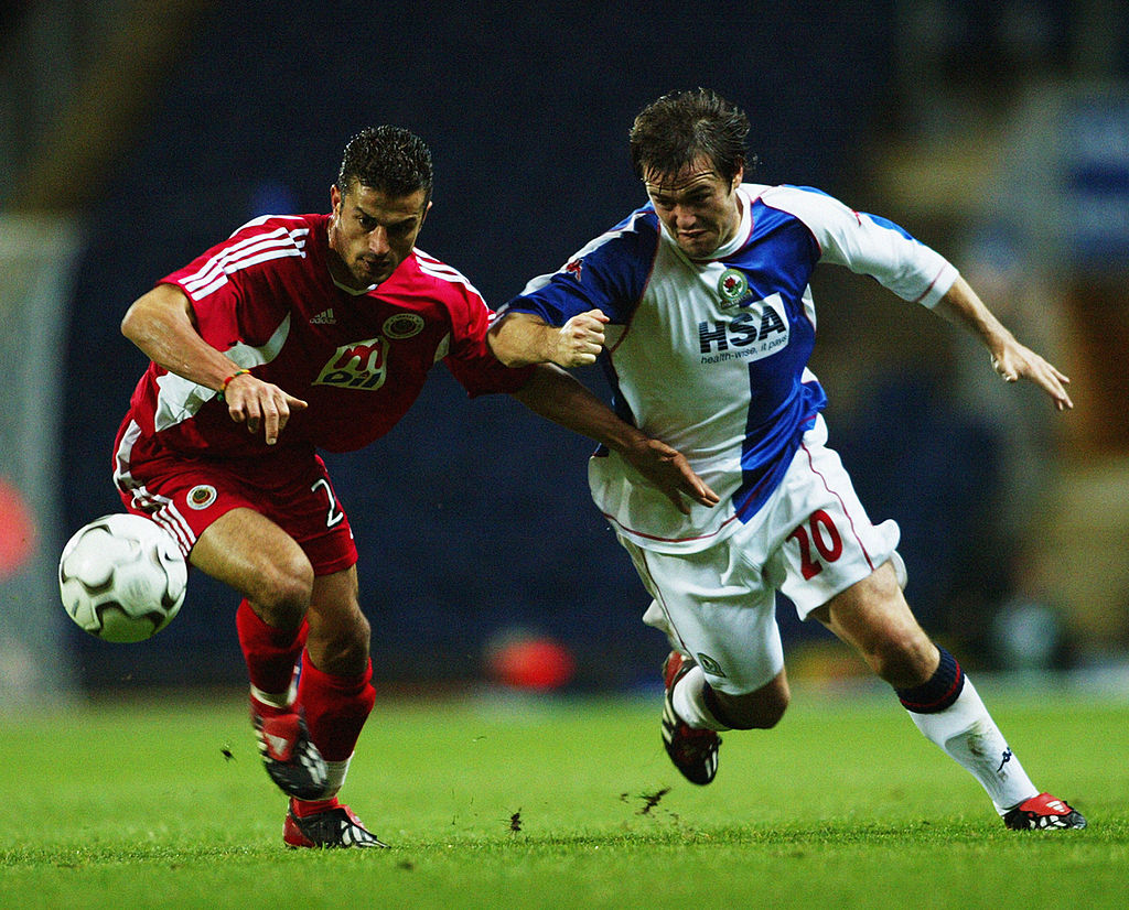
In 1992, McEwan's Lager acquired Coors. The company sponsored Blackburn Rovers – they were to be the jersey sponsor when Rovers won the Premier League in 1995 – and to promote their lager, for one match only, "COORS" was emblazoned over the iconic blue and white halved shirts.
Those shirts never went on sale, making them a unicorn of English football tops. And Blackburn actually had the greatest two-hit wonder in shirt history, too, wearing their 2003/04 European shirt just the twice in both legs against Turkish side Genclerbirligi. A shame, because that one was stunning, too.
15. Arsenal: the Navy European shirt
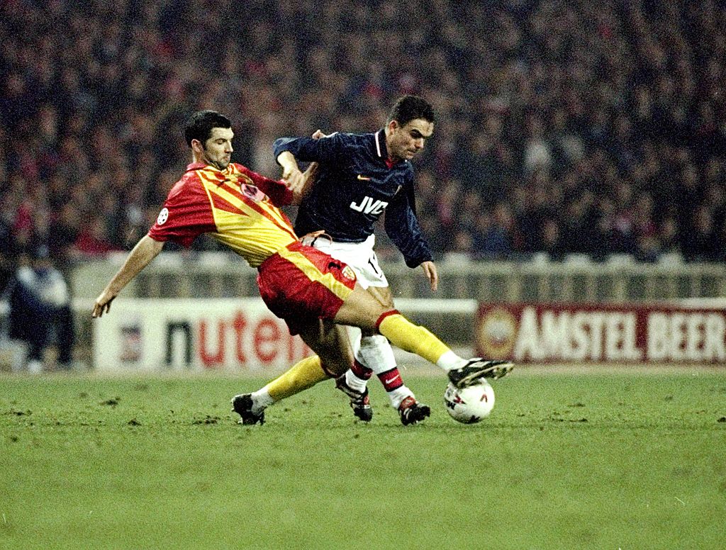
Navy blue was supposed to be Arsenal's away colours as long ago as the 1960s – but given that referees would always be dressed in black, the Gunners reverted to yellow to avoid clashing. Still, in the late 90s, Arsenal wore navy before the advent of third kits, donning a special one-off jersey at Wembley against Lens – who played in red and yellow.
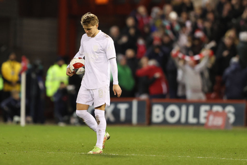
It just about edges the all-white No More Red shirt that was worn against Nottingham Forest in the FA Cup… purely because Forest won that one 1-0.
14. Fulham: 140-year Anniversary Shirt (2019)
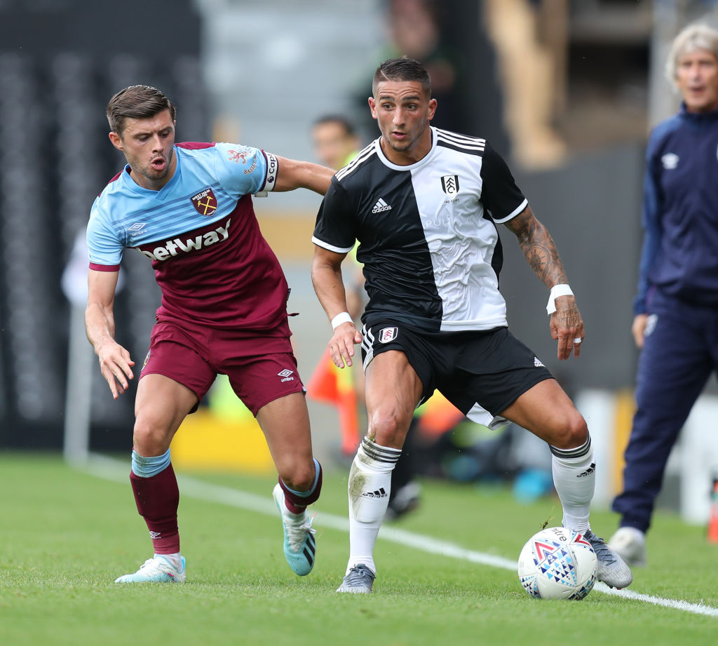
Never worn in a competitive match, Fulham marked 140 years as a club with a sponsorless half-and-half shirt.
The top recalled the original shirt design of the Cottagers and though it was based on a classic design, still felt modern enough – with the Adidas stripes on either shoulder. A shame they didn't wear this all season.
13. Toulouse: 80th Anniversary Shirt (2017)
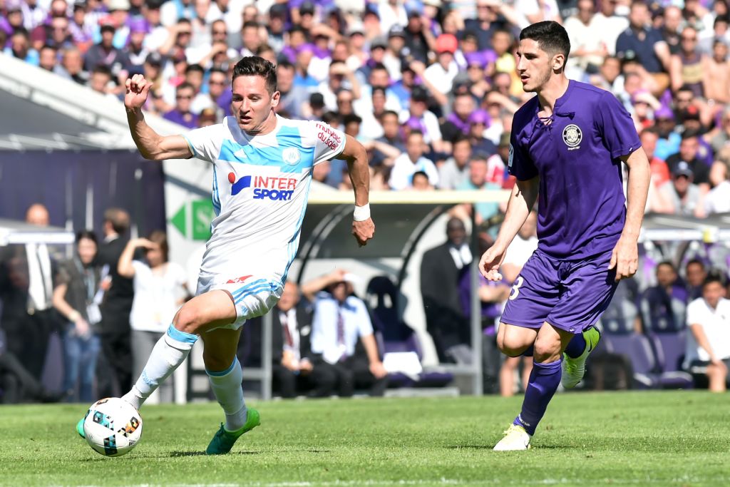
With a v-neck collar and retro style lace Toulouse celebrated 80 years in 2017 with style. Joma made this kit, with the fabric reportedly dyed violet.
The shirt also incorporated a one-of-a-kind badge, based on the three crests that had been used by the club in its history. Toulouse drew 0-0 with Marseille in this get-up.
12. Chelsea: FA Cup 50th anniversary kit (2020)

Half a century on from the vintage 1970 Blues side that won the FA Cup, Chelsea wore a classic shirt that felt less like a redesign of an old favourite and more like a… blue-out kit.
The sponsor was still visible on this one in a different shade of blue, while the vertical line on the back of the collar from the regular home kit was yellow for this one – just the 1970 kit's trim. The inclusion of a classic Chelsea badge was a nice touch, too.
11. Lazio 115-year anniversary kit (2015)
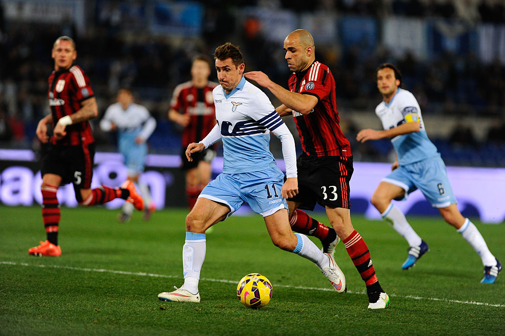
Two things were very clear with Lazio's 2015 one-off kit. Firstly, 115 years is not worthy of celebrating an anniversary; secondly, you don't have to redesign a shirt based on the good times.
Macron's special edition took cues from two tops from the 1980s – not a particularly cherished time in fans' hearts – to create something that actually, looked pretty unique and fresh. OK, maybe more clubs should celebrate 115 years…
10. Barcelona: The blue third shirt (2002)
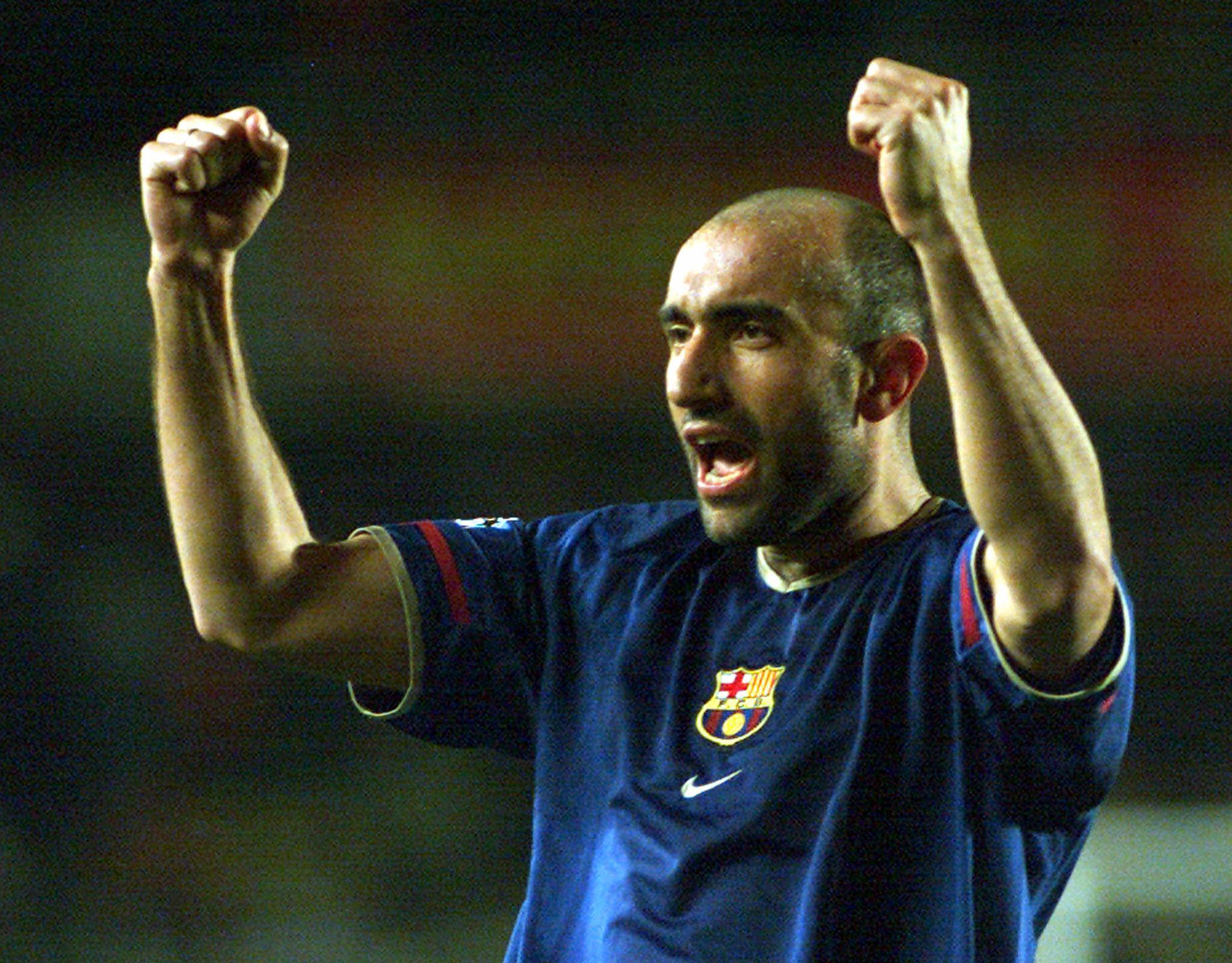
It feels wrong, doesn't it?
Barcelona's famed crimson and blue stripes – the Blaugrana colours – are perhaps the most famous stripes in football. So when Barça omitted the red for one night only against Galatasaray, it looked decidedly weird but incredibly cool. They've never worn this shade of blue since, either.
9. Everton: Goodison Park 125-year anniversary shirt (2017)
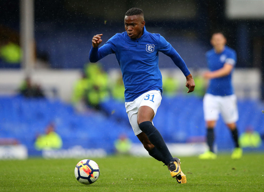
In a preseason fixture against Sevilla, Everton celebrated not their own birthday but that of their old ground, Goodison Park.
And though the Toffees have worn all sorts in the last few years from bright pinks to mad-patterned home tops with Angry Birds insignias on the sleeves, this shirt felt understated and classy. The classic badge looked glorious.
8. Poland: the Centenary shirt (2019)
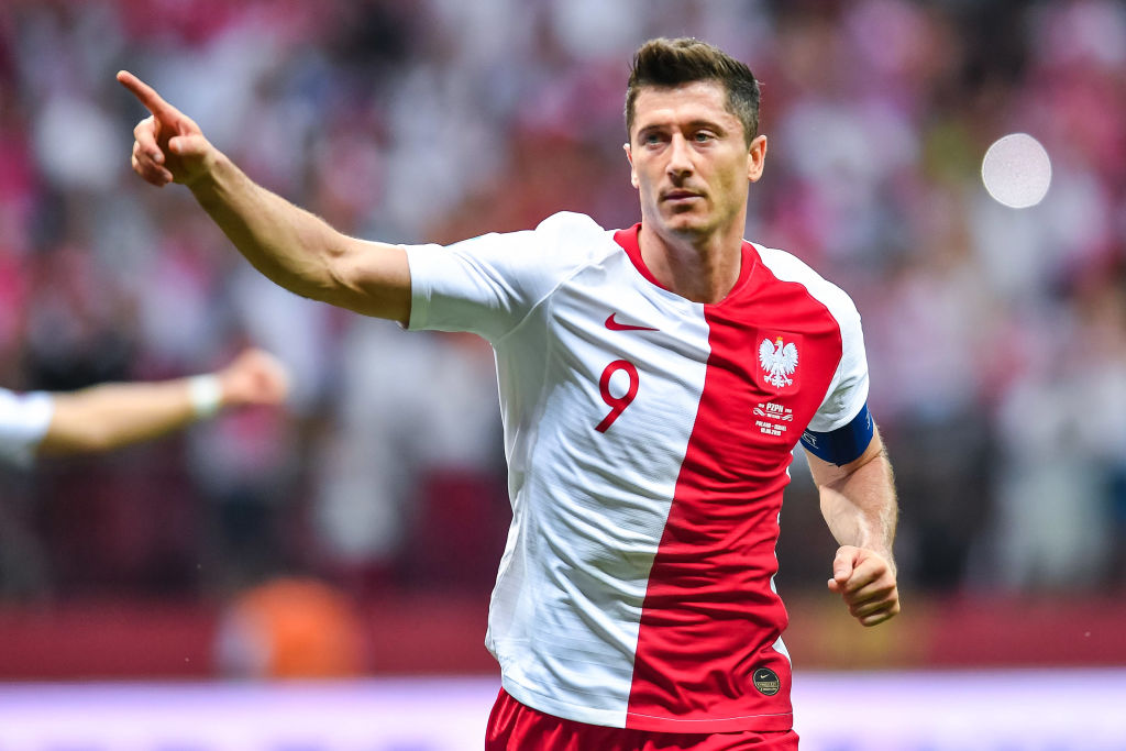
2019 was a big year for anniversary shirts, wasn't it?
Poland's for the occasion was nothing particularly outlandish, simply looking to reflect the nation's flag while looking a little like a Monaco shirt. The result was lovely, though.
7. Germany: The green away shirt (1990)
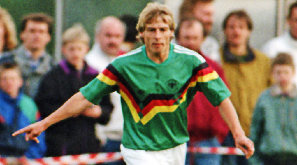
Germany only ever wore this top against TSV Barsinghausen in a friendly. The shirt took the black, red and yellow ribbon from the iconic 1990 home top, using it on the away effort.
Die Mannschaft more ordinarily had the 1988 Netherlands home top, only in green. That away jersey became a classic – but it's a close call as to whether it's better than this one.
6. Juventus: 120-year Anniversary Shirt (2017)
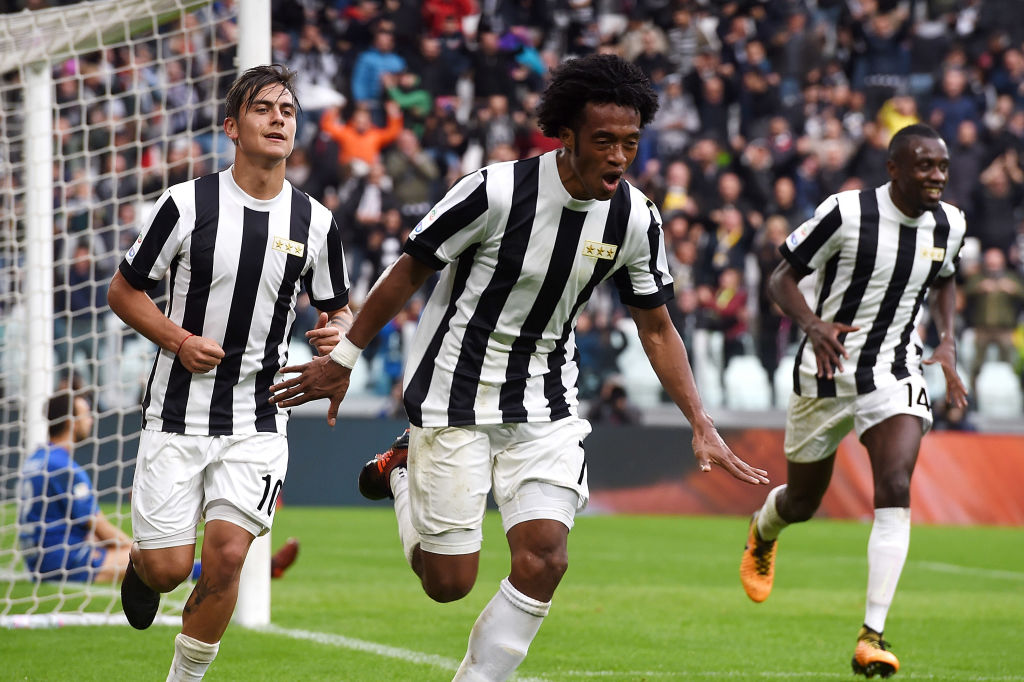
Marking 120 years of Juventus, the Old Lady wore their plainest shirt for years in a 2-1 win against Benevento in 2017.
No Adidas logo, no club crest – not even that modern monstrosity – just three gold stars on the left side of the chest, one for every 10 Scudetti in their history. Petition to change the Juve shirt to this every year, anyone?
5. Borussia Dortmund: the Blackout centenary shirt (2019)
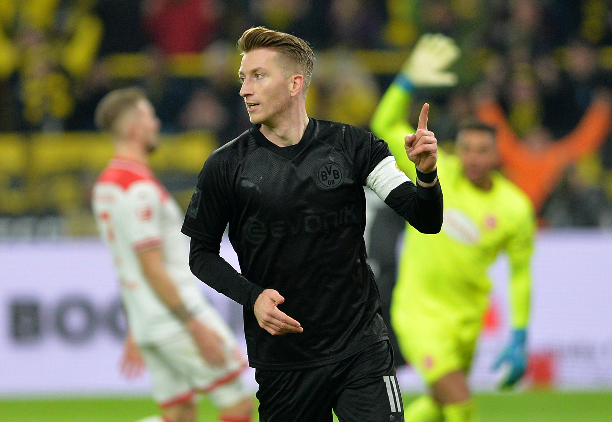
There's arguably nothing cooler than a blackout kit, is there? Now try a blackout kit worn by the hipsters' faves, Borussia Dortmund.
Marco Reus and co. wore this one as a 100-year homage, using silver numbers on the back below the customary "DORTMUND" at the top of the back. This has become legendary, with fans across Europe fawning over it.
4. Fiorentina: The Red 'Nintendo' kit (1999)
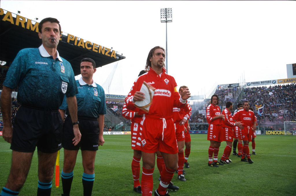
Fiorentina have worn red as a change shade in the past – but only once was this particular shirt worn: in a defeat, unfortunately, against Parma.
Sponsors can often take away from an otherwise nice jersey – looking at you, Chevrolet-era Manchester United – but perhaps the reason this one looks quite this good is because of the Nintendo logo, which was the same colour as the rest of the shirt. One of many iconic I Violi shirts and not just because Gabriel Batistuta wore it.
3. Juventus: Palace collaboration kit (2019)
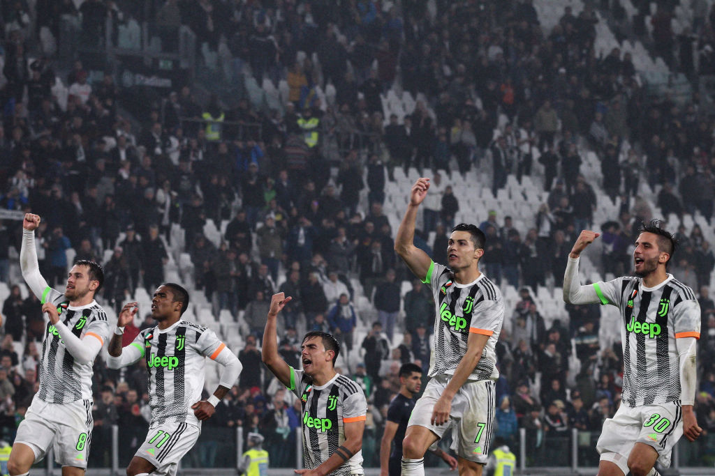
In 2019, Adidas's unlikely collaboration with London-based skate brand Palace created something genuinely fresh and different for Juventus.
On paper, bright green and bright orange probably shouldn't work with faded stripes and cloud graphics. Yet this shirt – which was worn in a game against Genoa – looked like it had landed from another galaxy, especially compared to some of the more tired efforts that Juve have been given over the years. An absolute triumph.
2. Various: Stand Up Speak Up kits (2005)
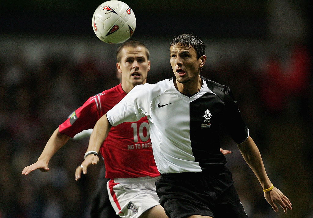
Remember those wristbands? Concocted as an anti-racism message for a series of friendlies, Nike introduced powerful black-and-white-halved tops in 2005 for their Stand Up Speak Up campaign, alongside the interlocking monochrome silicone bands, which were all the rage back then.
Various Nike sides wore them, with Netherlands donning their top away to England. The England shirts had "No to racism" in silver under the numbers, to support the message.
1. Manchester United: Munich Air Disaster 50th anniversary kit (2008)
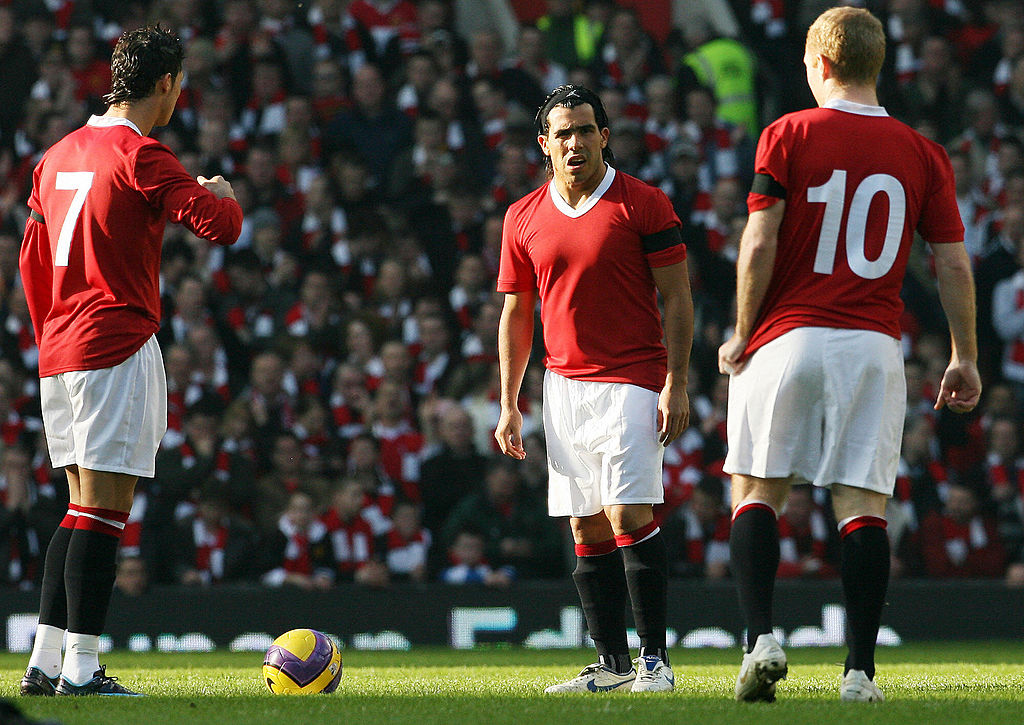
The Premier League had never seen anything like it. In 2008, Manchester United marked 50 years since the tragedy of the Munich Air Disaster with a beautiful and solemn tribute.
The all-red shirt with white trim had no badge and no logos, while the numbers on the back were straight from the 1950s. Manchester City, in turn, wore sponsorless shirts for the occasion. It's still the gold standard for how to do a tribute shirt with class.
Mark White has been at on FourFourTwo since joining in January 2020, first as a staff writer before becoming content editor in 2023. An encyclopedia of football shirts and boots knowledge – both past and present – Mark has also represented FFT at both FA Cup and League Cup finals (though didn't receive a winners' medal on either occasion) and has written pieces for the mag ranging on subjects from Bobby Robson's season at Barcelona to Robinho's career. He has written cover features for the mag on Mikel Arteta and Martin Odegaard, and is assisted by his cat, Rosie, who has interned for the brand since lockdown.
