The worst football kits ever
From the garish to the ghastly, these are 32 of the worst football kits the game has ever seen

The best football kits can be enduring classics; the worst football kits can be quite the opposite.
Over the years, some clubs have got it horribly wrong in the kit department – from 'novelty' efforts which just came out looking disastrous, to shirts so drab that players couldn't pick out their own teammates.
Here, we run through 32 of the worst kits in football history...
32. Coventry City away 1978-81
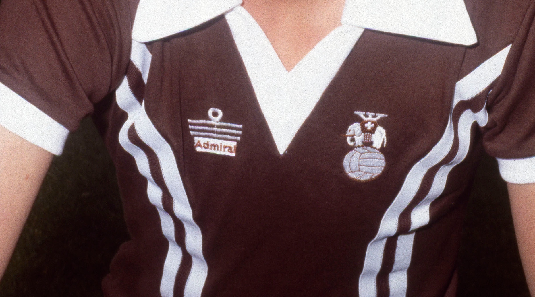
Infamous at the time, Coventry City's extremely brown Admiral away kit from the late 1970s has gone on to become a bit of a cult classic.
As is so often the case with such strips, though, that doesn't mean it's not rather horrible (although Germany's hipster favourites St. Pauli have built quite a strong brand around the colour).
31. Tottenham away 2022/23

Tottenham's 2022/23 campaign was not one to remember – and nor was their peculiar away kit from that season.
Is it just us or does it look like something you'd put on to go SCUBA diving? Granted, England doesn't get the greatest weather – but you don't need a wetsuit to play in the Premier League!
Get FourFourTwo Newsletter
The best features, fun and footballing quizzes, straight to your inbox every week.
30. Everton goalkeeper 2011/12
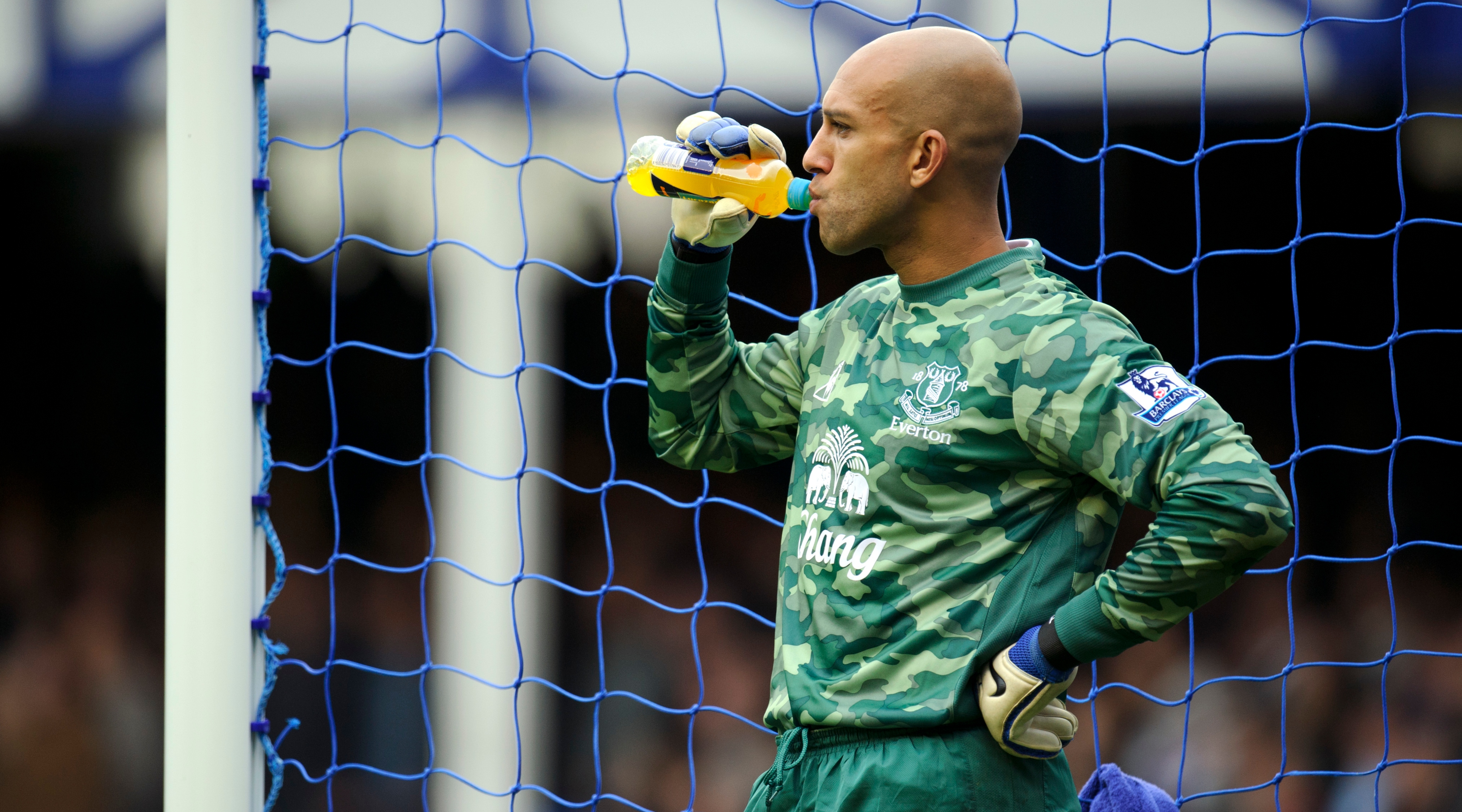
It would be advantageous to have an invisible goalkeeper – and we can only assume that's what Everton were going for when they dropped this camouflage effort for the 2011/12 campaign.
Did it work? Well, the Toffees had one of the best defensive records in the Premier League that season, with only top two Manchester City and Manchester United conceding fewer goals.
29. Exeter City home 2020-2022
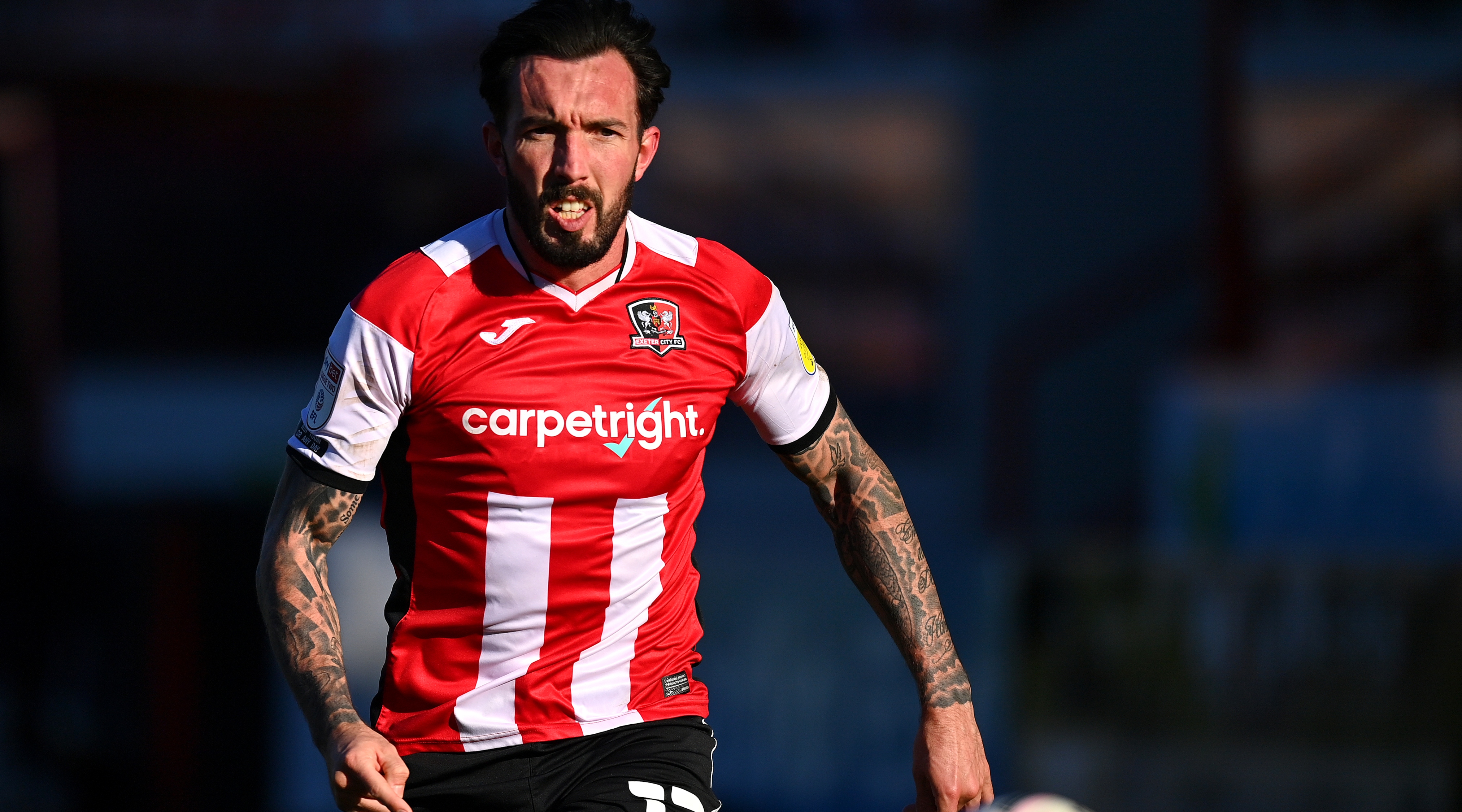
Exeter City's classic colour scheme is red and white stripes – or at least it was until 2020, when the Devon club decided to mix it up, and ended up messing it up.
It's fine until halfway up the shirt, then a big red splodge consumes the stripes (or maybe it was supposed to resemble a carpet in a nod to their sponsor at the time...?).
28. Arsenal away 2023/24
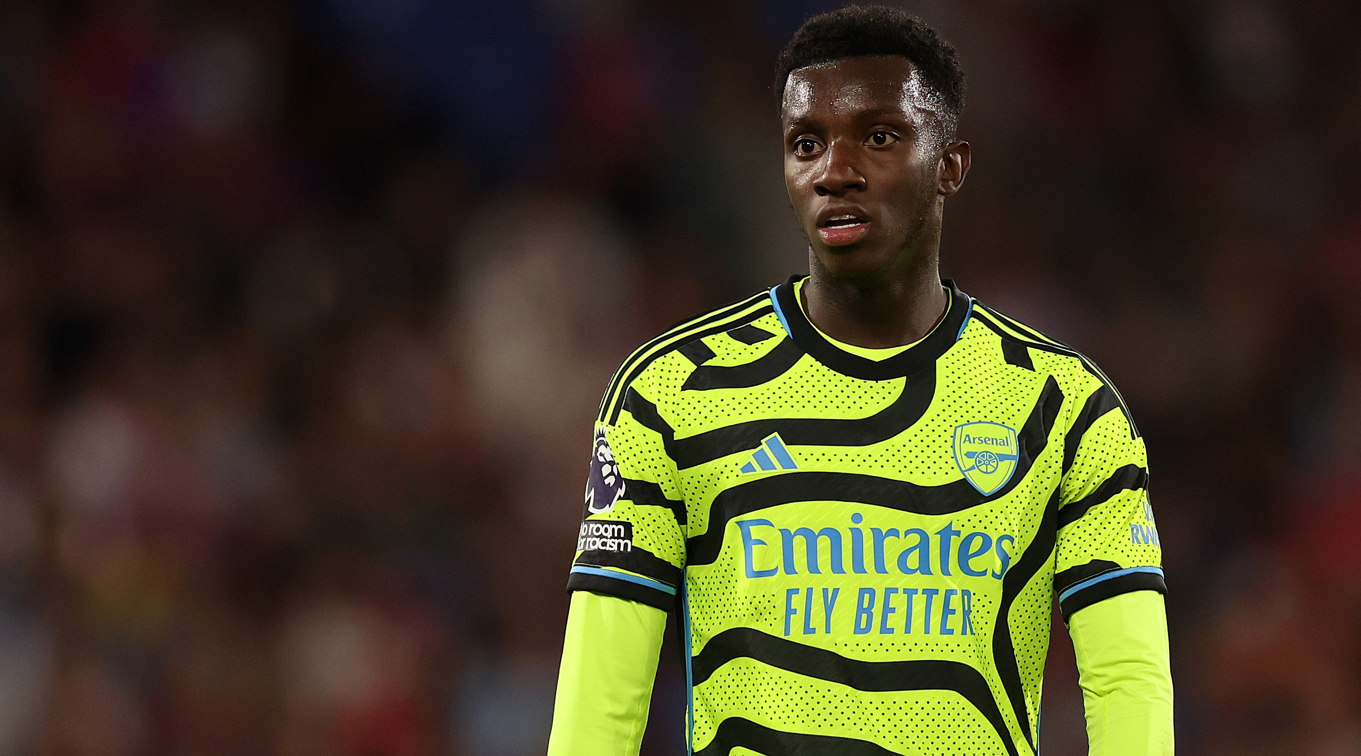
Arsenal made sure they would be seen on the road during the 2023/24 campaign, unveiling this truly garish away strip – undoubtedly one of the boldest in the club's history.
The Gunners had had plenty of other yellow kits over the years, but this took things to a whole new level (and isn't it going to cause some confusion with stewards...?).
27. Barcelona home 2021/22

For so long, Barcelona kept it simple with their iconic Blaugrana stripes and no sponsor – until the mid-2000s, in fact.
It was inevitable that a logo would eventually appear on the front of their shirt – but then they started fiddling about with the stripes too, and their club crest-inspired home design of 2021/22 was kind of chaotic.
26. Norwich City home 1992-1994
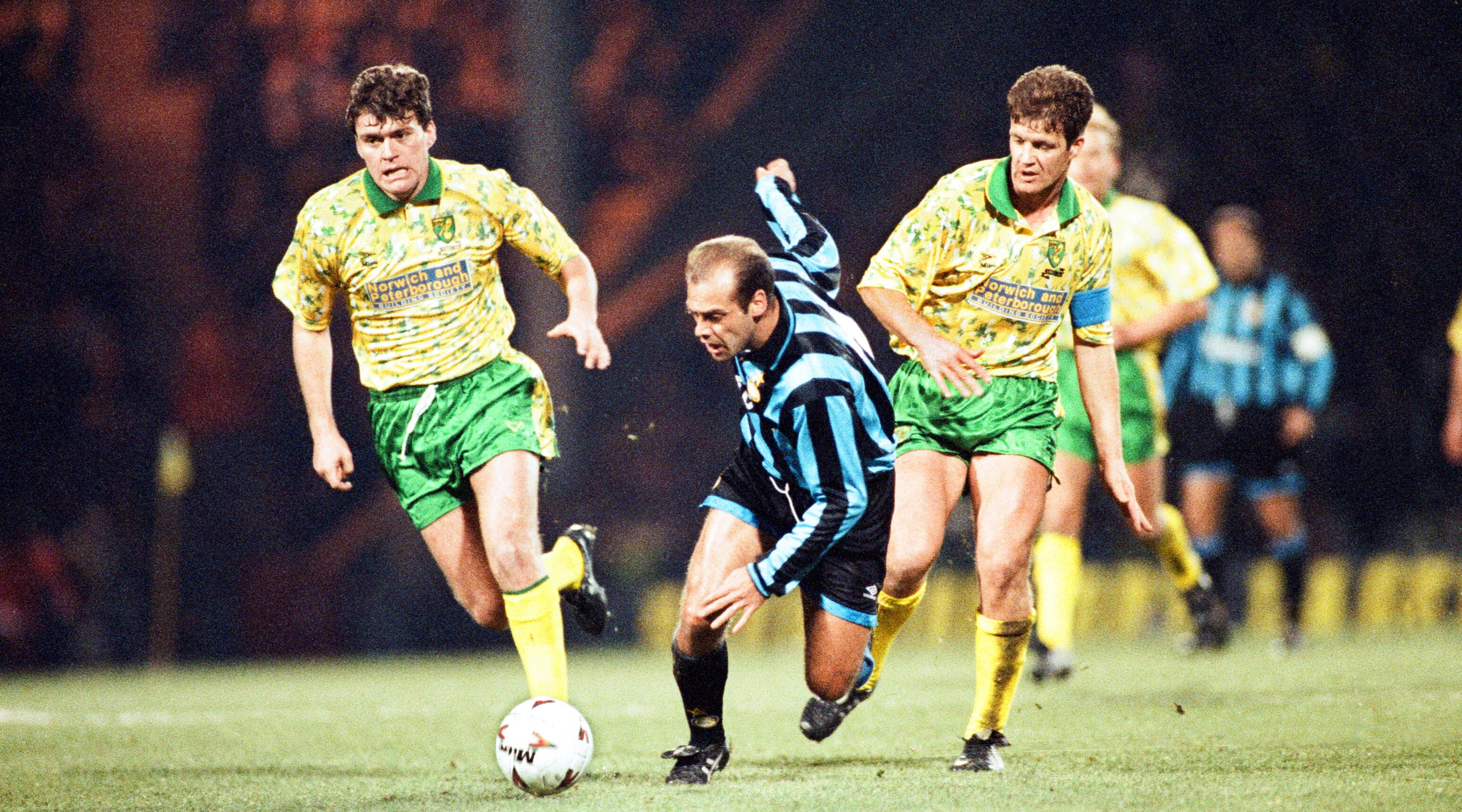
Norwich City are nicknamed the Canaries – and in the early 1990s, one (or more) of the little yellow birds apparently did their business all down the club's home shirts.
Not that it affected Norwich too much: they finished third in the inaugural Premier League season of 1992/93, which marked the highest league placing in their history.
25. Chelsea away 1995-1997

Chelsea's mid-1990s away strip was simultaneously far too yellow and not yellow enough – thanks to the presence of some out-of-kilter light blue stripes (which weren't even complete stripes).
This wasn't one of the West London club's finer efforts – although they did win the FA Cup in the kit's second season.
24. Hull City home 1992-1993
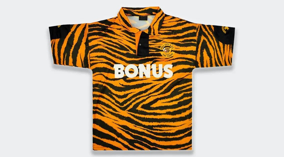
Hull City are nicknamed the Tigers – and the Yorkshire club seemingly wanted to make sure everybody knew that in the early 1990s, when they dropped this eye-catching kit.
Animal print rarely looks good on blokes who aren't rockstars – and, in the nicest possible way, then third-tier Hull's players were not rockstars.
23. Athletic Bilbao European 2004/05
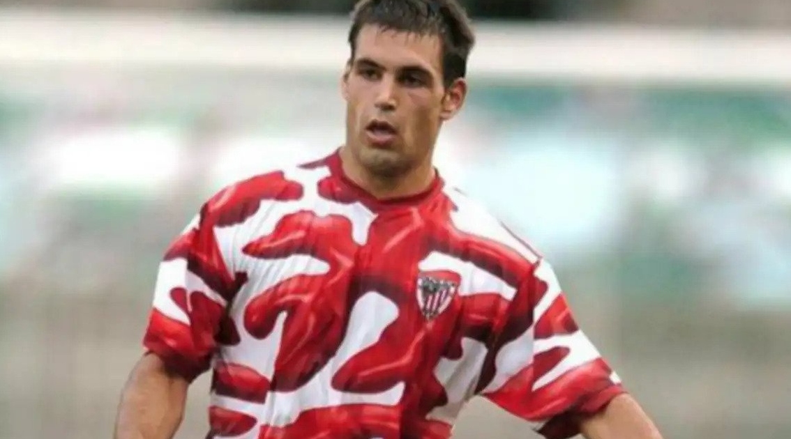
SPLAT! It's the 2004/05 Athletic Bilbao European kit – which must go down as one of the iconic Basque outfit's worst strips ever.
The city of Bilbao is famed for its architecturally funky Guggenheim art museum – but Athletic Club's players didn't exactly look like masterpieces while donning this during their UEFA Cup campaign that season.
22. Portsmouth third 2002/03

Gold kits tend to be pretty unflattering – tacky, even – but Portsmouth's 2002/03 third strip was a particularly bad example, if in part due to the shirt sponsor: Ty (of Beanie Babies fame).
That said, it has a special place in Pompey's history as that was the season they won the English second tier title at a canter, returning to the top flight after 25 years away.
21. Juventus third 2021/22

Juventus have had some great change strips over the decades; their blue, white and yellow 2021/22 third kit was not one of them.
Those colours don't really go together, and the pattern's lack of symmetry makes the design all the more frustrating – and that's before we get onto what is effectively two sponsor's logos slapped onto the front of the shirt.
20. Wolves away 2020/21

Wolves' 2020/21 away kit might not have been so bad had they left the orange and black accents (representing the West Midlands club's home colours) off the design.
As it was, this mostly blue and white number looked a bit like a liquorice allsort that's gone all funny in the packet (or one of your wife's dresses, as one creative Wolves fan proved...).
19. Stevenage away 2019/20
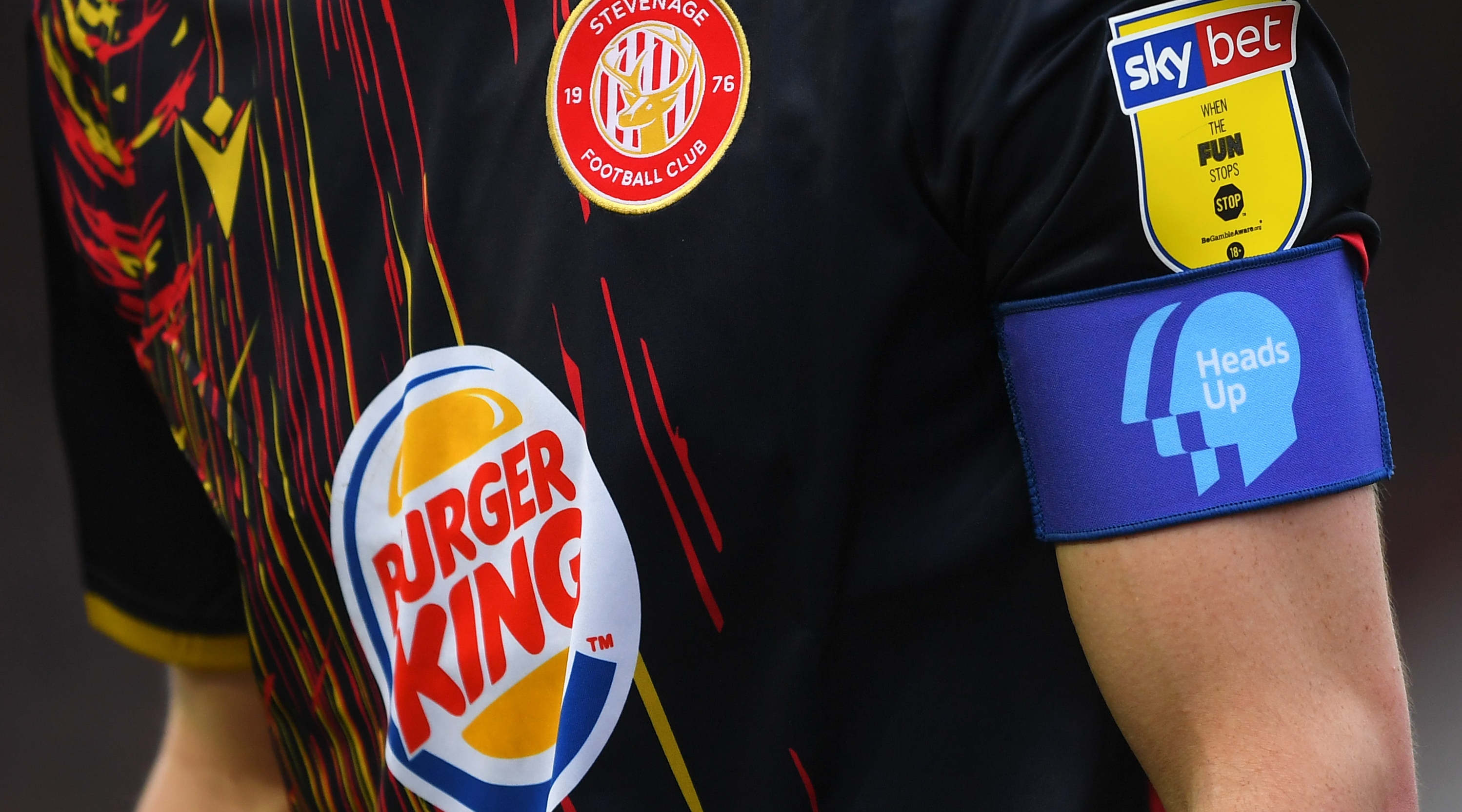
We all know how easy is it to spill ketchup down your shirt while tucking into your half-time burger or hot dog – but did Stevenage's 2019/20 away kit really have to remind us?
And it's not just ketchup either: that yellow stuff must be mustard, right? Maybe the Hertfordshire club's fans are just particularly messy eaters; who knows...
18. Atletico Madrid away 2004/05
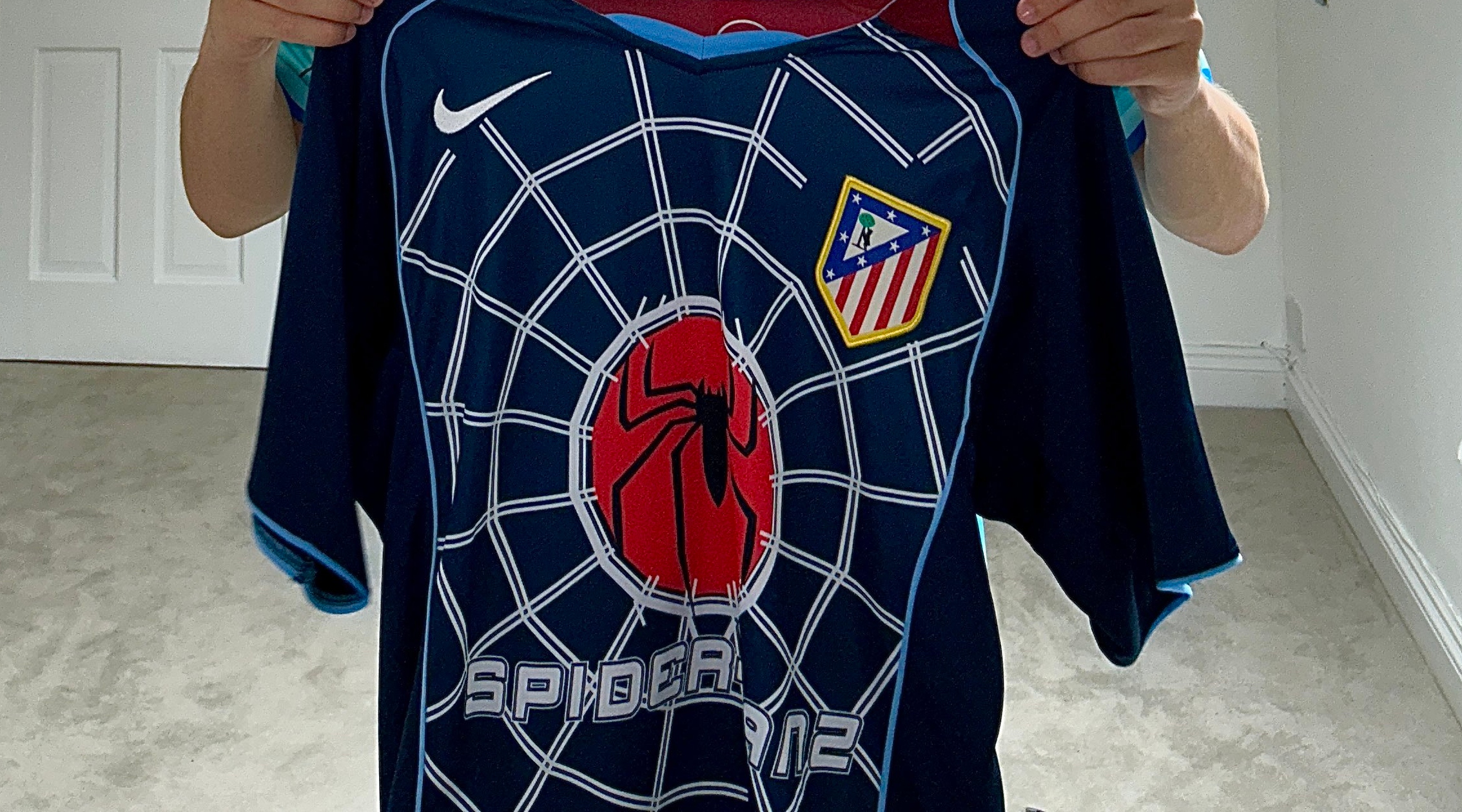
As part of their sponsorship deal with Hollywood film giants Columbia Pictures, Atletico Madrid's shirts regularly bore the logos of different blockbuster film releases.
That was pretty cool, we have to say – but they went too far with their spiderweb-adorned 2004/05 away shirt, promoting Tobey Maguire's Spider-man 2.
17. 1860 Munich Oktoberfest 2018
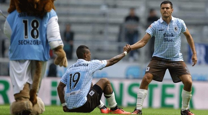
Oktoberfest is a big deal in Munich – a very big deal, attracting millions of visitors from around the world every year.
It's natural, then, that one of the Bavarian city's football clubs might want to release a kit celebrating the beer extravaganza – just maybe not an homage to lederhosen, as 1860 Munich came out with in 2018.
16. Celtic away 1991/92
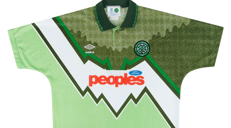
An away kit that looks just like your home kit is bad enough – but an away kit that looks like a badly executed artistic remix of your home kit is even worse, as Celtic fans will attest.
The late 1980s and early 1990s were barren for the Glasgow giants, whose supporters had to put up with this eyesore on the road as they saw their team miss out on the Scottish title for the fourth straight season.
15. Manchester City third 2021/22

Puma released a string of strips in this style for the 2021/22 season, so Manchester City weren't the only club lumbered with one – but 'unlicenced knock-off' isn't exactly a look you want when you're the English champions.
The club's badge was there – only it was within the fabric... in the same colour... It's fair to say this kit will not be remembered as a classic.
14. Manchester United away 1995/96
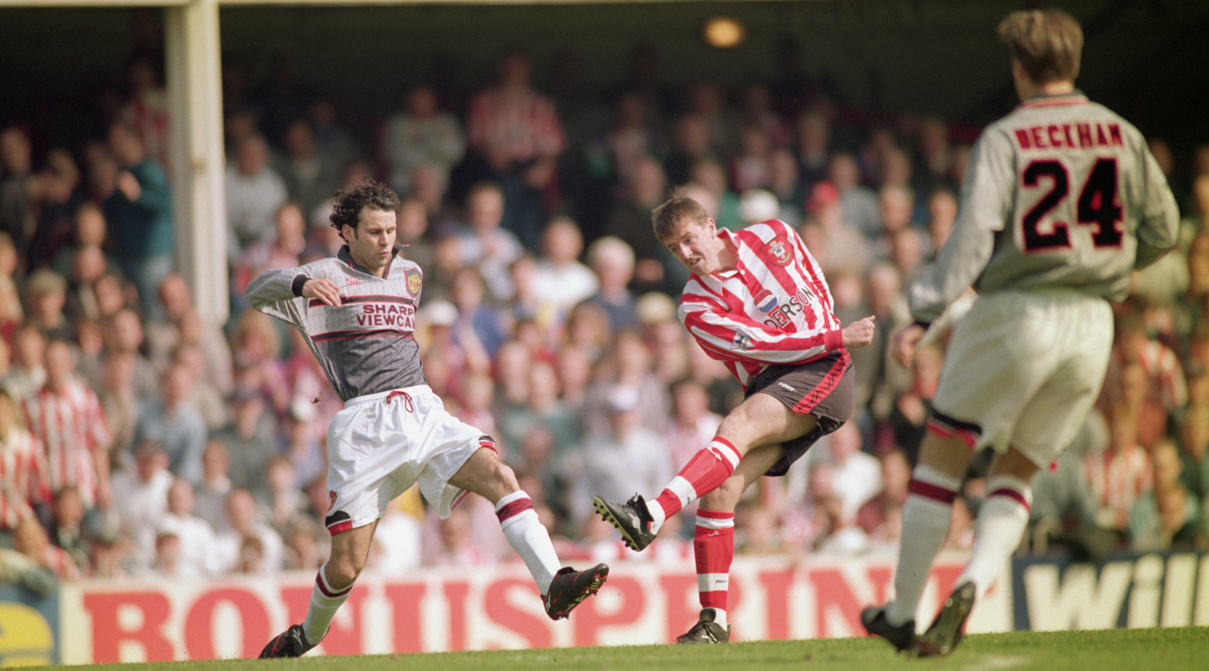
Manchester United's dreary grey 1995/96 away kit is one of the most infamous of the Premier League era – in no small part due to what happened in the Red Devils' game away to Southampton.
3-0 down to the Saints at half-time, United took the radical step of changing kits at half-time as players complained they couldn't see each other properly. They went on to lose 3-1.
13. Liverpool third 2011/12
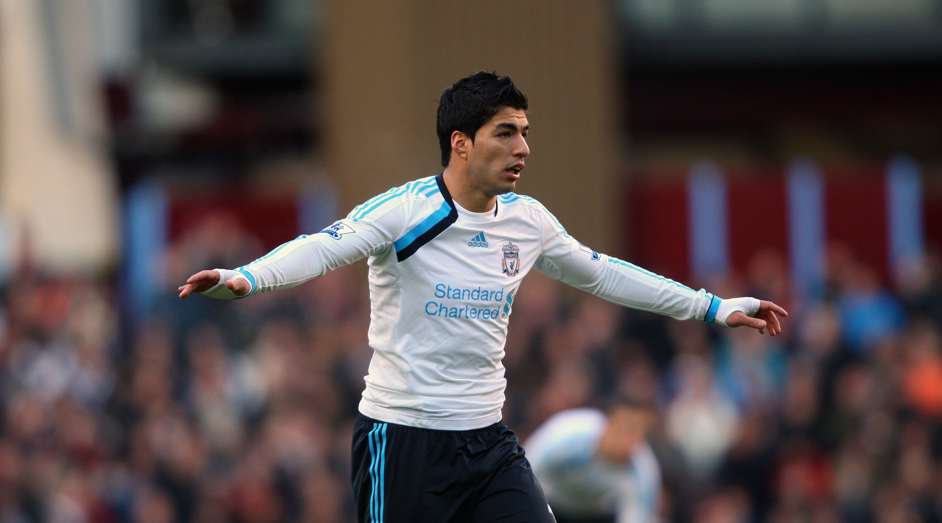
Blue has featured on the odd Liverpool kit throughout the Merseyside giants' long history – but, given that it's associated with their local rivals Everton, it never looks quite right in any shade, and it was especially unappealing in this combination from 2011/12.
Plain old white with a black and light blue accent: it's just not very appealing, is it? Mind you, the worst part is arguably the almost entirely monochromatic take on the Reds' iconic badge.
12. England goalkeeper 1995/96
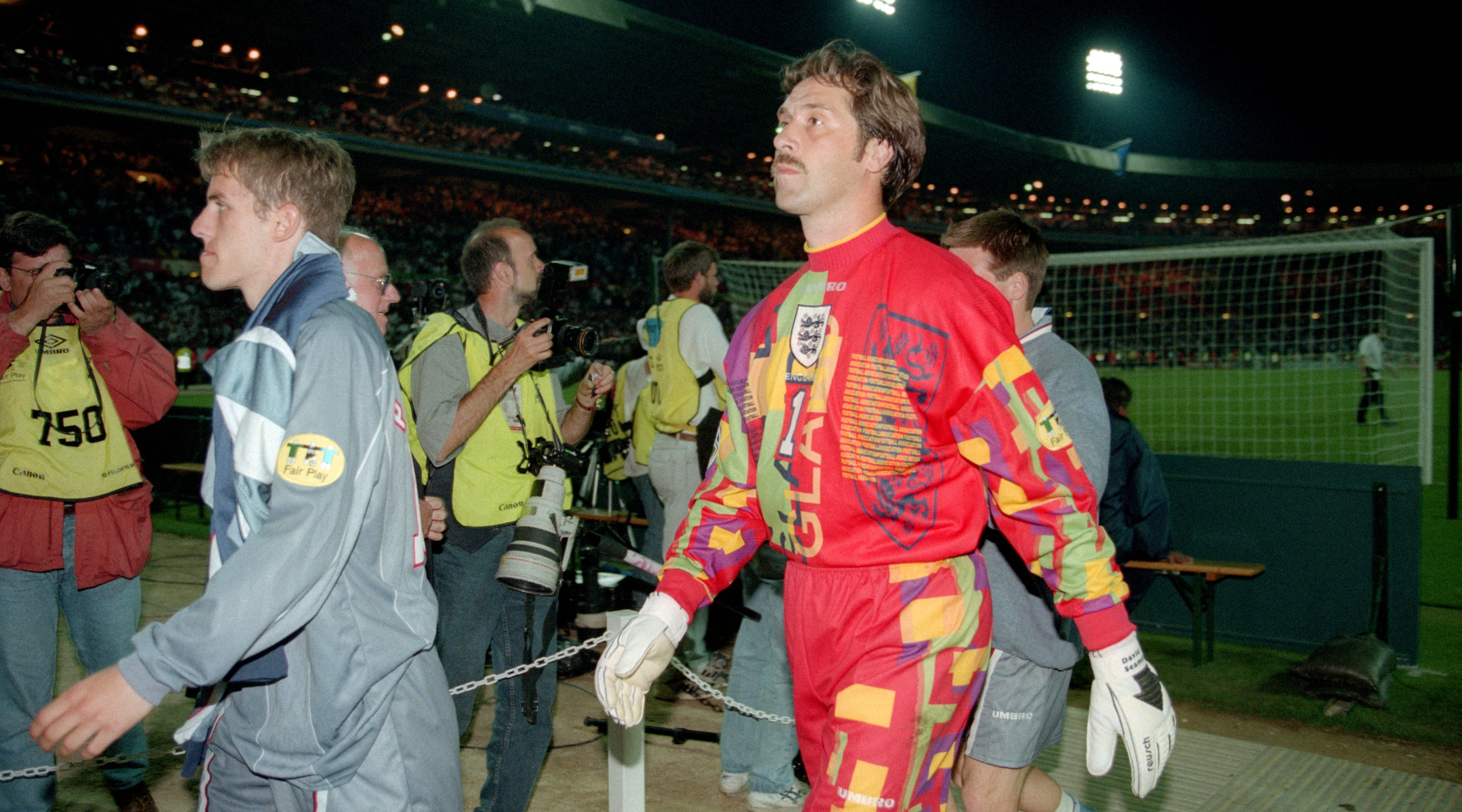
The grey kit England's outfield players wore as they were knocked out of Euro 96 by Germany on penalties was bad enough – but poor old David Seaman stuck out like a saw thumb between the sticks.
Garish goalkeeper strips can be legendary – but this one had far too much going on, to the point it just didn't look very... professional.
11. Scotland away 2014/15
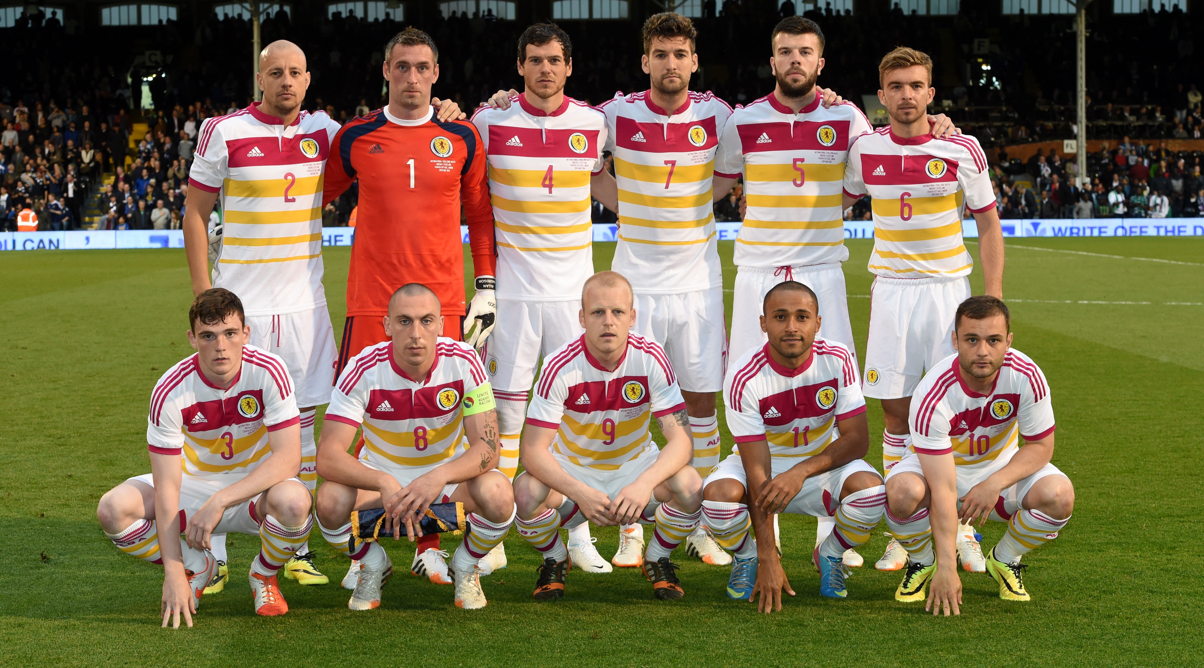
Looking somewhat like Neapolitan ice cream with the chocolate third taken out, Scotland's pink, yellow and white 2014/15 away kit was a bit of a shocker.
Could they not at least have incorporated some sort of tartan pattern or something else a bit more... Scottish into the design? The nation's players at the time must have dreaded games with a colour clash.
10. Wycombe Wanderers home 1996/97
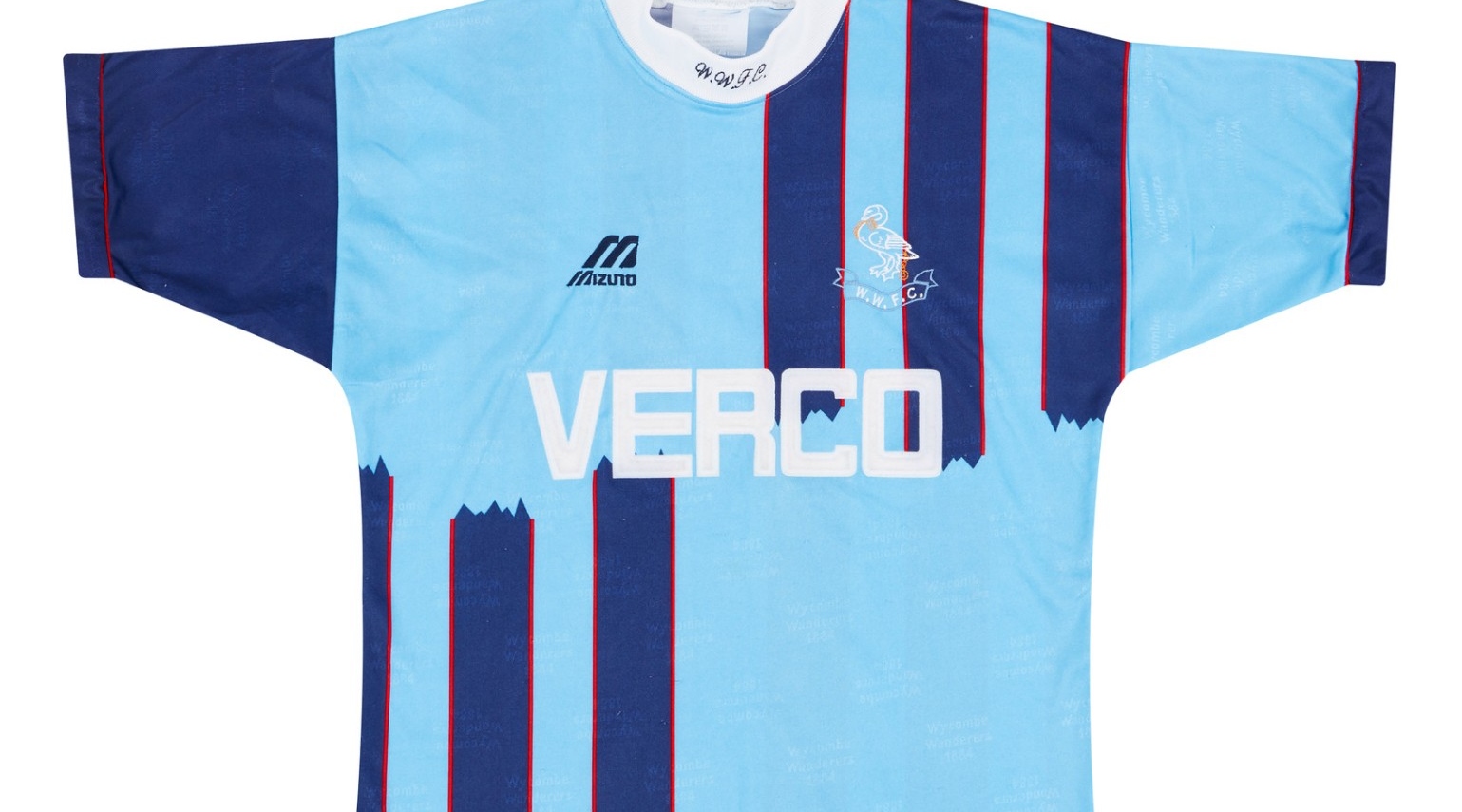
Wycombe Wanderers have famously played in light and dark blue quarters for much of their history – the combination is synonymous with the Buckinghamshire club – so why they went and ruined it for the 1996/97 season is beyond us.
This design – complete with vicar-esque collar – was voted for by the fans, although the other choice they were given was arguably even worse.
9. Newcastle away 2009/10

Newcastle's promotion back to the Premier League in 2010 was a jubilant occasion – a jubilant occasion tarnished by the fact they secured their top-flight return wearing this kit.
If you threw up this colour, you'd probably be pretty concerned – and the Magpies' 2009/10 away strip was positively vomit-inducing.
8. Stoke City away 1996/97
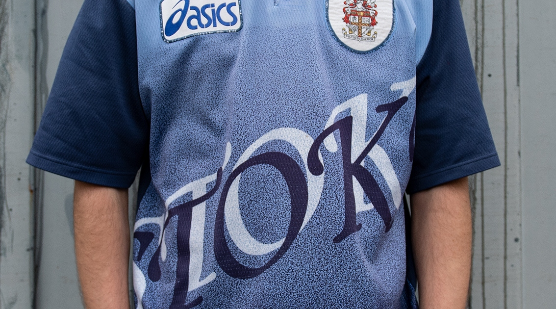
Who needs a badge when you can just loudly emblazon the club's name across pretty much the whole shirt? We can only assume that was Stoke City's thinking here.
The opposition certainly wouldn't have been in any doubt as to who they were facing whenever the Potters rocked up in this disaster of an away kit.
7. Getafe home 2010/11

Getafe took the concept of sponsorship to unprecedent levels at the beginning of the 2010s: seemingly not content with Burger King's logo on the front of their shirt, they went and let the fast food behemoths advertise on the inside of it too.
We can't verify whether any player actually did it during a match, but lifting the shirt over one's head in celebration would reveal the brand's 'King' mascot. Strange stuff indeed.
6. Fiorentina away 1992/93
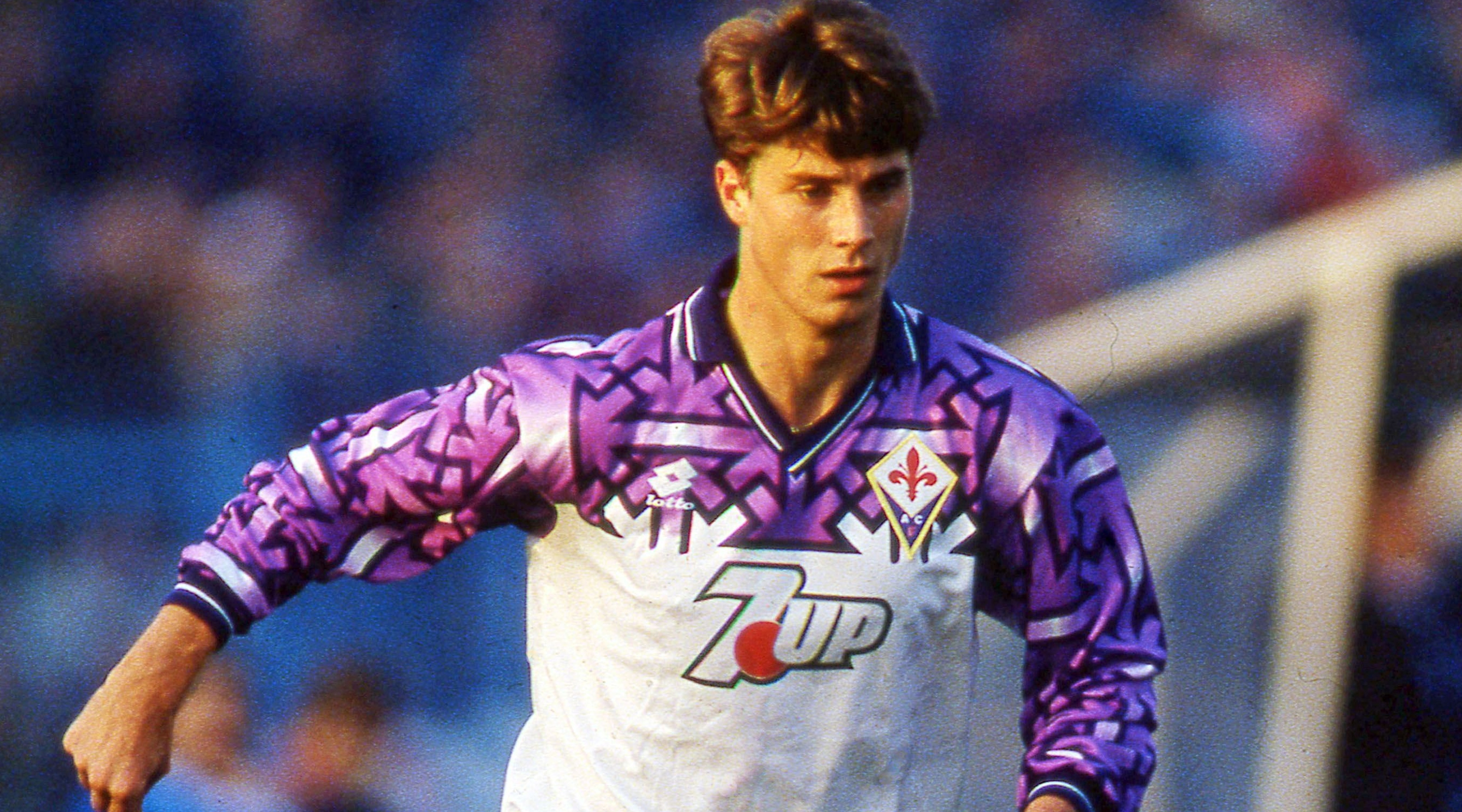
At first glance, you might notice the major problem with Fiorentina's 1992/92 away shirt – but once you spot it, you can't unsee it.
Look closely and that zig-zag design reveals... swastikas. Unsurprisingly, La Viola soon did away with this kit – which appeared during a disastrous campaign that saw them relegated from Serie A for the first time in 55 years.
5. Reggina special edition 2012/13
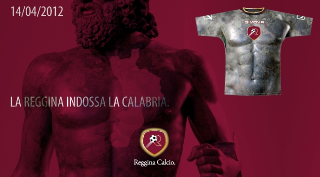
Reggina's kit based on the muscular body of an Ancient Greek statue probably sounded really cool in the brainstorming stage. The finished article did not turn out that way...
Produced for the Serie B's derby against Crotone, it's somewhat hard to believe this pair of strips (yes, they really had a home version and an away version) ever existed – but it did, and Reggina are never going to live it down.
4. Cultural Leonesa special edition 2014/15
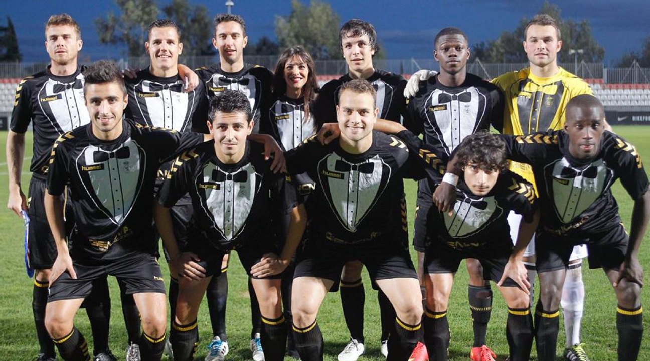
Specially made for a charity tournament, we can't knock the reason behind this tuxedo-inspired kit from Spanish lower-league outfit Cultural Leonesa.
We can knock the strip itself, though: it makes them look like a group of lads on a stag do in fancy dress as butlers or snooker players – which probably wasn't what they were going for...
3. CD Palencia home 2016/17
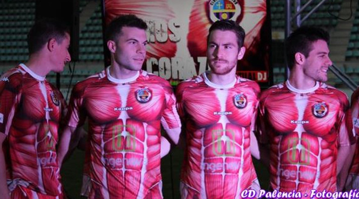
There must have been something in the water in the lower levels of the Spanish football pyramid around this time: just look at THIS strip CD Palencia came out with.
Making it look like their players had been skinned alive, this was the club's actual home kit too – what a nightmare! Did they take inspiration from that Reggina effort from a few years beforehand, we wonder...
2. Colorado Caribous home 1978
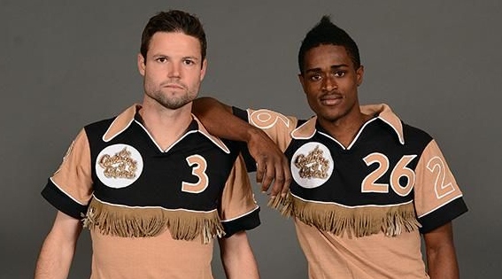
The Colorado Caribous played just one season in the old North American Soccer League (NASL) – but they left their mark on the competition with one of the worst kits the world has ever seen.
Brown and tan is an atrocious colour combination – and the tassels across the chest... Just why?! The tassels were made of leather, too! Goodness gracious.
1. Cameroon home 2002

This one's so bad it's not even a shirt: it's literally a vest. And it landed Cameroon in hot water with FIFA.
The Indomitable Lions wanted to wear it at the 2002 World Cup - but the powers that be wouldn't let them. Spoilsports!
So, Cameroon attached sleeves for the tournament – only to later defy FIFA by competing in a one-piece kit at the 2004 Africa Cup of Nations, for which they were docked points in qualifying for the next World Cup.
Tom Hancock started freelancing for FourFourTwo in April 2019 and has also written for the Premier League and Opta Analyst, among others. He supports Wycombe Wanderers and has a soft spot for Wealdstone. A self-confessed statto, he has been known to watch football with a spreadsheet (or several) open...

