These are the 19 best kits for the 2016/17 season (say us)
From Brazil to Turkey, Mexico to Italy, Huw Davies has picked out this season's shirt stunners

19. Bayern Munich, away
As Coco Chanel once said, probably, “Two-tone monochrome stripes offset by neon trim is the new black”. Probably.
Adidas led the way with their change kits for Wales at Euro 2016 and Chelsea 2016/17, but with Bayern they’ve added a third tone and swapped bitter lime for zesty orange. Fanta-stic.

18. West Ham, home
Just as it’s hard to follow last season’s Boleyn send-off, it’s hard to follow that campaign’s gorgeous, stripped-back Umbro kit.
This refined effort comes pretty close, though, despite some unwieldy wording accompanying the crest.
WEST HAM: the new 2016/17 home kit! Available now: July 16, 2016
17. Espanyol, home
Get FourFourTwo Newsletter
The best features, fun and footballing quizzes, straight to your inbox every week.
That fuzzy stripe will put off non-PowerPoint enthusiasts, but at least it’ll make opponents think they’re tripping.
And check out the innovative swopping collar, resembling a mayoral chain superimposed on a kestrel’s beak. Just us?
Les samarretes !¡Las camisetas de la Maravillosa Minoría! July 5, 2016
16. Lille, away
Phwooaaarrrrrr!
[RAPPEL] Nouveaux maillots home (blanc), away (rouge) & 3rd (bleu) du LOSC par > July 5, 2016
15. Sao Paulo, home
The Tricolor are no strangers to sleek kits, and here, their white, black and red hues are tastefully lifted by an embedded background design.
It’s just a shame Sao Paulo didn’t indulge in a literal kit launch – i.e. into space – as they did in 2013.
home musim 2016 persembahan Under Armour. May 24, 2016
14. Ajax, away
It’s a brave look, this, but Ajax pull it off. No, the XXX doesn’t refer to porn, or booze, or The XX (remember them?).
It’s taken from the Amsterdam coat of arms, which represents the city’s proud history of porn, booze and The XX.
will play in our new 2016-17 away kit! What do you think?! May 6, 2016
13. Barcelona, home
The simple, sponsor-less tribute to Barcelona’s first European Cup win, 25 years ago, should go down as a timeless classic.
FC Barcelona has launched a new kit for the 2016/17 season. Do you have yours yet? June 10, 2016
12. Porto, home
A restrained design template, juxtaposed with subtly shaded stripes-within-stripes, topped off with a sumptuous collar? Yes please. The slightly naff sponsor is a pity, though.

11. Inter, home
The classic shirt, set in a marginally darker blue and accompanied by a dizzying ripple motif, is really brought to life by golden touches – so much so, even the yellow socks work. That may not be a popular opinion, however…
e presentano le nuove divise Home e Away per la stagione 2016/2017 July 6, 2016
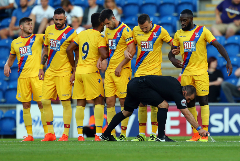
10. Crystal Palace, away
Returning to 2014/15’s yellow change strip is a good move for Palace, and sashes always look great on away kits, where they can’t upset a club’s traditional colour balance. And look at the collar! This is everything the disappointing home strip isn’t.

More beauties on page two >>>
9. Bologna, home
See, Macron, you can do red and blue stripes! Bologna’s kit is lush in its simplicity. You won’t find many striped kits with a better collar and sleeve design.
al Bologna a titolo definitivo July 14, 2016
8. Hoffenheim, home
Diving collar, well-matched tones, mildly amusing sponsor – we like this effort a Lotto (oh, hush).
New TSG 1899 Hoffenheim home kit for 2016/17 by Lotto. Revealed and worn yesterday v Schalke May 15, 2016
7. Juventus, home
This is a beauty. For a black-and-white shirt there’s a lot going on, but it avoids resembling a barcode. While Juve aren’t alone in featuring Adidas’ trademark three stripes down the sides, not the shoulders, it works particularly well here.

6. Arsenal, goalkeeper
Gone forever – or at least temporarily – are garish keeper jerseys. Printing nerds such as FFT will call the colour scheme CMYK (cyan, magenta, yellow, black), but all that really matters is that it’s niiiiice.
Arsenal's Petr Cech will wear the PUMA Tournament GK kit in 16/17 - & so can your keeper at June 28, 2016
5. Bayer Leverkusen, home
This season Bayer Leverkusen – backed by a pharmaceutical giant, don’t forget – swapped big boys Adidas for local lads Jako, and the result is a swish switch to black.
It’s a mighty fine shirt, weird shoulder pattern aside.
Who's ready to get this new and started?July 7, 2016
- RECOMMENDED 11 of the weirdest kit launches: An 80,000 floral design, Star Wars and Spain's cats
4. Aberdeen, away
Aberdeen’s bid to match or even improve on second place, despite Rangers’ arrival, will look especially sexy on the road.
Here it is... the new Aberdeen FC away kit! Available online at June 14, 2016
3. Galatasaray, home
There’s a lot to like here, be it the colour contrasts, the thin horizontal lines, or the continuing shirt-to-shorts stripe. Lovely.
Galatasaray'ımızın 2016/17 sezonu formaları. (via Footy Headlines) July 12, 2016
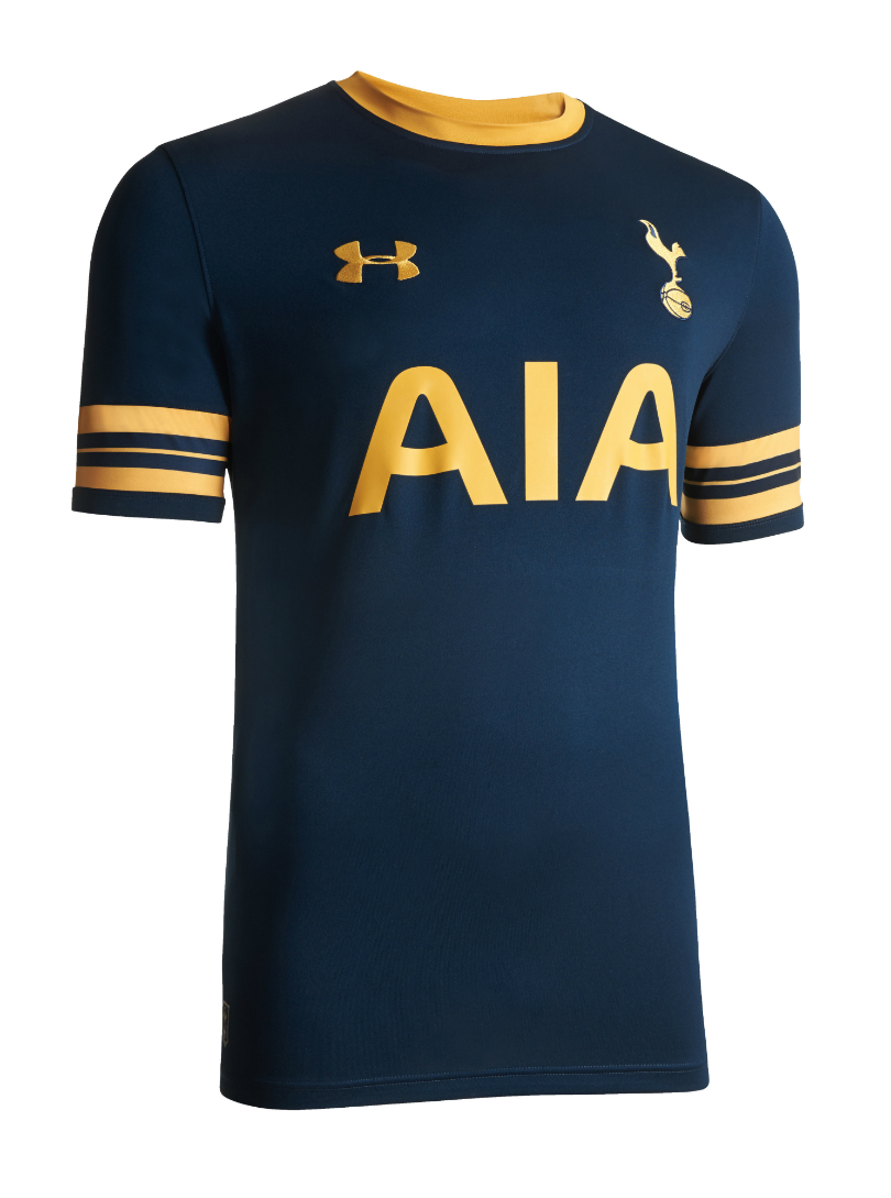
2. Spurs, away
Tottenham’s third kit for 2016/17 is a gold monstrosity, but their primary two uniforms more than make up for it.
We especially like what Under Armour have done with the change strip: clean and understated, in just the right shades.

1. Pumas, home
Crikey. Where to start? No, really: ‘where do we start?’ must have been the first thing Nike said when beginning this conceptual design.
The shirt incorporates everything from zodiac signs and the popular Central Library’s circular patterns (representing the contrasting heliocentric and geocentric theories of Copernicus and Ptolemaeus, obviously) to traditional Mexican imagery and a 16th-century city map, creating an astounding tribute to astronomy and astrology that, most importantly, looks incredible. It’s impressive Nike even managed to find space for their swoosh.
¡Pumas de corazón! ¡Porten con orgullo nuestra nueva piel!July 13, 2016
Buy this. Buy this now.
Huw was on the FourFourTwo staff from 2009 to 2015, ultimately as the magazine's Managing Editor, before becoming a freelancer and moving to Wales. As a writer, editor and tragic statto, he still contributes regularly to FFT in print and online, though as a match-going #WalesAway fan, he left a small chunk of his brain on one of many bus journeys across France in 2016.
