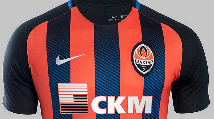
19. Shakhtar Donetsk home
Shakhtar have long been underappreciated in the kit stakes, and it’s time to put that right. This probably isn’t their greatest ever contribution, but it’s still better than most: orange and black is a cracking combination, while the blue gradient adds a different dimension. It’s a yes from us.
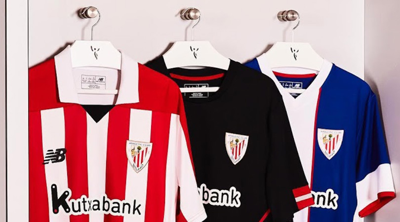
18. Athletic Bilbao, home and away
It’s easier than you’d think to mess stripes up, but Athletic Bilbao have struck the right balance this year: not too many (are you reading this, Sunderland?) and not too few.
They’ve backed that up with a very smart away top, which is supposedly based on the uniform worn by the club in the 1940s. Works for us.
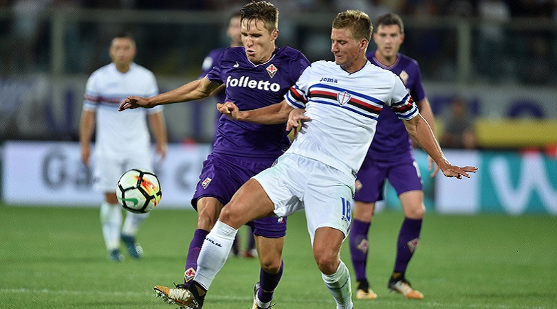
17. Fiorentina, home
A minimalist Le Coq Sportif classic, Fiorentina almost lost their place in the rankings as punishment for revealing four (four!) away kits for the 2017/18 campaign. None of them come close to matching this evocative purple number, which has thankfully been deemed too sacred to tinker with. Sometimes less really is more.
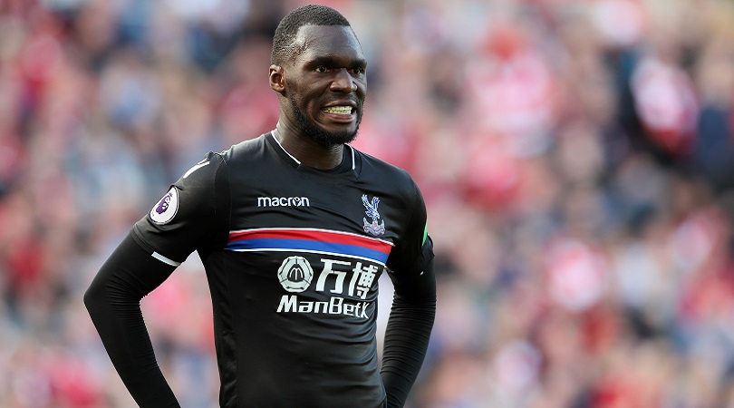
14. Crystal Palace, away
Oh, Palace. You were almost there. You could have had something truly special here. But you’ve gone and ruined it with the final addition.
Let’s be clear: this is still a very lovely design, the red and blue horizontal band adding a dash of style to an already-sexy black background. It’s impossible to ignore the ugly sponsor’s logo splattered all over it, though, which is why Palace miss out on the top 10 (probably not for the last time this season).
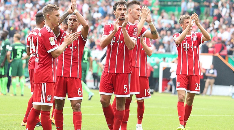
13. Bayern Munich, home
Bayern don’t produce many duds and the 2017/18 home outfit is no exception to that rule. A throwback to the 1974 European Cup-winning shirt worn by such greats as Gerd Muller and Franz Beckenbauer, this strip features four vertical white stripes on a red canvas and is rounded off nicely with extra dashes of white on the sleeves and collar.

8. Flamengo, home and away
Adidas have played a blinder here. Flamengo’s traditional red and black hoops are complemented by some terrific little touches, namely the two white buttons and the black stripes on the shoulder.
The away kit, a white shirt with a red and black stripe running down the left-hand side, is arguably even better.

4. Benfica, home
Polo-style collar? Tick. Embroidered badge? Tick. A sponsor’s logo which, as far as possible, blends in rather than takes over? Tickety tick tick.
A tribute to former great Eusebio, this kit is 1960s-inspired without looking dated. It’s just a shame they ran out of inspiration before designing such a dreadfully dull away strip.
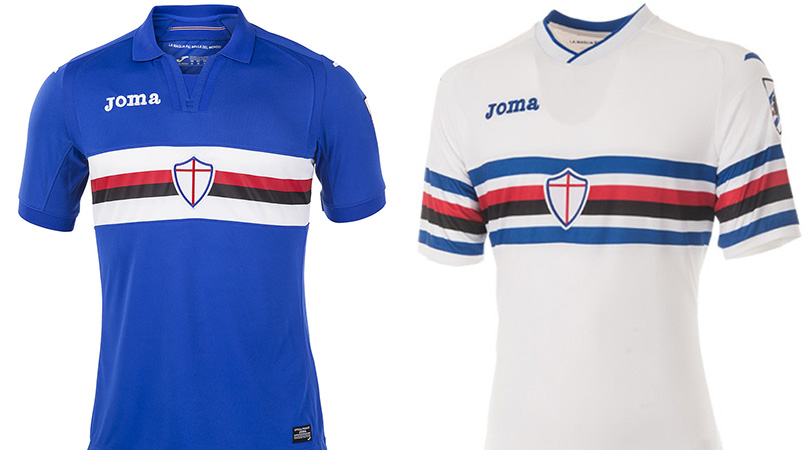
1. Sampdoria, home and away
The kit kings are back and, mercifully, they haven’t changed a winning formula. Both home and away shirts feature the legendary horizontal band of white, blue and red; the badge remains on the sleeve, too, which is the type of thing only Samp are cool enough to pull off.
The words “la maglia più bella del mondo” (“the most beautiful shirt in the world”) are stitched on the inside of both jerseys. Who are we to argue?
Greg Lea is a freelance football journalist who's filled in wherever FourFourTwo needs him since 2014. He became a Crystal Palace fan after watching a 1-0 loss to Port Vale in 1998, and once got on the scoresheet in a primary school game against Wilfried Zaha's Whitehorse Manor (an own goal in an 8-0 defeat).

 Join The Club


