20 football shirts that looked better with a sponsor
Lovely, lovely logos
The stunt pulled by Paddy Power and Huddersfield recently shone a light on how readily fans will rise up against the tarnishing of their beloved traditional colours.
Over the years, however, some sponsorship deals have become almost as synonymous with the kit as the colours themselves. Others have helped make the design even more eye-catching. Don’t believe us? Then read on…
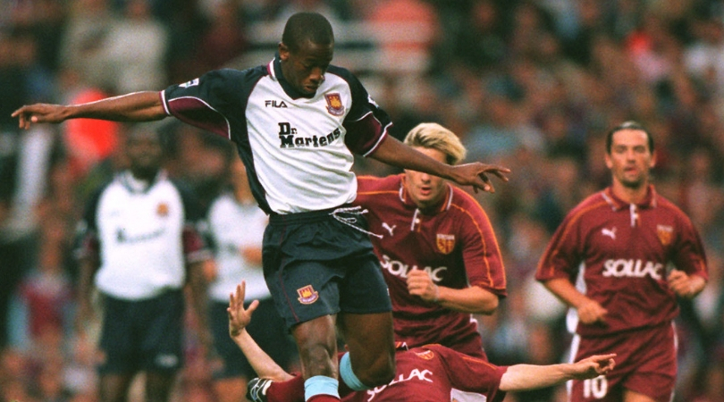
West Ham away, 1999-2001
The idea of the skinheads’ preferred footwear brand sponsoring a football team nowadays seems farfetched, but Dr Martens struck deals with the Hammers and Rushden & Diamonds at the turn of the millennium.
The claret sleeve undersides helped this not look like a Spurs top at first glance, but the eye-catching logo made sure.
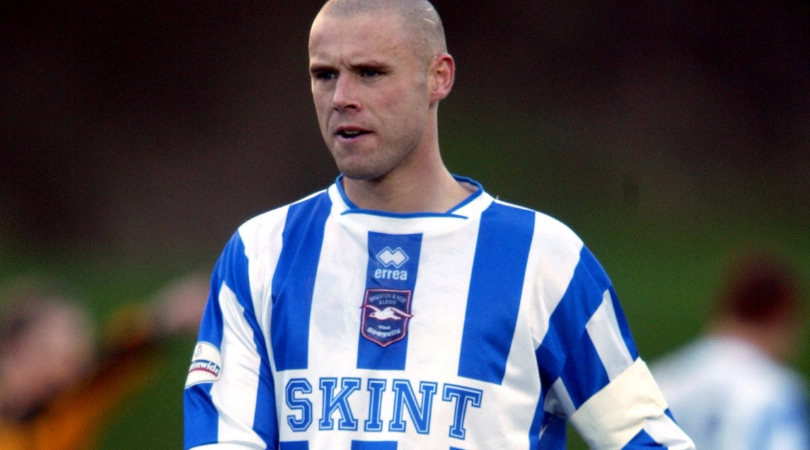
Brighton home, 2002-04
Very cool. The Seagulls peaked – in kit sponsorship terms, anyway – in the early-noughties by plastering local hero Fatboy Slim's record label across the front of their shirts. What’s more, the big block letters actually complemented the rest of the kit nicely, with a white-and-blue combination that matched the traditional stripes.
Brighton have come a long way since those lower-league days, and fans might have a wry smile at the idea of players running around with ‘Skint’ written on their fronts now they’re cashing in on the Premier League millions.
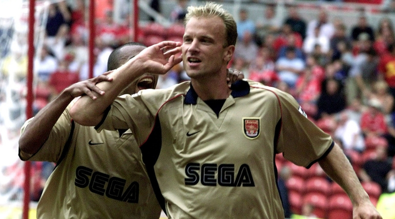
Arsenal away, 2001/02
Before the Invincibles era kicked off, Arsenal were already at it as they went unbeaten in this kit.
All three losses in their second Premier League title season under Arsene Wenger came at home, where they wore a decidedly less appealing top flogging SEGA’s ill-fated Dreamcast. Who even bought one of those?
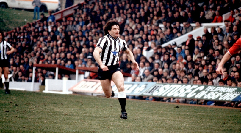
Newcastle, 1983-86
Although Newcy Brown is actually brewed in the Netherlands nowadays, it remains a Newcastle icon and has proudly emblazoned several kits.
In the mid-1980s, the blue star incorporating the city skyline shone on its own. And although the ‘90s shirts were also great, less is usually more when it comes to football kits.
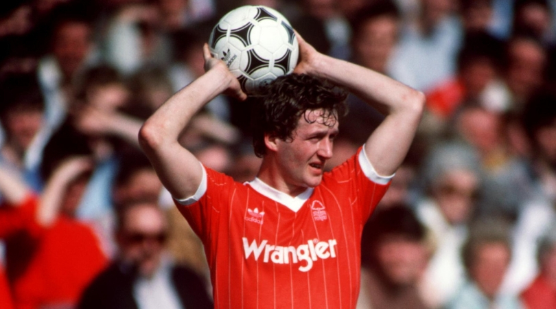
Nottingham Forest home, 1982-84
Back in 1982, Peter Taylor’s decision to retire as Brian Clough’s assistant was the talk of the town in Nottingham.
A new sponsor was therefore a fairly insignificant development, but it did still improve a shirt that wasn’t unlike those being worn by Liverpool and Manchester United at the time. Pinstripes for the win.
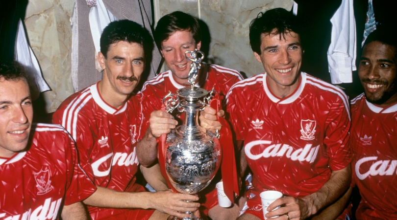
Liverpool, 1989-91
Back in the old days (a time before the Premier League, kids) Italian domestic appliances were all the rage. Probably.
This effort from Adidas was arguably Liverpool’s boldest of all time – and that classy font would’ve improved your washing machine itself, regardless of what you put in it.
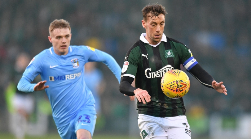
Plymouth home, 2018/19
Plymouth sank to League Two last season, but at least they looked good.
PUMA kits don’t always get a great press, but this one bucked the trend – thanks in no small part to the Ginsters logo. Who would’ve thought that a petrol station treat could be a fashion phenomenon?
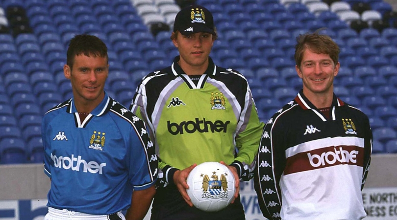
Manchester City home, 1997-99
One thing’s for sure – you’ll know about it if Kappa are making your club’s kit. This was the first in a six-year run of unusually dark blue efforts, but the last of Brother’s 12-year association with City.
Umbro’s tops from earlier years might hold more retro value, but the Japanese printer company’s low-key lettering helped transform this kit – and distract your gaze from the horrible mess on the sleeves.
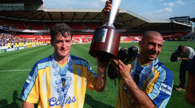
Chelsea away, 1996/97
'90s away kits were a bit unpredictable to say the least, but Coors managed to stop this monstrosity from blending into the crowd – whether by luck or design.
It returned the following season with Autoglass plastered through the middle instead, but it wasn’t quite the same and proved that the American brewery’s logo had helped improve what had been a terrible kit.
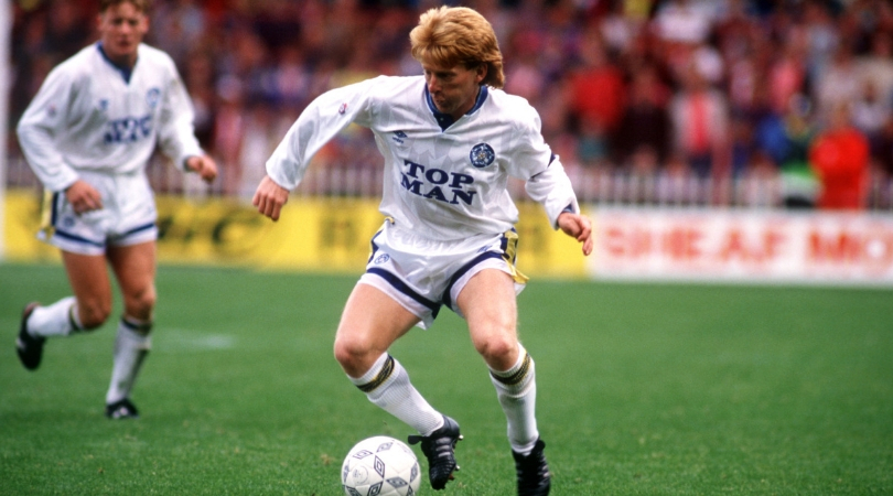
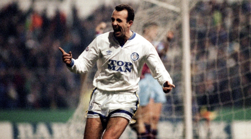
Leeds home, 1990/91
Topman’s early badge managed to provide the finishing touch to an already excellent Umbro-designed Leeds kit. The Elland Road club finished fourth on their return to the top flight, all while clad in one of their greatest shirts.
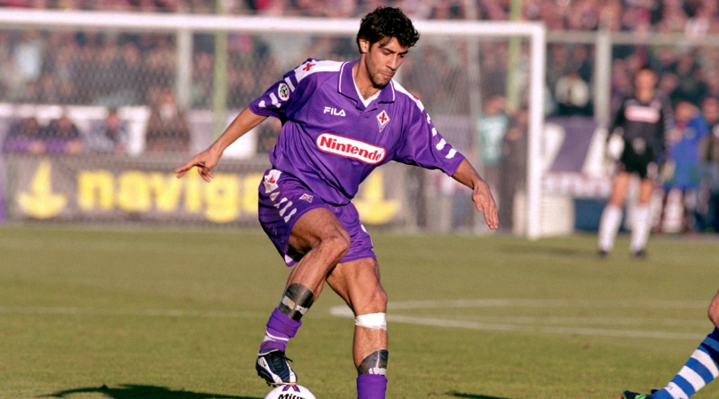
Fiorentina, 1998/99
These colours usually shouldn’t mix well, but trust the Italians to make it work. This effort from La Viola is one of the sport’s most striking and memorable shirts.
Nintendo can look back fondly on a job well done – in the nation of their own moustachioed, turtle-trampling mascot, no less.
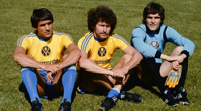
Eintracht Braunschweig, 1972/73
Yes, you really are seeing a proud Jägermeister logo sticking out on the front of players’ jerseys. What’s more, it was the first time a team had ever put a sponsor on the front of their kits, and forced stuffy German suits to change the nation's laws.
It was a strong start to the marketing game, as the logo was neat, unintrusive and complemented the rest of the kit.
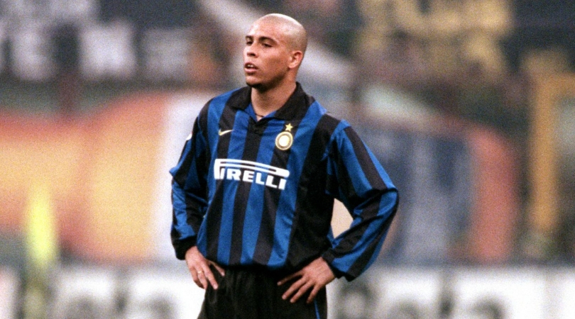
Inter Milan home, 1998-99
The blue and black stripes. The golden badge. The long Pirelli ‘P’.
All of it just screams ‘Inter’. Plus, let’s be honest, it looked even better when Ronaldo had it on.
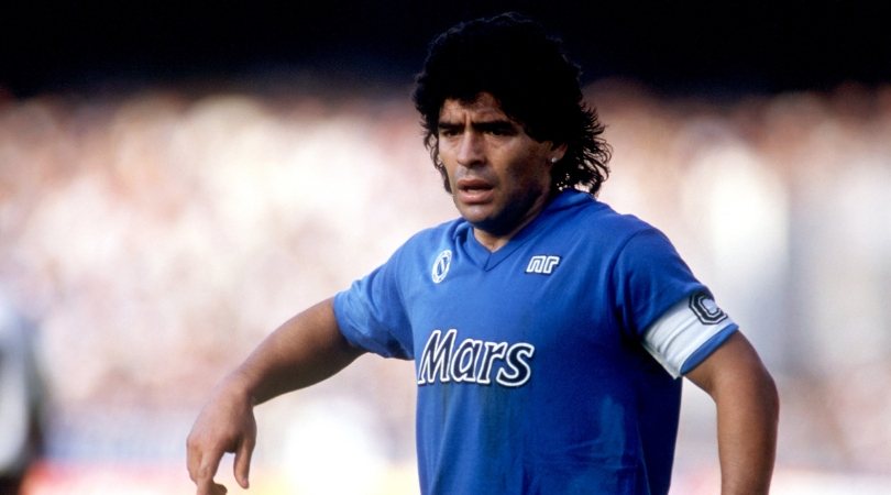
Napoli, 1988-89
It doesn’t get much more iconic than this.
One of (if not the) greatest players of all time, wearing one of (if not the) greatest kits, sponsored by a modest plug for one of (if not the) greatest chocolate bars. Delicious.
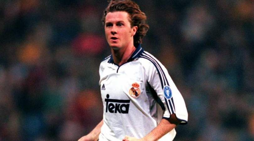
Real Madrid, 2000/01
Steve McManaman! Raul! Fernando Morientes! Roberto Carlos! Real Madrid used to be much more fun. Or are we just getting older?
Anyway, it turns out that flogging a German company that manufactured kitchen and bathroom products only added to the traditional shining white top.
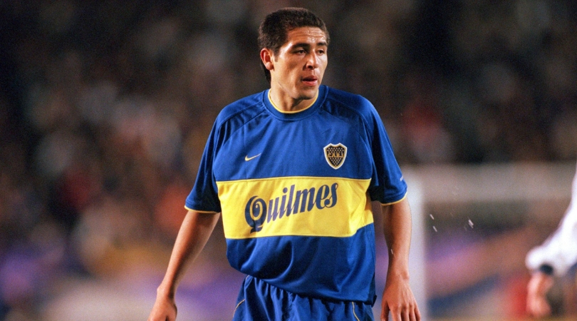
Boca Juniors, 2000-01
A playful font promoting Argentine beer Quilmes somehow managed to complete the look with one of football’s most iconic kits.
It’s just a shame they appear to have given poor Juan Roman Riquelme an XXL version.
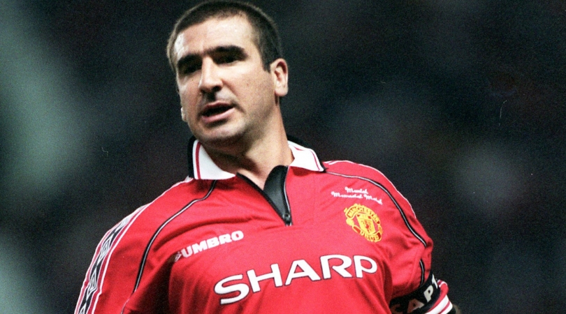
Manchester United, 1982-2000
Sharp were synonymous with United for almost two decades, taking pride of place on the famous red shirt from 1982-2000.
The badge was never intrusive and always aesthetically suitable to the myriad designs the club went through in that time.
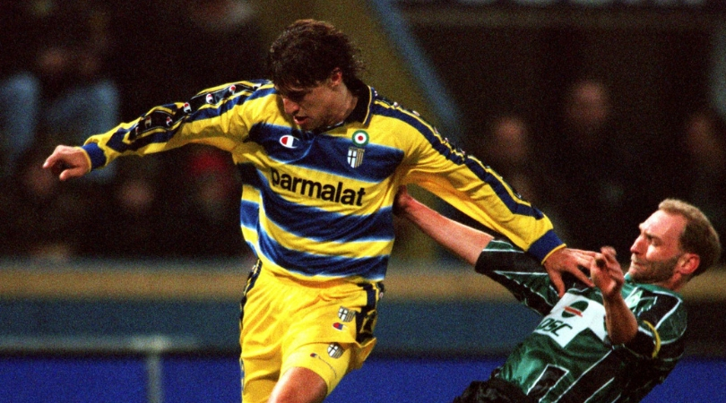
Parma, 2000-01
There’s something quite nice about the name of the club appearing in a sponsor. The logo of the dairy giants – owned by the same crook who controlled the club – went well with the rest of the colours. If anything, kit maker Champion had the most to answer for with those ridiculous sleeve and shoulder badges.
It also boasts nostalgia value, bringing back memories of Hernan Crespo, Fabio Cannavaro, Lilian Thuram, Gigi Buffon et al tearing it up for the provincial side.
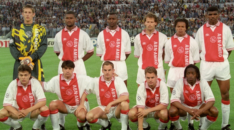
Ajax, 1991-2008
Dutch bank ABN Amro got some great exposure during Ajax’s successful spell in the mid-1990s and beyond. Their name was emblazoned on the Amsterdam club’s top for so long that it became a part of what an entire generation expected from an Ajax shirt.
Plus, the fact that it’s written horizontally makes it easier on the eye, perhaps because it leaves the traditional red and white stripes unbroken.
Alasdair Mackenzie is a freelance journalist based in Rome, and a FourFourTwo contributor since 2015. When not pulling on the FFT shirt, he can be found at Reuters, The Times and the i. An Italophile since growing up on a diet of Football Italia on Channel 4, he now counts himself among thousands of fans sharing a passion for Ross County and Lazio.
