The 20 worst kits of the 2017/18 season
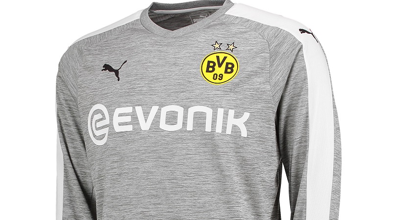
20. Borussia Dortmund, third
“How is this for a change?” Borussia Dortmund asked when releasing this abomination. Do you really want to know? It’s a grey pyjama top, for goodness’ sake.
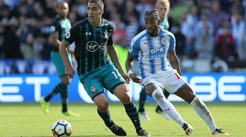
19. Southampton, away
This is like that weird dress again: are the stripes on Southampton’s kit blue or green? Either way, they’re not very nice.
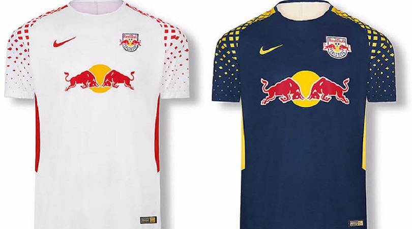
18. Red Bull Salzburg, home and away
Now we all know the reason why Red Bull Salzburg’s badge is virtually the same as the sponsor’s logo, but it still doesn’t look particularly good. The splattered yellow shapes – some of them circles, others square, others diamonds – don’t do much for FFT either.
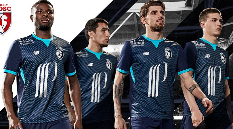
17. Lille, third
For starters, what’s that sponsor’s logo? Secondly, what’s with the random blotches of turquoise? And last but not least, why are there more white lines than a city banker's Friday night out?
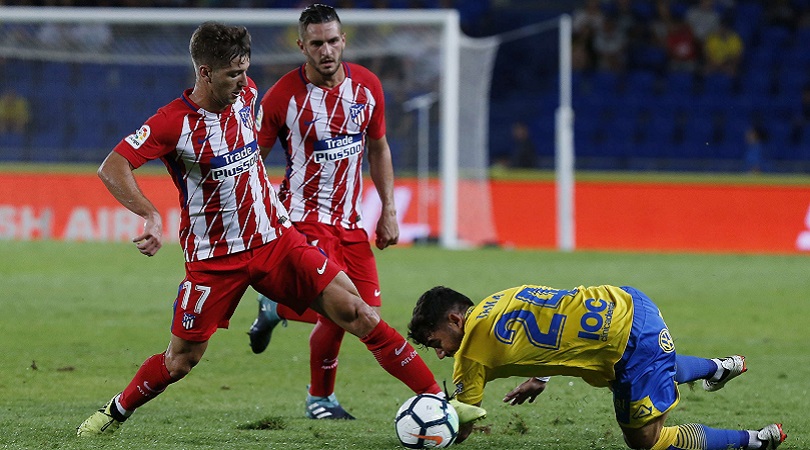
16. Atletico Madrid, home
This looks a bit like one of those optical illusions you stare at for a while before rubbing your eyes and reaching for the paracetamol. Atletico’s combination of red and white shirts, blue shorts and red socks is one of the best around, but this year’s top really isn’t doing the business.
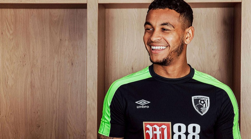
15. Bournemouth, third
While black away kits are usually more attractive than not, Bournemouth have ruined theirs with a dreadful sleeve and shoulder design. The colour is bad enough, but Umbro have taken things a step further by needlessly cramming their logo in as many times as possible. It’s a shame, because this strip had potential.
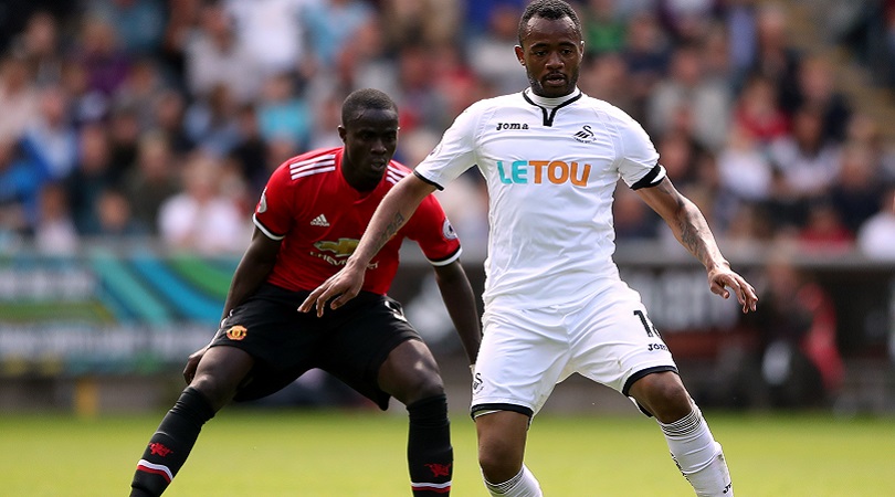
14. Swansea, home
Now we appreciate it can’t be easy to come up with fancy new designs when your team wears all white, but… this? In the words of Chandler Bing: could you get any duller? (He probably said that at some point.)
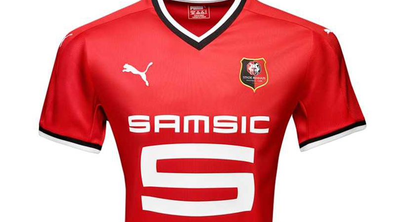
13. Rennes, home
No prizes for guessing what ruins this jersey. Did it really need to be that big?
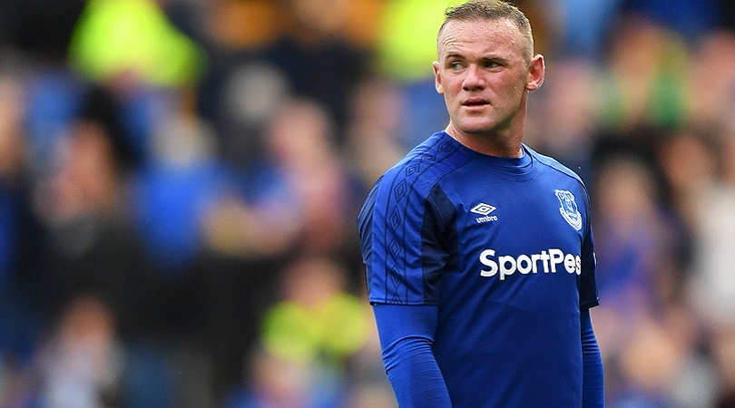
12. Everton, home
You’d think it would be easy to avoid messing up a kit like Everton’s, but apparently not. Those underarm patches, in a darker shade of blue, really don’t need to be there. Frankly, it looks like a training top – at best.
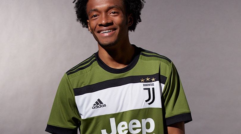
11. Juventus, third
It’s not been the greatest of summers for Juventus: they’ve lost star centre-back Leonardo Bonucci to Milan and, more significantly, released this excrescence. It’s the colour, rather than the design, that does for them here.
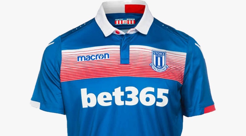
10. Stoke, away
We’re guessing this was originally planned as an all-royal blue number, before someone at Macron panicked and slapped a weird red and white barcode on. Yes, those may be Stoke’s home colours, but this is way down the list of how best to incorporate them.
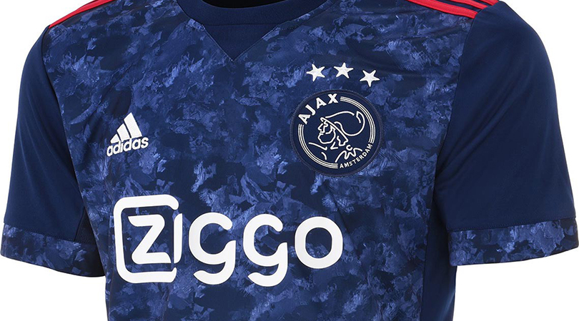
9. Ajax, away
If your club produced a team as good as the Eredivisie-winning, European champions of Ajax 1994/95, it would be perfectly reasonable to honour them at some point in the future. That’s what the Amsterdam outfit have decided to do with their blue away kit this term, but the graphic print – the shirt’s key feature – looks more slapdash than stylish.
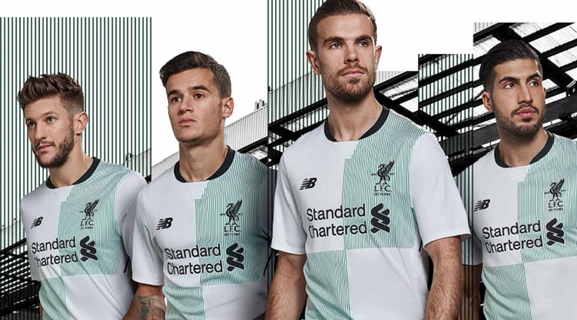
8. Liverpool, away
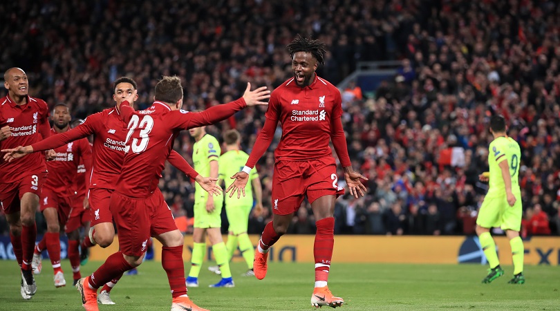
Ah, Liverpool. You did so well with the home kit. If only you could have shown competence in both areas of the game (an issue on the pitch too – how apt), things could have been so, so different. This must have been the final straw for Phil Coutinho – just look at the poor lad's expression.
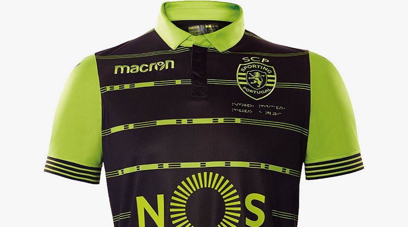
7. Sporting, away
*Vomits*.
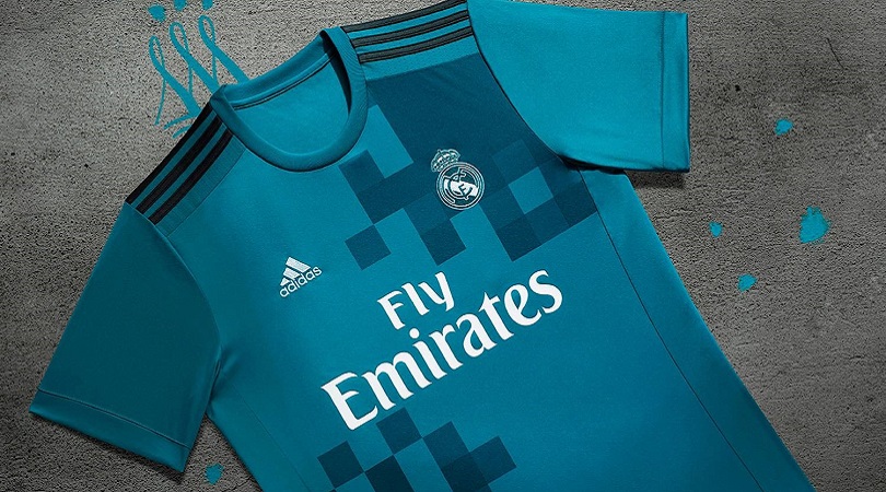
6. Real Madrid, third
They may be the best club side in Europe right now, but they can’t make a third kit. This would actually be a perfectly fine top if it weren’t for the needless squares in the top left and bottom right, like a crap game of Space Invaders.
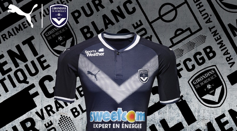
5. Bordeaux, home
Having a downward arrow on your outfit is never a good idea (especially when the sponsor's called 'Sweetcom'). There’s no need to make it that easy for them. And the less said about the pink, black and purple third kit, the better.
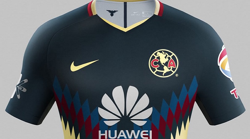
4. Club America, home
There’s far too much going on here. Let’s begin from the top and work our way down.
It actually gets off to a decent start; that’s a nice shade of dark blue, the collar’s pretty snazzy and there’s nothing to dislike about the badg… hang on, what are these weird blue diamond things? Oh, there are red and darker blue ones too? What about the cream finish that makes it look like a cheap 'Italian' sofa from SCS? And why are there two main sponsors whose logos massively contrast? AND WHY ARE THEY SO BIG?
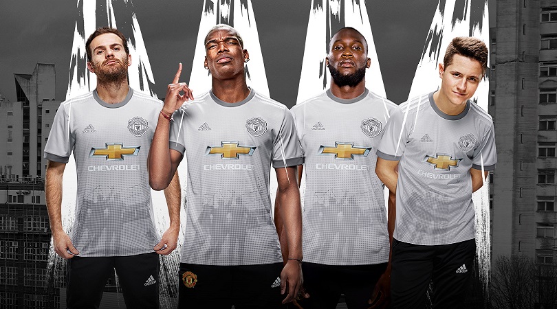
3. Man United, third
"The players don't like the grey strip," Alex Ferguson said after Manchester United’s defeat by Southampton at The Dell in 1996, a game in which the visitors switched shirts at half-time. "The players couldn't pick each other out. They said it was difficult to see their team-mates at distance when they lifted their heads.”
A penny for the Scot’s thoughts on United’s latest third kit, then. Marketed as silver rather than grey, it’s pretty ugly either way; the darker shades on the collar and sleeves add nothing, while the inclusion of a silhouetted Denis Law, George Best and Sir Bobby Charlton is well intentioned but shoddily carried out. Southampton must be licking their lips already – somebody fetch Le Tiss.
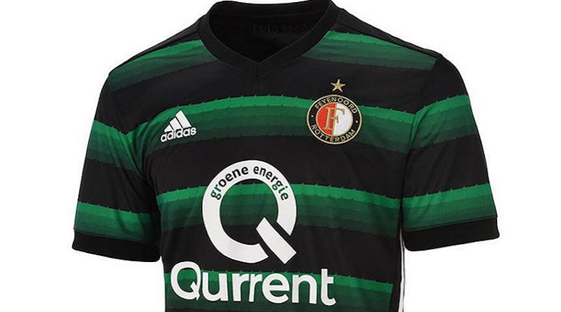
2. Feyenoord, away
What were they thinking? Four shades of green, repeated in multiple layers, with black stripes and a massive ‘Q’ thrown in for good measure? Count us out.
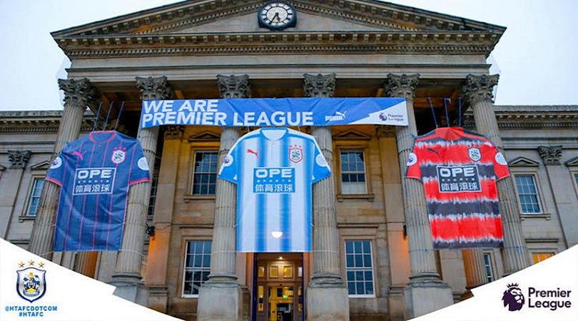
1. Huddersfield, home and away(s)
This is definitively not how you should mark promotion to the top flight for the first time in 45 years (or any promotion, relegation, mid-table mediocrity etc.).
It takes a while to work out which of these monstrosities is worst. The home one is probably least offensive, even if the stripes look like they’ve been drawn on using Microsoft Paint (RIP).
That makes it a straight shoot-out between the two away uniforms, which Huddersfield plan to alternate between this season. Although the blue-with-pink-pinstripes design is an eyesore, it’s not quite as awful as the orange-with-black-audio-waves number that pays homage to their 1991-93 effort. DELETE KITS.

Greg Lea is a freelance football journalist who's filled in wherever FourFourTwo needs him since 2014. He became a Crystal Palace fan after watching a 1-0 loss to Port Vale in 1998, and once got on the scoresheet in a primary school game against Wilfried Zaha's Whitehorse Manor (an own goal in an 8-0 defeat).
