Ranked! The 20 best World Cup kits
Best World Cup kits
There’s a decidedly old-school feel to many of this year’s World Cup kits, but retro doesn’t automatically equal reward in our rankings. After studying all 64 of the shirts that will be on show in Russia this summer, we’ve picked out the best 20 in this slideshow…
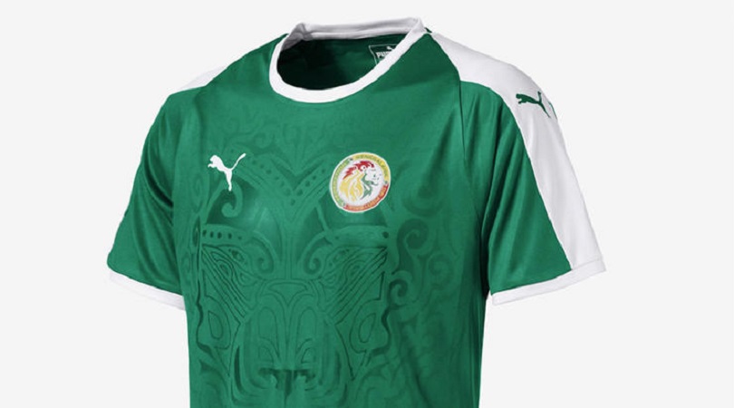
20. Senegal, away
Despite this lush shade of green, Senegal’s home kit – yes, one of Puma’s many white ones – does the central design better.
The graphic print of a lion (Senegal’s nickname is the Lions of Teranga) is a fine idea, even if the predatory cat featured here looks more bemused than frightening. Perhaps they’re just trying to lull the opposition into a false sense of security…

19. Argentina, away
This is an attractive design, based on Argentina’s 1993 away strip, and it would be higher in this list if the blue wasn’t too pale (as on the home shirt) for a kit that’s 99% black from head to toe.
It’s not quite on a par with the identical effort Nike made for Colombia’s home kit, although that isn’t to say we wouldn’t happily wear it. In conclusion: not bad, but room for improvement.
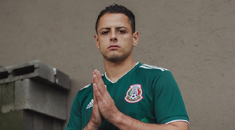
18. Mexico, home
Given that football is a game played on grass, green kits have always been difficult to get right – that’s probably why most teams don’t bother.
With that in mind, Mexico deserve plenty of credit for their 2018 offering. Adidas’ three diagonals are inverted to good effect, thought the best part of this ensemble is the colour matching. Top CMYK work, people.
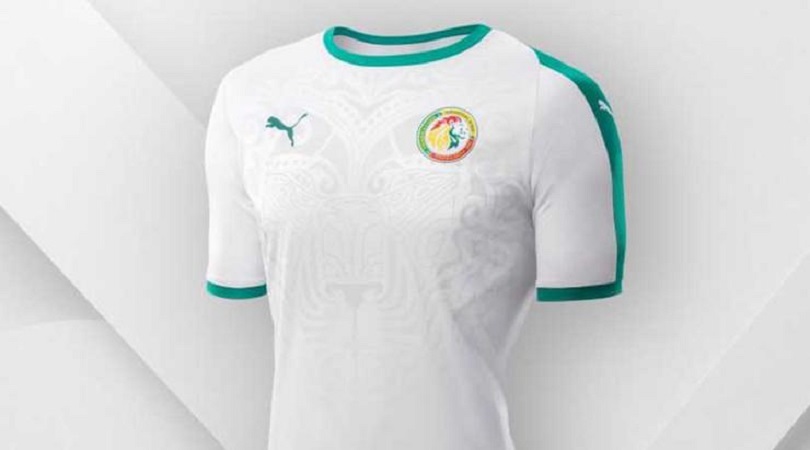
17. Senegal, home
It’s not as good as the Lions of Teranga’s previous shirt, which featured a big cat’s gaping maw preparing to swallow Sadio Mane’s squad number, but the stylised lion sits nicely here.
It’s a satisfyingly clean and minimalist kit, and will no doubt look even better when Mane and Keita Balde are performing a celebratory dance while wearing it.
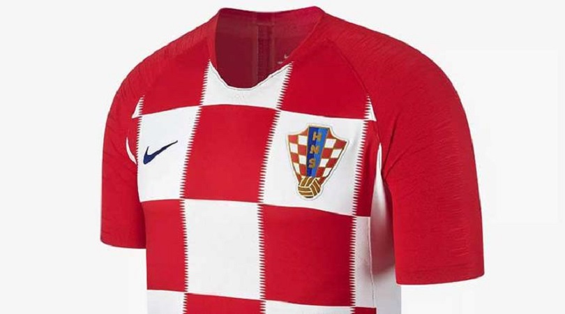
16. Croatia, home
The Vatreni topped our Euro 2016 rankings with a billowing, swirly thing that made us ask, “Trouble is: how can Nike top it?” Turns out they can’t.
This effort falls down in comparison as the squad number sits far too low, hidden up Luka Modric’s armpit as a result of gigantic squares limiting space for Nike’s swoosh. Plus, the fuzzy lines make our head hurt. It’s impossible to make an ugly Croatia kit, mind, and overall this is still a good ’un.
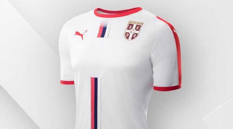
15. Serbia, away
Simple yet stylish, using only Serbia’s flag as inspiration, this top proves Puma could have made each of those white away kits unique even when there isn’t a massive lion to stick on it.
This is another pleasingly clean design, with the red crew neck, red cuffs and red strip down the sleeves adding a dash of pizzazz to what could otherwise have been considered a slightly dull offering. It’s a yes from us.
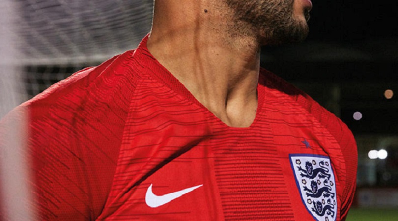
14. England, away
This isn’t overwhelmingly popular (not that any England kit ever is these days) but it’s a strong number. Red suits England better than blue and, most impressively, Nike approached St George’s Cross with the right amount of subtlety – it’s easy to imagine this kit having gone full Hard Brexit.
It’s not quite good enough for the top 10 and critics have argued it’s just a red shirt with a bit of a pattern on the front, but it’s undoubtedly better than most uniforms we’ll see on show in Russia.
13. Germany, away
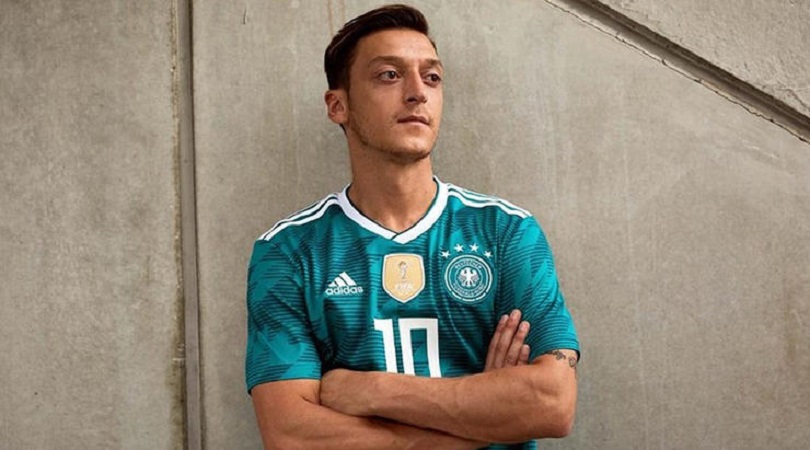
Now this is retro. We applaud the intent, and to an extent the execution as well, but here’s a question: was this ever a good kit to begin with? And don’t get us started on the font Adidas are inflicting on several of their teams.
Still, you can see why this kit is a hit. The colour – officially termed ‘EQT green’ – is quintessentially German, and the graphic pattern, also inspired by Mannschaft kits from the 1980s and 1990s, is another #nicetouch.
12. Uruguay, home
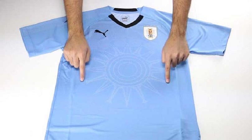
This is good from Puma: simple, eye-catching and featuring a sun graphic inspired by Uruguay’s Sol de Atlantida monument… or possibly just, y’know, the sun.
The dashes of black around the collar and in the Puma logo prevent this from being too one-dimensional, although we’re not letting those four stars – Uruguay have ‘only’ won the World Cup twice – go unremarked upon.

11. Brazil, away
Yes. Yes. Yes. This is how a Brazil away kit should look. Blue has been the colour of the Selecao’s change strip ever since they won the 1958 World Cup in Sweden, but the shade has often changed.
This royal blue is the perfect hue, made even better by the glorious smatterings of yellow in the badge and in Nike’s swoosh. And just to really ram home how good they are at football, Brazil’s away shirt includes a graphic pattern of a star to go alongside the five above their crest.
10. Spain, home
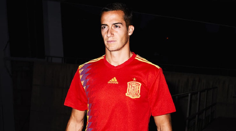
Hoo boy, the ’90s really are back, aren’t they? Spain’s home shirt is modelled on the one they wore at USA '94, and although it’s unnoticeable from one side, the look front-on is swish.
The Adidas logo moving centrally to accommodate this design feature gives an asymmetrical feel as it sits close to Spain’s very large crest, but we’re quibbling, really. Overall, this is excellent.
9. South Korea, away
Most kits near the top of our rankings have made a bit of noise on social media; this, however, has made about as much impact as a referee telling Sergio Ramos to behave.
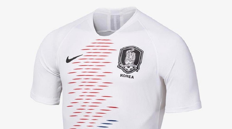
That’s a shame, because South Korea’s second kit is subtly sublime. Nike have borrowed the national flag’s Taegeuk iconography and turned it into a beautiful wave pattern, but we fear we’ll only see it worn in one game.
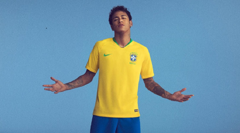
8. Brazil, home
Proving once again that simplicity is often the best approach, Nike have done little with Brazil’s legendary uniform except to brighten its yellow shade a touch, making it stand out even more.
You can imagine this being worn on five-a-side pitches everywhere from Sao Paulo to Shoreditch in years to come. And that, ladies and gentlemen, is the real quiz.
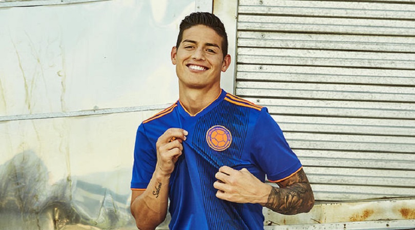
7. Colombia, away
Inspired by their orange jerseys of the ’70s and ’80s, only with the contrast turned up to 11, Colombia’s away kit takes their regular blue back-up and goes supernova with it.
The colour matching is perfect, and we especially like the vertical print that’s apparently (come on, we can’t know everything) a nod to the mulera – a scarf worn over the shoulder by Colombia’s coffee growers; Los Cafeteros being the Colombian national team’s nickname. All in all, it’s a strong look.
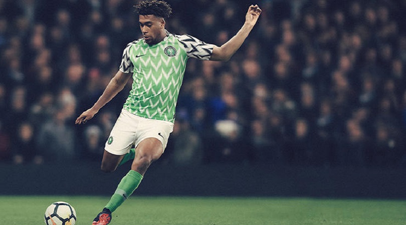
6. Nigeria, home
Wow. This is quite something. Nike say this design “pays subtle homage to Nigeria’s ’94 shirt, worn by Nigeria’s first team to qualify”; we say that’s a generous interpretation of the word ‘subtle’.
The Super Eagles’ USA '94 kit was actually plain green with a weird white cowl thing. So we have to ask: if this new effort is only loosely inspired by days gone by, did they have to combine the lush pale green of the torso with the “eagle wing-inspired black-and-white sleeves”, making the shirt look like a cut-and-shut of two cars with equally bonkers owners? It’s still great, though.
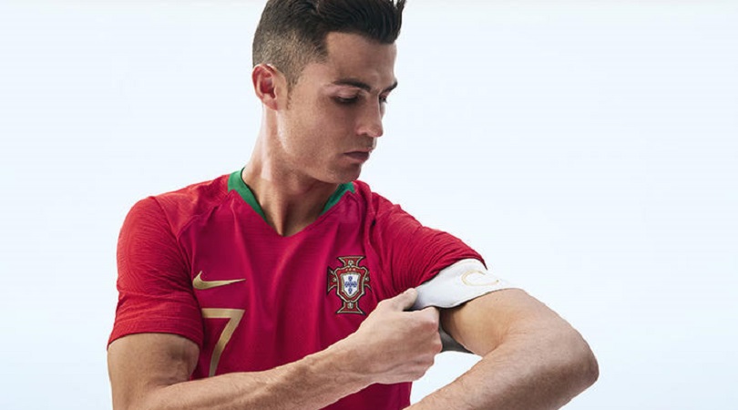
5. Portugal, home
We like this a lot. The colours are rich, with Nike’s Vapor sleeve template design working particularly well in these hues, and the silly breastplate worn at Euro 2016 is gone.
The gold metallic trim looks fantastic, too, even if the designers say it’s there to symbolise royalty because “Cristiano Ronaldo is a Portuguese hero and we wanted to tell the story of the modern king of football leading this new team”. Yuck.
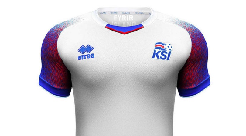
4. Iceland, away
With great sadness, we had to put Iceland second-last in our Euro 2016 countdown. This time, however, Errea have really come up trumps – proving that tournament experience never goes amiss.
The sleeve design here is sex on legs – well, arms – with the merging colours representing fire and ice, one melting the other.
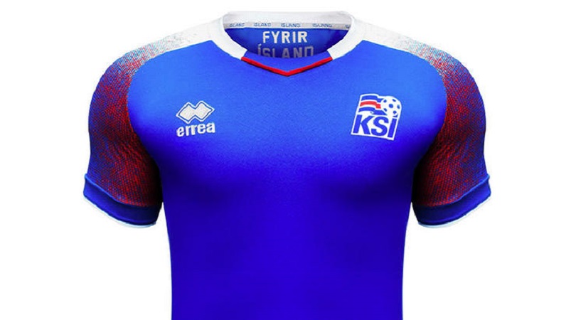
3. Iceland, home
It’s almost the same as the away shirt, yet somehow even better. The sleeves, to our eyes at least, are identical to those on the change strip, with the plain white canvas on the front of the kit becoming blue but remaining otherwise unchanged in terms of wider design.
Kits which use the same template for both home and away versions sometimes look too samey, but this is an exception. Top work.
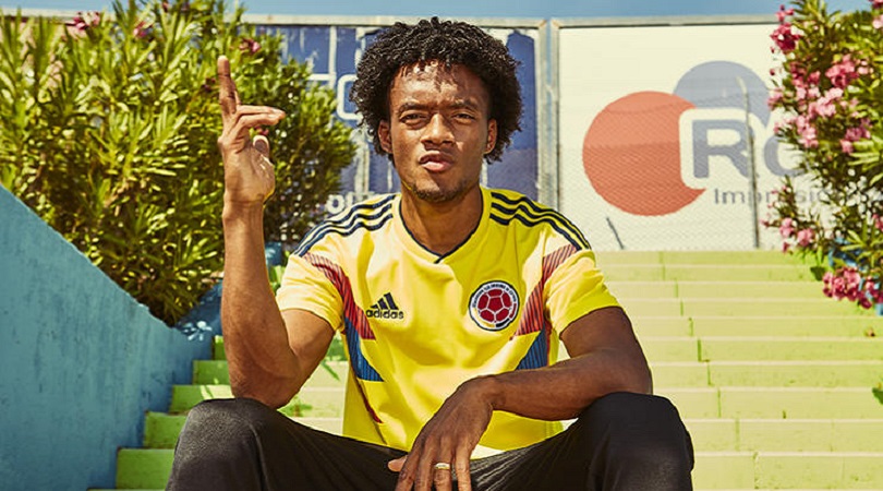
2. Colombia, home
Yes please. Other Adidas countries have borrowed heavily from this design (*cough* Argentina *cough*) but truly it belongs to Colombia, as a virtually identical remake of their Italia '90 shirt worn most famously by one Carlos Valderrama.
And the only significant change – besides the shoulder stripes being navy blue instead of red – is an improvement, as the yellow socks of old become red in order to perfectly represent the Colombian flag: from top to bottom, yellow, blue and red. Exquisite.
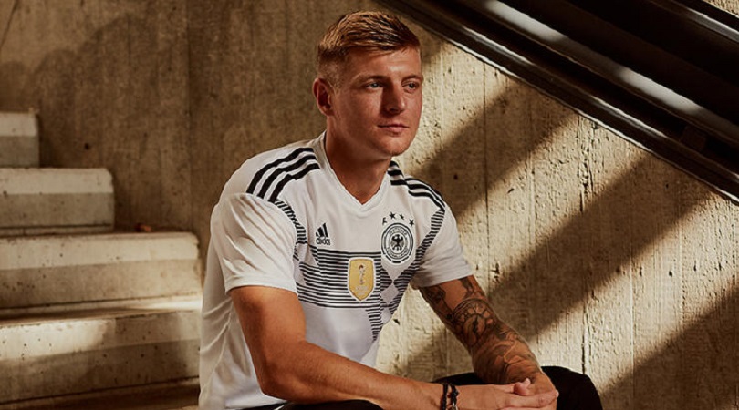
1. Germany, home
Logically, this doesn’t work. The lettering for players’ names is horrific, as we discussed earlier, and horizontal stripes force the squad number down to an unhelpfully low position. Won’t somebody think of the commentators?
On the other hand... just look at it. Gaze upon this wondrousness, then shield your eyes from its celestial beauty. It’s retro yet modern, busy yet clean, and based on a previous classic (Germany’s 1990 shirt, which featured the flag’s colours of black, red and yellow rather than this monochrome interpretation) yet instantly iconic in its own right.

Greg Lea is a freelance football journalist who's filled in wherever FourFourTwo needs him since 2014. He became a Crystal Palace fan after watching a 1-0 loss to Port Vale in 1998, and once got on the scoresheet in a primary school game against Wilfried Zaha's Whitehorse Manor (an own goal in an 8-0 defeat).
