Ranked! The 20 worst World Cup kits
Worst World Cup kits
Be warned: this year’s collection of World Cup kits features some fairly uninspiring efforts (fun fact: 40% of them are plain white). After closely studying the 64 tops that will be on display in Russia this summer, we’ve picked out the worst 20 in this slideshow…
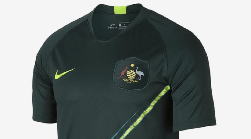
20. Australia, away
This is a cricket top, isn’t it? Do cricket tops usually have badges the size of continents? So many questions, so few answers.
Even aside from the oversized logo, there’s plenty to dislike here. Dark green is a very difficult colour to pull off, and the diagonal sash is frankly bizarre.
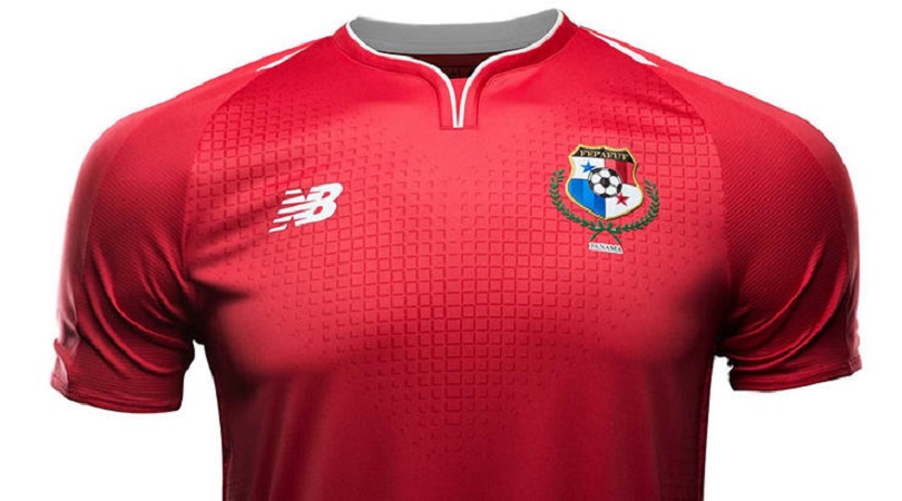
19. Panama, home
We’re glad Panama are at the World Cup. It’s always fun to see new faces on the biggest stage and the fact most people don’t know much about Hernan Dario Gomez’s side adds a welcome layer of intrigue and mystery.
But we’re not ones to let sentiment get in the way of business here at FourFourTwo, so with due apologies to the Canal Men, their home kit is mediocre at best.
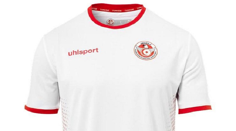
18. Tunisia, home
Thanks to revolutionary new technology from German manufacturers Uhlsport, it’s possible to forget this kit even as you’re looking at it. Which is actually rather fitting for a team who most of us still don’t know much about.
So yeah, the shirt. Well it’s, er, white. And it has some funny red dots on the side. And… nope, that’s all we’ve got.
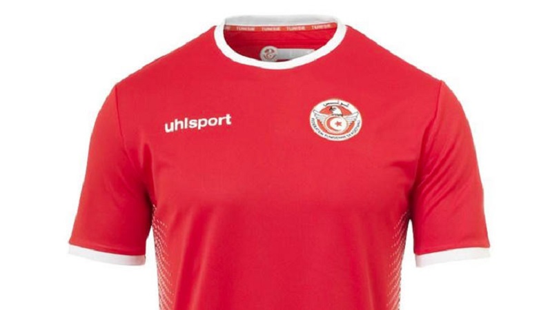
17. Tunisia, away
Thanks to revolutionary new technology from German manufacturers Uhlsport, it’s possible to forget this kit even as you’re looking at it. Which is actually rather fitting for a team who most of us still don’t know much about.
So yeah, the shirt. Well it’s, er, red. And it has some funny white dots on the side. And… nope, that’s all we’ve got.
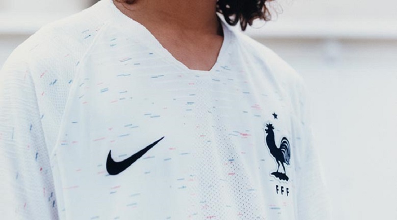
16. France, away
In a doomed attempt to better the unbetterable, which was France’s gorgeous flag-across-the-shoulders away kit for their hosting of Euro 2016, Nike tried something different this time.
Specifically, they took a plain white T-shirt and used it to calibrate an old inkjet printer. No? Oh, ask your dad. Anyway, we’re not at all impressed, although Antoine Griezmann will still probably find a way to make it look nice.
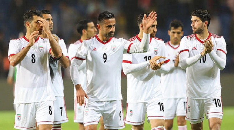
15. Iran, away
If you’re looking at this kit and thinking ‘Iran’s shirt looks quite similar to my Sunday league team’s!’, you could be on to something.
Team Melli don’t have a permanent kit deal and have instead chosen their 2018 outfit from Adidas’ teamwork catalogue, which is also used by amateur sides across the world. Pity those countries who somehow managed to rank even higher in this list…
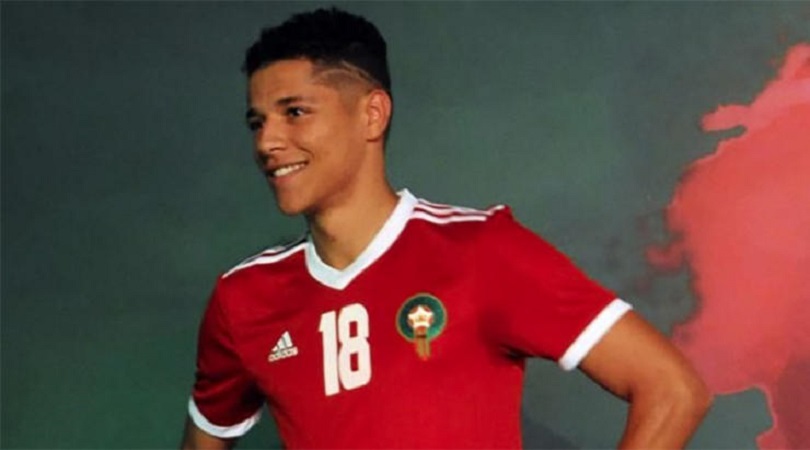
14. Morocco, home
This was one of the final two kits to be revealed, and the design doesn’t assuage any doubts that Adidas just forgot they had to make one and rushed this out at 4pm on a Friday afternoon.
They say necessity is the mother of invention, but this offering suggests otherwise. Unless dull, one-dimensional designs and weirdly large squad numbers are your thing, that is.
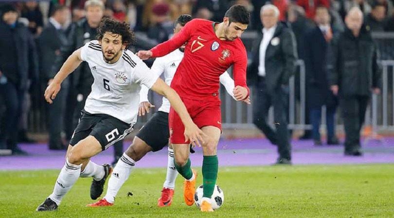
13. Egypt, away
Football kits don’t become popular purely because of the design. It’s no coincidence that many of the World’s Cups most iconic jerseys belong to successful nations, be it the Dutch’s orange from the 1970s, Argentina’s blue and white from 1986 or Brazil’s glorious yellow from, well, any point in the last 60 years.
So listen carefully, Egypt: if you can’t play like Germany, don’t dress like Germany. Unless you can play like Germany after all, but you’ll have to prove it first.
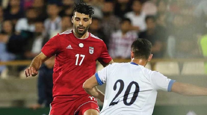
12. Iran, away
“Carl? Carl! People are saying our Iran away kit is boring. Is there anything we can add to jazz it up a bit? What’s that you’re wearing?”
“This? Oh, my nephew gave it to me. He went to the zoo yesterday and got this sticker of a jaguar for putting a quid in the fundraising box.”
“Perfect!”
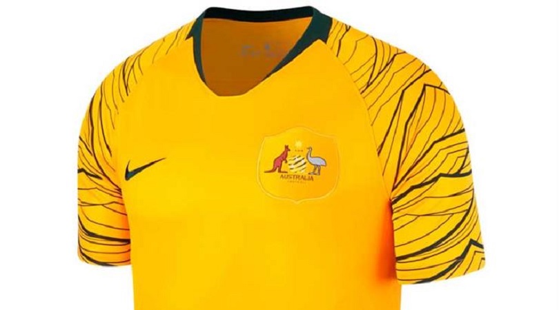
11. Australia, home
While it’s good to see the Socceroos dropping their green shorts (as it were) and wearing all gold instead, their fans will be thankful that Russia’s cooler climate means they can wear jackets to cover the shirt sleeves.
In a classic case of something sounding better in a pitch meeting than it ends up looking, the wave motif was inspired by Australia’s triumphant 2006 team “requesting the support of every fan to create a sea of gold”. You tried, Nike, and that’s the important thing.
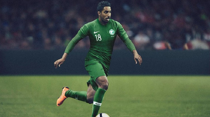
10. Saudi Arabia, away
Now we don’t want to accuse anyone of anything, but it’s hard to shake the suspicion that Saudi Arabia mixed their kits up and erroneously submitted their home jersey as their away one and vice versa.
The Green Falcons (the clue’s in the name, guys) have opted for a white home shirt, with the above uniform serving as their change strip. The problem is it’s just too green, with matching shirts, shorts and socks meaning there’s nothing to offset the principal colour.
9. Costa Rica, away
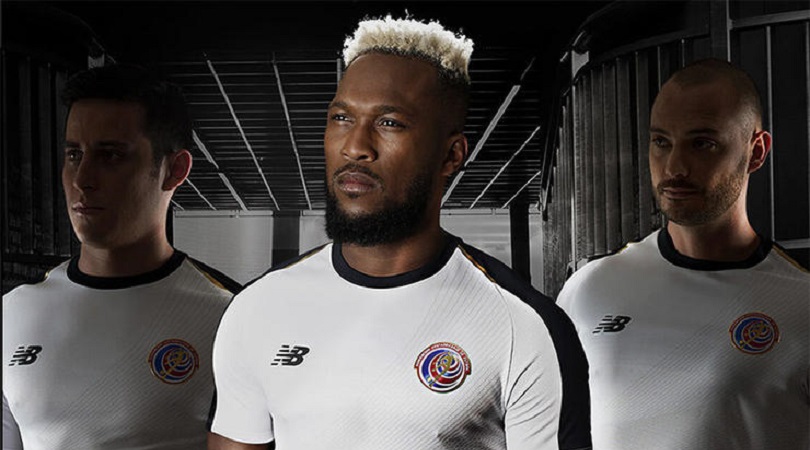
FourFourTwo doesn’t condone lying, so we may as well admit that we kind of forgot that Costa Rica were even taking part in this summer’s World Cup.
It’s their own fault, though; if Los Ticos were trying to lodge themselves in people’s minds, they should have done much more than produce this bland away kit, which looks more like a vintage Derby County top from the 1970s. We look forward to seeing Dave Mackay bossing the game against Serbia on June 17.
8. Morocco, away
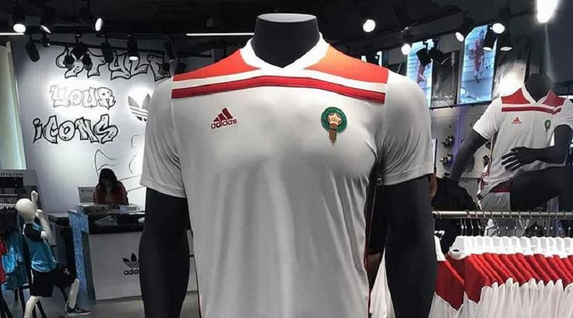
The Moroccan FA delayed their kits’ reveal in order to stymie touts with their replicas, so it’s unfortunate that the official versions wound up resembling replicas anyway.
We’re not sure why the touches of red around the collar are so square, or whether they were supposed to continue down the strip. Frankly this shirt looks unfinished – and that’s never a good thing.

7. Spain, away
This is, apparently, ‘halo blue’ (i.e. off-white) and red (i.e. orange). We’re really sorry Adidas, but you can colour us unconvinced.
The graphic sprint is supposedly a nod to the 1980s, although the fact you can barely make it out is a slight problem. An outfit utterly unsuited to a national team with the nickname La Furia Roja (‘The Red Fury’).

6. Japan, home
Japan’s home jersey for the 2018 World Cup is meant to look like samurai armour, but there’s just one small problem: it doesn’t.
The Samurai Blue aren’t expected to make much of an on-field impact in Russia, and they certainly won’t be doing so in the fashion stakes either.
4. & 5. Switzerland, away & Uruguay, away
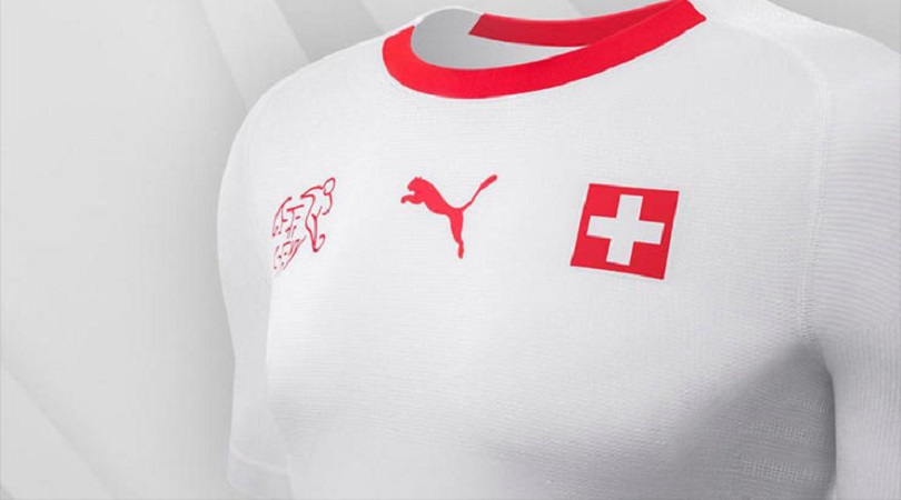
So, this World Cup will have a lot of white kits. And while Adidas, Nike, Umbro, New Balance, Hummel and Uhlsport are all guilty of putting out an uninspiring plain white T, the worst culprits are the otherwise-sound Puma.
Not only did they release extremely similar white shirts for 10 different nations, they announced all 10 together, as if trying to emphasise the homogeneity. Only four of these 10 will be at Russia 2018, and two feature a design that makes things a bit more interesting. Switzerland and Uruguay weren’t so lucky.
3. Serbia, home
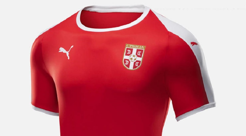
This exceedingly dull Powerleague-ish top has no redeeming features. Take out the badge and you wouldn’t have any idea who this kit belonged to. In fact, keep the badge in and we still wouldn’t be sure…
The white trim down the sleeve is an attempt to add something mildly interesting to the design, but that’s as good as it gets. We really hope the Serbia team aren’t as boring as their jersey.

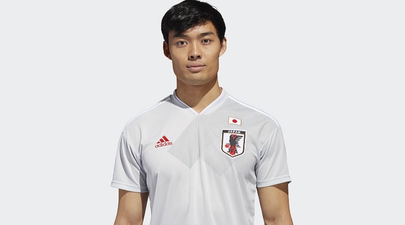
2. Japan, away
Adidas, why do you hate Japan so? Grey shirt + white shorts + white socks = apparent laundry disaster. “Aw, mum! What’s happened to the Japan away kit I found in lost property?”
It’s also an incredibly boring way to celebrate your sixth successive qualification for the World Cup finals. Perhaps they’ve run out of ideas, but it really shouldn’t have been that hard to find something better than grey.
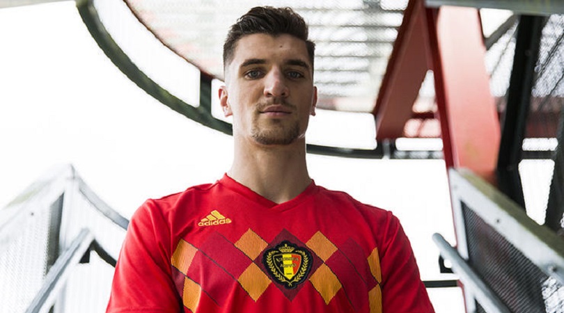
1. Belgium, home
Not then, not now, not ever. Retro can be brilliant – but only when the original kit wasn’t crap. This kit is a throwback to Belgium’s offering at Euro 1984 – a strange choice in itself, given they didn’t make it out of the group.
The Red Devils will at least be more red, following their overly black number at Euro 2016; however, they’ll still be wearing a design that looks as if it was knitted by Thibaut Courtois’ nan. It’s a big thumbs down from us.

Greg Lea is a freelance football journalist who's filled in wherever FourFourTwo needs him since 2014. He became a Crystal Palace fan after watching a 1-0 loss to Port Vale in 1998, and once got on the scoresheet in a primary school game against Wilfried Zaha's Whitehorse Manor (an own goal in an 8-0 defeat).
