Worst ever World Cup kits
The World Cup doesn’t come around very often, which is part of what makes it so brilliant. With four years in between tournaments, you would expect kit manufacturers to have enough time to put together something special for the big occasion. As this slideshow proves, though, that isn’t always the case…
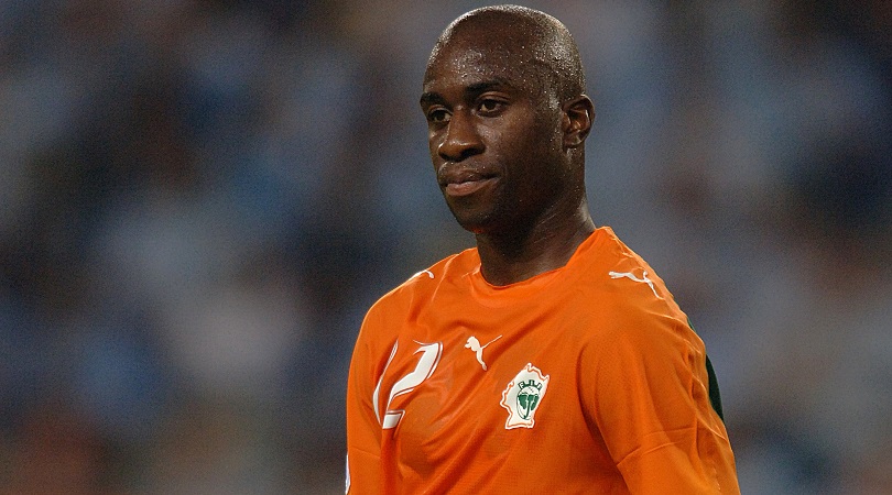
20. Ivory Coast (2006)
Let’s face it, orange isn’t actually the new black: it’s a difficult colour to pull off, being the general sartorial preserve of American convicts, lollipop ladies, air traffic controllers and members of mad 70s sex cults that might start stabbing each other at any minute.
The Tangerines of Blackpool veer into hi-vis tabard territory, but Ivory Coast’s tops are more of a mouldy clementine rather than a proud easy peeler.
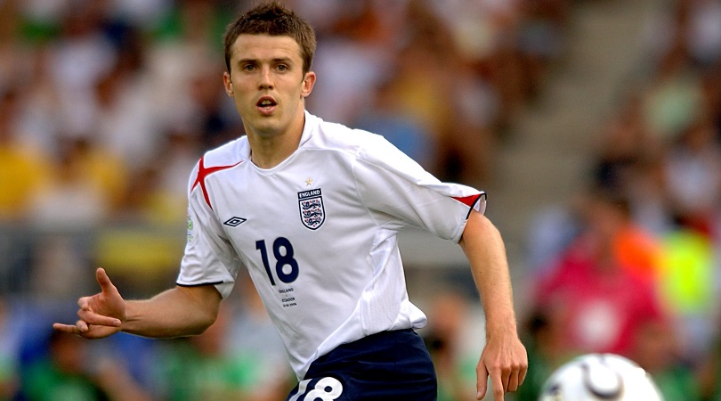
19. England (2006)
Essentially just a white Tee with the whisper of a St George’s cross draped across the shoulder, this kit was almost as dull as the first 90 minutes of the England vs Portugal game.
Even the cross doesn’t look right, and we’re not sure why Umbro felt the need to include a dollop of red on the sleeves. Maybe it’s a good thing England didn’t triumph in Germany – if they had, this top would be etched onto our brains for ever more.
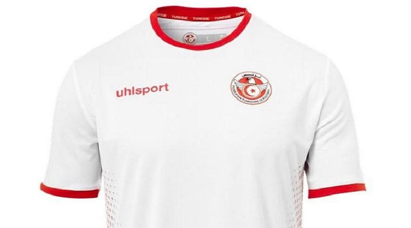
18. Tunisia (2018)
A top design so lazy that we can’t be bothered writing more than one sentence about it. What’s that, boss? You’re paying by the word for this?
Well, Tunisia’s kit for the 2018 World Cup is incredibly uninspiring, a plain number with no distinguishing features whatsoever. It’s also… nope, that’s all we’ve got.
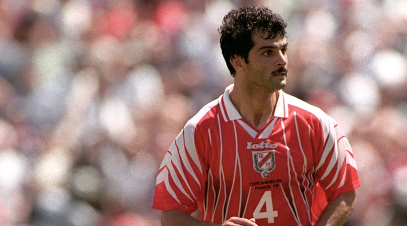
17. Tunisia away (1998)
If their entry for this year was quarter-arsed, Tunisia’s ’98 away design was wild and hellish: The Eagles of Carthage looked like they’d been attacked by actual angry eagles – or perhaps Freddy Krueger, with life-ending artery slashes sustained to the shoulders and groin.
It’s another poor effort, and one we can’t help thinking was rushed out after someone had deleted the files for the original on a Friday afternoon.
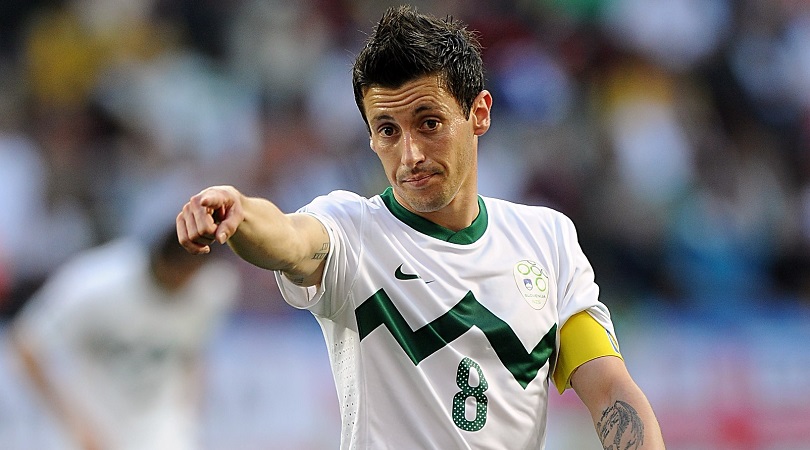
16. Slovenia (2010)
It’s hard to quite put your finger on what’s wrong with this, but the odd line graph feels too low, the shades too neutral, and the overall effect somehow a bit too Twenty20 cricket-y.
We can see an Australian off-spinner secretly scuffing up a ball in it, and then weeping on television – but it just didn’t suit Aleksandar Radosavljevic. Strange that.
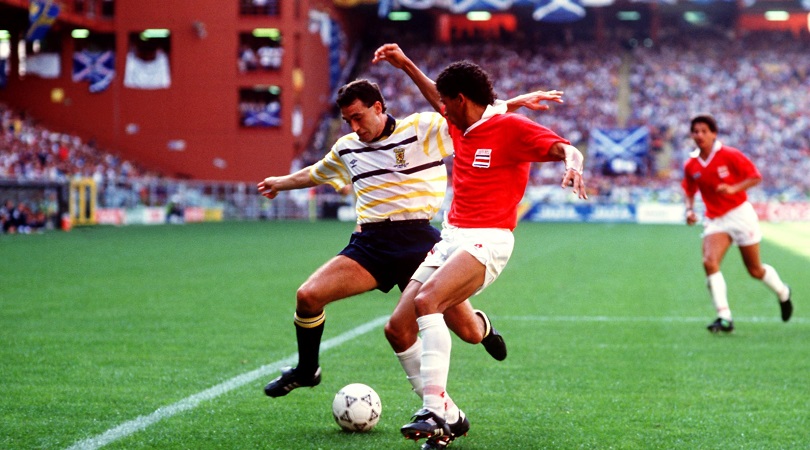
15. Scotland (1990)
Say what you like about Scotland’s international footballing woes, but they usually look pretty menacing on the pitch in their noble blue.
Their away choices have been odder, however – and the Tartan Army’s torrid time at Italia ’90 was worsened by this bizarre purple and yellow horizontal striped fashion calamity, in which they lost to Costa Rica.
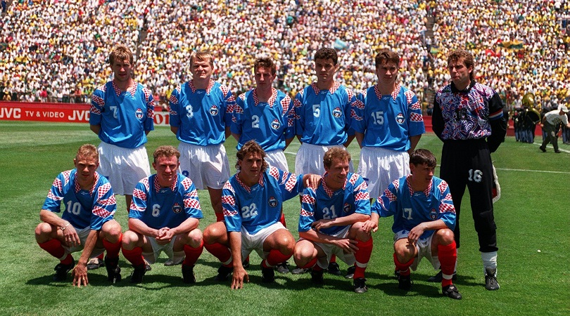
=13. Russia away (1994)
After competing as the USSR at World Cup 1990 and CIS at Euro ’92, it’s no wonder Russia didn’t know if they were coming or going at USA ’94 (the answer was going, their group stage exit confirmed despite a 6-1 thrashing of Cameroon in their final game).
A baffling Reebok away kit - blue with odd flashes of the Ghost of Croatia Future defiling the shoulders – was just as confusing.
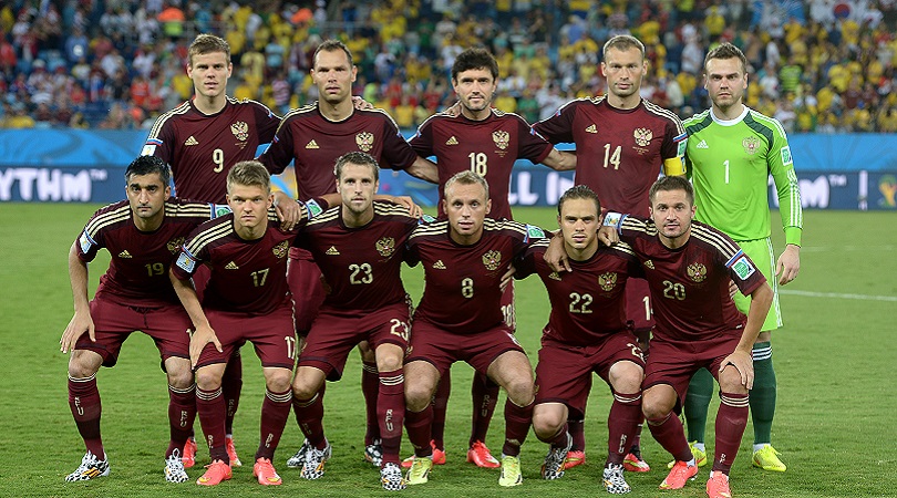
=13. Russia (2014)
It’s 2018 and having a go at the Russians is suddenly as fashionable as it was back in 1968, so we might as well give their old football tops a kicking as well as accusing them of being responsible for ruining Facebook and electing Trump.
Anyway, four years ago in Brazil, while everyone was supping the juice out of coconuts, jigging a samba and generally having a technicolour carnival, Russia were trudging round miserably in this incredibly austere and serious garment.
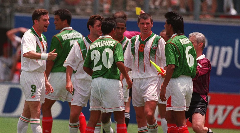
12. Republic of Ireland away (1994)
Much of the pasty Irish side were sunburned and irritable in the scorching heat of USA ’94, and their white change kit, with three feeble, fading green stripes down the middle, didn’t do Aldo, Keano and Steve Staunton-o any favours, appearance-wise.
We’re not sure about the collar either, and if that third colour is supposed to be gold then we might as well all pack up and go home.
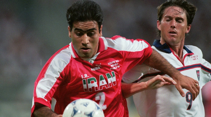
11. Iran (1998)
Font failures, the Puma logo, shirt number, ‘I.R.’ letters and ‘COUPE DE MONDE FRANCE 98’ all orbit a weird, uncalled-for central tricolour IRAN motif, making Mehdi Mahdavikia resemble a Wolverhampton speedway ace with too many sponsors (which, for all we know, he may also have been). And what’s with the jagged sleeves?
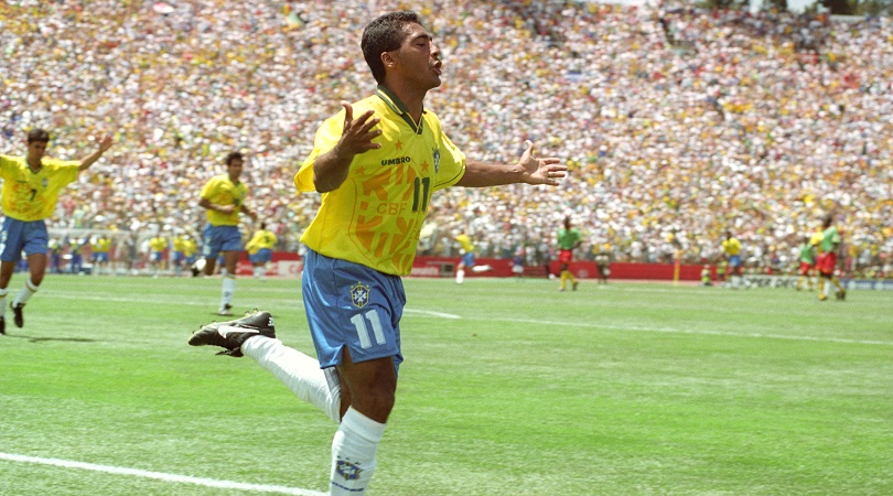
10. Brazil (1994)
There was a strange phase in the mid-90s where designers – newly armed with computer technology that could do all sorts of crazy layered nonsense – went into collective overkill.
Think about the mad Manchester United top that had Old Trafford subtly pasted into the background, or the Mexico jersey with an Inca god peeping out through the player’s stomachs. It didn’t last long but Brazil’s ’94 kit had been well and truly ruined by then.
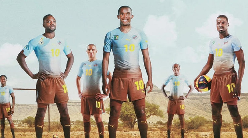
9. Africa Unity (2010)
Puma put out some interesting kits for the first World Cup held on African soil, and some of ‘em were crackers. But alas the Africa Unity kit, which was worn by numerous nations during qualifying and had the noble aim of funding biodiversity, was a bit of a wrong ‘un.
It was meant to represent the continent’s mighty earth and sky, but ended up looking like Man City emerging from a 1970s mudbath.
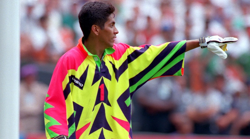
8. Mexico goalkeeper (1994)
Aargh! My corneas! They’re melting! Mexico’s 1994 outfield home kit was semi-acceptable, but goalkeeper Jorge Campos strode onstage in a fluoro zigzag vomit hodgepodge that Lady Gaga would deem a bit over the top.
Being the coolest hombre at the World Cup (5ft 6in tall, wild acrobatics, crazy saves), Campos somehow pulled it off anyway – and was also actively involved in the design, presumably after necking a couple of goblets of peyote.
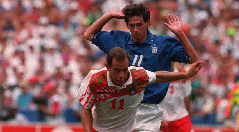
7. Mexico away (1994)
Yes, we’re still here with Mexico, yes it’s still the 1990s, but Christ, what on earth was going on with this away kit?
The white strip featured a slapdash multi-panelled collage across the shoulders and chest, which made El Tri look like their skin had been ripped off their right upper arms by the bird of prey that had settled on the left.
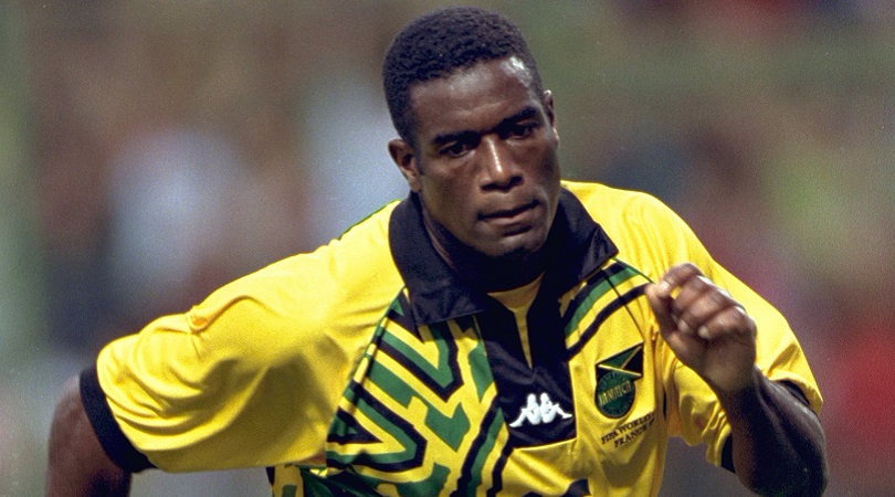
6. Jamaica (1998)
The Reggae Boyz, on paper, should have a nice shirt: their yellow is every bit as noble as Brazil’s, and the green and black of the flag are classic and complementary trims – but they keep making a pig’s ear of it.
The current design looks like the mid-90s Norwich side after a vigorous afternoon of paintballing, but the ’98 eyesore by Kappa was even worse. Even Usain Bolt would look like a wally in this disastrous garment.
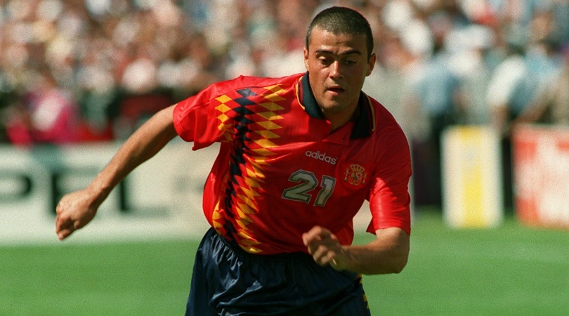
5. Spain (1994)
Remember when Spain weren’t very good? Ask your dad, kids. Anyway, we reckon there was a direct correlation between the awful tops they had in the 90s and their inability to break through at a major tournament.
This one was the nadir for Nadal and pals: a harlequin horror show which, even for the times, was about three sizes too big for every player.
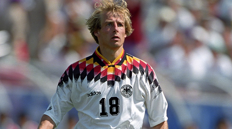
4. Germany (1994)
Adidas are normally reliable shirt operatives, but 1994 was clearly a strange time (almost half our our entries are from the design hell of 1994) and the same rhombus-crazed bozo who presumably went mad with the Spain kit was also allowed to deface the normally intimidating looking Mannschaft top with equilateral quadrilaterals.
Germany didn’t even make the semi-finals, which must have felt weird for them. We can’t help but conclude the kit had plenty to do with it.
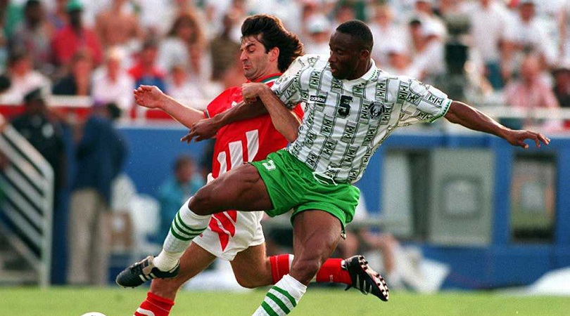
3. Nigeria (1994)
More 1994 Adidas woe, alas – although this berserkness, which looks like the Super Eagles plastered a load of dollar bills to their shirts, veers dangerously close to so-bad-it’s-good territory. Close, but not quite.
We’re really not sure what the intention was, beyond a practical joke going way too far. Honestly, we’ve been looking at it for a solid 20 minutes and still haven’t the foggiest.
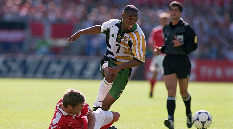
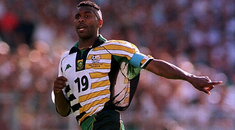
2. South Africa (1998)
Just insane: the kind of bizarre garment that renegade golfer John Daly might design for his LoudMouth Apparel range after spending 48 hours in Hooters.
It’s essentially four kits rolled into one – and none of them would be any good as standalones. A truly bizarre offering which looks like it was designed by a four-year-old with a paintbrush.
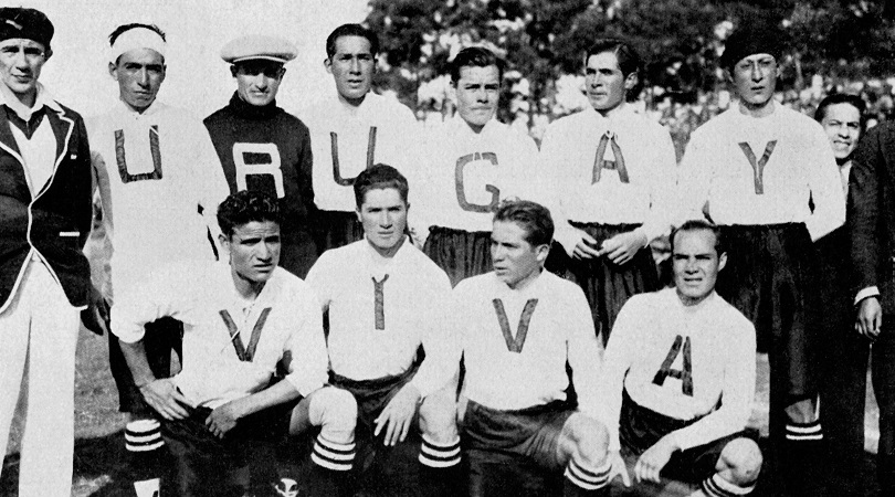
1. Bolivia (1930)
Resembling the sort of risible little Englanders that go to Centre Court in T-shirts that carefully spell “GO ANDY!” in a bid to get a chortling comment from John Inverdale, Bolivia decided to pay tribute to the hosts of the first ever World Cup by pulling on shirts that read “VIVA URUGUAY”.
Alas, one of the team photos saw a letter U go missing, meaning the side spelt ‘URUGAY’, so the tribute came off as a vague insinuation. Overall, a deserving winner.
Greg Lea is a freelance football journalist who's filled in wherever FourFourTwo needs him since 2014. He became a Crystal Palace fan after watching a 1-0 loss to Port Vale in 1998, and once got on the scoresheet in a primary school game against Wilfried Zaha's Whitehorse Manor (an own goal in an 8-0 defeat).

 Join The Club


