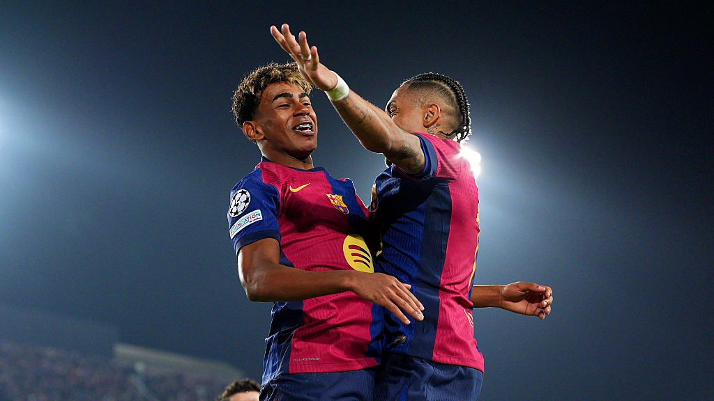
Ranked! The 30 best Premier League kits of the '90s
Here are the top 30...
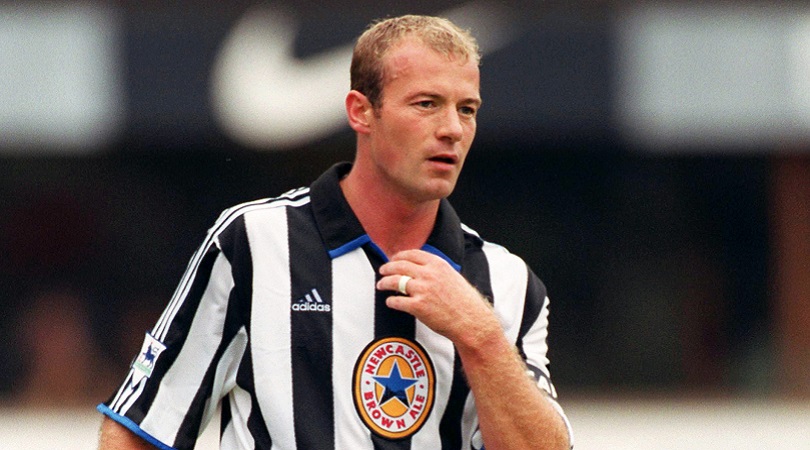
Best kits of the 90s
Just as you would probably prefer to avoid your fashion sense from the ’90s being raked over on the internet, we’ve been kind to certain Premier League clubs by ignoring their various monstrosities and focusing on some of the more acceptable replica shirts from the first eight seasons of the rebranded top flight. Here are the top 30....
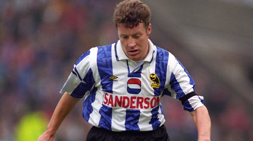
30. Sheffield Wednesday, home (1992/93)
Sheffield Wednesday have now been outside the top tier of English football for two decades, but they were fixture of the Premier League back in the 1990s.
In the division’s inaugural campaigns they even produced this wondrous home jersey, with the sponsor’s logo blending neatly with the blue and white stripes. It also helped the Owls enjoy one of their most successful post-war seasons: a seventh-place finish and participation in two cup finals.
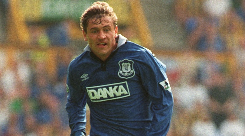
29. Everton, home (1995-97)
Producing kits isn’t always an easy talk for those clubs with one predominant colour. Being respectful of tradition while simultaneously trying to add new flourishes is far from straightforward, but Everton certainly succeeded in 1995/96 and 1996/97.
The black and white collar looks excellent, as does the subtle black graphic pattern on the main body. The Toffees even managed to win at Anfield while wearing this number – that’s how good it was.
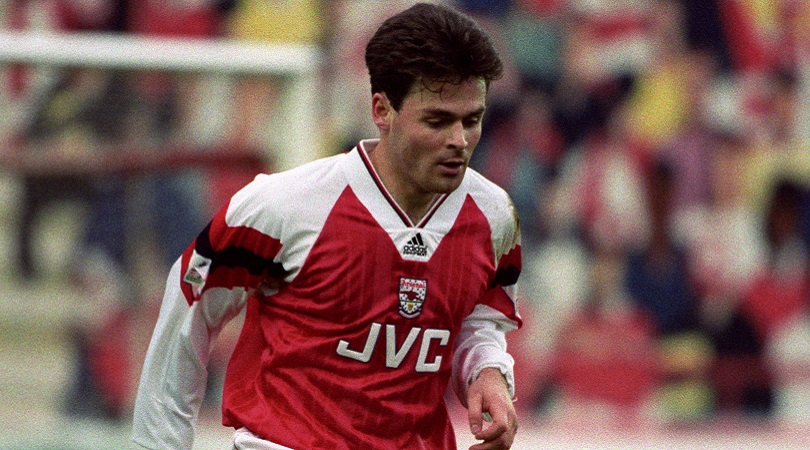
28. Arsenal, away (1992/93)
Fifth-place finishes are treated like the apocalypse by Gunners fans these days, so God only knows what Arsenal Fan TV would have made of their 1992/93 campaign, when George Graham’s side only just scraped into the top 10.
In fairness, Arsenal did win the FA Cup and League Cup that year, and further consolation for their poor top-flight campaign could be found in this gorgeous yellow change strip.
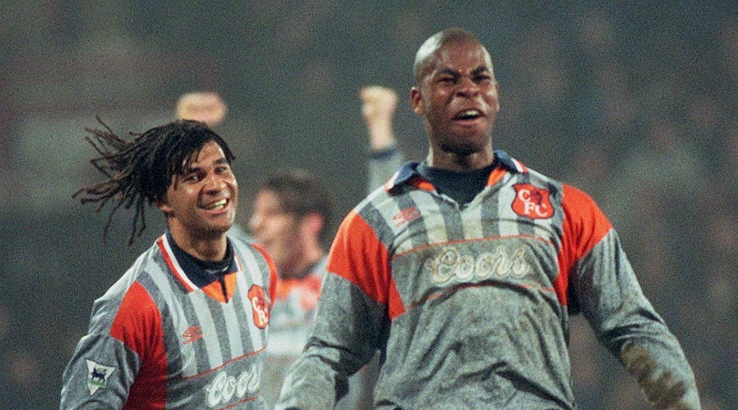
27. Chelsea, away (1994-96)
Let’s be honest: Ruud Gullit could make any football jersey look sexy (OK, OK, maybe not Norwich’s 1992/93 monstrosity). We’re prepared to admit that Chelsea’s away kit in the mid-1990s is the Marmite of this particular category, but here at FourFourTwo we’re huge fans of food spreads made from yeast extract.
Combining grey, orange and blue was a gamble by Umbro, but they – and Ruud in particular – managed to pull it off.
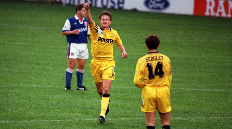
26. Tottenham, away (1993-95)
Yellow tends to be the go-to colour for away kits, but few Premier League teams have pulled it off as well as Spurs between 1993 and 1995.
The black chequered pattern on the shoulder adds something a bit different, as does the splash of white in the top right corner. The shade of yellow is perfect too, although we don’t quite agree with Teddy Sheringham’s answer when we asked him where this shirt should be placed in our list.
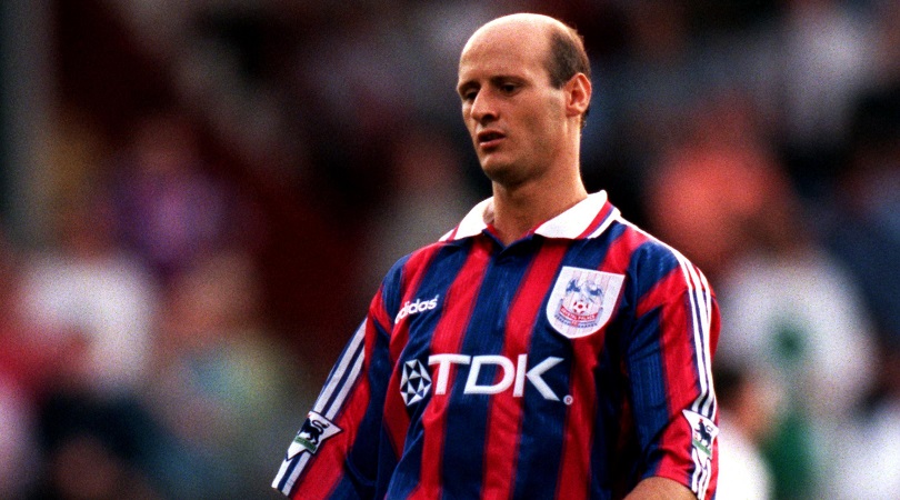
25. Crystal Palace, home (1997/98)
Crystal Palace fans didn’t have much to shout about in 1997/98, when they finished rock bottom of the Premier League. The incongruous presence of Attilio Lombardo in their team was one silver lining, as was a fantastic home kit which got the balance between red and blue absolutely right.
However, even Adidas’ excellent offering and Lombardo’s genius couldn’t prevent Palace sinking back to the second tier.
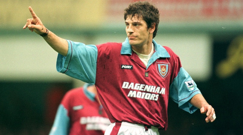
24. West Ham, home (1996/97)
We know football kits tended to be baggier than the skin-tight shirts we see today, but this baggy? Perhaps Slaven Bilic accidentally pulled on the shirt that was being saved for Neil Ruddock the following year.
Claret and blue are classic football colours, and we love the ratio between them in West Ham’s 1996/97 uniform. Also, Dagenham Motors is a wonderful 1990s kit sponsor.
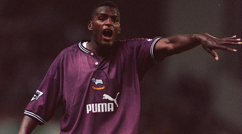
23. Derby, away (1996/97)
Producing a maroon away kit in the 1990s was a bolder move than it would be today, but Puma got it absolutely right. Derby’s change strip from 1996/97 is stunning; the only disappointment is that they didn’t wear it that often, switching to yellow and blue the following season.
As well as the beautiful main colour, the buttoned-up colour and central positioning of the club crest and sponsor’s logo deserve a big thumbs up.
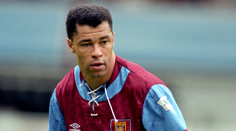
22. Aston Villa, home (1992/93)
Just look at that lace-up colour and try and tell us that this isn’t a superb kit. It’s so attractive that we’re even willing to forgive the strange blue semi-circle just below it.
For a long time in 1992/93 it looked as if Villa were going to win the title, even if Ron Atkinson’s side ultimately finished 10 points adrift of champions Manchester United. Still, a runners-up finish and dazzling home kit represented a pretty decent season.
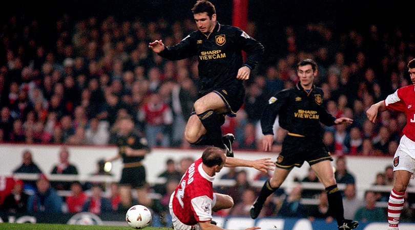
21. Manchester United, third (1993/94)
Black is an underused colour when it comes to away kits, with 1993/94 Manchester United producing one of the best examples of why it should be considered more often by kit manufacturers.
The dashes of gold throughout the shirt, shorts and socks make for a fine contrast, and the fact Eric Cantona was around to model it helped Umbro's cause no end. Once they went black, United never should have gone back.
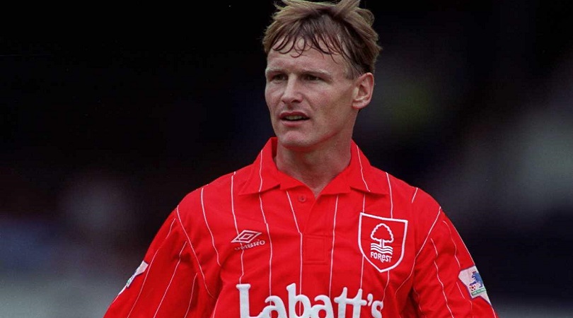
20. Nottingham Forest, home (1992/93)
This kit should bring back bad memories for Forest fans: the team being relegated, Brian Clough retiring, Robert Rosario existing. But the design is so pleasing that all of it almost disappears.
The elegant pinstripes offset the presence of the fashionable Canadian lager advertised over it. The crest is simple but just the right size, which is more than can be said for Teddy Sheringham’s XL jersey.
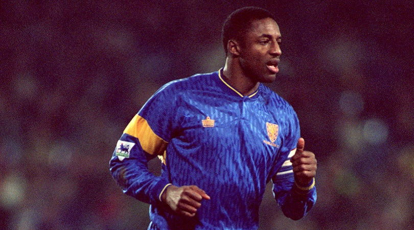
19. Wimbledon, home (1992/93)
Wimbledon’s 1992/93 offering makes it in on a technicality, qualifying purely on the basis that the Dons didn’t carry a sponsor on their shirt that season. This isn’t a comment on the corporate greed of modern football, but more one on clean kit designs: football shirts always, always, always look better without a sponsor.
Did we mention the absence of a sponsor?
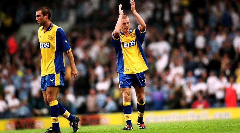
18. Derby, away (1999/2000)
Derby’s Premier League-era kits are, almost without exception, terrible. Maybe it’s because they were often made by Puma, who didn’t really hit their stride until that run of shirts in the early/mid-2000s which basically went see-through whenever anyone sweated in them.
This one, however, is rather tidy. An always-winning combo of blue and yellow is the main reason for its success, while the top simply looks nice and clean too. If it was good enough for Georgi Kinkladze, it’s good enough for us.
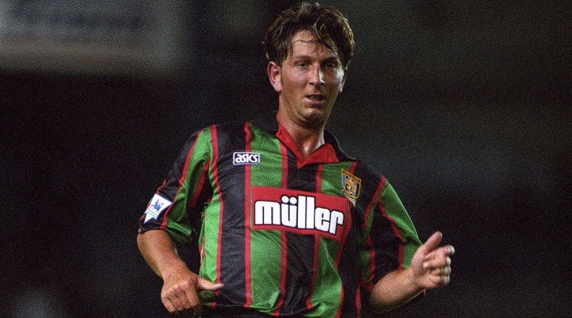
17. Aston Villa, away (1994/95)
This one gets in perhaps not because it’s an especially nice kit, but because it’s so quintessentially ’90s. It looks just like a collarless shirt you could imagine Lee Sharpe or Ryan Giggs putting on to go down the disco circa 1993.
Green, black, thick lines – the more we think about it, the less we like it, but the fact it’s so representative of the decade means it’s impossible to leave this Villa shirt out.
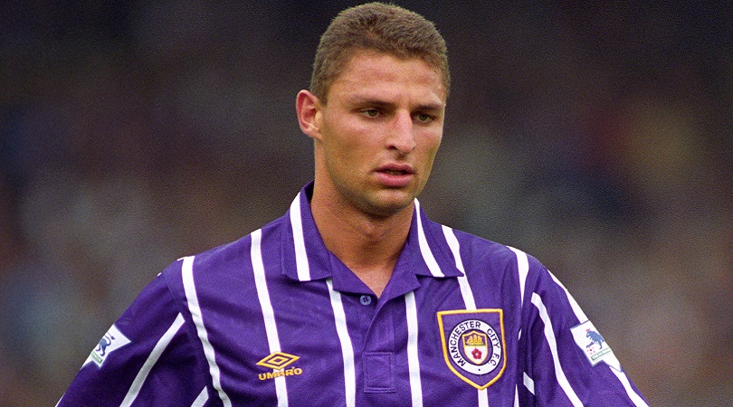
16. Manchester City, away (1992-94)
The high point to City’s away kits was their black-and-red checked number circa 1987, but they never quite nailed the retro away jersey in the ’90s.
This one looks a little like something you’d find in the River Island spring sale, but it’s a pleasing combination of simple (straight up-and-down pinstripes) and unusual (purple kits aren’t that common outside of Florence). Early-to-mid ’90s City weren’t particularly memorable on the pitch, but this shirt makes up for it.
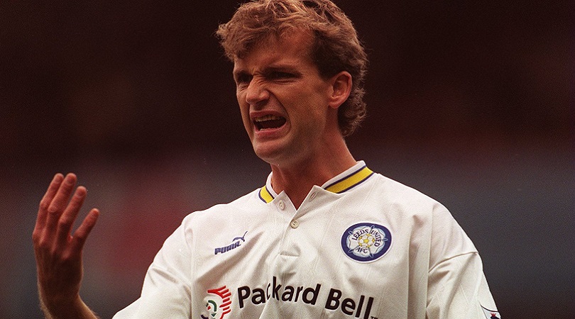
15. Leeds, home (1996-98)
It may be a cliché, but sometimes less really is more. It’s difficult for clubs like Leeds to offer variations in design season after season – after all, they’ve only got white to work with – but that didn’t preclude them from producing this beautiful kit.
The only quibble we have is the positioning of the sponsor’s logo – it’s probably a bit too high, but at least Packard Bell had the decency to make their emblem relatively small and unobtrusive. Which is more than can be said for Carlton Palmer, who wore this top in 1996/97.
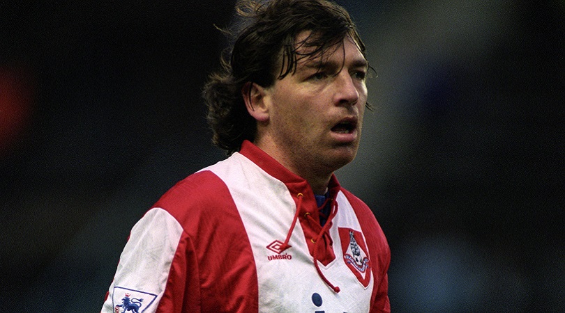
14. Oldham, away (1992/93)
Oldham didn’t make much of an impact in the Premier League, narrowly surviving in 1992/93 before falling through the trapdoor the following season. In the two-and-a-half decades since then, they haven’t even come close to sealing a return to the promised land, dropping to the third tier just in time for Tony Blair's 1997 election win and staying there ever since.
Yet while therir two-year stint in the top tier was largely forgettable, they deserved to be remembered for this shirt. It’s almost a reverse Ajax number, which, appropriately enough, is how you might describe the Latics’ team too: Total Football in reverse.
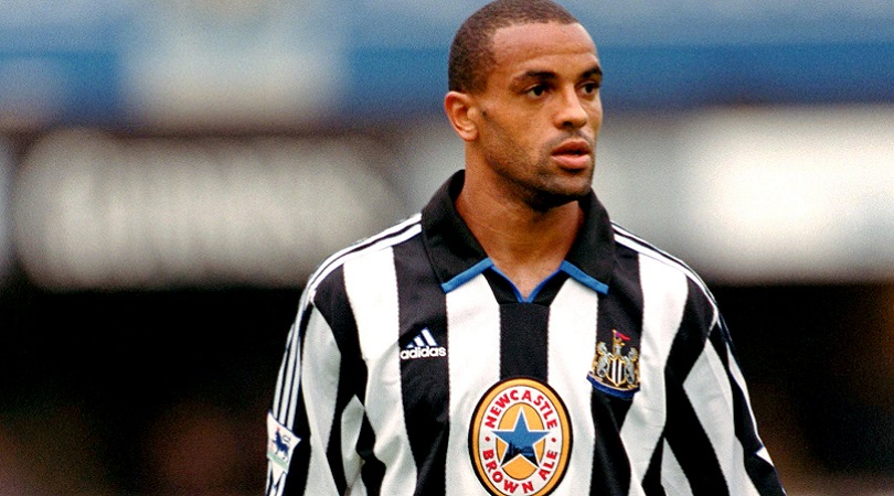
13. Newcastle, home (1999/2000)
Perhaps Newcastle’s effort from 1992/93 was better, with its big blue Newcy Brown star in the middle, but this edges it out because it was a welcome return to form, coming after that awful shirt the Magpies had with a big shield on the back (the one Temuri Ketsbaia ripped off to kick seven bells out of an innocent advertising board).
It’s also a lesson in an art which shouldn’t be complicated, but plenty make a mess of anyway: getting the proportions of stripes right. Howay the lads.
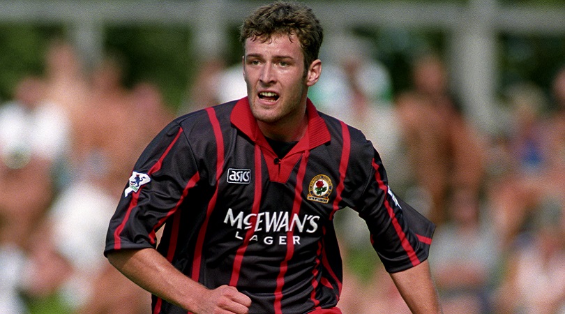
12. Blackburn, away (1994/95)
Nice kits and success don’t always go hand-in-hand (Manchester United’s home shirt in 1999 was, for instance, terrible), but Blackburn supporters must have been extra delighted that their title triumph was achieved in such terrific togs.
Their away shirt was better than the home, neatly blending black and red while also accentuating the Lancashire Rose in the club’s badge. Even Chris Sutton, who recently told FFT he’s a “happily miserable” person, didn’t seem to mind it too much.
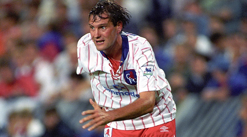
11. Chelsea, away (1992/93)
Pinstripes always look smart on a football shirt, so this Chelsea number from the Premier League’s inaugural season was always going to make the cut. It is, in truth, a little disconcerting to see so much red on the Blues’ kit, but they get away with it thanks to the stylishness of the overall design.
Talking of style, the classy Glenn Hoddle could probably make any football top look elegant, even when he was nearing his late thirties.
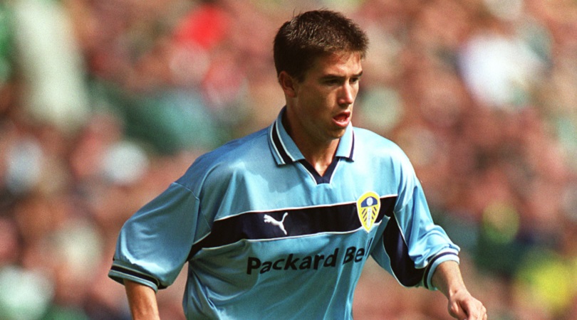
10. Leeds, away (1999/00)
It can be tough to explain why certain kits are so nice, and this Leeds offering from 1999/00 certainly fits within that category.
Perhaps it’s the gentle shade of blue. Or maybe it’s the placement of the single stripe across the chest, not too big but not too small, linking badge and manufacturer with a colour that matched the sponsor. Or could it be the knowledge that this shirt was just an attractive facade to the impending financial crisis at Elland Road? Whatever the reason – and there’s probably more than one – it’s a great top.
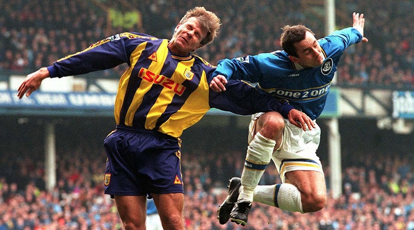
9. Coventry, away (1998/99)
This looks like a last-minute job: in the last week of July 1998, someone at the Le Coq Sportif factory (wherever that is, presumably France) suddenly sat bolt upright and screamed: “THE COVENTRY AWAY KIT! I KNEW THERE WAS SOMETHING I HAD TO DO!”
We’re imagining the employee in question then running around like the McAllisters when they realise they’re late in Home Alone. How else do you explain pairing yellow with purple and a dash of red? But this kit somehow works, perhaps through sheer luck, perhaps because they’re Le Coq Sportif and are therefore natural geniuses who can produce beautiful sportswear even when they’re up against the clock.
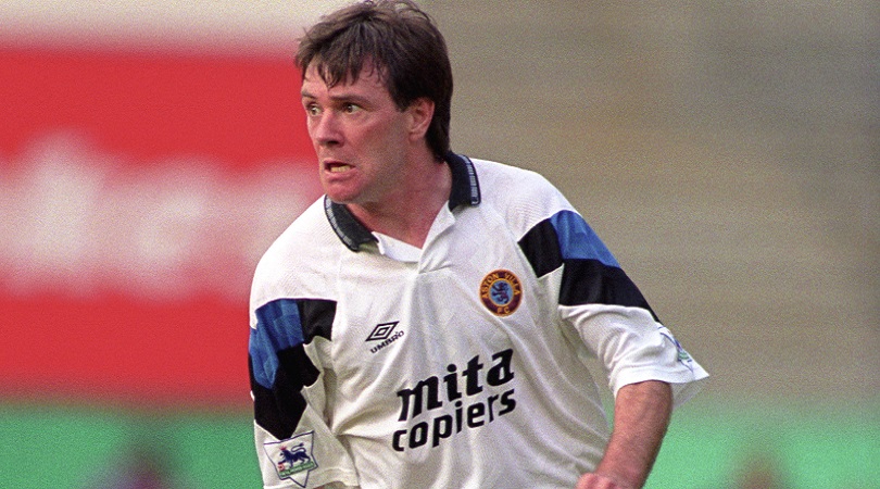
8. Aston Villa, away (1992/93)
Umbro were absolute sods for a template in the ’90s, two or three teams often looking more or less identical but with changed colours.
This was one of the better ones, though, clean and white with blocks of colour on each arm that looked a bit like Tetris pieces. The front of the shirt is nice and clean, and the font on the sponsor’s logo adds to the kit’s quirkiness. And then there's that classic crest, too.
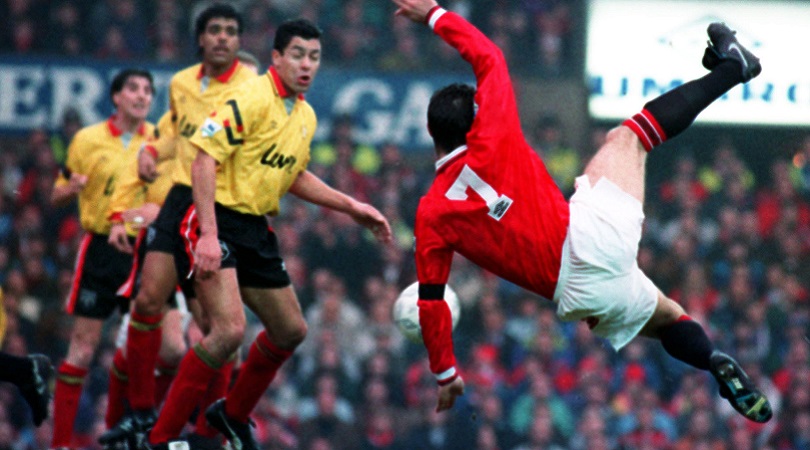
7. Sheffield United, away (1992/93)
Sheffield United’s shirt from 1992/93 is another example of an Umbro template that did the rounds of the Premier League in the early ’90s. The colours on this top – bright yellow, red and black trim – really made it pop.
This, and an even brighter yellow one a couple of years earlier, meant Blades away ends often looked like congregations of matchday stewards. Even Eric Cantona felt compelled to throw a few shapes when he came face to face with these flashy threads.
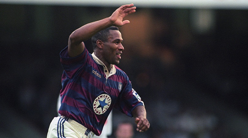
6. Newcastle, away (1995/96)
Question: which is the only sponsor’s logo to actively enhance a shirt? Answer: Newcastle Brown Ale.
This would be a pretty sweet kit anyway, employing the underused hoops formation, paired with a tasteful dark blue and maroon colour scheme, along with that collar Miles off of This Life always seemed to have on his shirts. It’s oh so ’90s, but there’s no doubt it’s the brown stuff that makes it.
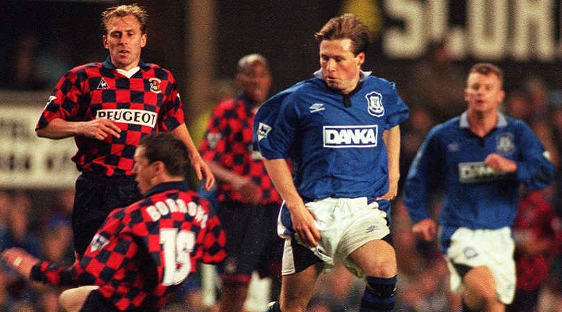
5. Coventry, away (1996/97)
Why don’t more people do chessboard kits? Everyone loves Croatia’s, they’re a bit different and instantly catch the eye, plus they almost always look absolutely magnificent.
The Coventry away kit everyone remembers is that brown one from 1978, but this from 1996/97 is significantly better and has the benefit of not making every player look like they’ve violently soiled themselves. Which, on balance, is an important part of any football shirt.
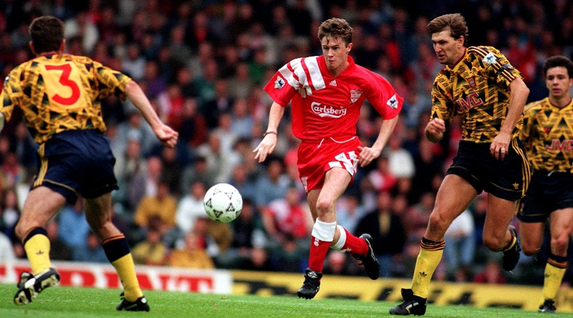
4. Liverpool, home (1992/93)
The ’90s was the era of the baggy kit, when manufacturers cut loose with the longer shorts and, giddy with the possibilities opened up by the provision of extra material, started producing kits which made it look like every player was wearing his older brother’s garments.
This effort from the Premier League’s maiden campaign did have a billowy element, and signalled the early years of Liverpool being, frankly, a bit pants. The clean lines and Adidas stripes are a sight to behold, though.
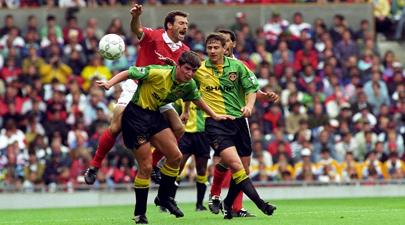
3. Manchester United, away (1992-94)
Football and advertising started to get themselves together properly in the ’90s: that may or may not be a good thing, but the campaign Umbro ran to go with their Newton Heath-inspired half-and-half yellow and green strip was certainly memorable.
Even a young Roy Keane didn’t seem to mind wearing it, which is clearly a triumph for the Red Devils and their kit-makers.
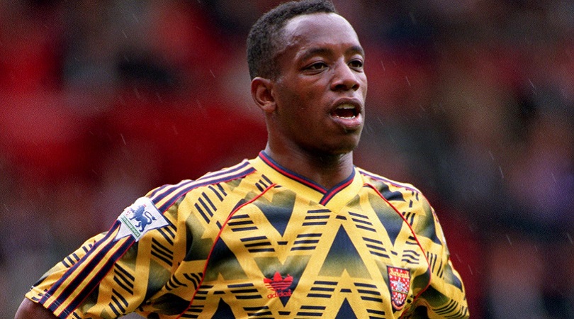
2. Arsenal, away (1992/93)
Did you really watch football in the ’90s if your dad didn’t say at some point: “That Arsenal kit looks like cat sick!”? Well, sorry dad but you’re wrong.
This was a belter, perhaps looking a little more like television interference than is ideal, but providing an iconic Adidas pattern that lives on today in hipster corners of east London.
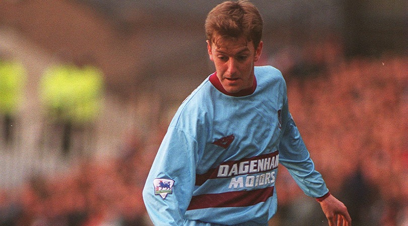
1. West Ham, away (1993-95)
Retro kit designs can be a bit hit and miss: a pleasing nod to the past, or a lazy neglect of ideas? There are numerous examples of the former from the ’90s, but occasionally – like this effort from West Ham – they come up lovely.
OK, Ian Bishop, Trevor Morley and Tim Breacker weren’t quite Geoff Hurst, Martin Peters and Bobby Moore, but a kit design can only do so much. And this kit design does a great deal, beating off significant competition to take top spot in our ranking.

Greg Lea is a freelance football journalist who's filled in wherever FourFourTwo needs him since 2014. He became a Crystal Palace fan after watching a 1-0 loss to Port Vale in 1998, and once got on the scoresheet in a primary school game against Wilfried Zaha's Whitehorse Manor (an own goal in an 8-0 defeat).
