Ranked! Every Premier League club’s home kit from worst to best
And the winner is...
As a fan, the release of a new kit is always one of the most highly-anticipated moments of the off-season. So which Premier League clubs hit nails on heads?
We've run the rule on the 20 top home... er, tops to be launched this summer – and named the winners and losers from English football’s catwalk. Starting with...
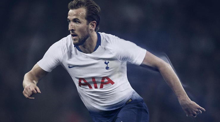
20. Tottenham
What were they thinking? Clearly the designers were going for a shorts-leaking-into-shirts look, but (also clearly) they didn't consider how ridiculous this will look with white shorts in the Champions League. Forget about the transfer window – this kit is Tottenham’s real failure of the summer.
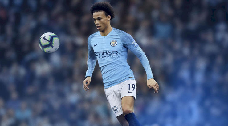
19. Manchester City
Oh dear. Nike have tragically dressed a collection of players who play beautiful football in an outfit that resembles a plain T-shirt with radio static on the arms. You wouldn’t dress Monica Bellucci in a shell suit or make Aidan Turner pull on some Crocs. Focus on David Silva’s feet, not his torso.
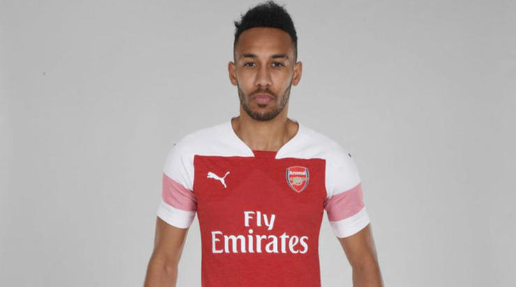
18. Arsenal
It’s a no from us. It looks like someone has forced about four different designs onto one top, attempted to sketch something taking all that in, left for the evening with the job half-done and then someone took the scrambled drawing off the desk and sent it to the factory for production. There might be a nice jersey in there somewhere, but this isn’t it.
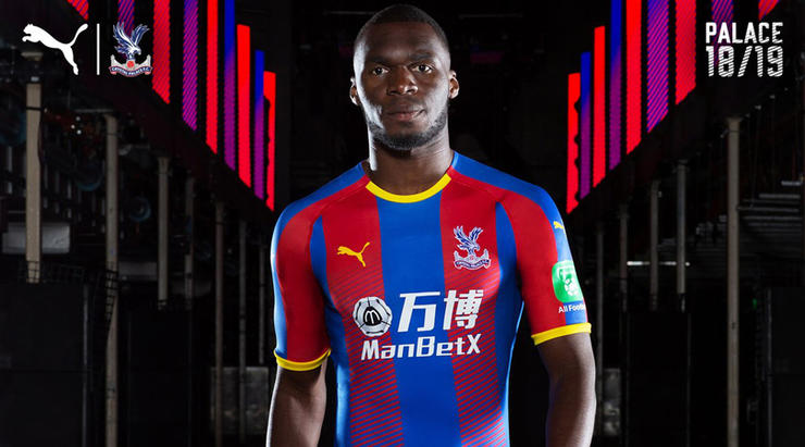
17. Crystal Palace
The problem is similar to Arsenal’s; the fondness for a fade at the waist is an issue with a block colour kit, but with stripes? You’ve already got your variation there, guys. There’s no need to complicate things more. The yellow trim saves a few points, but overall this is a no.
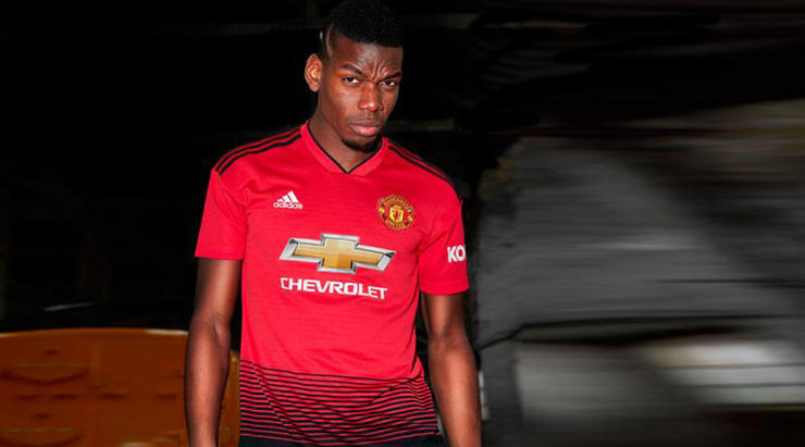
16. Manchester United
Change isn’t fundamentally a bad thing, but Manchester United’s switch from white to black shorts might be. It might just reflect Jose Mourinho’s mood, but at least the gradient makes a bit of sense. That said, it’s still another gradient. Stop it!
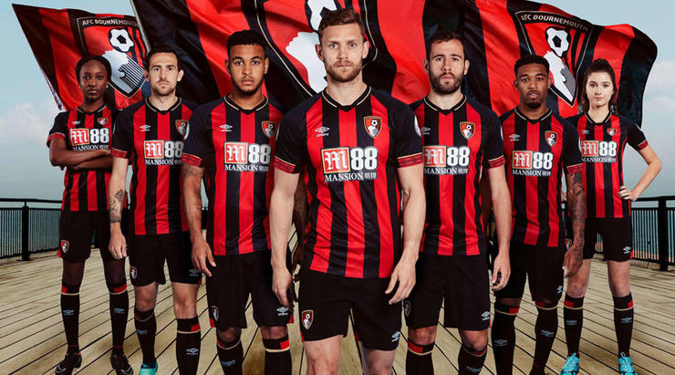
15. Bournemouth
There’s something not quite right here. Is it too busy? Maybe the collar or the sleeve detail? The sponsorship logo on the front? Is the club badge oversized? We can’t quite decide what the issue is, but there definitely is one. Maybe it’s nothing. It could be a grower. Maybe it’s just rubbish. We’re not sure.
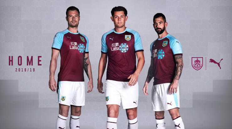
14. Burnley
It’s not bad, but not much good either. Certainly not with that travesty of a sponsor splashed all over the front. We get that clubs will inevitably just choose the sponsor that hands over the most cash, but can’t they for once just think of the aesthetics? You’re going to have to wear these kits for an entire season, lads. Come on. Have some dignity.
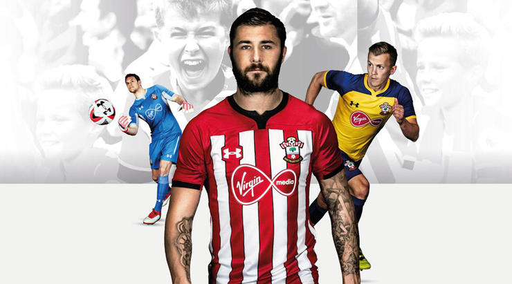
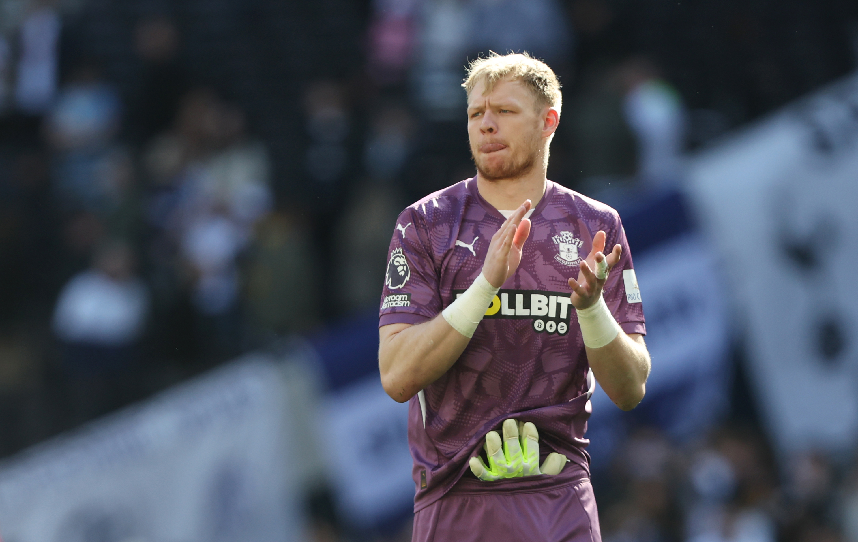
13. Southampton
At a loss for things to say with this one. Isn’t this just the same as last season’s? Or some season before? It’s just a bit dull, isn’t it. The kind of kit nobody would pay any attention to. Apt, considering the season ahead for Southampton? You said that, not us.
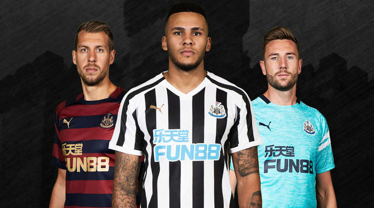
12. Newcastle
Again, a bit nothingy. It’s a simple black-and-white-striped shirt, churned out; the vanilla ice cream of football kits. Sorry for going back to the sponsors, but mercy this is a bad example. Just slapped onto the front with no attempt to blend it with the rest of the design. No.
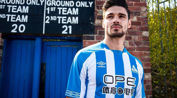
11. Huddersfield
It’s… fine – not exactly memorable, looks OK with a minimalist kind of vibe - but the real star here comes just above the left nipple. Huddersfield’s terrier badge hasn’t been a feature on their shirts since the early 1970s, but it’s back now. It’d seem that a season in the Premier League fills you with confidence.
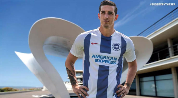
10. Brighton
There’s a fine line to tread between simple and boring kit designs, and this tippy-toes all over that line like the most delicate gymnast. To its credit, the white sleeves are an upgrade on last season’s fuzzy blue, but then there isn’t a huge amount happening here. It looks a bit like a template: up to you whether that’s a good or bad thing.
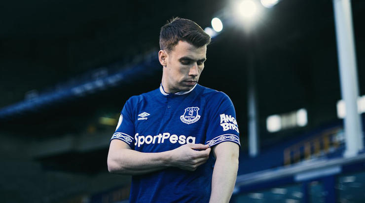
9. Everton
This probably shouldn’t be so far up the list, because it’s merely adequate, but it’s such an upgrade on last term that it deserves a decent spot. Their 2017/18 kit looked like it had been found in a PE lost property box, while the new version at least looks like something that someone might wear out of choice, rather than as the only option other than a vest and pants. Nice sleeves.
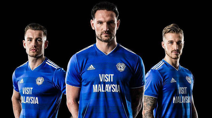
8. Cardiff
Yes. Good. Not completely convinced with the V-neck, but you can’t have it all. And the sponsor’s logo works for a change: it’s big, sure, but the font is nice and clear, and it’s message is clear. ‘Visit Malaysia, you say? Maybe I will - I’ll have a look on Expedia just as soon as I’ve finished watching Junior Hoilett shank a cross into the stands.’
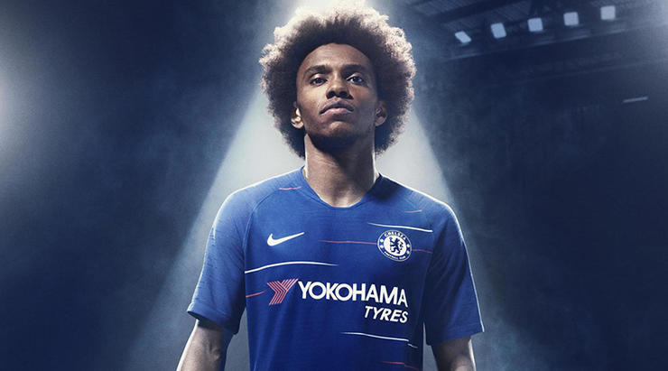
7. Chelsea
In theory, this should be terrible; it looks like the start of TV interference. Or a rubbish t-shirt from the 'reduced to clear' section of Topman. But you know what? We like it. Probably not something you’d wear out to dinner, but at least it looks different from the usual templates. A low bar, perhaps, but we’ve all got to make it through the night somehow.
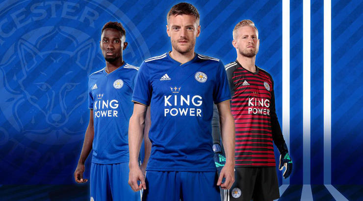
6. Leicester
Adidas deserve a pat on the back for not getting too formulaic with their kits: there’s a recognisable theme, without them all looking identical, subtle variations in each. This is a good example: the nice diagonal lines set it apart just enough without being too flashy. And lord forbid a football top is too showy.
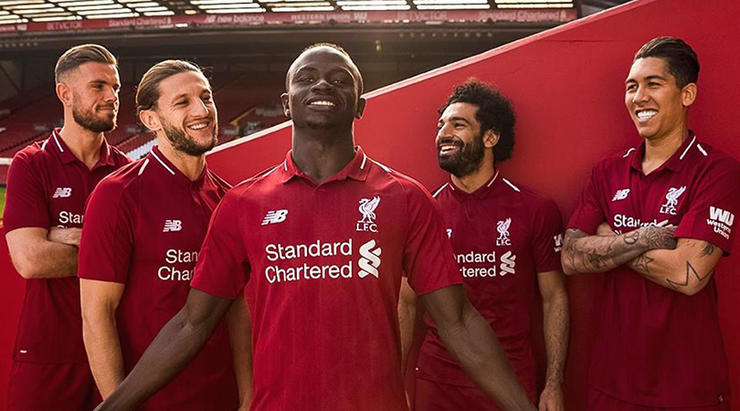
5. Liverpool
The lack of any gold loses this kit a couple of points, because everyone knows the best Liverpool tops feature some gold. But it’s still very good; proof that you can do some decent things with basically just a plain red jersey. Nice subtle detail, and being made by New Balance, it benefits from not being exactly the same as five other kits in the division.
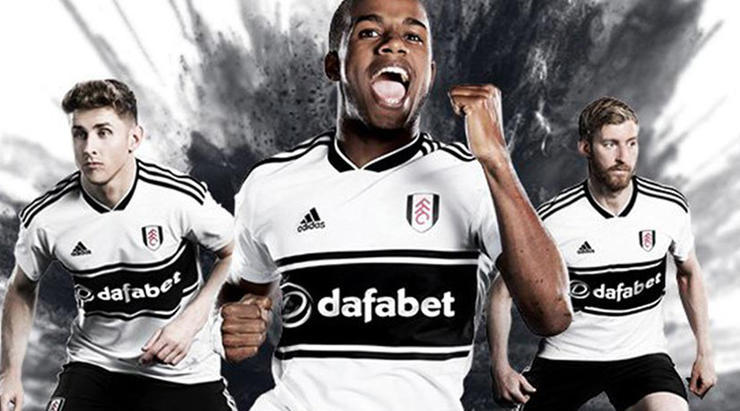
4. Fulham
Yes please. The idea of the late 1990s being retro is a worrying one for people of a certain vintage, but if you’ve made a trip to an Urban Outfitters over the last year or so, you must’ve come to terms with that by now. This is very nicely done and has the added advantage of making the sponsor’s logo look like it’s actually part of the design.
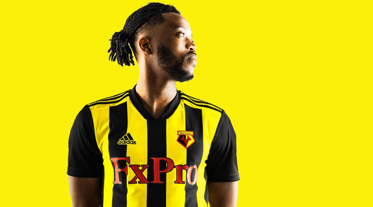
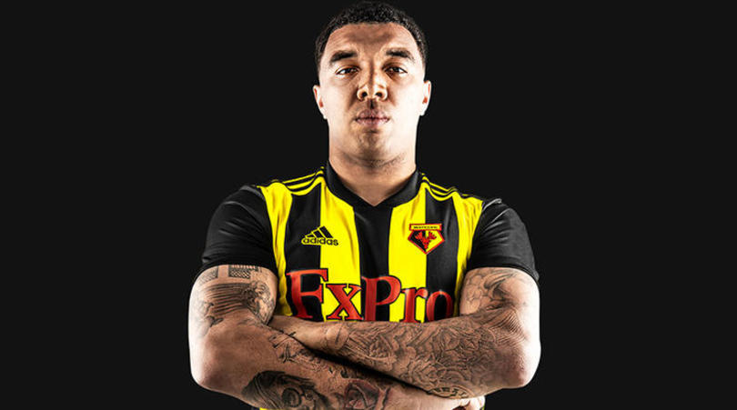
3. Watford
We like it. Sue us. This may have come under fire on popular internet social media microblogging platforms, mostly because it doesn’t actually look like a Watford kit. Where did those black stripes come from? Still, tradition can go hang with this one – and extra points are added for making something of the sponsor’s name, the red adding a dash more colour.
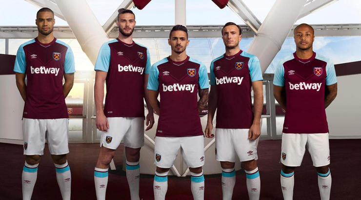
2. West Ham
Absolutely. All the way in here. Nice blue hoops on the sleeves, an attractive clean design, some subtle horizontal stripes. It’s a shame Aston Villa aren’t in the Premier League because their kit is a thing of beauty, but this is the closest we’ve got in the top flight. Ideally the whole sleeves of West Ham shirts should be that blue colour, but we’re nit-picking.
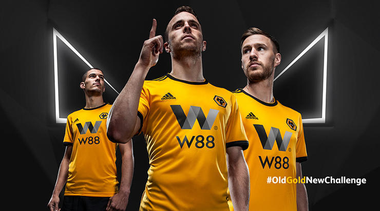
1. Wolves
Congratulations Wolves, winners of the 2018/19 Premier League (’s best kit award, as decided by FourFourTwo)! A beauty for sure. Wolves’ top last term was one of those horrible efforts with fuzzy bits on the sleeves, but when in doubt, go simple: black sleeve stripes and gold. Deservingly top of the podium.
