It was just #banter
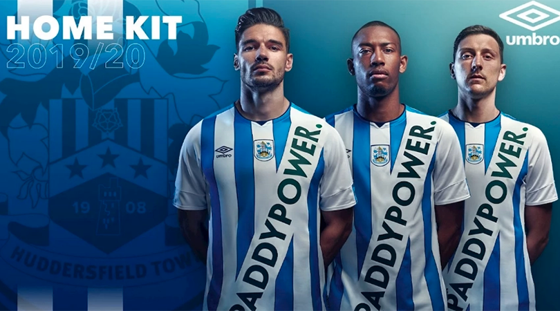
When Huddersfield announced this horror, Football Twitter cried foul. Main sponsor Paddy Power had forged a reputation built on mischief and japery, and terrified Terriers were waiting for the 'proper' shirt to drop within hours.
Only it didn't... until two days later, when Huddersfield finally revealed their 'actual', sponsor-less shirt (which in fairness, is an absolute beauty). After all, who could make a sash look that bad?
But that original effort isn't the only shocker to be unleashed upon the world so far this summer. Someone call the fashion police...
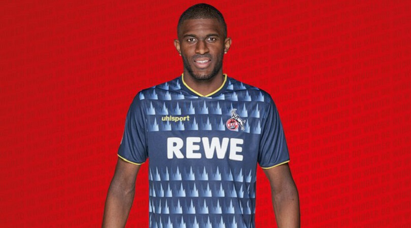
24. Koln third
“FC [Koln] stands for tradition and modern, for classic values and courage for change,” said director Alexander Wehrle last month. “Accordingly, we have also created our kits for the 2019/20 season by following the traditional formula that our fans want: at home white, away red and something special for the third kit.”
We can certainly agree that this is special – but not in a good way.
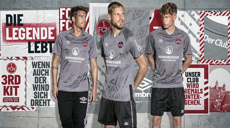
21. Nurnberg third
Rumour has it that Alex Ferguson demanded Manchester United change their grey away kit at half-time of a 1996 clash with Southampton not because the players couldn’t pick each other out against the stadium’s backdrop, but because he finally realise how dreadful the shirt was. Nurnberg should have read up on their history.

20. Nottingham Forest away
Red and blue are the two primary football kit colours, and it always jars when a club known for one of the two produces a change strip featuring the other. It’s impossible not to associate Nottingham Forest with red, so why do they insist on going blue for their away top so often? What’s more, this doesn’t even look good by anyone’s standards.

18. Doncaster away
Darren Moore might be a lovely man, but even he must have had words when he saw Doncaster’s away kit for 2019/20. The new Rovers boss will be forced to watch his side turn up at opposition grounds wearing something that looks more like an intentionally bad t-shirt than a football kit.
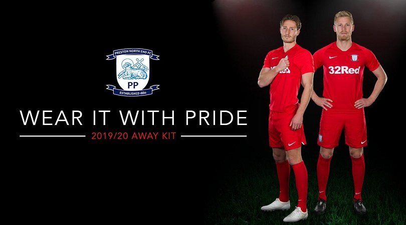
15. Preston away
Plenty of kit manufacturers go overboard in their attempt to produce something unique and eye-catching, but it’s also possible to be too extreme in the other direction. As far as we can tell, Nike have simply handed Preston a plain red top and stuck three logos on it. We’d love to see the brainstorming notes for this one.
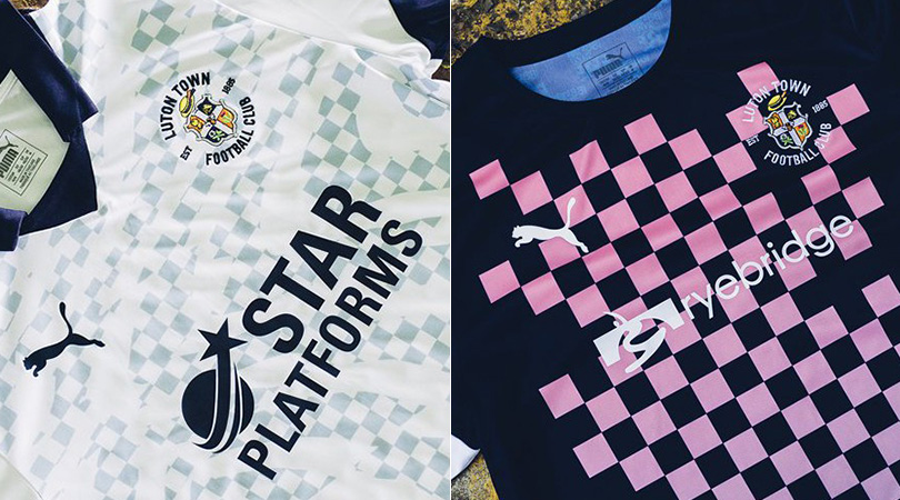
14. Luton aways
It’s always nice when clubs give a nod to tradition with their kit designs, but we’re afraid Luton’s pleas aren’t enough for their two away uniforms to avoid inclusion on this list.
A block design, using the navy and pink colours that featured on the club’s first ever home strip, is confusing. The alternative version – inspired by the Hatters’ iconic chequered flag, obviously – is far too messy for our liking.
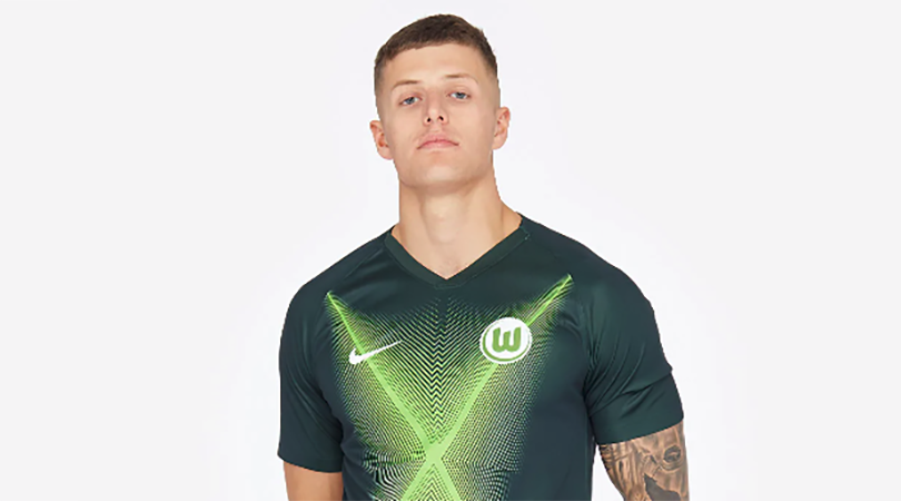
13. Wolfsburg home
“The light effects of the home jersey radiate a lot of positive energy and the shirt is a further development of last season's successful dark green jersey,” explained Wolfsburg managing director Michael Meeske upon the strip’s release.
FourFourTwo are sticklers for efficiency, and we can sum it up in far fewer words: it’s rubbish.
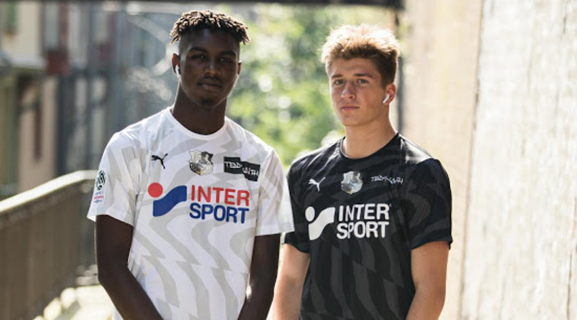
11. Amiens home and away
Not content with sending supporters to sleep with their on-field performances (only one surviving Ligue 1 team scored fewer goals last season), Amiens have decided to knock their remaining fans out with a pair of kits that could feasibly be used as tools for hypnosis. Perhaps they’re hoping to send opposition players into a trance and make it easier to hold on for a 0-0 draw.
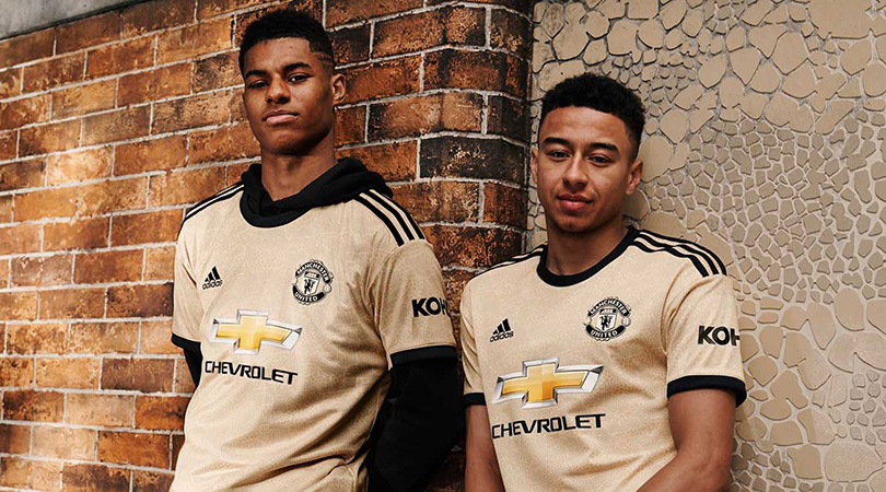
10. Manchester United away
It’s been another busy summer at Manchester United, who have been scouring the globe for potential new additions to their official commercial partners. And when they’ve got a spare minute, maybe even some players.
United’s away kit is a bizarre-looking “savannah-toned” jersey whose mosaics are apparently inspired by those found in Manchester’s Northern Quarter – although we’re yet to come across anything that looks like this. Imagine what it’ll do to Phil Jones’s face.
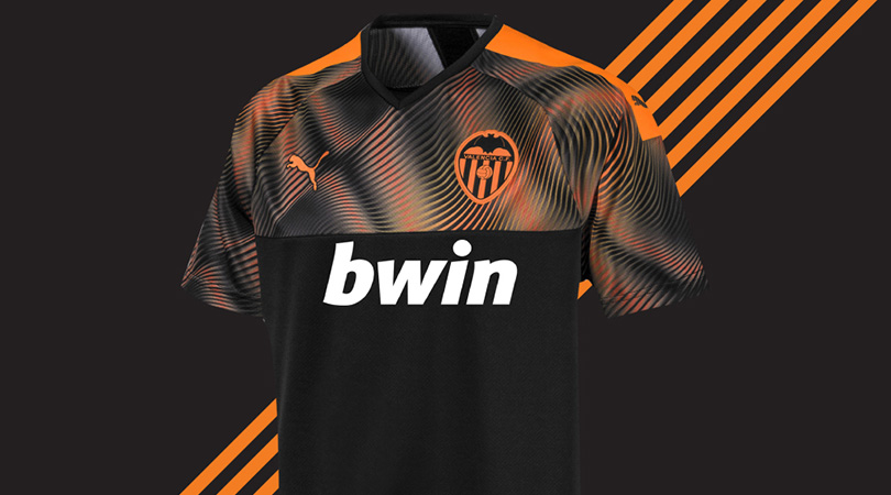
9. Valencia away
Black and orange often make for a lovely colour combination on away kits, but we’re struggling to get on board with this.
The fiery graphic at the top of the shirt cuts off so abruptly that it feels as if PUMA ran out of orange colouring a third of the way through. Either that or the designers suddenly noticed it was 5pm on a Friday and were keen to make the most of two-for-ones at the boozer.
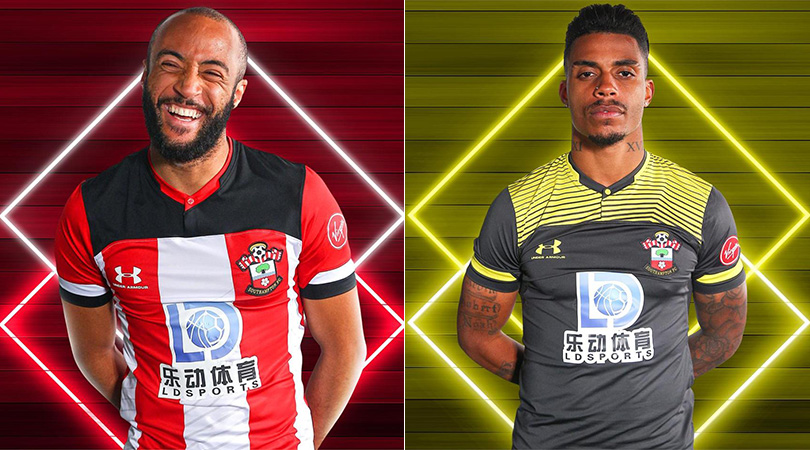
8. Southampton home and away
When the Saints go marching in, we’ll be heading out. Southampton have become increasingly bold in recent years, frequently tampering with their classic red and white stripes, but this year’s home shirt doesn’t cut the mustard.
The away one is even worse. If any future kit manufacturers are considering combining grey with yellow, just take a look at this design and get back to the drawing board.
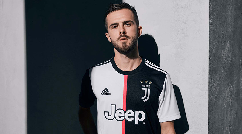
6. Juventus home
Juventus are so utterly dominant in Serie A that they seem to think they can do what they like. Their first move was to rip up the club’s traditional crest and replace it with a generic ‘J’; now they’ve gone a step further and replaced their iconic black and white stripes with a halved home jersey featured a baffling pink strip down the middle. Is nothing in this world sacred?
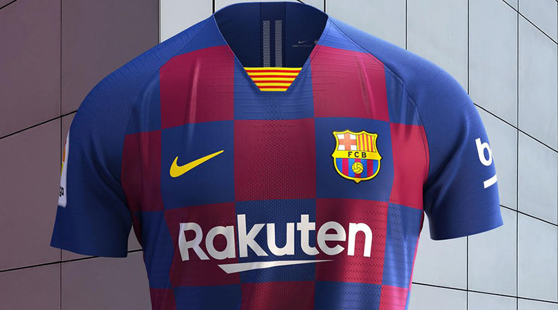
2. Barcelona home
Now, we can understand the logic behind Barcelona consulting Lionel Messi on big transfer decisions, but letting Ivan Rakitic design the kit is a step too far.
Article 24, paragraph 5b of the football kit rulebook clearly states that a chequered design should not be present on any jersey that doesn’t belong to Croatia.
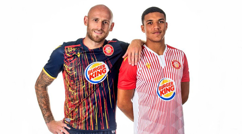
1. Stevenage home and away
Fun fact: it’s impossible for a human being to focus on other parts of these kits for more than three seconds before the brain and eyes are drawn back to the sponsor’s logo.
The home shirt actually looks more like a Burger King employee’s uniform than a football jersey, while the garish graphic on the away offering is literally painful to look at. What a pair of whoppers.
Greg Lea is a freelance football journalist who's filled in wherever FourFourTwo needs him since 2014. He became a Crystal Palace fan after watching a 1-0 loss to Port Vale in 1998, and once got on the scoresheet in a primary school game against Wilfried Zaha's Whitehorse Manor (an own goal in an 8-0 defeat).

 Join The Club


