Ranked! The worst club badges in football
A club's crest is an important part of its identity, so this lot could have taken a bit more pride...
What makes a good club crest? It's an interesting question, but it's not one we're going to answer here. Instead, we've scoured the globe to pick out the very worst examples of emblems, from the bland to the barmy, to the "What the heck is going on here?!"
So sit back, relax and prepare to be horrified by the following 19 monstrosities...
The worst club badges in football
19. Chelsea
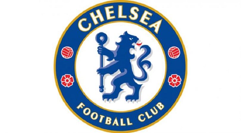
Unlike the roaring beast that dominated the Blues’ badge from 1986 to 2005, this incarnation of the Chelsea lion isn’t very intimidating.
Several changes were made in the revamp of an older logo, so there’s no excuse for a supposedly ferocious creature merely looking miffed that an opposition forward has beaten the offside trap. Or perhaps that’s exactly what Chelsea intended all along.
Alternatively, the king of the jungle may have been distracted in the middle of doing something important. Your guess is as good as ours.
18. Benevento
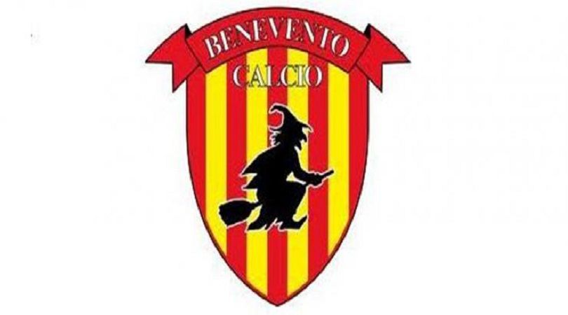
Fabio Cannavaro’s Benevento are struggling to trouble the promotion places in Serie B right now, having scored just six goals in their first eight matches. But perhaps the real reason for their struggles is just karma doing its thing after seeing the club’s badge.
Being brutally honest, that witch simply doesn’t look up to the job. Has it even made it off the ground? And what’s with the clown shoes?
Get FourFourTwo Newsletter
The best features, fun and footballing quizzes, straight to your inbox every week.
17. Sheriff Tiraspol
Serial Moldovan championship winners and regular Europa League botherers, Sheriff were founded by a company called Sheriff, play at the Sheriff Stadium and have a sheriff’s badge as their… well, badge. Clearly someone’s a big John Wayne fan.
Still, putting a star above a star, which features a football made of stars, might just be overkill. We get it, guys.
16. Warriors
Warriors were called Singapore Armed Forces FC until 2013. They have never been nicknamed the Rhinos. But when the S.League rejected Warriors’ warrior and insisted all mascots must be animals, the club opted for a rhino instead.
Which is all well and good, until you discover nobody can actually draw one. This attempt is so naff it’s almost good – ‘almost’ being the key word in that sentence. We’re not quite sure why they couldn’t make it fit within the badge’s boundaries, either.
15. Rayo Vallecano
While FFT loves the fantastically left-wing Madrid side, we think it’s a step too using the club crest to lay into capitalism by displaying a stock market crash.
Rayo’s offering looks like three badges rolled into one, as if a competition was run but the organisers couldn't pick a winner so merely decided to combine three separate winners' choices into one. Cop outs!
14. West Ham United
Having ‘TIW’ adorning the crossed hammers is a nice touch, referring to club forerunners Thames Iron Works. However, the attempt to market the club globally upon their move to Stratford – and removal of Boleyn Castle from the badge – is so cynical, so blatant, that it feels as if LONDON should be followed by the word (HONEST).
It’s also just a bit boring. Granted, some clubs are guilty of trying to include too much on their canvas, but it’s hard to escape the feeling that the Hammers’ crest is half-finished.
13. Viitorul Constanta
He’s totally air-kicked this, right? Maybe the Romanian side are trying to lure opponents into a false sense of security, but this certainly isn’t a crest to strike fear into the hearts of the opposition.
Indeed, our friend looks far too fragile for the rough and tumble of Liga I. We’re not saying he can’t cope with the physical demands of the Romanian top flight, but even Mesut Ozil would fancy his chances of knocking this fella off the ball.
12. Alloa Athletic
What. A. Badge. Alloa are going strong in the Scottish third tier at the time of writing, which we put down to the remarkable amount of steroids they’ve been pumping into their mascot. Allegedly.
We’re also interested in the sweatbands he’s wearing. Since when did wasps sweat? Something strange is going on here…
11. Manchester City
In December 2015, following protracted disgruntlement among some sections of the fan base, Manchester City did away with the giant eagle that had adorned their crest since 1997. The new design was meant to be unveiled on Boxing Day, only for the Intellectual Property Office to spoil the surprise by putting it on their website before Christmas.
In any case, it was au revoir to the eagle, the three stars, the Latin motto ‘Superbia in Proelia’ and the less Latin ‘FC’, everyone having now accepted that Manchester City are a football club. And City fans rejoiced, as the crest returned to its humble origins as a club badge on Pro Evolution Soccer.
10. Limon FC
Costa Rica are actually quite good at football, so their Primera Division is worthy of better club emblems than this. At least the humanoid tornado sees the funny side… or it’s sucking on a Limon. We can’t tell.
Besides, we’re more concerned with why its left arm is so much beefier than its right – and, come to that, why a tornado has arms. After all, it’s still able to kick a football using, like Neil Ruddock, the power of wind. And how does its crown stay on?
9. Genoa
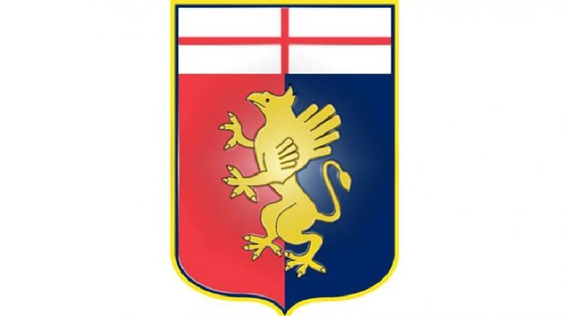
The facial expression says it all. Genoa’s poor old griffin looks bemused at all the attention; either that or he’s just been caught with his beak in the biscuit tin.
Italy’s oldest currently active club, Genoa were founded by Englishman James Richardson Spensley in 1897, which explains the Saint George’s Cross at the top of the crest. Not that the griffin’s noticed.
8. Universidad de Chile
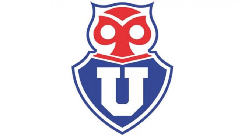
The chuncho, or Austral pygmy owl, is supposed to represent wisdom, knowledge and spiritual harmony, but none of those things are evident in La U’s drawing of it. What’s meant to be an owl looks more like a skull perched atop the uniform of an American jock.
Over time, the owl/skull/thing’s expression has softened from anger to bewilderment, which is the path all of us must take eventually. We look forward to seeing what it looks like in 50 years’ time.
7, 6. Hamburg, Nuremberg
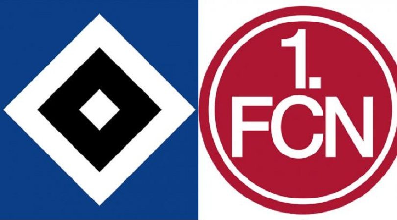
Put some bloody effort in, Germany, for goodness’ sake. It’s as if the Bundesliga realised the day before its first season began that there was no way to identify its members, and every club had to come up with a logo overnight. Matches between Hamburg and Nuremberg resemble a clash between rival supermarket chains.
They’re not alone, either – Werder Bremen and Wolfsburg are guilty of much the same. The Bundesliga may be home to fast, attacking football and a thriving fan culture, but it really does need to address its logo problem.
5. Wycombe Wanderers
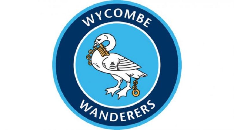
“Gerald, what the hell have you been feeding the mascot?”
We’re not too sure about the gold, either. Is the swan donning some nice new jewellery or has he been chained around the neck to stop him escaping and flying off in pursuit of a better life? The poor thing must be jealous of his brother over at Swansea, who enjoys an altogether more relaxed existence.
4. AS Marsa
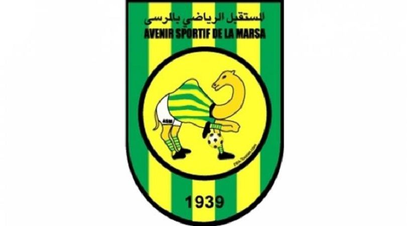
The Tunisian outfit have a badge straight out of a religious children’s book. And, as charity-shop wisdom dictates, it’s easier for a camel to get through the eye of a needle than into a football strip.
The creature itself seems to know this, looking at its lurid kit as if to say, “Does my hump look big in this?” That’s the least of its worries: its right foreleg is twice as long as its left and has at least three kneecaps.
No, no, this isn’t right at all. Someone in the north of Africa is genetically modifying camel DNA.
3. RB Leipzig
The universally hated RB Leipzig are bankrolled by Red Bull, energy drinks manufacturer and patron saint of lorry-driving students. You may have noticed from their historic club crest. By the way, their name is ‘RasenBallsport Leipzig’, meaning Lawn Ball Sports Leipzig, which is of course perfectly natural and just coincidentally has the same initials as Red Bull.
But German football rules forbid advertisement on their badge. So instead, not-Red Bull Leipzig have two red bulls charging into a golden orb, in an image that is in absolutely no way reminiscent of Red Bull’s logo. Could have fooled us.
2. Catania
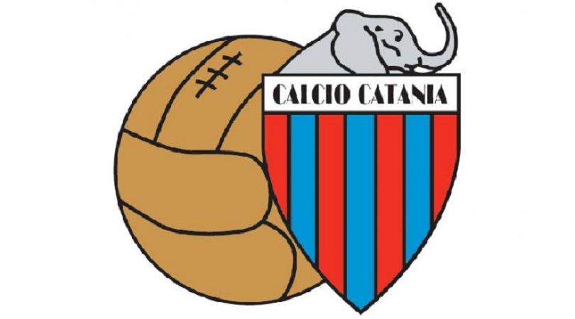
It feels churlish to criticise incorrect scale in a club’s badge, given their artistic nature. Even so, this crest from Catania is just bizarre.
Why is that leather ball so ludicrously large? Shouldn’t the blue and red shield, emblazoned with the club name, be the crest’s main feature? Why is that elephant trying to hide behind said shield? If Babar’s doing something naughty, football fans have a right to know.
1. Burton Albion
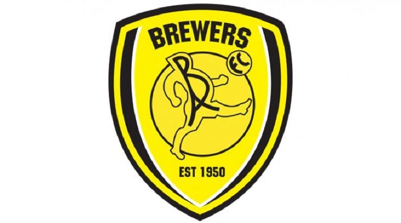
Most clubs seek to finesse their image when they reach new heights. Not Burton. The Brewers are higher up the ladder than they’ve ever been before, but they refuse to drop their pub team of a crest.
Just look at it. Gaze upon this exquisite monstrosity. The image Burton Albion have chosen to represent themselves to the world is an oddly proportioned chubber failing to do keepy-uppies in his dance shoes. Perhaps it’s a warning about the dangers of brewers getting high on their own supply.
Huw was on the FourFourTwo staff from 2009 to 2015, ultimately as the magazine's Managing Editor, before becoming a freelancer and moving to Wales. As a writer, editor and tragic statto, he still contributes regularly to FFT in print and online, though as a match-going #WalesAway fan, he left a small chunk of his brain on one of many bus journeys across France in 2016.
