Leeds United’s ’smiley’ badge explained as fans heap praise on club’s retro away kit
Leeds United's new yellow away kit features a nod to the past that fans are loving

It’s the middle of summer, so we’re at the height of kit reveal season, as clubs across the land unveil their new shirt designs which they hope will get the thumbs up from fans and fly off the shelves.
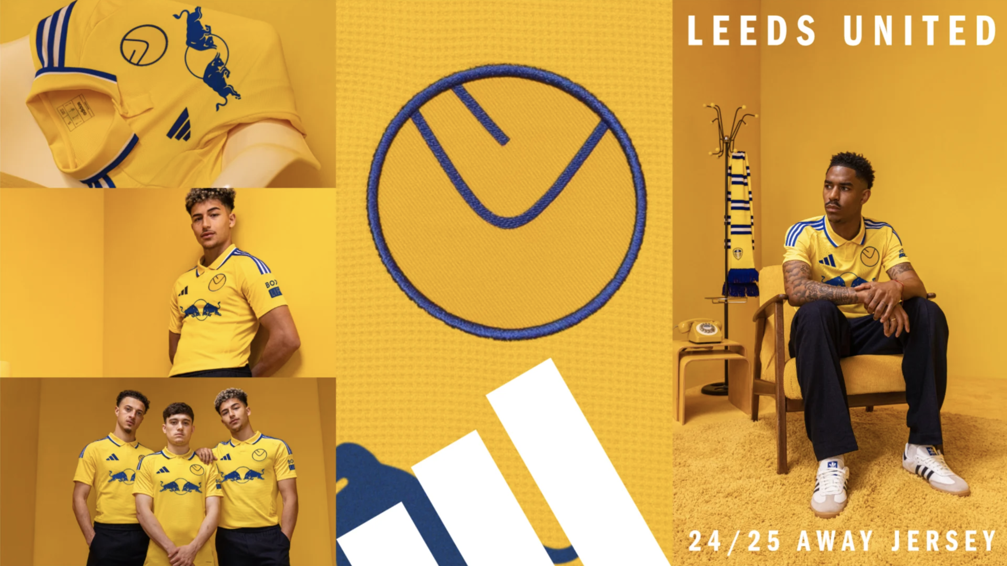
The latest kit release to turn heads is the new Leeds United away shirt, with the Championship side looking to the past for inspiration as they followed a recent trend of bringing retro badges back to change strips.
The badge in question is the iconic ‘smiley’ crest which first featured on kits during the 1970s and this new kit, based on an original late-1970s design, has been met by near-universal praise by Leeds fans - who if you remember the 2018 new badge debacle, are not afraid of calling out something they don’t like.
VIDEO How Gareth Southgate Evolved England (And Why He HAD To Go)
What is the story behind Leeds United's ’smiley’ badge?
Back in the 1970s, Leeds United were not only one of the best teams in Europe, but also trailblazers when it came to kits and marketing. Leeds' legendary boss Don Revie was the first manager to entertain the idea of selling replica shirts to fans when he met with Admiral's top brass in 1973.
This meeting aligned well with Leeds' innovative approach at that time, with Revie hiring an artist/PR consultant by the name of Paul Trevillion to try and shed the club of their ‘dirty Leeds’ image a year earlier and as part of this remit, he set about changing the club’s kit.
Among his innovations were numbered sock tags, that each player would throw into the crowd as souvenirs following the match and in 1973 he redesigned the club badge, ripping up the LUFC script design and creating a new, very of its time crest that featured a yellow L and U, nestled together in bubble writing on a blue background. The rotation on the L gave the impression of a smile, which is where it gets its name and a post-modern classic football design was born.
Get FourFourTwo Newsletter
The best features, fun and footballing quizzes, straight to your inbox every week.
🟡 𝐀𝐥𝐫𝐞𝐚𝐝𝐲 𝐈𝐜𝐨𝐧𝐢𝐜!Introducing the new 24/25 #LUFC x @adidasfootball away kit!July 24, 2024
The badge would undergo a few tweaks, including an inversion of the blue and yellow colours in the 1975/76 season but remained as the club’s primary crest until the 1980/81 season, when a new peacock design was used.
The smiley badge has remained a cult favourite for Leeds fans, while the crest has since undergone a host of changes. The peacock badge was used for four seasons before the team moved to a Yorkshire rose-inspired crest between 1984 and 1998, with the first version of what came to be the current crest being unveiled in 1998.
📸 | Our new crest #MOT #LUFC6 months of research10,000 people consulted Ready for the next 100 yearsWatch video ➡️ https://t.co/rIIdL2Yz9F pic.twitter.com/pMrd3zTjClJanuary 24, 2018
Infamously, in 2018 the team unveiled a new badge that took inspiration from the ‘Leeds salute’ and the crest, showing a headless figure’s clenched fist against their chest was one of the most disastrous rebrands in football history. After six hours of it being mocked relentlessly on social media and 30,000 signing a petition calling for it to be torn up, the club ditched their bold new look.
Judging by the early reaction of supporters on social media, it’s fair to say this retro-inspired new look has gone down somewhat better.
More Leeds United stories
The birth of the replica football shirt, 50 years on
What Leeds United's Red Bull deal means as club confirms partnership
For more than a decade Joe Mewis has worked in football journalism as a reporter and editor, with stints at Mirror Football and LeedsLive among others. He is the author of four football history books that include times on Leeds United and the England national team.

