Ranked! The 20 best kits of the 2018/19 season
You’ve seen our worst of the campaign, so now it’s time for the good ‘uns. Swoooooon!
20. Arsenal, away
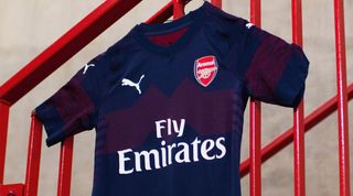
This season’s set are likely to be the last Arsenal kits made by Puma, with Adidas in line to take over for the 2019/20 campaign. The home jersey isn’t to our liking, but this ‘Peacoat’ and ‘High-Risk Red’ number (purple and red, to you and FourFourTwo) is very pleasing on the eye.
19. Liverpool, home
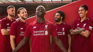
Liverpool delivered in glorious fashion last term with a darker red kit, and they’ve sensibly decided to stick with a winning formula. Critics may claim there’s little difference between this and the 2017/18 version, but the Merseysiders and New Balance deserve credit for resisting the temptation to tamper. It could even be argued that the improved collar makes this shirt a slight upgrade.
18. Juventus, home
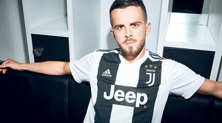
Juventus have shifted from six stripes to three this season – a potentially risky move, but one that’s paid off. Having Cristiano Ronaldo around to model it can’t have done the shirt’s popularity any harm.
17. Lyon, home
Get FourFourTwo Newsletter
The best features, fun and footballing quizzes, straight to your inbox every week.
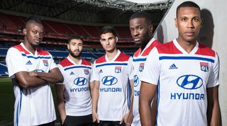
A relatively simple design, this classy Lyon shirt neatly encompasses all three of the club’s traditional colours. The red shoulder pads are the standout feature, and the French outfit deserve a bonus point for having a congruous sponsor’s logo.
16. Derby, home
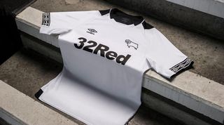
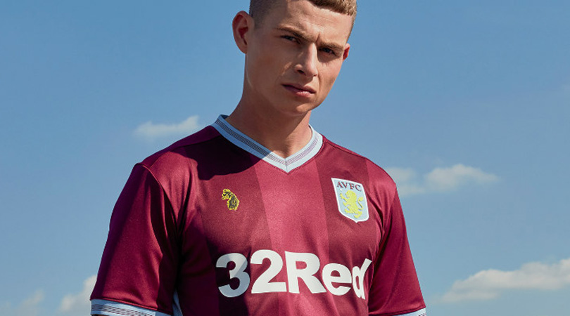
Umbro have nailed their sleeves this year, highlighted in this pleasingly simple design of Derby’s. ‘32Red’ is a deeply unsatisfying sponsor which appears needlessly large here, granted, but the rest of this effort is spot on for Frankie Lamps’ lot.
15. Newcastle, away

Look at this kit and try not to picture David Ginola jinking down the wing, or Les Ferdinand smashing home a finish. Impossible. A retro offering inspired by the iconic 1995/96 Magpies side, the only thing missing is a return for former sponsor Newcastle Brown Ale. Fun88 just doesn’t have the same ring to it – and it doesn’t taste as good either.
14. Huddersfield, home
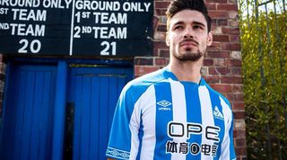
Huddersfield produced three shocking strips last time out, but this home kit is very strong. Simple but striking, it even features a terrier badge first used in the 1970s in place of the normal club crest. Consider yourselves redeemed, folks.
13. Bayer Leverkusen, away
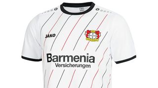
To mark the 30th anniversary of their 1989 UEFA Cup triumph, Leverkusen have released a commemorative kit as their change strip for the upcoming campaign. Red and black diagonal pinstripes on a white canvas is something we’re completely on board with.
12. Roma, home
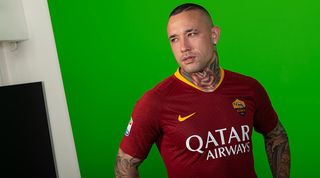
Lovely stuff from Roma, who’ve shown a willingness to learn from their Champions League victors Liverpool by adopting a darker shade of red. The yellow collar and Nike swoosh are important flourishes, and the graphic design – a nod to the chainmail armour donned by soldiers in ancient Rome, of course – is subtle and complementary, rather than distracting and overbearing.
11. Galatasaray, home and away
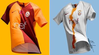
A snazzy effort from the Turkish outfit, whose distinctive yellow and red halves have once again delivered. This is a particularly clean design with no unnecessary graphic patterns on the front, and we’re big fans of the sleeves being the opposite colour to the body. Good work.
10. Inter, home
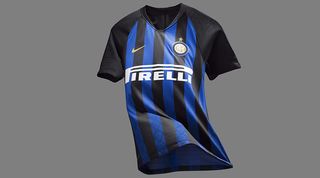
Everyone makes mistakes in football, so the true test is how you respond. Rather than repeating the same error they made last year, when Inter’s kit resembled a barcode, Nike have bounced back with a gorgeous return to the classic black and blue stripes. Lesson learned, we hope.
9. Tigres, home

This is a difficult one to explain with words; a cluttered kit with about four too many logos (is that a tribute to a London tube station on the right breast?) and a zig-zag pattern – supposedly inspired by Russia’s 2017 Confederations Cup shirt, of all things – which makes your eyes hurt after a while. But just look at this shirt and try to tell us it’s not beautiful.
8. Crystal Palace, home and away
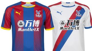
As any Tottenham fan will tell you, it’s difficult to get the fade effect right. Palace have managed it, though, ensuring their home top still looks good without the accompanying shorts. The return of the sash for their change strip is another pleasing development, although the jarring sponsor’s logo prevents a higher placing.
7. Chelsea, home
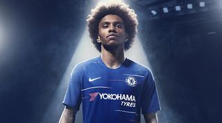
When you’ve only really got one colour to work with, it can be difficult for clubs to produce distinct designs year after year. Chelsea’s 2018/19 uniform is a fantastic example of how to mix things up while remaining true to your identity; those subtle red and white horizontal lines are a unique feature among Premier League clubs.
6. Wolves, home
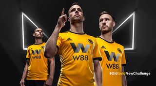
Wolves are back in the big time and aren’t exactly keeping quiet about it, having spent the last few weeks snapping up half of the professional footballers in Portugal. Yet the most pleasing thing about their summer has nothing to do with transfers and everything to do with the welcome return of a classic English kit. The West Midlanders moved back to a lighter, more traditional shade of gold to mark their return to the top flight, although if we’re being picky, the notes of grey in the sponsor’s logo are a little off-putting.
5. Boca Juniors, home
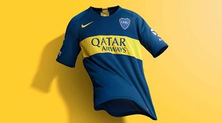
You’d have to seriously screw up to produce a poor Boca Juniors kit. Mercifully, Nike haven’t done that. There’s nothing revolutionary about the 2018/19 edition, but that’s undoubtedly a positive. Why would you mess with such a classic?
4. Aston Villa, home
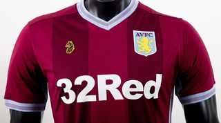
We might be seeing a bit more of a lifestyle/football crossover with future kits after this. Aston Villa have joined forces with British clothing brand Luke 1977 for this year’s effort – and the results are suitably delightful. The two gradients of claret coexist in beautiful harmony, while both sleeves and collar are elegantly classic. It’s no wonder that Villa reported an 180%+ uplift in pre-order sales compared to last season.
3. Fulham, home
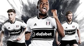
Fulham have marked their promotion in style, releasing the best kit of the 2018/19 Premier League season. Inspired by outfits worn in the late 1990s, this shirt possesses the optimum balance between black and white, and the central horizontal strip is a sight to behold.
2. Sampdoria, home
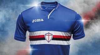
Sampdoria’s success in the shirt stakes is well established by now, but this iconic design never gets old. A predominantly blue jersey with a white, red and black band running across the centre, the Blucerchiati’s kit also stands out for its badge: a centrally placed shield with no words or other overt reference to the fact it’s symbolising a football club.
1. Kaizer Chiefs, home and away
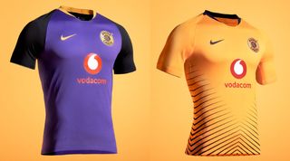
Oh yes. Kaizer Chiefs have produced two delightful kits for the current season: first, a gold home jersey with black strips which represent “traditional spears rising together to create a sense of motion and unity on the field”. The second is a stunning purple-bodied, black-sleeved change strip with some fetching splashes of gold on the collar, crest and Nike swoosh. Now, where can we buy one… or 10?
Now read...
THE BAD Ranked! The 17 worst kits of the 2018/19 season
GUIDE 28 red-hot fantasy football tips from old winners and experts
Greg Lea is a freelance football journalist who's filled in wherever FourFourTwo needs him since 2014. He became a Crystal Palace fan after watching a 1-0 loss to Port Vale in 1998, and once got on the scoresheet in a primary school game against Wilfried Zaha's Whitehorse Manor (an own goal in an 8-0 defeat).
