The 50 best football shirts... EVER
What makes a great shirt?
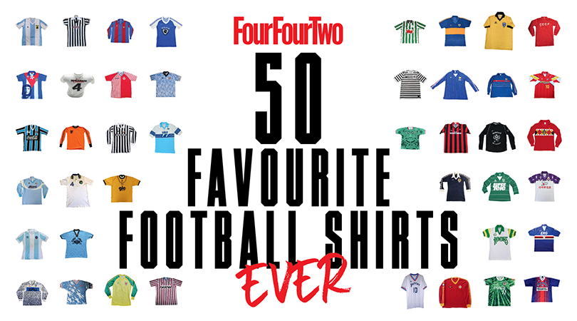
What makes a great shirt?
Unfortunately the answer isn't just 'anything that's not Norwich 1992-94'.
Is it what it looks like? Who wore it? Whether a team won stuff in it? Whether it makes you smile? Misty-eyed? Well, it's all of those things and yet maybe even none of them; for football shirts are a completely subjective entity, and difficult to evaluate. And yet, we can still all agree on many of the beauties out there.
In 'The Football Shirts Book', Neal Heard sets out to rejoice about more than mere design. "I find it's more about sharing memories with people," he says. "I like the fact that around the globe you can wear a shirt and someone will stop you to ask the immortal question: 'Where'd you get that?'..."
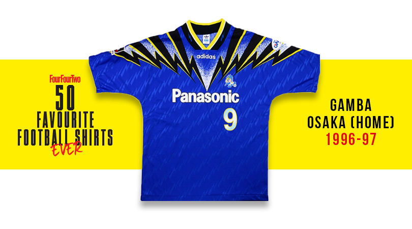
50. Gamba Osaka, home (1996-97)
J League jazziness: the crescendo of lightning bolts – fittingly, descending into Panasonic’s logo over the chest – is electrifying.
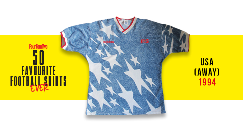
49. USA, away (1994)
Best remembered for Alexi Lalas – the wizard-bearded giant for whom a cameo as part of the Night’s Watch must still be realistic. This none-more-American kit featured faux denim and giant stars, and was like nothing ever seen before.
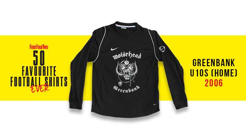
48. Greenbank U10s (2006)
Back in 2006, a group of under-10 kiddos from Lincoln petitioned Lemmy to let them don his famous Motorhead logo on their shirt – and the metal maestro agreed, adding: “Kick everything really hard.” Eventually he met the squad. Ace!
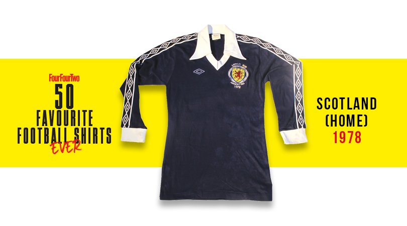
47. Scotland, home (1978)
Archie Gemmill chipped Holland's keeper at World Cup ‘78 to score one of the tournament’s most beautiful goals ever – and he looked pretty fly too in a fine Umbro design, with the logo dotted along the sleeves.
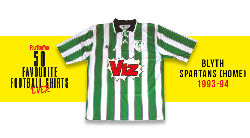
46. Blyth Spartans, home (1993-94)
The Geordie genius of Viz is surely the North East’s greatest contribution to British culture – and their sponsorship of Blyth was entirely fitting, as well as looking excellent.
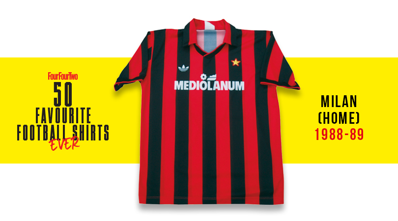
45. Milan, home (1989-90)
Few better teams, few better shirts: say ‘Milan’ to fans of a certain vintage and they can’t help but picture Gullit, Rijkaard and Van Basten posing in this belter, high on their own brilliance.
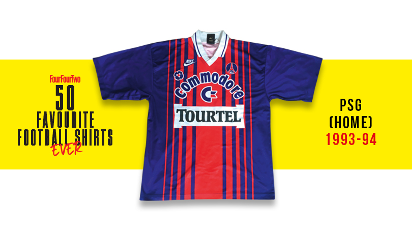
44. PSG, home (1993-94)
Sometimes more really is more: a loony collision of widening-then-thinning stripes, bold colours and in-yer-face sponsors – and yet this Parisian party somehow works.
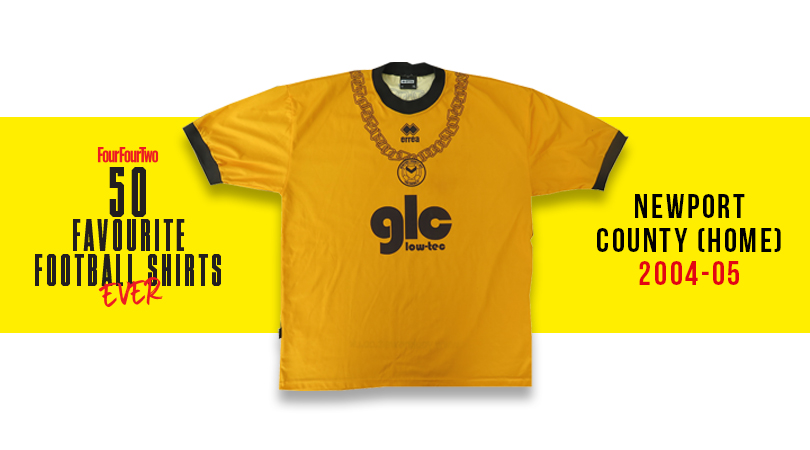
43. Newport County, home (2004-05)
The golden years of Welsh comedy rap. Buoyed by their international hits Guns Don’t Kill People, Rappers Do and the searing social commentary of Your Mother’s Got a Penis, Newport-based Goldie Lookin Chain became sponsors for their team’s FAW Premier Cup run and whacked a giant GLC on the actual shirt.
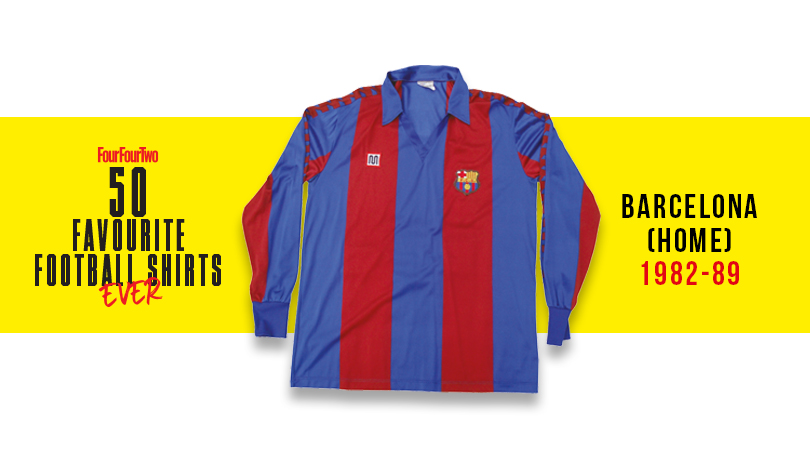
42. Barcelona, home (1982-89)
Another team with very few poor shirts in its back catalogue thanks to an delightful colour combo and simple execution. Their peak was perhaps the decade in which local brand Meyba – better known for their swimwear – made the shirt.
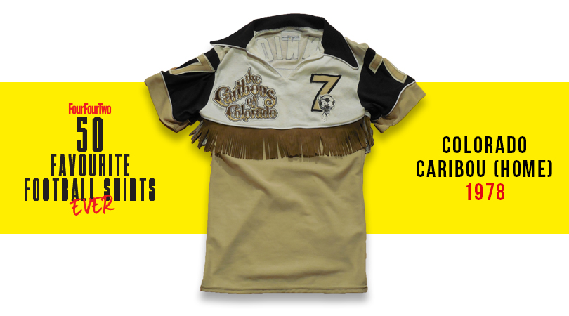
41. Colorado Caribou, home (1978)
The NASL always played with the boundaries of acceptability – it’s the American way – and never more than with this Caribou shirt. It featured a tassled ‘rodeo fringe’ around its midriff, making the Denver side – founded and disbanded in the same year – look like ludicrous line dancers. Coyote ugly but somehow fantastic.
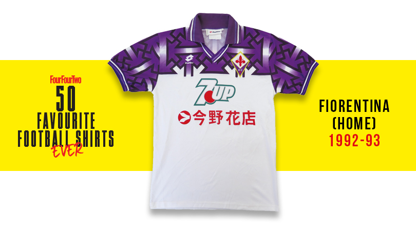
40. Fiorentina, home (1992-93)
It was a tough year on-field – Fiorentina were relegated from Serie A – and also for Lotto’s designers, when it was noted that their shirt was splashed with swastikas. La Viola pleaded it was accidental, but the shirt was withdrawn anyway just in case.
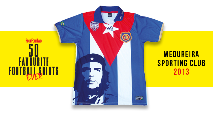
39. Madureira Sporting Club (2013)
Brazilian side Madureira stuck '60s Argentine troublemaker Che Guevara on their shirt – and not only hoping they'd sell it to students: it marked 50 years since the club visited Guevara's Cuba and met the beret-wearing Marxist after a game.
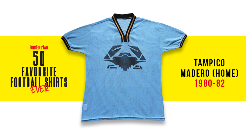
38. Tampico Madero (1980-82)
Mexico's Tamaulipas region is well known for its
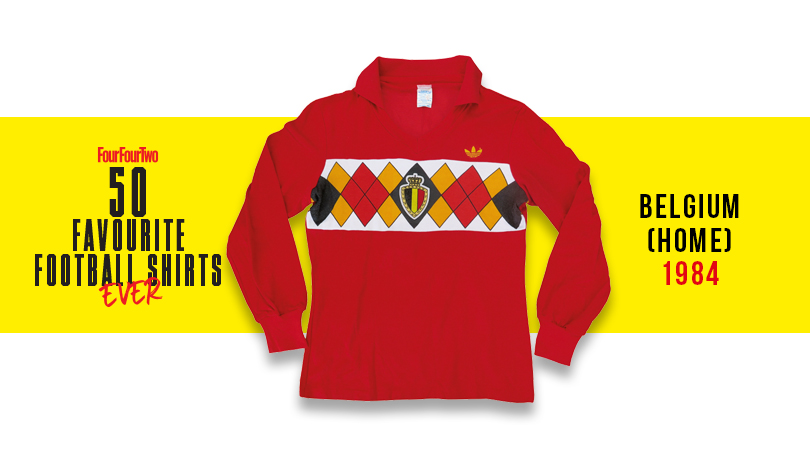
37. Belgium (1984)
Half shirt, half back of a playing card: this is an '80s football casual's wet dream, and one of the most thoughtful international shirts of all time. Adi at their creative best.
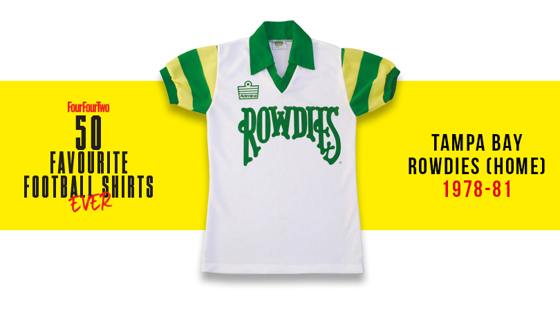
36. Tampa Bay Rowdies (1978-81)
One of the short-lived NASL’s finest efforts: a great green and white colour scheme, and a font you’d associate more with a rock ’n’ roll poster.
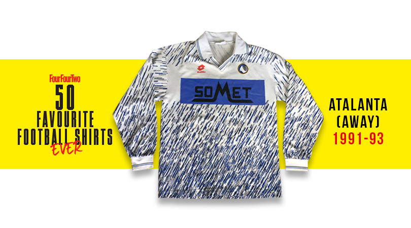
35. Atalanta, away (1991-93)
A love-it-or-hate-it affair - and we’re firmly in the former camp. Some art school football kits look dreadful, but this pen-flecked attempt – classic early '90s stuff – was rather swish.
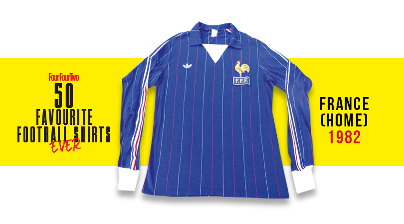
34. France (1982)
OK France, we'll admit it: your shirts are le bomb. The deep blue, central stripes and proud cockerel make this jersey something to crow about – especially as a terrific Bleus team wore it at the '82 World Cup.
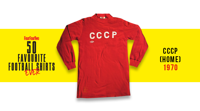
33. CCCP (1970)
The Soviet Union's big red machine trampled its way to the last eight of Mexico '70, where they were eventually beaten by the Uruguayans. Still, at least they did it while looking menacingly sharp in this simplistic number, complemented by the terrifying all-black goalkeeper kit of Lev Yashin.
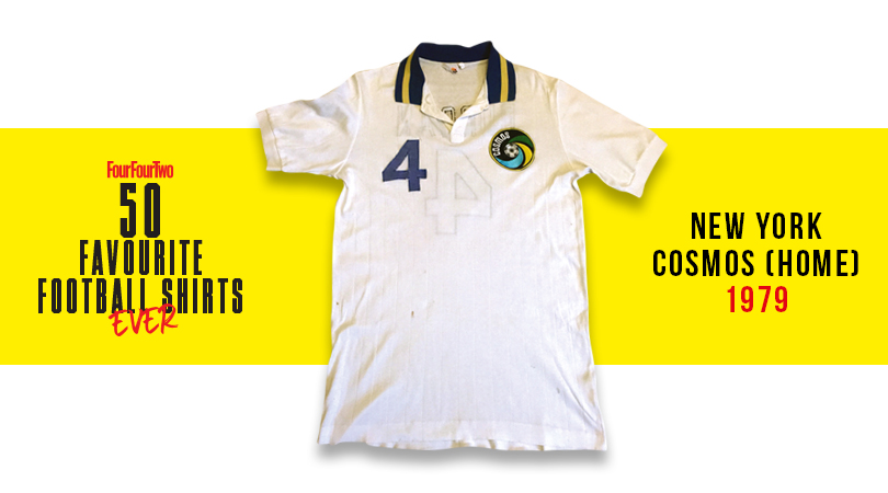
32. New York Cosmos (1979)
Designed by Ralph Lauren, this shirt was further proof that the Cosmos weren't really about football; more peacocking around Studio 54 with Warhol and Bowie. Nevertheless, the logo was brilliant, and with Carlos Alberto, Franz Beckenbauer and Johan Neeskens all in the side, the Cosmos could play a bit too.
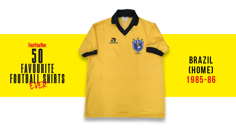
31. Brazil (1986)
There’s no such thing as a bad Brazil shirt, but this particular offering, donned by Socrates, Zico, Josimar and Falcao, is the definitive Seleção selection.
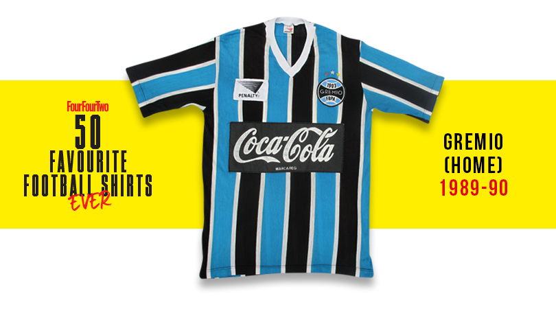
30. Gremio, home (1989-90)
A Brazilian classic colour combo, enhanced further by the sewn-on manufacturers logo and curly fizzy pop logo sponsorship. One of the greatest South American shirts you'll ever see.
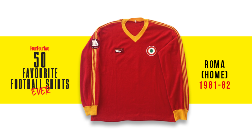
29. Roma, home (1981-82)
Another club who rarely release ropey kits – it's impossible for that colour combo and wolf imagery to fail – Roma’s apex came in 1981/82 with its most stylish exponent, Falcao (despite his curly Phil Neal mullet), supposedly having a hand in the design.
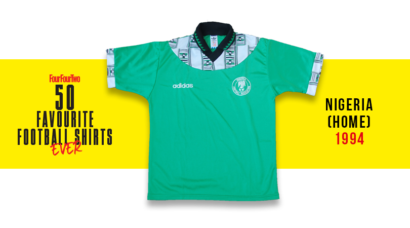
28. Nigeria, home (1994)
The Super Eagles topped their group at the 1994 World Cup with this African print-patterned adidas number, only to deny us a fifth game in it by losing to eventual runners-up Italy in the round of 16. It's a shame more teams don't incorporate local influences into their kits like this.
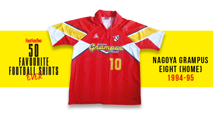
27. Nagoya Grampus Eight, home (1994-95)
J League kits have always been influenced by Japan’s unique artistic and design tradition, and this from Grampus Eight – modelled by Gary Lineker for a couple of seasons – was a major hit.
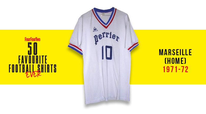
26. Marseille, home (1971/72)
A groundbreaker. This was the first jersey to have something we now take for granted: a brand logo and a sponsor. More importantly, it looked extremely dapper.
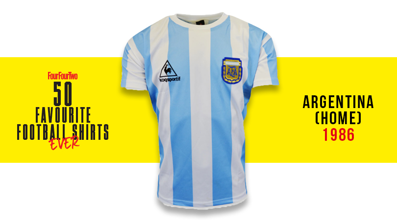
25. Argentina, home (1986)
England's defenders saw a lot of this top's rear while watching Diego Maradona evade their challenges for 90 minutes at Mexico '86 – the World Cup at which Argentina's diminutive genius left everyone in his wake before lifting the Jules Rimet. Iconic.
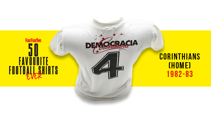
24. Corinthians, home (1982-83)
This one's charged with political significance: in ’82 the players of the crisis-torn Sao Paulo side – including cigarette-mad Seleção God Socrates – took control of day-to-day operations, with employees, players and managers each receiving an equal vote. Oh, and it looks incredibly gorgeous, too.
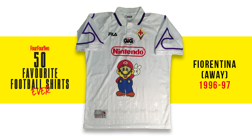
23. Fiorentina, away (1996-97)
Purple (even just as trim, like here) is a difficult colour to pull off and often the preserve of the Mad Cat Lady, but in Florence they’ll tell you it’s violet and point you at a picture of Gabriel Batistuta looking dashing. Bonus points for Super Mario.
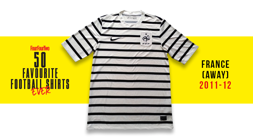
22. France, away (2011-12)
The Breton stripe was used by the French navy from 1858, popularised by Coco Chanel in 1917, and is still a staple of casual womenswear and high fashion Jean Paul Gaultier sailor outfits. Full marks to les Bleus for embracing the tradition for this shipshape away effort.
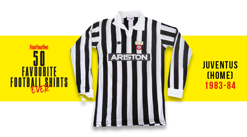
21. Juventus, home (1983-84)
A kit fit for Serie A champions and European Cup Winners' Cup winners. This stunning uniform from Kappa is the all-time classic Juve shirt, known for its stylish giant collar, smart V-neck... and Michel Platini.
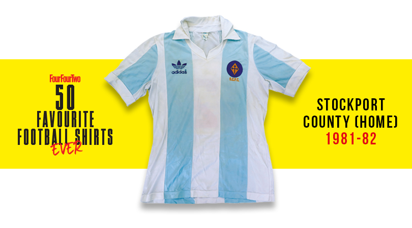
20. Stockport County, home (1981/82)
Even the most agitated Falkland Islander would find it tough to deny that Argentina's international shirt is a peach. It's a great shame that Stockport’s homage to it was withdrawn when the war over Las Malvinas broke out early that campaign.
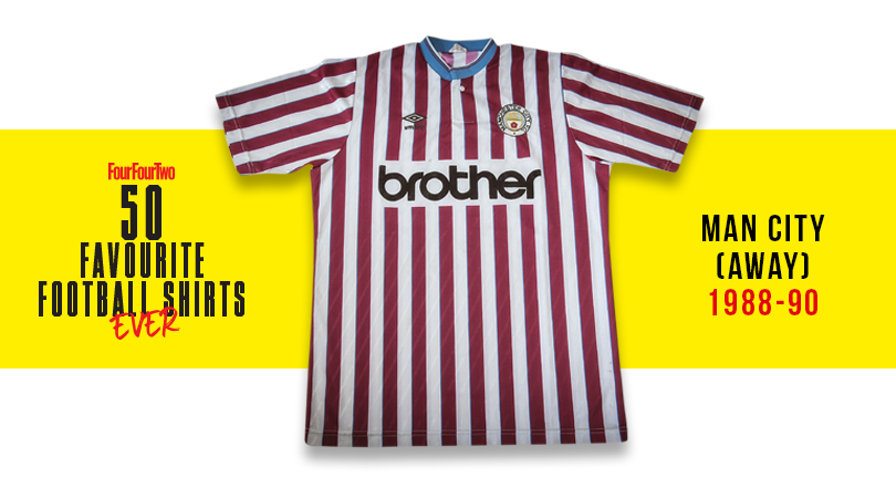
19. Man City, away (1988-90)
One of the (very) few football shirts which could feasibly be worn in the church of Mancunian acid house cool, the Hacienda. Watch my pint, Bez!
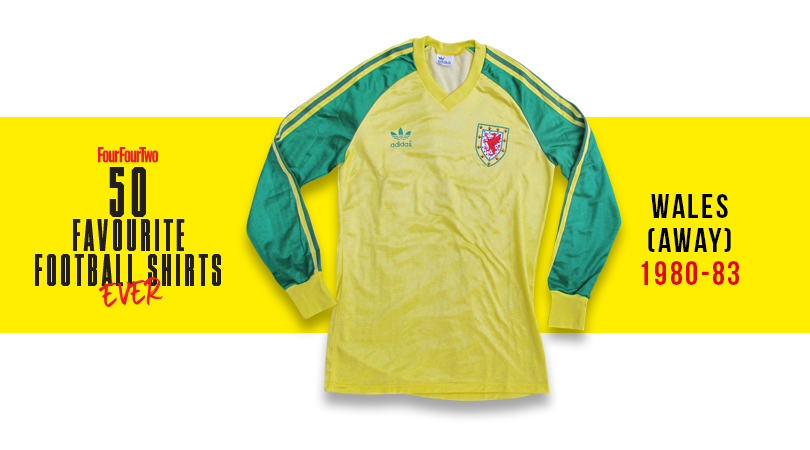
18. Wales, away (1980-83)
Wales have produced some excellent shirts over the years, and for our money the best is this obscure yellow and green away top from 1980-83. Think Ian Rush, Kevin Ratcliffe and Joey Jones in full adidas glory.
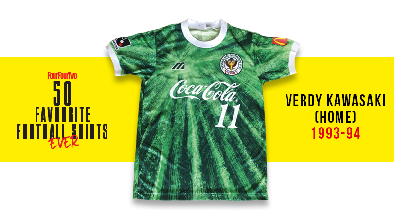
17. Verdy Kawasaki, home (1993-94)
Presumably after passing the bong around Mizuno HQ and wigging out to Anthem of the Sun by the Grateful Dead, the designers got on with creating this wonderfully psychedelic shirt for the Tokyo-based outfit. Far out, おとこ (that’s Japanese for 'man', if you didn't know).
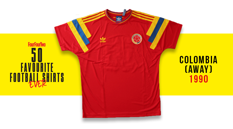
16. Colombia, away (1990)
Higuita! Valderrama! Escobar! Rincon! Iconic side they may have been, but Colombia were actually rather pants at the 1990 World Cup in Italy, limping out of the group stage in third spot then suffering elimination at the hands of Cameroon. Still, at least they looked smart while getting their arses handed to them by Roger Milla & Co. in this deep red number, complete with jazzy symmetrical shoulder bars.
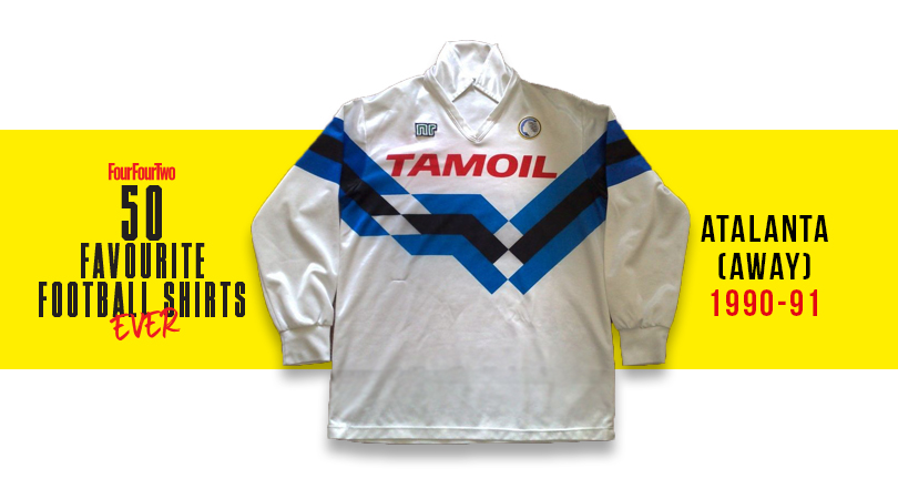
15. Atalanta, away (1990-91)
Despite being a cut and paste of the memorable Germany kit from the same era, this is a magnificent design. The colour scheme just gives it the edge over Die Mannschaft’s best threads.
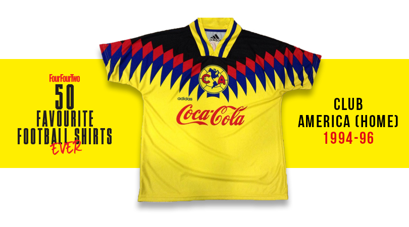
14. Club America, home (1994-96)
A shirt which invokes both Colombia’s ‘birdman’ super-fan and the Rio carnival, this was a jersey that could easily have gone awry. The primary colours' ambition on display makes it more brilliant than bonkers, though, while the continental badge provides the ideal flourish.
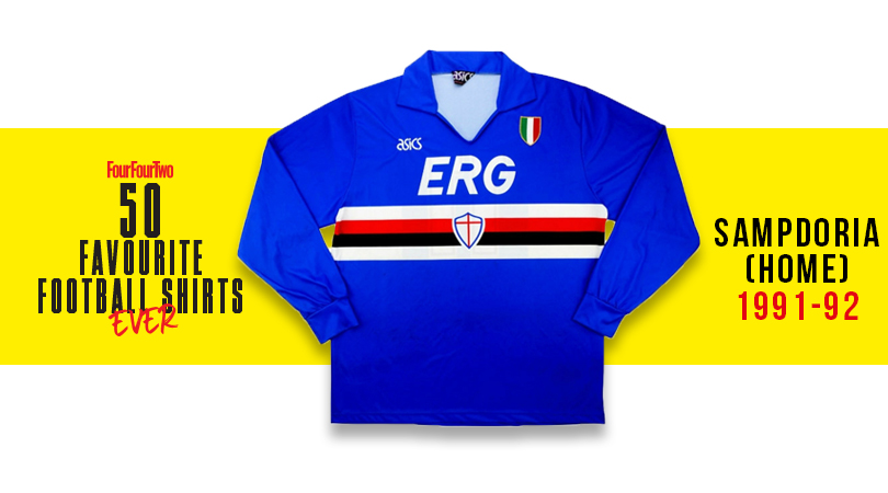
13. Sampdoria, home (1991/92)
Sampdoria kits are always outstanding, but this particular edition – from the season after Samp pipped Inter and Milan to the Scudetto – is slick Italian style at its very zenith. Best worn by the slick ‘terrible twins’ up top – Gianluca Vialli and Roberto Mancini.
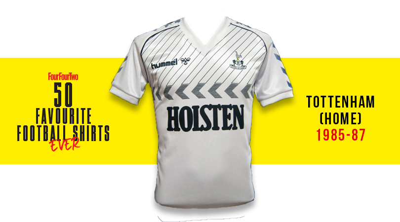
12. Tottenham, home (1985-87)
Good on hummel, who were strong in their belief that slanted pinstripes above chevrons would work. And by Jove, they really do: this super-snazzy Spurs outfit from the mid-to-late '80s was brilliant design, featuring yet more chevrons on the sleeves and neatly fitting all of its components into a compact area. Ossie Ardiles never looked so good.
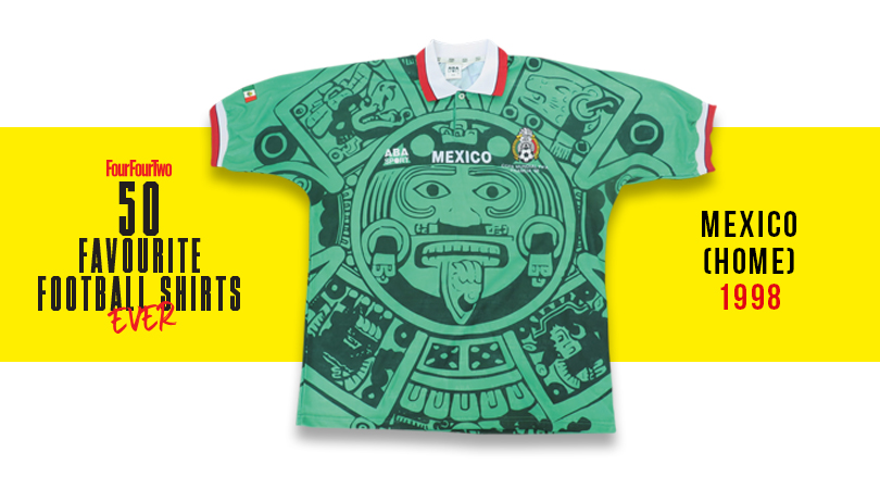
11. Mexico, home (1998)
A bit of local artistic influence always enhances a kit, as evidenced here by the welcome inclusion of Aztec god Quetzalcoatl - who apparently enjoyed becoming drunk on fermented agave juice and cavorting with his sister in celebration.
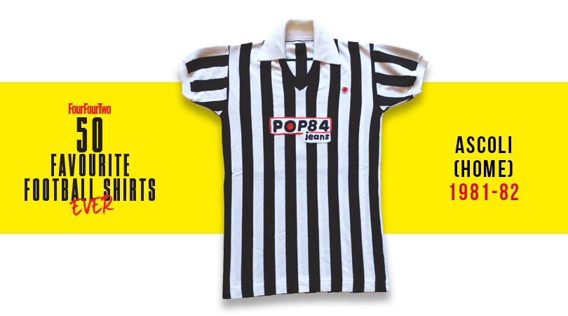
10. Ascoli, home (1981-82)
Simply stunning. From the Gridiron field judge stripes to the neat ‘Pop 84 Jeans’ sponsor and discreet badge, Ascoli have managed to out-Juve Juventus with this one. Bravo.
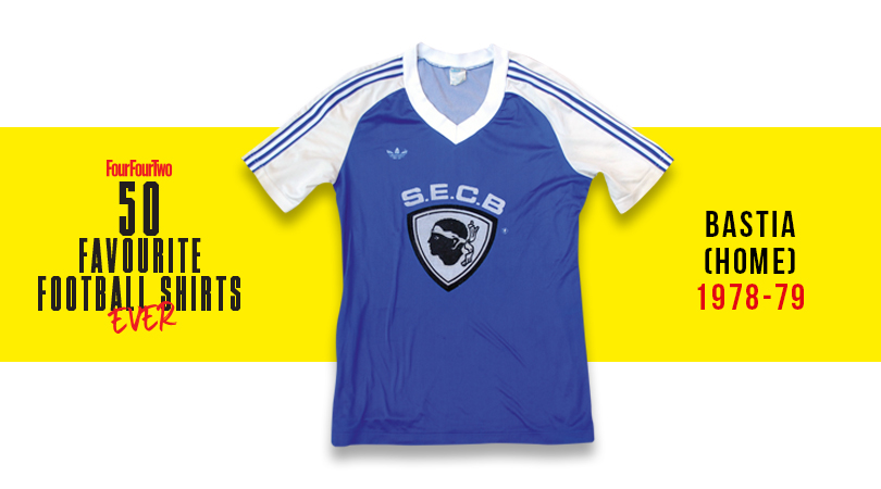
9. Bastia, home (1978-79)
No sponsor, just a giant version of the club's Corsican crest and acronym dominating this adidas delight. Simple, effective and downright beautiful.
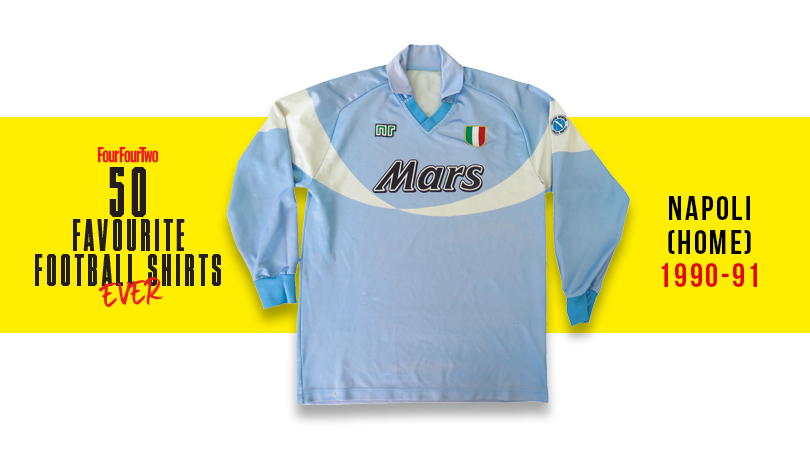
8. Napoli, home (1990-91)
The shirt that followed Napoli's finest hour: their second (and most recent) Scudetto, Maradona in his barmy pomp, and an NR top with a Mars logo that's guaranteed to make Serie A romantics go misty-eyed.
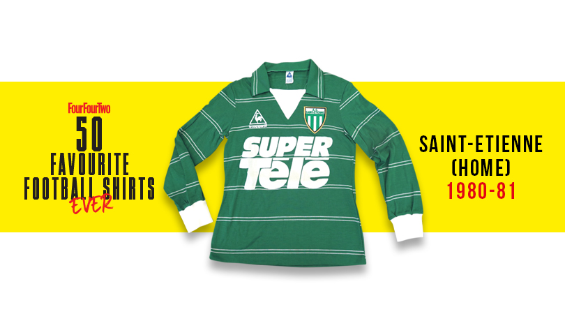
7. Saint-Etienne, home (1980-81)
No team has ever had such a sexy je ne sais quoi as Saint-Etienne; this is a top so Gallic it should be having an affair with your next-door neighbour. The green number - replete with massive SUPER TELE sponsors, because why not? – looked magnifique on the French kings, who called upon Jacques Santini and Michel Platini in those heady days. Allez les Verts!
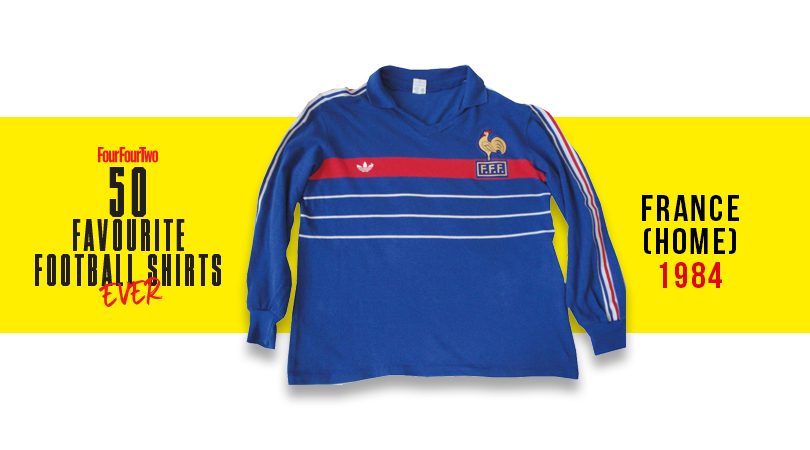
6. France, home (1984)
Wasn't that Platini a lucky boy? Before he was a puffed-up ball of UEFA administrative self-importance, the French wizard was one of the most aesthetically delightful players to ever grace a football pitch. This uniform was his equal: a never-bettered Bleus masterpiece.
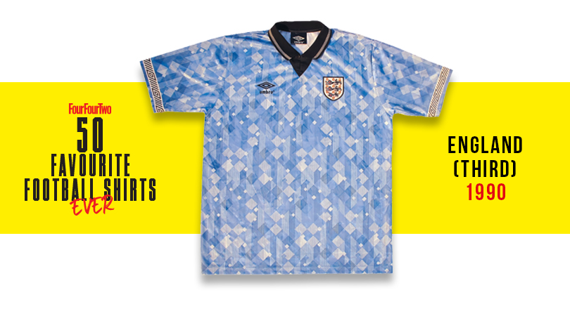
5. England, third (1990)
A shirt which, truthfully, shouldn’t be admirable: the overlaid diamonds that Umbro went bananas for were often nausea-inducing, but this one somehow worked. Worn with effortless chic by Barney Sumner in the World In Motion video, it neatly encapsulates the good vibes of that summer.
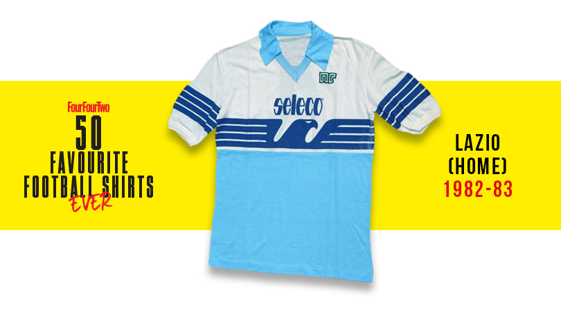
4. Lazio, home (1982-83)
Yet more brilliance from the NR brand, whose simple baby blue effort with beautiful trim was prevented from resembling a toddler’s top by its striking – if slightly fascistic – expansion of the Lazio badge.
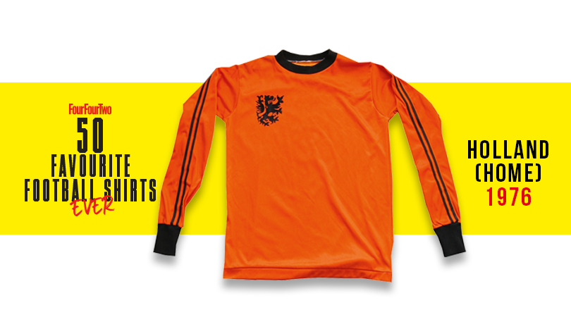
3. Holland, home (1976)
Johan Cruyff was sponsored by Puma, and famously ripped off one of the three stripes of the company’s mortal enemy from his Netherlands shirt – which somehow made it look even better. Perhaps the best ever Oranje shirt, on the planet’s most stylish operative.
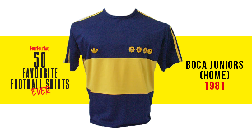
2. Boca Juniors, home (1981)
It’s difficult to think of a more perfect collision of iconic team, player and shirt: the bouffant-bonced Diego Maradona still had his baby cheeks when he donned Argentina’s most striking kit for one wonderful season before joining Barça.
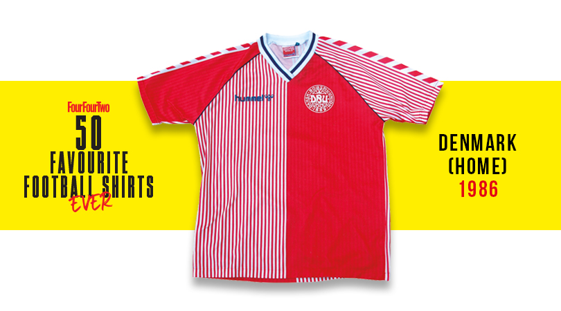
1. Denmark, home (1986)
Many of the Norse marauders who went on to triumph at Euro ’92 were at the World Cup in Mexico, where they pulled on the tournament’s most pulchritudinous top. Produced by Aarhus-based firm hummel, its striking chevrons and gentlemanly pinstripes worked marvellously.

Greg Lea is a freelance football journalist who's filled in wherever FourFourTwo needs him since 2014. He became a Crystal Palace fan after watching a 1-0 loss to Port Vale in 1998, and once got on the scoresheet in a primary school game against Wilfried Zaha's Whitehorse Manor (an own goal in an 8-0 defeat).
